Maison et Objet 2015

I was in Paris at the end of last month for interiors trade fair Maison et Objet which takes place twice a year (Jan & Sept) at an exhibition centre in Villepinte to the north of the city. The show is enormous, and I mean really enormous, it's spread across eight vast halls each one the size of Earl's Court. To get there you can travel from the centre of Paris on the RER, or it's also very close to Charles de Gaulle airport. I Eurostarred it and stayed in the city centre.

There was so much to see I felt like I only scratched the surface, but I was on a mission as I was writing a piece for a British newspaper so I did my best to race around the show, and the city, snapping away with my phone. 

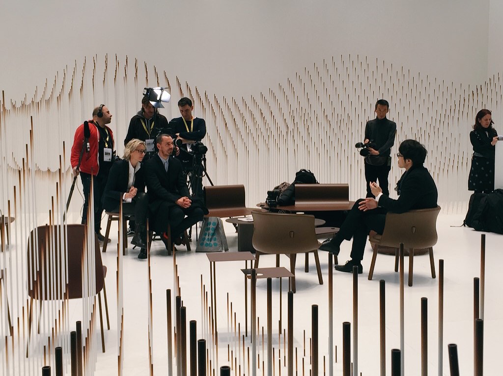
 Japanese designer Oki Sato, the founder of internationally renowned design studio Nendo, was named Designer of the Year.Here's a picture I took of him facing the media surrounded by his chocolate-themed installation which made me think 1.…


Japanese designer Oki Sato, the founder of internationally renowned design studio Nendo, was named Designer of the Year.

Here's a picture I took of him facing the media surrounded by his chocolate-themed installation which made me think 1. what a cool dude and 2. god I would hate to be famous. The stand had an appealing, wavy, cocoa-coloured structure surrounding it, but the piece de resistance was nine chocolates moulded into different shapes to play with the idea of how texture affects taste - one is smooth, one is pointy, one is hollow etc. The idea being to get a different perspective on an ordinary thing. It's a bit out there, but I liked it. 

Oki Sato also did a video interview on the Maison et Objet website and he comes across really well, especially when he says: "a good design is one you can explain down the telephone to a child, because it's not about forms, colours or shapes - it's the idea". Also, he eats the same noodle dish every day in the same place, so he can "notice the small differences, because it's those kind of differences which generate new ideas". He's so zen. 

Nendo's 'Chocolate Lounge' at Maison et Objet plays with the idea of taste and texture.

Nendo's 'Chocolate Lounge' at Maison et Objet plays with the idea of taste and texture.

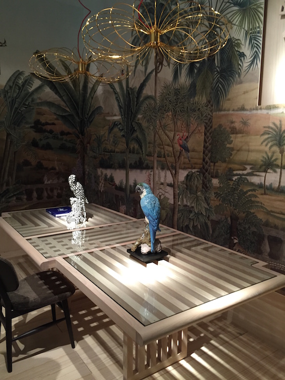
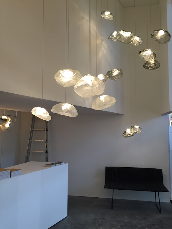
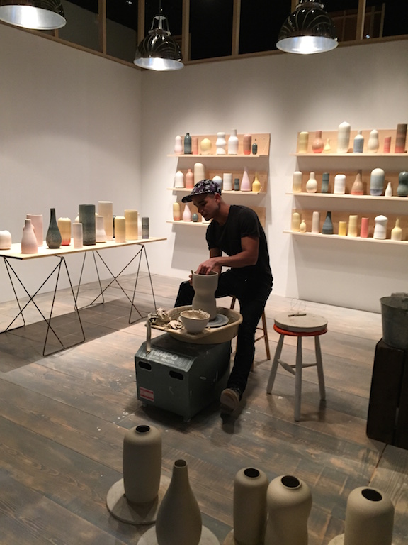
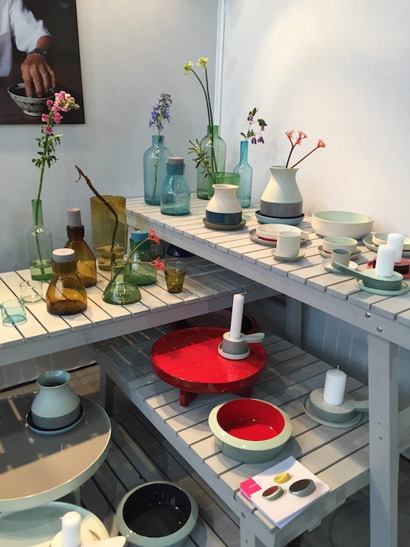
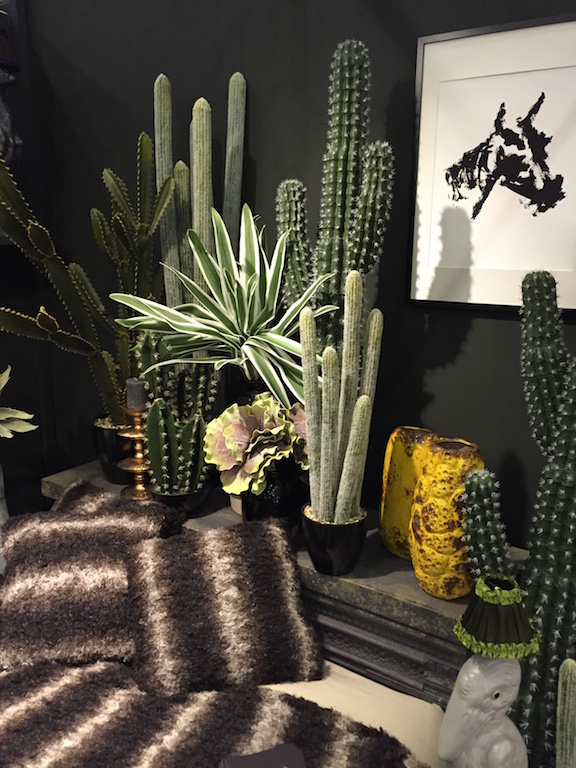
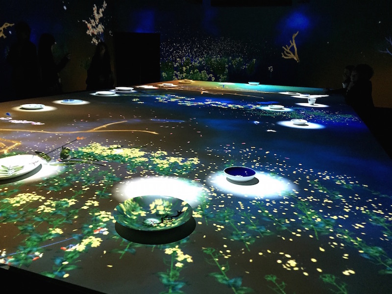
Below is a collection of photos I took at the show, a bit random, but they all struck me as interesting in their own right - from floating cloud lights at Bocci to the fascination with how things are made epitomised by ceramics studio Tortus Copenhagen to some crazy Japanese lighting coolness by teamLab. Oh, and fake cacti at Abigail Ahern - it's the new pineapple, trust me. 

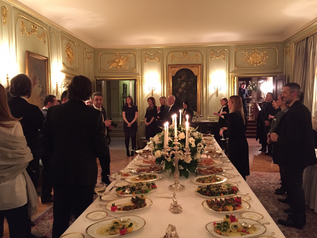
It wasn't all work though. On the Friday night I went for dinner at the Turkish Embassy with Istanbul-based design studio Autoban. I'm not kidding. The Turkish Ambassador to France hosted it and the food was amazing. You can see Autoban's most recent interior design work in London at Alan Yau's restaurant Babaji in Soho. (Thank you Neil and Irene at Tomorrow PR)

Ultra Kitchens

New year, new kitchen? Here's a piece I wrote for last month's issue of The London Magazine about "ultra kitchens", in other words, the money-no-object kitchens you find in certain London properties and all the gadgetry that goes along with them. If, like me, you are fascinated by other people's houses then you may enjoy some of the more jaw-dropping details like hydraulic lifting glass walls to "erase the barrier" between inside and out and clients who send their chef to choose the appliances.


An indie Christmas

So much stuff to buy, how to choose? Here's a completely subjective list of things that have been rolling around my head recently. The loose theme is they are all things from indie shops.

A festive, but not necessarily "festive", tattoo from the brilliant Brooklyn-based temporary tattoo company Tattly (founded by the wondrous Swiss Miss). There are so many different ones and they are super cool and just downright fun. I've already sent my husband a link to this one.

ps read the very short Tattly story if you want a quick blast of inspiration. 

I'm a sucker for blue and white ceramics so the Indigo Storm (great name btw) collection of swirly blue glazed earthenware by Faye Toogood for Staffordshire-based pottery company 1882 Ltd caught my eye. 1882 Ltd was founded in 2011 by a fifth generation descendent of the Johnson Brothers who started making ceramics in 1882. Go! British manufacturing.

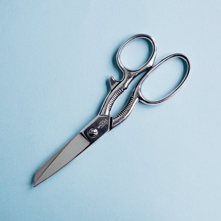
How about a classic pair of old-fashioned scissors made by Ernest Wright & Son in Sheffield - a business that was about to go bust until a short video on Vimeo showing how they make their scissors made it onto the BBC, went viral and they were... saved by the internet.

This 'multi-purpose' pair of scissors made of stainless steel has a bottle and can opener built into the handles and it's available from The Saturday Market Project. Another high five for British manufacturing. Yay. 

I'm a bit over geometric prints, never thought I'd say that, but I think I'm just bored of the precision perfect-ness. Having met the delightful Klaus Haapaniemi, a Finnish designer based in London, at London Design Festival this year I'm now a going crazy for his folkloric fantasy textiles. 

Stationery is always welcome in my book (boom boom) and the Rifle Paper 'Travel the World' 2015 calendar ticks a lot of boxes, it's available from Papermash
Contradictions are what make us human, so I'll let this geometric-shaped item in because actually in this context it looks fantastic. I love this brass bottle opener by Fort Standard, yes, I know it's expensive, but this is in in the spirit of "buy less, but better". It's available from Fate London, in fact I like almost everything on this site, it's so earthy. 

These earrings made me laugh. And they're from one of my favourite museum shops The Southbank Centre Shop, well it's not technically a museum more of a cultural institution, but it's in roughly the same category, and it has some pretty cool stuff in it. 

Design Matters with Debbie Millman

Instead of leafing through a free newspaper on the train yesterday I listened to a podcast. It was Design Matters by Debbie Millman and it got me thinking about more than just the latest cast of I'm a Celebrity, although why Michael Buerk is going in remains a mystery.

Millman is a New York-based writer and branding whizz who runs a company called Sterling Brands, has done for twenty years, and since 2005 she has interviewed over 250 interesting design people for her thoughtful podcast. The great and the good are all on there including the brilliant Maria Popova of BrainpickerTina Roth Eisenberg aka Swiss Miss and Ben Schott of Miscellany fame.

I listened to her recent interview with Caroline Baumann who is director of the Cooper Hewitt, Smithsonian Design Museum in New York which opens next month after a $90 million refurb. The new look museum will be interactive and immersive and participatory in a way that we can only hope our new Design Museum in London will be when it opens in 2016.

One of the innovations they've come up with is an interactive pen which will be handed to you on arrival. So instead of snapping photos on your phone, or looking at a museum app, you'll be able to tap the pen on things that interest you and it will store the information. You then take your pen to an interactive table where you can explore, manipulate and even sketch with it. In other words learn about design by designing yourself. Clever. 

In short... Americans are good at thinking BIG, podcasts are better than default scrolling through Twitter and I need a trip to NYC.


Stuffocation

http://stuffocation.org/the-book/

At the risk of shooting myself in the foot, seeing as I write about STUFF on this blog, here's a book I think we might all benefit from reading. I was recommended Stuffocation by James Wallman by a design writer friend and it struck a chord immediately. We are drowning in stuff when what should really be looking for is experiences. I downloaded it on kindle as it didn't feel quite right (pre) ordering the hard copy... and having even more stuff. 

It also sent me off down the internet rabbit hole and I stumbled across a video called The Tipping Point: Where Design Comes To Die by the RSA-supported project The Great Recovery, which is another timely reminder about consumerism and the circular economy. It will make you think about what happens after you've dumped your stuff at the dump... oh the guilt. It's 13 mins long, but stick with it - it's actually relatively upbeat. 

Cosy corner

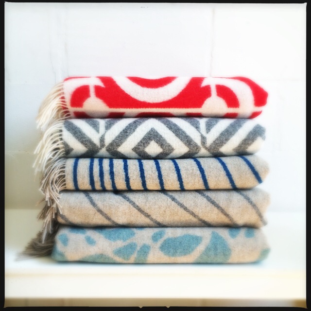
This very appealing image landed in my inbox last week and I think it pretty much speaks for itself. I'm calling it "the upside of winter".

These lovely large blankets (140 x 190cm, £195) are woven from Scottish lambswool, in Scotland. They've been designed by Lorraine Statham of Loophouse, the London-based company known for their colourful rugs, so it's nice to see them branching out.

Upscale design lushness

I'm thrilled to have two features in the Autumn 2014 issue of the heavy-duty compendium of upscale design lushness which is Alto Magazine. The magazine issues follow the seasons so there are only four a year which makes a refreshing change in this high speed media world and at £30 a copy it is really more like a book. It's the very definition of "tangible media" my current favourite buzz phrase to describe the tactile delight of an actual paper magazine. 

On p48 is my piece on the beautiful lights being dreamt up by bespoke lighting companies for which I interviewed Charles Edwards, Chris Cox of Cox London and Will Fisher of Jamb. And on p154 is my interview with interior designer Sarah Lavoine about an extraordinary apartment she designed for a French movie producer in the 7th arrondissement in Paris. I could get used to living in Alto world.


LDF14 Highlights

I've just about recovered from my week of excitement at the London Design Festival. There's so much to say and I've barely scratched the surface, but here are some of my visual highlights.

I'm always a sucker for a bold print so naturally I felt compelled to take a shoe selfie on one of fashion designer Jonathan Saunders' new rugs for The Rug Company.

I'm always a sucker for a bold print so naturally I felt compelled to take a shoe selfie on one of fashion designer Jonathan Saunders' new rugs for The Rug Company.

While I was at The Rug Company I couldn't help but notice the impressive scale and precision hanging of the pictures. Also, the beautiful lantern. 

While I was at The Rug Company I couldn't help but notice the impressive scale and precision hanging of the pictures. Also, the beautiful lantern. 

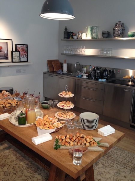
You know you've made it when... The Rug Company has their own kitchen with resident chef at the back of the showroom (555 King's Road). They laid on this feast for the official launch of the Chelsea Design Quarter. Not too shabby.

You know you've made it when... The Rug Company has their own kitchen with resident chef at the back of the showroom (555 King's Road). They laid on this feast for the official launch of the Chelsea Design Quarter. Not too shabby.

Just across the road I was stopped in my tracks by this giant lantern. Having recently interviewed Charles Edwards for Alto Magazine I have a greater appreciation for the work that must have gone into it. Also, wow, it really shows how scale is ever…

Just across the road I was stopped in my tracks by this giant lantern. Having recently interviewed Charles Edwards for Alto Magazine I have a greater appreciation for the work that must have gone into it. Also, wow, it really shows how scale is everything. 

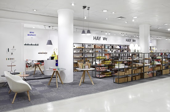
These are the Tela glasses from Wrong for Hay which I was raving about last week. They have the feel of stitched fabric, very tactile and rather beautiful too. I nipped into Selfridges and found the Hay mini market in the basement (it's there u…

These are the Tela glasses from Wrong for Hay which I was raving about last week. They have the feel of stitched fabric, very tactile and rather beautiful too. I nipped into Selfridges and found the Hay mini market in the basement (it's there until Christmas) I'm still lusting after the cushions. 

Zaha Hadid's self-supporting Crest sculpture in the V&A courtyard was very easy on the eye and a much photographed centrepiece. Here's a more technical write up from Dezeen which explains how they got 8mm thick aluminium sheets to curve lik…

Zaha Hadid's self-supporting Crest sculpture in the V&A courtyard was very easy on the eye and a much photographed centrepiece. Here's a more technical write up from Dezeen which explains how they got 8mm thick aluminium sheets to curve like this.  

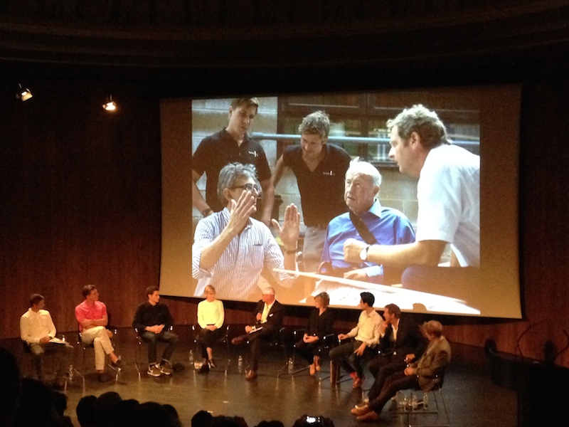
This is a pic from the talk I attended at the V&A about the Wish List. I can't rave enough about this one, it really is a special project. Sir Terence Conran, in partnership with AHEC (American Hardwood Export Council) and his own furniture comp…

This is a pic from the talk I attended at the V&A about the Wish List. I can't rave enough about this one, it really is a special project. Sir Terence Conran, in partnership with AHEC (American Hardwood Export Council) and his own furniture company Benchmark, asked his famous friends: "What have you always wanted?" So, Norman Foster, Richard Rogers, Amanda Levete... the list of 10 is a roll call of the great and the good of contemporary architecture and design... were partnered with emerging designers to actually make their dream object, the thing they'd always wanted but never found - assuming that thing could be made from sustainable wood. 

You can read more about it here and there's a lovely 6 minute short film by Petr Krejci (click on playlist and it's the 11/11 one) shot at Benchmark's Berkshire workshop where all the pieces were made over a two week period. Watch it and I guarantee you'll be dreaming of moving to the country and taking up wood carving. All the pieces are on show at the V&A until 24th October.

Paul Smith was there demonstrating his revolving shed which was designed with Nathalie de Leval and made from thermally modified ash for the Wish List project.

Paul Smith was there demonstrating his revolving shed which was designed with Nathalie de Leval and made from thermally modified ash for the Wish List project.

Another Wish List object was Zaha Hadid's shapely water carafe "Ves-el" made from white oak and designed with Gareth Neal. Benchmark had to upgrade its CNC software to achieve the complicated form. Neal described it as having: "A sense of the handma…

Another Wish List object was Zaha Hadid's shapely water carafe "Ves-el" made from white oak and designed with Gareth Neal. Benchmark had to upgrade its CNC software to achieve the complicated form. Neal described it as having: "A sense of the handmade through the arm of a robot, questioning the viewer's perceptions of craft". Hmm food for thought.

Greeny/blue is pretty much my favourite colour so I made a beeline for these mouth-blown glass cylinders. They were part of an installation by glass artist Jeremy Maxwell Wintrebert in conjunction with Perrier-Jouet, also at the V&A. Each cylind…

Greeny/blue is pretty much my favourite colour so I made a beeline for these mouth-blown glass cylinders. They were part of an installation by glass artist Jeremy Maxwell Wintrebert in conjunction with Perrier-Jouet, also at the V&A. Each cylinder is made from one breath. Pretty cool. 

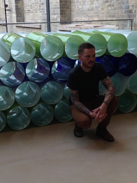
This is Wintrebert posing by his cylinders. It's all about "the balance of light and form, as well as the paradoxical strength and fragility of glass". And arm tats. 

This is Wintrebert posing by his cylinders. It's all about "the balance of light and form, as well as the paradoxical strength and fragility of glass". And arm tats. 

I met up with fellow design journalist Giovanna Dunmall at the Ace Hotel in Shoreditch and we ended up spending most of the week hanging out at various events which was fab. Here she is trying out "designer doughnuts" by Martino Gamper. 

I met up with fellow design journalist Giovanna Dunmall at the Ace Hotel in Shoreditch and we ended up spending most of the week hanging out at various events which was fab. Here she is trying out "designer doughnuts" by Martino Gamper

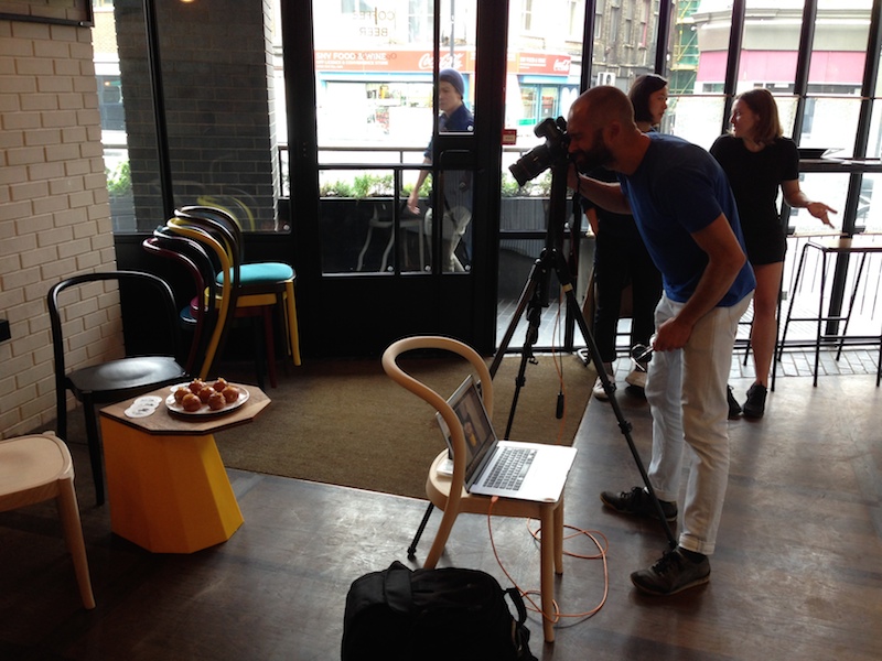
Just as I was desperately trying to contain an eye roll of "only in East London" I turned around and saw said doughnuts having their own photoshoot. I've seen it all now. They were delicious though. 

Just as I was desperately trying to contain an eye roll of "only in East London" I turned around and saw said doughnuts having their own photoshoot. I've seen it all now. They were delicious though. 

I took some time out to do some serious journalism work on Fabien Cappello's 'Soft Play' installation in the lobby of the Ace Hotel. It was unlike any soft play I've ever been to.

I took some time out to do some serious journalism work on Fabien Cappello's 'Soft Play' installation in the lobby of the Ace Hotel. It was unlike any soft play I've ever been to.

Bethan Laura Wood's Altar was inspired by temple displays, altar pieces and harvest festivals and in the background you can see the inside of Hoi Polloi restaurant. I really liked it. It was part of the Super Stimuli event at Ace Hotel. 

Bethan Laura Wood's Altar was inspired by temple displays, altar pieces and harvest festivals and in the background you can see the inside of Hoi Polloi restaurant. I really liked it. It was part of the Super Stimuli event at Ace Hotel. 

Over at 100% Design at Earl's Court I caught a bit of Philippe Starck's talk. He is arguably the original celebrity designer. Make of that what you will. He's apparently a bit of a hermit who does very little publicity these days, but he was on fine…

Over at 100% Design at Earl's Court I caught a bit of Philippe Starck's talk. He is arguably the original celebrity designer. Make of that what you will. He's apparently a bit of a hermit who does very little publicity these days, but he was on fine Gallic form here in an almost stream of consciousness monologue: "being a designer isn't a choice, it's a sickness".

Giovanna introduced me to the designer Paul Kelley (above) who was showing these amazing magnetic copper cubes that configure any way you like and looked just like real live Minecraft blocks.

Giovanna introduced me to the designer Paul Kelley (above) who was showing these amazing magnetic copper cubes that configure any way you like and looked just like real live Minecraft blocks.

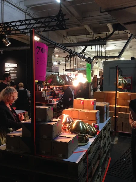
Designjunction, held at the old postal sorting office on Oxford Street, was as busy as ever at the press preview with thumping bass coming from the DJ booth. Down on the ground floor Tom Dixon was selling items at up to 70% off (pic above). And ther…

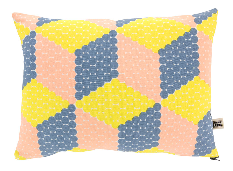
Designjunction, held at the old postal sorting office on Oxford Street, was as busy as ever at the press preview with thumping bass coming from the DJ booth. Down on the ground floor Tom Dixon was selling items at up to 70% off (pic above). And there was so much to see over four floors it was pretty overwhelming. I always like the ground floor shopping bit which has lots of great indie shops/people like Kangan Arora, Theo, Hend Krichen, Ham, MinaLima, The Artful Project.

I was also excited to find a new "affordable high-end" online interiors brand called Hem which is part of Fab.com and is coming to the UK very soon. I'll do a separate post on this.

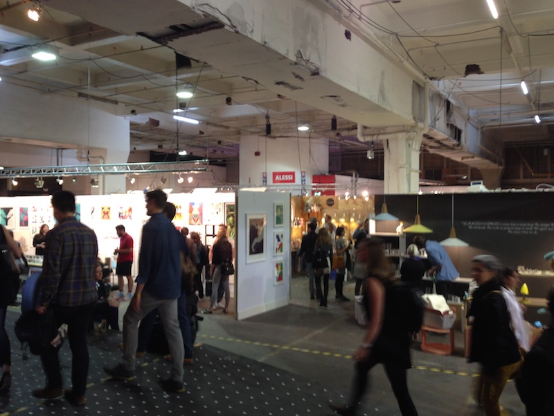
Designjunction draws the crowds year on year.

Designjunction draws the crowds year on year.

I went to a pretty cool party at the top of Tate Modern, here's a totally unnecessary picture of the view.

I went to a pretty cool party at the top of Tate Modern, here's a totally unnecessary picture of the view.

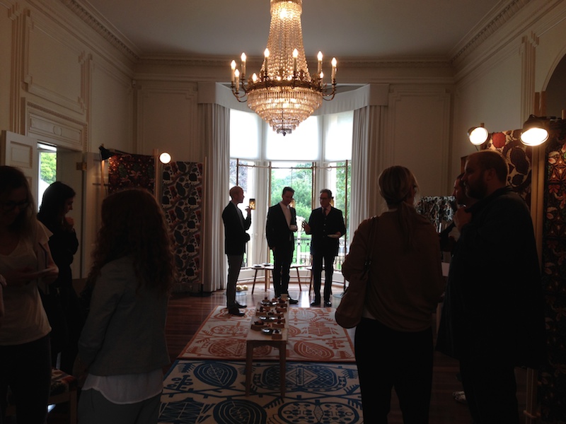
At the Finnish Ambassador's Residence, no less, we got to meet the delightful Klaus Haapaniemi who is a Finnish textile designer. It was such a beautiful location in which to see beautiful things. 

At the Finnish Ambassador's Residence, no less, we got to meet the delightful Klaus Haapaniemi who is a Finnish textile designer. It was such a beautiful location in which to see beautiful things. 

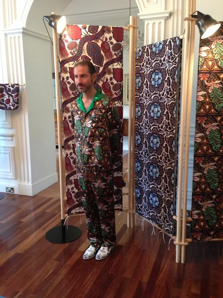
Loved this pyjama wearing dude at the Klaus Haapaniemi launch. The fabrics are lovely, they have a William Morris vibe. 

Loved this pyjama wearing dude at the Klaus Haapaniemi launch. The fabrics are lovely, they have a William Morris vibe. 

A wonderful clash of pattern at Klaus Haapaniemi who may be edging out the Hay cushions in my pattern lust list. 

A wonderful clash of pattern at Klaus Haapaniemi who may be edging out the Hay cushions in my pattern lust list. 

Airbnb put four sheds up in Trafalgar Square. It was a bit unexciting. 

Airbnb put four sheds up in Trafalgar Square. It was a bit unexciting. 

Although I did love the cool chicks from Patternity who were one band member short of the sisters from Haim. 

Although I did love the cool chicks from Patternity who were one band member short of the sisters from Haim

At Tent London I was instantly chilled out by the low vibrations of by these Meditation Bowl Bells, part of an exhibition called Constancy and Change in Korean Traditional Craft. Every home should have one.

At Tent London I was instantly chilled out by the low vibrations of by these Meditation Bowl Bells, part of an exhibition called Constancy and Change in Korean Traditional Craft. Every home should have one.

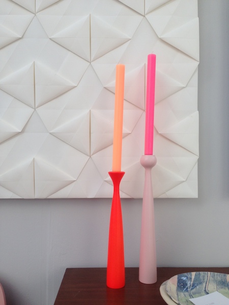
Also at Tent I saw this stunning origami wall covering by RCA graduate Tracey Tubb. Wow. 

Also at Tent I saw this stunning origami wall covering by RCA graduate Tracey Tubb. Wow.


Honorary mention for the fabulous Italian designer Paola Navone who introduced her new textiles collection for Dominique Kieffer by Rubelli she talked about how the interiors industry likes everything to be perfect, but she rallies against…

Honorary mention for the fabulous Italian designer Paola Navone who introduced her new textiles collection for Dominique Kieffer by Rubelli she talked about how the interiors industry likes everything to be perfect, but she rallies against this:"Little accidents, I like them; I try to promote imperfection, controlled imperfection". 

And finally, this rug by Christopher Farr really spoke to me.

And finally, this rug by Christopher Farr really spoke to me.

Will and Charlotte of Jamb

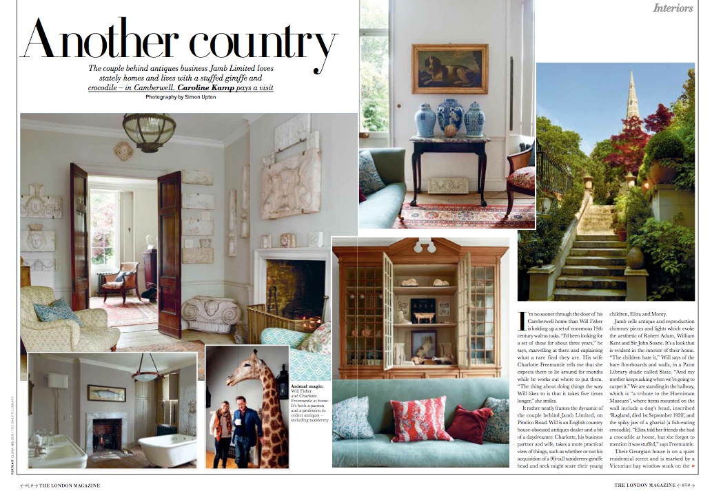
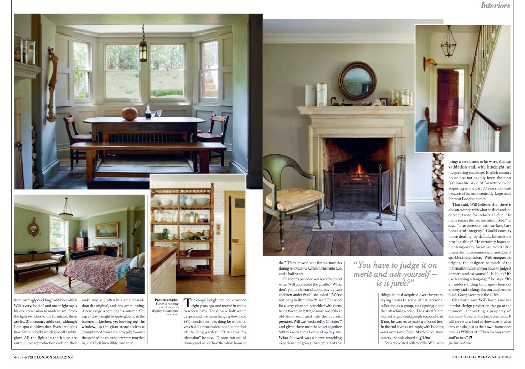
This month's issue of The London Magazine features my interview with the delightful husband and wife team Will Fisher and Charlotte Freemantle of antiques company Jamb at their home in Camberwell. They were a total joy to intervi…

This month's issue of The London Magazine features my interview with the delightful husband and wife team Will Fisher and Charlotte Freemantle of antiques company Jamb at their home in Camberwell. They were a total joy to interview and their house is a truly individual mix of antiques and quirky collectibles - yep, that is them posing with a taxidermy giraffe head. It is always a privilege to be invited into someone's home in order to write about it and I love the opportunity to chat to creative people like Will and Charlotte. I left feeling very inspired, mixed with the usual panic about whether my phone had recorded the interview.

London Design Festival 2014

The London Design Festival - which I wrote about in my September column, above - is on right now. I'll be in London most of this week checking out various events. The official launch at the V&A last Friday was very inspiring - there are some fantastic installations here's a list including one in the Raphael Gallery by Barber Osgerby and BMW which has to be seen to be believed. It's a giant, reflective, kinetic sculpture which slowly rotates and casts rather beautiful shadows and completely changes the feel of the room as it turns. As the designers said: "it's an experience, not a series of objects; it's meant to distort, to feel like you're floating". 

Edward Barber and Jay Osgerby explaining their extraordinary installation in the Raphael Gallery at the V&A

Edward Barber and Jay Osgerby explaining their extraordinary installation in the Raphael Gallery at the V&A

It's an amazing thing to behold, but impossible to photograph. Here's my best iPhone attempt. 

It's an amazing thing to behold, but impossible to photograph. Here's my best iPhone attempt. 

I also popped in to see the Hay and Wrong For Hay collections on show at a fancy address in Queen Anne's Gate, St James where the art of display was very much in evidence (see above and below).  Hay is a cult Danish brand run by a husband and w…

I also popped in to see the Hay and Wrong For Hay collections on show at a fancy address in Queen Anne's Gate, St James where the art of display was very much in evidence (see above and below).  Hay is a cult Danish brand run by a husband and wife team Rolf and Mette Hay who design beautiful everyday items at not completely crazy prices. The best bit of news is they are doing a pop up shop in Selfridges - the Hay Mini Market - until Christmas so you can actually buy stuff, like their bold cushions by Nathalie du Pasquier of Memphis Group fame and their Tela glasses with a textile print surface. 

Hay hired ex-Wallpaper journalist Benjamin Kempton to do the styling. which was beautifully done.

Hay hired ex-Wallpaper journalist Benjamin Kempton to do the styling. which was beautifully done.

Wrong for Hay and Hay are popping up in Selfridges till Christmas 

Wrong for Hay and Hay are popping up in Selfridges till Christmas 

School of Life

New products from The School of Life

New products from The School of Life

This quote made me smile as it's exactly how I'm feeling right now.

September is a really busy month in the design calendar as the nine day London Design Festival (13th -21st September) is less than two weeks away. I wrote a little preview of what's going on for The London Magazine here and I'm now sifting through my emails trying to work out which of the zillion events I should attend. It's such a great opportunity to get out and about and talk to people that once I actually get there I will love it and it will be very inspiring - plus it'll provide good blog and journalism content for the next few months.

But back to The School of Life which I'm a bit obsessed with. It's an institution founded on philosophical and secular principles by Alain de Botton (whom I have long rated as a voice of reason and who is also very good on Twitter) and offers talks and general thoughtfulness on how to live in a digital age.

With reports on how anxiety and depression are on the rise, I think in time this place is going to seem less poncey and more mainstream. Anyway, alongside their talks they also have a shop (natch) and they do an interesting range of thoughtful and sometimes quite funny presents if you are in the market for any. The Emotional Baggage bag is pretty funny.

I note that the staff list is full of women (hurrah) and what's not to like about an institution which has the job title "philosopher in chief". 

 Now, back to my inbox.

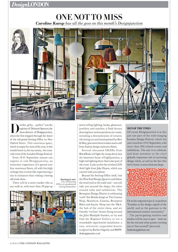
The London Design Festival's myriad events kick off in a couple of weeks: my latest column for The London Magazine.

The London Design Festival's myriad events kick off in a couple of weeks: my latest column for The London Magazine.

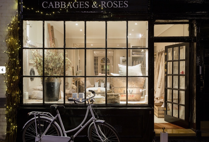
Indie of the Week #46: Cabbages & Roses

sydneystreet.jpg

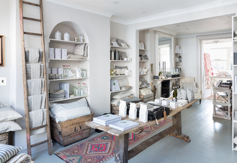
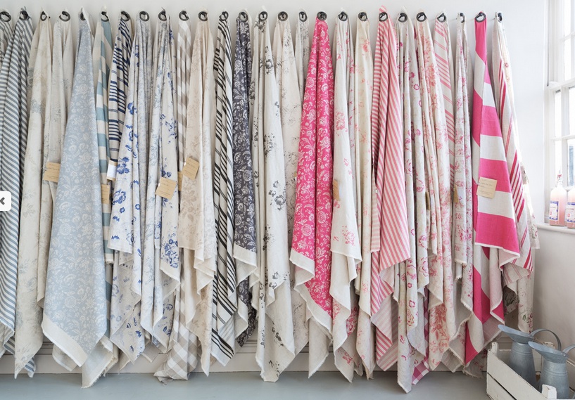
There are certain times of year when I feel especially drawn to the kind of pretty textiles and faded prints you find at London-based indie shop Cabbages and Roses. Now is one of those times. This is a company with a characteristically English vintage sun dress and wellies kind of vibe - which they do so well it's no surprise to learn they have a shop in Tokyo too. Founder and owner Christina Strutt started her mail order business in 2000 from her kitchen with a range of fabrics which then became homeware and finally a fashion line. She's also written seven books; most recently Living Life Beautifully which features lush photography of work/home spaces, including her own London apartment and her home in Bath - a 600 year old cottage where she also designs her fabrics. The team remains small and since earlier this year has been based above their new shop in a grade II listed building in Chelsea. Where else?  

Who are you? Christina Strutt of Cabbages and Roses

Where can we find you? 121 - 123 Sydney Street, London, SW3 or online at cabbagesandroses.com 

Describe your store in five words: Home sweet home. Delicious clothes.

What makes you different? I think because everyone is individual the company, our designs and our products come from our heads and our hearts. We are not a corporation without a soul, so I think that what we make and sell is an unadulterated edit of what we love.

How you decide what makes the cut? If we love it it gets in, if we have doubts it doesn’t. 

What were you doing before you did this? Vogue Living, motherhood, freelance styling, interior decorating. 

If you were starting again what advice would you give yourself? Start earlier, understand a budget, be careful who you trust.

What are you most proud of? Surviving for 14 years, our beautiful shops, the best staff I could wish for, recognition that what we do is worthwhile. Having seven books published. 

Do you have a favourite thing in the store right now? All the knitwear.

What's hot for 2014? Beautiful new stripe fabrics that co-ordinate so beautifully with our floral fabrics. Our linen clothing. 

'Indie of the week' celebrates the best independent stores around. These places sell interesting and varied collections of design-related things you don't see everywhere else. They may support young or local designers or be great at finding unique things from around the world. By thinking a little more creatively about what they stock they are fighting the bland homogenisation of so much of the high street. And since I'm down with the realities of modern life, online only stores count too, because a beautiful and easy to use website is just as delightful an encounter in cyberspace.

Do you you have a favourite store? I'd love to hear from you.

Ardingly Antiques Fair

Strolling about in the sunshine at Ardingly in Sussex. That's a retro enamel lampshade I'm clutching. 

Strolling about in the sunshine at Ardingly in Sussex. That's a retro enamel lampshade I'm clutching. 

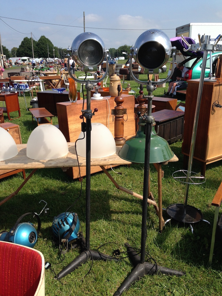
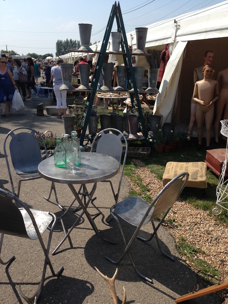
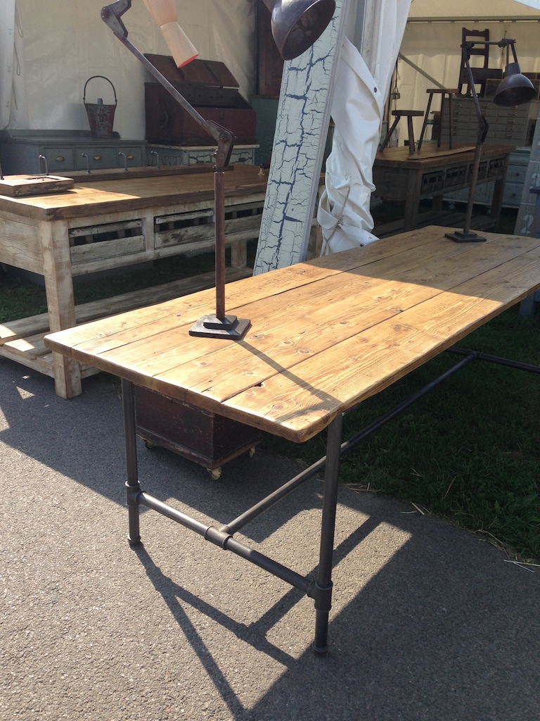
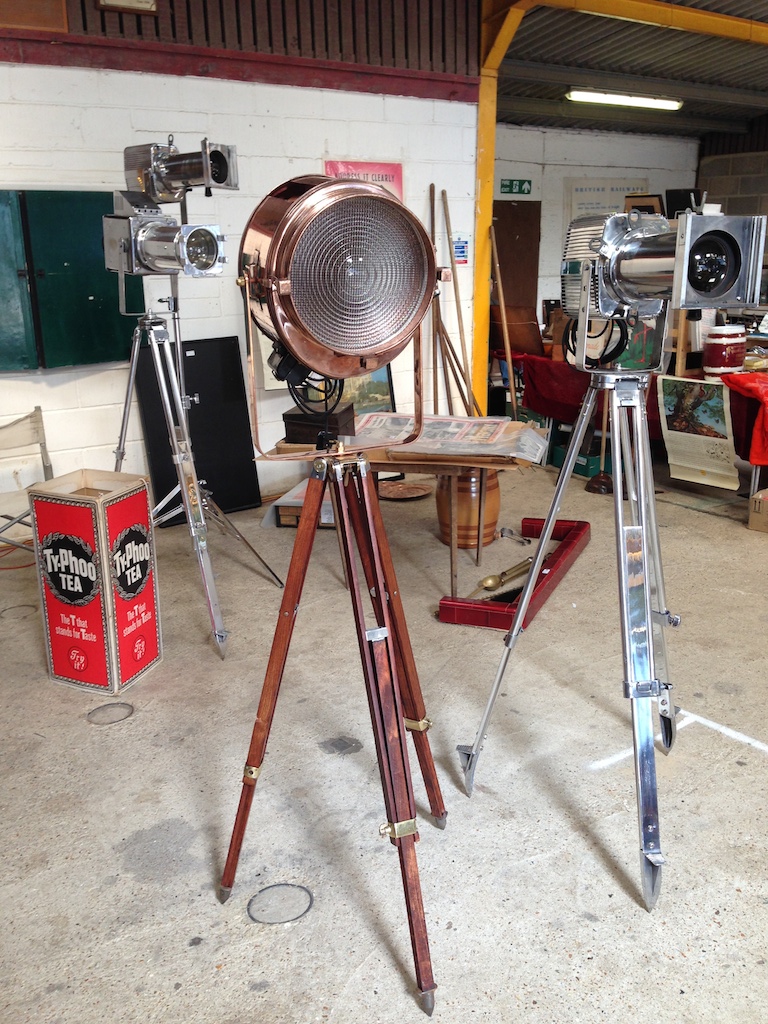
I had a great day at Ardingly Antiques Fair, in Sussex, this week. It's the biggest event of its kind in the south of England and it's on every couple of months. The glorious sunshine certainly helped, but it was so much fun to stroll about and look at all the different things on offer - and to spot a few trends. I can report that vintage theatre tripod lights are very big news, as are industrial looking tables made from old floor boards and scaffolding, ditto antlers, zinc planters and retro enamel lampshades. The next one is in September, I hope to make it, maybe see you there? 

The London Magazine - July issue

How apt that this month's copy of The London Magazine has Boris on the cover since I am now such a big fan of his bicycling innovation. You can read the Q&A he did with the magazine here. I particularly liked this bit about the future of cycling in the city: "...and we are also putting about £100 million into mini-Hollands in outer London boroughs. That doesn't mean the place will be full of tulips and cannabis - but cycling will be a way of life". 

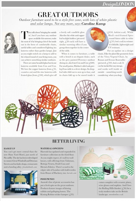
My column this month is about bringing ideas from your inside space to your outside space, the new Ham Yard Hotel (which I blogged about here), picnicware from Anorak and the swanky new furniture floor at Harrods. You can read it online here

Weekend in London

Fab "Festival of Love" signage on the Southbank this summer 

Fab "Festival of Love" signage on the Southbank this summer 

I have just spent a precious child-free weekend with my husband cycling around London on Boris Bikes and had the most fantastic time. You may already be familiar with the bikes, so I apologise for being late to the party on this one, but I genuinely had not realised just how brilliant they are - and only £2 for 24 hours - £2 ! Who knew there were still bargains to be had in London. And cycling is definitely the fastest and most pleasant way to get about in the heat. The app was a bit hit and miss, but it's a minor gripe. 

The fourth plinth has got this magnificent fellow on it

The fourth plinth has got this magnificent fellow on it

Being on bikes meant we could cruise around town to places as diverse as the the Real Food Market behind the Royal Festival Hall on the Southbank and the restaurants around Charlotte Street. We loafed around in the heat in Regent's Park, checked out the Sunday market at Spitalfields, and the graffiti on Leake Street and parked the bikes right outside Tate Britain, as well as visiting some fab eateries including Lantana Cafe, Barnyard, Rosa'sScoop and The Modern Pantry. We got a last minute deal and stayed here, on Russell Square. I'm now even more into Bloomsbury than I was before, it is so central. 

Another reason to visit Tate Britain, not the other one

Another reason to visit Tate Britain, not the other one

The new spiral staircase at Tate Britain is worth a visit to the museum alone - it is stunning. We came in via the new riverside entrance, through the cafe, and the architects Caruso St John have done a beautiful job on the interior to create a feeling of lightness and calm. I particularly liked the clusters of ceiling lights they've used throughout. And the patterned tiles, obvs. Read more about it here

Yep. Pretty sold on Boris biking. And holidaying in London now I don't live there anymore.

Yep. Pretty sold on Boris biking. And holidaying in London now I don't live there anymore.

And just when you think you've seen it all you pop round the corner and find this little gem - Pollock's Theatrical Print Warehouse and Toy Museum on Whitfield Street, Fitzrovia. 

And just when you think you've seen it all you pop round the corner and find this little gem - Pollock's Theatrical Print Warehouse and Toy Museum on Whitfield Street, Fitzrovia. 

Indie of the Week #45: SMUG

Donna Wilson at SMUG FRUIT GROUP.jpg

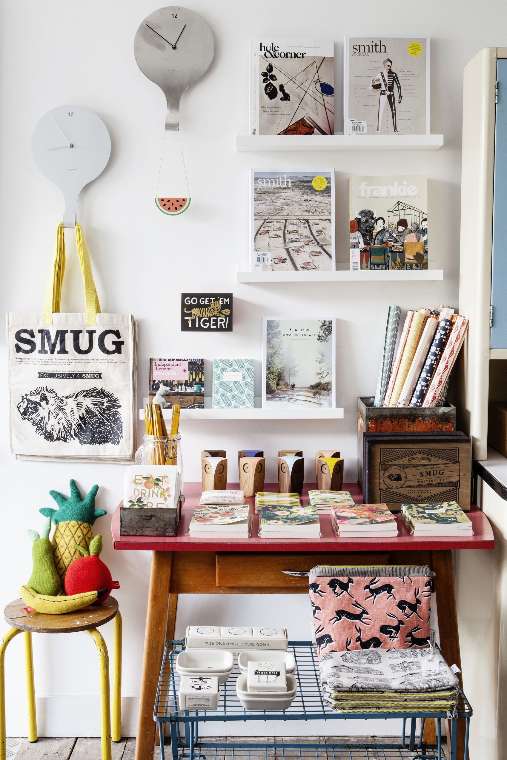
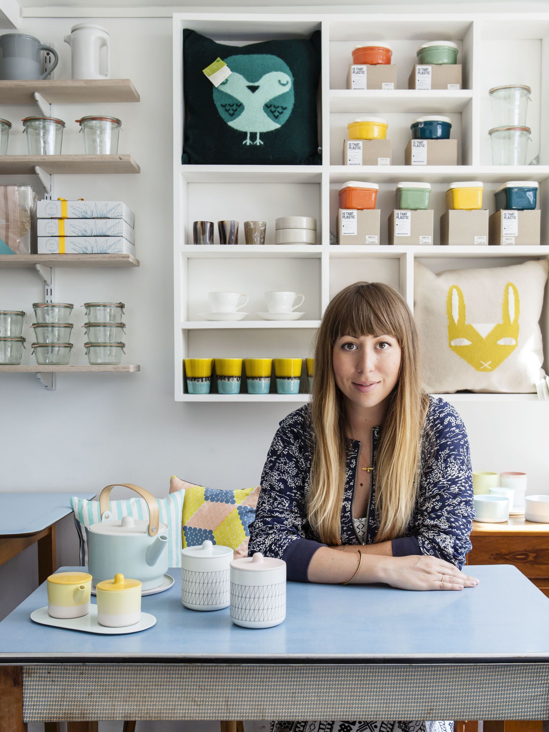
Having recently celebrated five years in business Lizzie Evans is justifiably proud of her small shop SMUG in Islington's Camden Passage, just a short walk from Angel tube. "To get to five years is nice, you feel established, like it's going to be ok!" she says. You may be thinking what I was thinking when I first came across it - funny name for a shop. 

"The old definition of the word smug was to smarten up yourself or your home", says Lizzie, [not for the first time, I'm guessing] "it was about making things look nice. Now it's come to mean a bit pleased with yourself". She found the definition (along with the guinea pig illustration which became her logo) in an old illustrated dictionary she inherited from the former owner of her house. In other languages the word smug means different things - one definition is "beautiful" - and people often come in and say "is it Danish or Swedish?" 

She recently opened a small cafe in the shop, it's only open weekends at the moment, but by September it will be open full time. Far from being pleased with herself Lizzie is realistic about her new venture: "We've been open for four weekends, which is actually only 10 days, it's hard to get people to change their habits and to know we are here".

She sells interior accessories for the home from great brands including the popular Dutch ceramics company Scholten and Baijings, plus vintage furniture, so if you pop in for a coffee you could take home the chair you've been sitting on. Just try not to be too [current definition of the word] smug about it. 

Who are you? Lizzie Evans, owner and creative director of SMUG.

Where can we find you? 13 Camden Passage, Islington, N1 8EA; online at ifeelsmug.com; on Twitter @ifeelsmug

Describe your store in five words: Curated, Kooky, Design-led, Homelike, Original.

What makes you different? I'd like to think that SMUG strikes the balance between great design (particularly our exclusive products) and a homey, light and airy space that you want to spend time in. We want you to feel welcome, to stick around as long as you like, be inspired and maybe even feel a little SMUG. I'm always trying to think of new ways to do this. This year we've starting running workshops upstairs and have opened CAFE SMUG downstairs at the weekends.

How you decide what makes the cut? I've got a pretty clear vision of what SMUG is and the sorts of products that work with what we do. Colour comes in to it a lot. I'm also led, of course, by what I like personally and to a certain extent by fashion. But every piece should stand the test of time, be good quality and be reasonably priced [with consideration for the work that has gone into it]. Curating the shop is my favourite part of the job so I'm always thinking about and looking for things that will fit in, fill the gaps and create new collections.

What were you doing before you did this? I studied Interior and Spacial Design at university in London before spending a short time in Melbourne doing a bit of graphic design. While I was there I designed the interior of our shop and the graphics for the brand. I then returned home to manage the building project and source all of the products for when the building was ready and we could open our doors to the world.

If you were starting again what advice would you give yourself? You'll get there in the end. Just keep pushing and working to realise your vision. Keep dreaming big dreams.

What are you most proud of? I'm most proud of the collaborations and exclusive products I've worked on with designers over the years. It feels really special to have so many special products that you can only buy here.

Do you have a favourite thing in the store right now? I'm particularly taken at the moment with our new ceramics collection from Lenneke Wispelwey. I think my favourite piece is the Canard Goblet but it's all pretty breathtaking.

What's hot for 2014? This September, during London Design Festival, we're launching an exclusive collection of Woollen Fruit designed for SMUG by Donna Wilson.

'Indie of the week' celebrates the best independent stores around. These places sell interesting and varied collections of design-related things you don't see everywhere else. They may support young or local designers or be great at finding unique things from around the world. By thinking a little more creatively about what they stock they are fighting the bland homogenisation of so much of the high street. And since I'm down with the realities of modern life, online only stores count too, because a beautiful and easy to use website is just as delightful an encounter in cyberspace.

Do you you have a favourite store? I'd love to hear from you.

Ham Yard Hotel

ham yard hotel

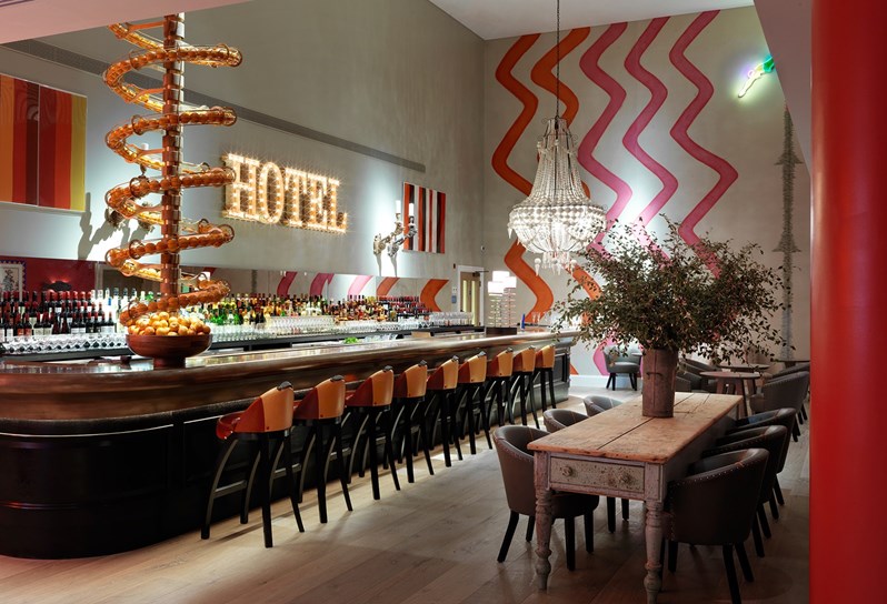
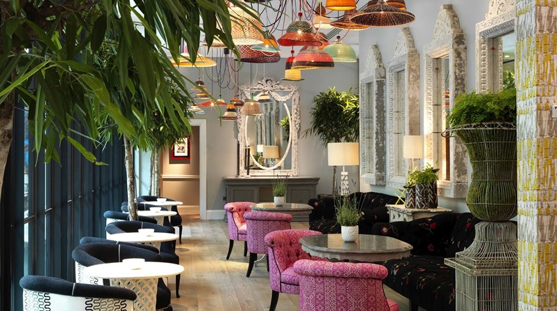
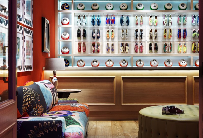
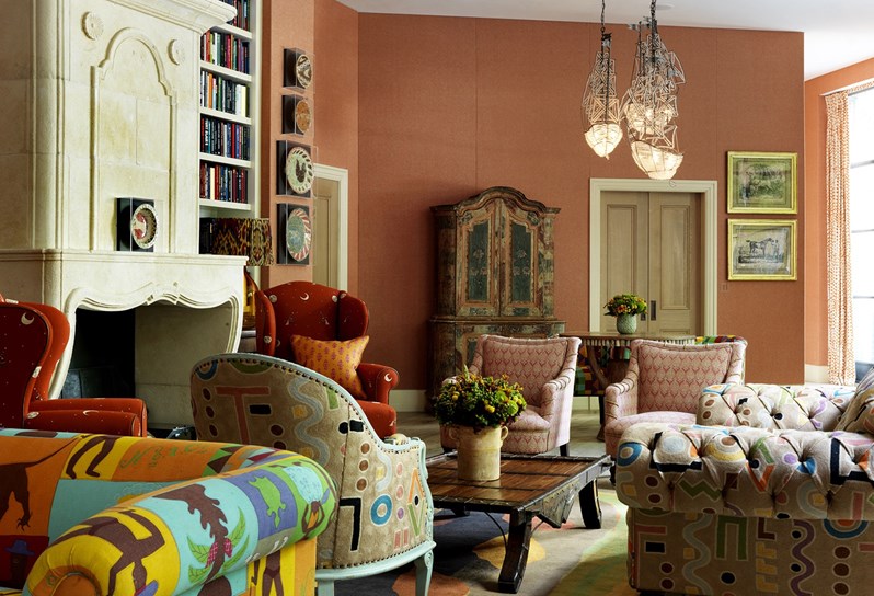
There is a cool new hotel just opened in London which I can see becoming very popular very quickly. Ham Yard Hotel is between Mayfair and Soho, just behind Piccadilly, and has been designed by the talented Kit Kemp who brings just the right mix of playfulness, colour (pink and orange zig zag walls? yeah!) texture and sense of fun (a helter skelter for oranges? why not) to lift what could be a boring corporate space into somewhere where you really do want to hang out.

ham yard hotel

It's part of a clever bit of upscale urban regeneration with the hotel at the centre of a 'village' which includes apartments, offices and shops, and a courtyard which connects Great Windmill and Denman Streets.

ham yard hotel

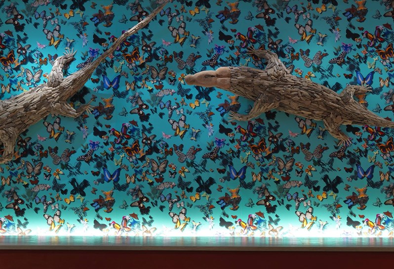
Down in the basement there is a fab 1950s meets Out of Africa, via some Howard Hodgkin paintings, bowling alley called 'The Croc' (look out for the driftwood crocs on the wall). 

ham yard hotel

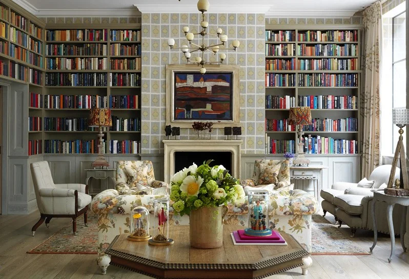
There's a theatre for movie screenings along with several bars and some seriously funky meeting rooms for hire, a library, a restaurant and a drawing room. The rooms are pricey, as you might expect, but you don't have to stay there to get a feel for the place.  

When I visited there were lots of breakfast meetings going on in the ground floor cafe area and I think it will rapidly become the place to meet, in fact I think it already is. It's a stunning and uplifting and basically just really fun space to hang out in - and it's really central. BOOM. 

ham yard hotel