The green antenna is always on

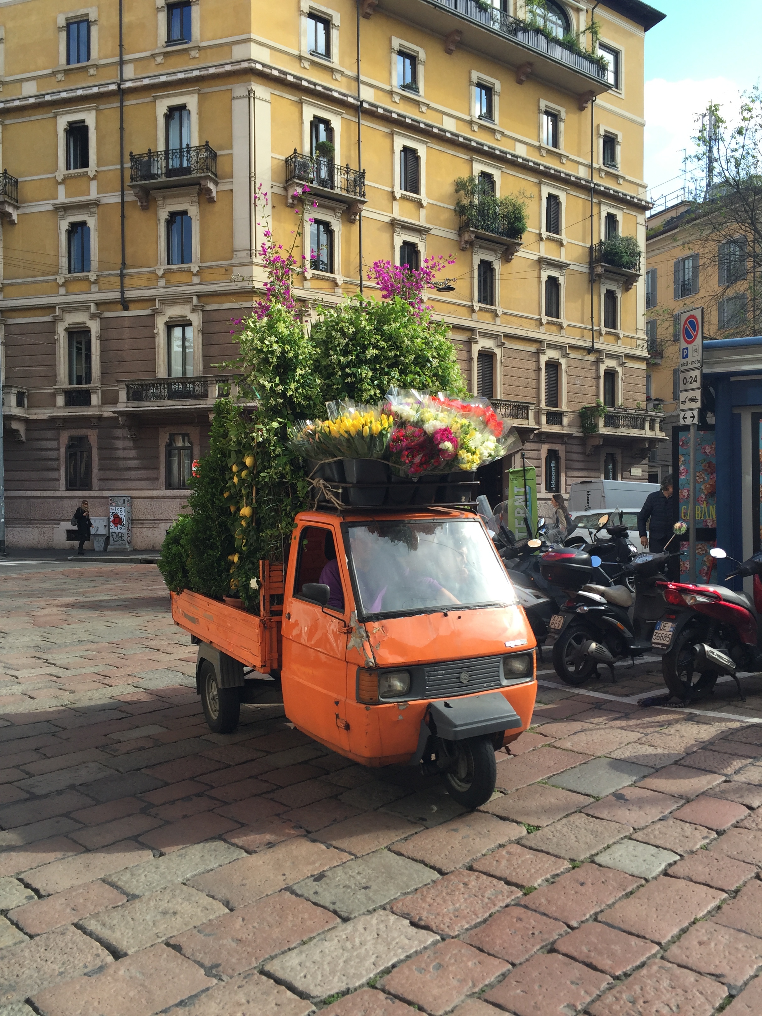
One of the things I've discovered since becoming a garden designer is that wherever you are - in the countryside, in the city, walking down your local street or away on holiday - you always have your green antenna on.

On a recent visit to the Tate Modern we went up to the brilliant 10th floor viewing platform in the Blavatnik Building extension. After I'd had my fill of staring into the flats opposite and admiring the modern furniture and tasteful decor my eyes were drawn to the green spaces down below. I loved the shapes, they felt really sketch-like. As if someone had gone over an architect's drawing with a bright green pen. 

A sliver of lush green planting between high rise apartments 

A sliver of lush green planting between high rise apartments 

A sinuous swathe of green bringing much needed curves into the sharp edges of the built environment 

A sinuous swathe of green bringing much needed curves into the sharp edges of the built environment 

Luciano Giubbilei - Garden Designer

luciano book cover.jpg

I've just finished reading a book by the Italian master of garden and landscape design Luciano Guibbilei called 'The Art of Making Gardens'. I say reading, there was a lot of gazing at beautiful photography as well. It was given to me by a friend and the timing couldn't have been better.

The book centres on Luciano's time working in the gardens at Great Dixter alongside Head Gardener Fergus Garrett and students James Horner and Rachael Dodd. It's an experience he describes as enriching his work as a designer despite him already having a solid 20 years in the industry and two Chelsea gold medals.

Luciano's international work reflects his native Italian (he was born in Siena) tradition of clipped hedges, pleached trees and expanses of lawn which have a more sculptural, formal aesthetic and work on the play of light and shadow. So how did he end up deep in an English flower border planting out dahlias?

A need to experiment and push himself. Over the past few years he has made regular pilgrimages from London to East Sussex to work a patch of bare soil in the vegetable garden and in doing so has embraced colour and flowers for the first time. His descriptions of the place, of the people and of his journeys down from the city are beautiful. 

"My time at Great Dixter has quite literally grounded me. I find myself going there several times a month, so that I can at last experience the passing of the seasons and the feeling of being in a working garden. My work there has also improved and enriched my practice in ways I never imagined. It has led me towards a deeper understanding of plants and the work that goes into creating and maintaining a garden".

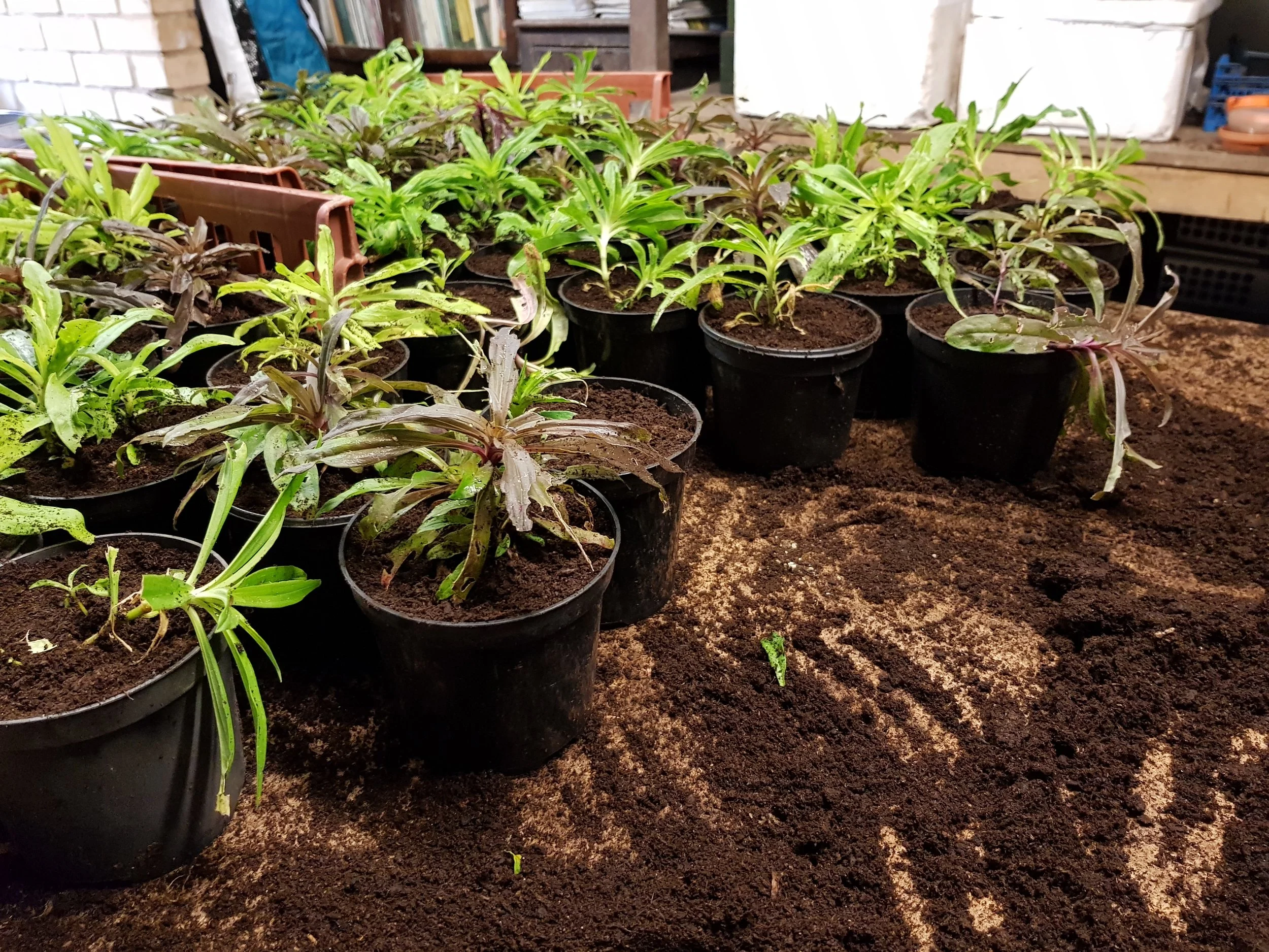
It really resonated with me as since January I have been making weekly visits to work in the garden at Gravetye Manor. The importance of getting outside and away from the computer, to actually be in nature and observe how plants behave through the seasons is the key to learning about succession planting (when one follows another and you can keep a border looking good for several months). But it's also about the people who, with a complete lack of ego, are all working together towards a common goal and exchanging ideas along the way. Like him, I have found it extremely grounding (although unlike him I am only at the beginning of my career). 

Below, he describes returning to Dixter in the spring:

"It was love at first sight. The border was a sea of soft bronze fennel foliage and forget-me-nots, dotted with the staggeringly beautiful tulip 'La Belle Epoque'... Combined with the other flowers, the effect was of a finely woven gauze, making the border seem vast, almost never-ending. Having last seen the space as bare earth, almost devoid of colour, I now found in painterly, full of movement and the beginning of a new world.

I still feel the same anticipation on each visit - curious to know what has changed, which plants have come up, how the compositions are working - but I feel it most strongly in spring, when the change between visits is so pronounced". 

I like the way he brings a gentle, romantic sensibility to the labour of gardening which, let's be honest, involves rather more in the way of dirt under the nails, inclement weather and a lot of heavy lifting. 

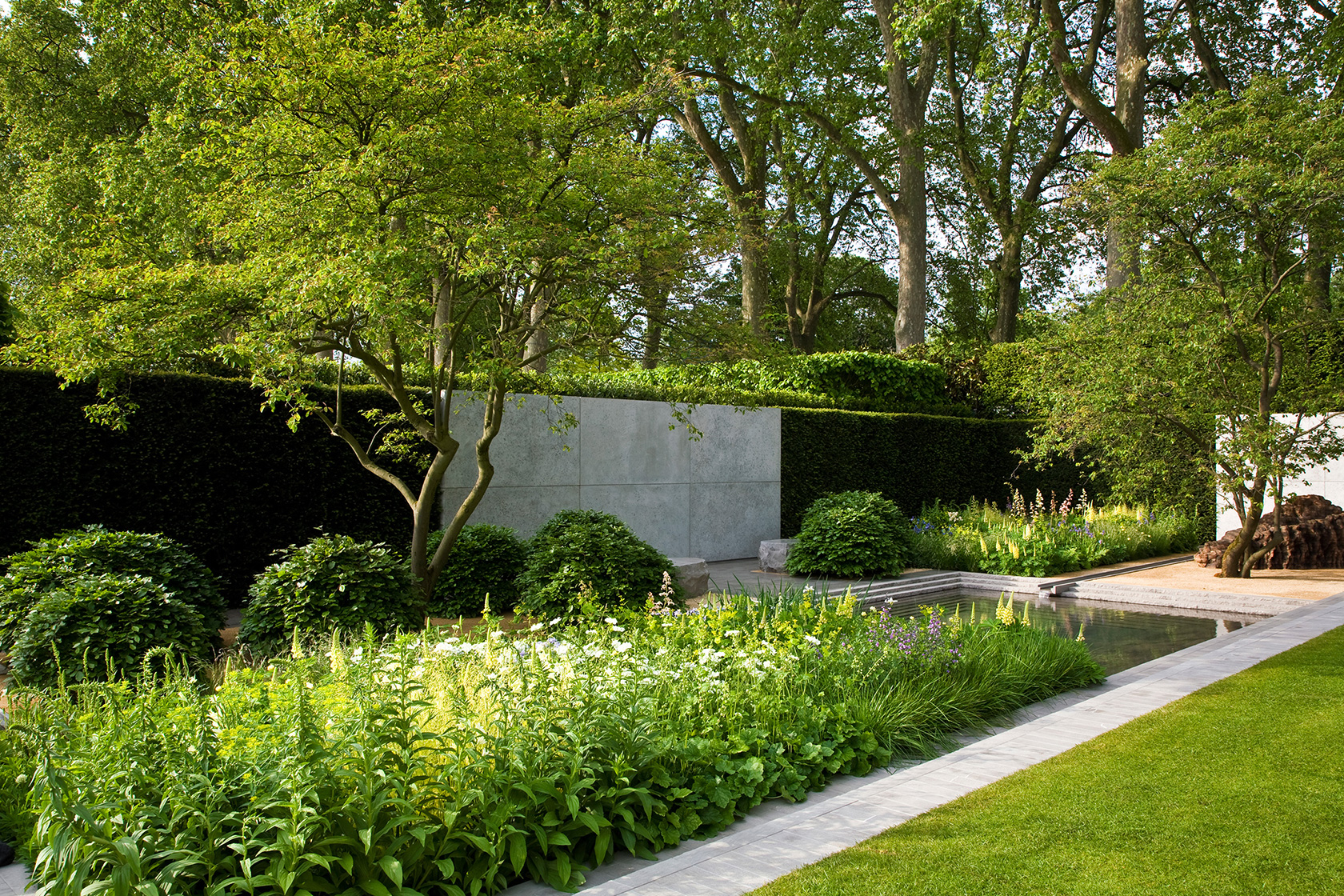
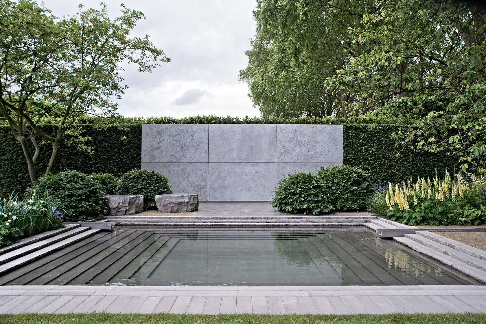
Luciano Giubbilei's gold medal and Best in Show winning Chelsea garden from 2014 

Luciano Giubbilei's gold medal and Best in Show winning Chelsea garden from 2014 

Another view of the 2014 Chelsea garden which uses form, texture and reflection to great effect.

Another view of the 2014 Chelsea garden which uses form, texture and reflection to great effect.

The Arts and Crafts abundance of Great Dixter may seem at odds with the designer's favoured minimalist lines, but has inspired him to create his own border there

The Arts and Crafts abundance of Great Dixter may seem at odds with the designer's favoured minimalist lines, but has inspired him to create his own border there

Salone del Mobile, Milan 2016

Ciao!

Ciao!

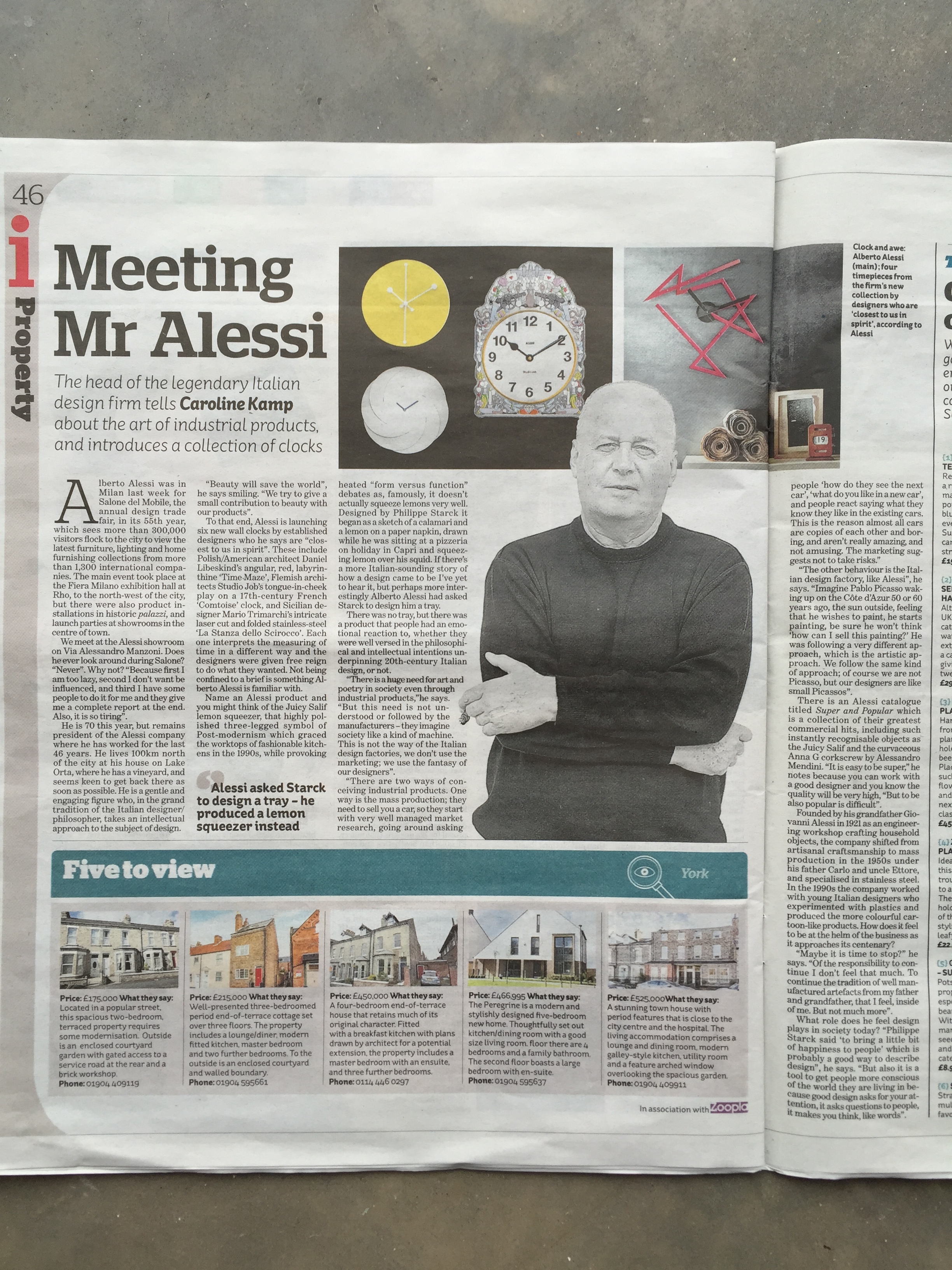
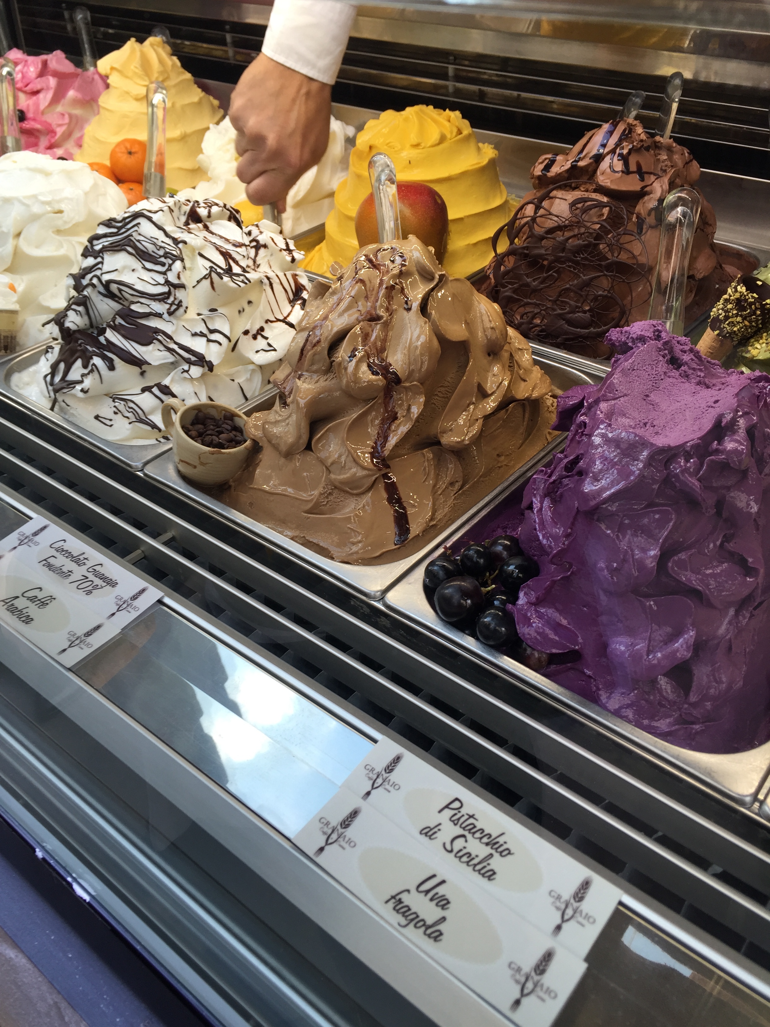
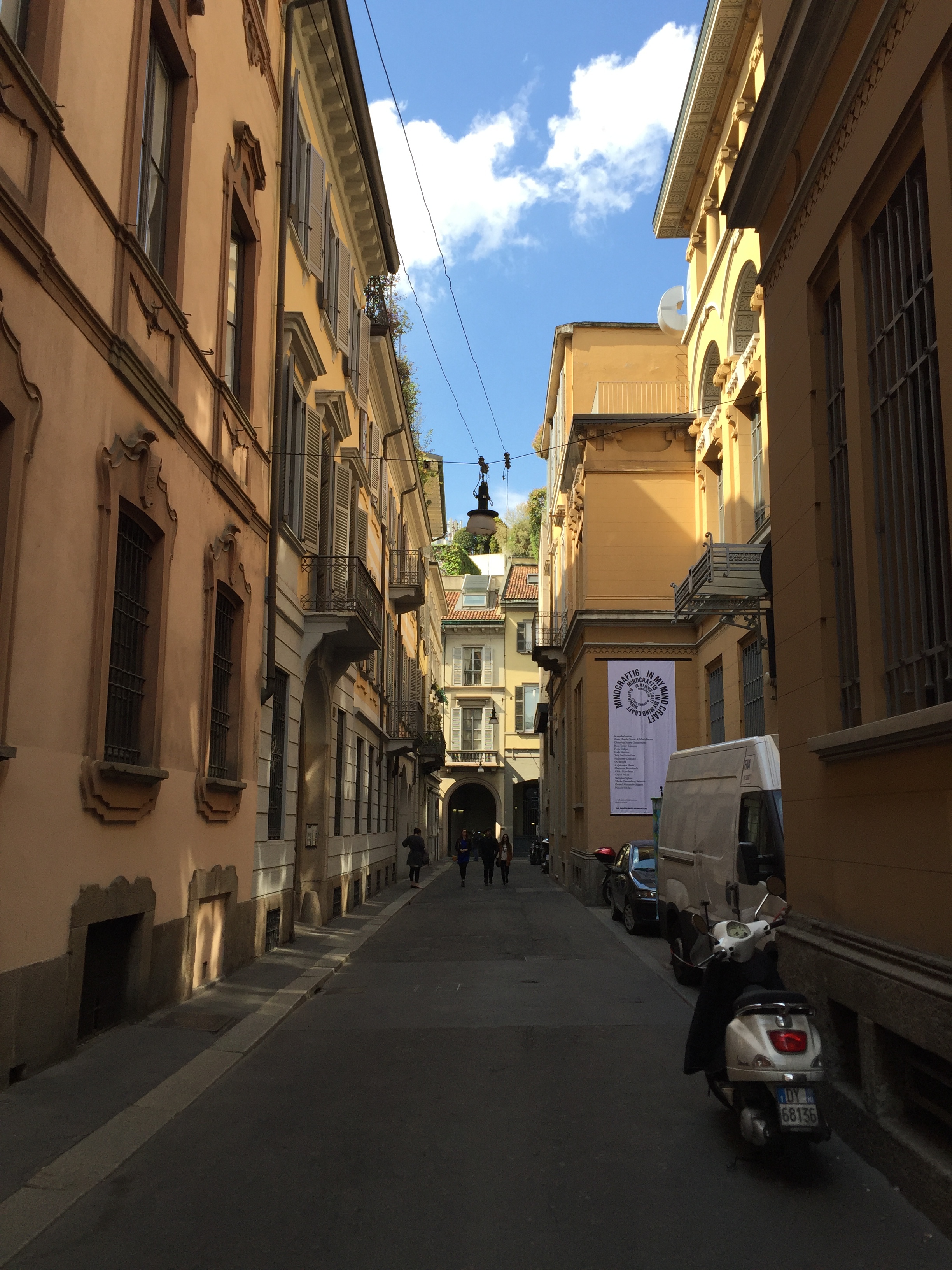
With very little persuasion I was back in Milan last week for the annual design fair Salone de Mobile. Now in its 55th year, it is bigger than ever. Launch events are sprawled across the city taking place in elegant palazzi and modern showrooms. For me, it's as much about the new things on show as the context in which they are shown, reminding me how much I appreciate beautiful interior design, plus there's a real buzz in the city which is infectious. Here are a few pics with captions that sum up my week. 

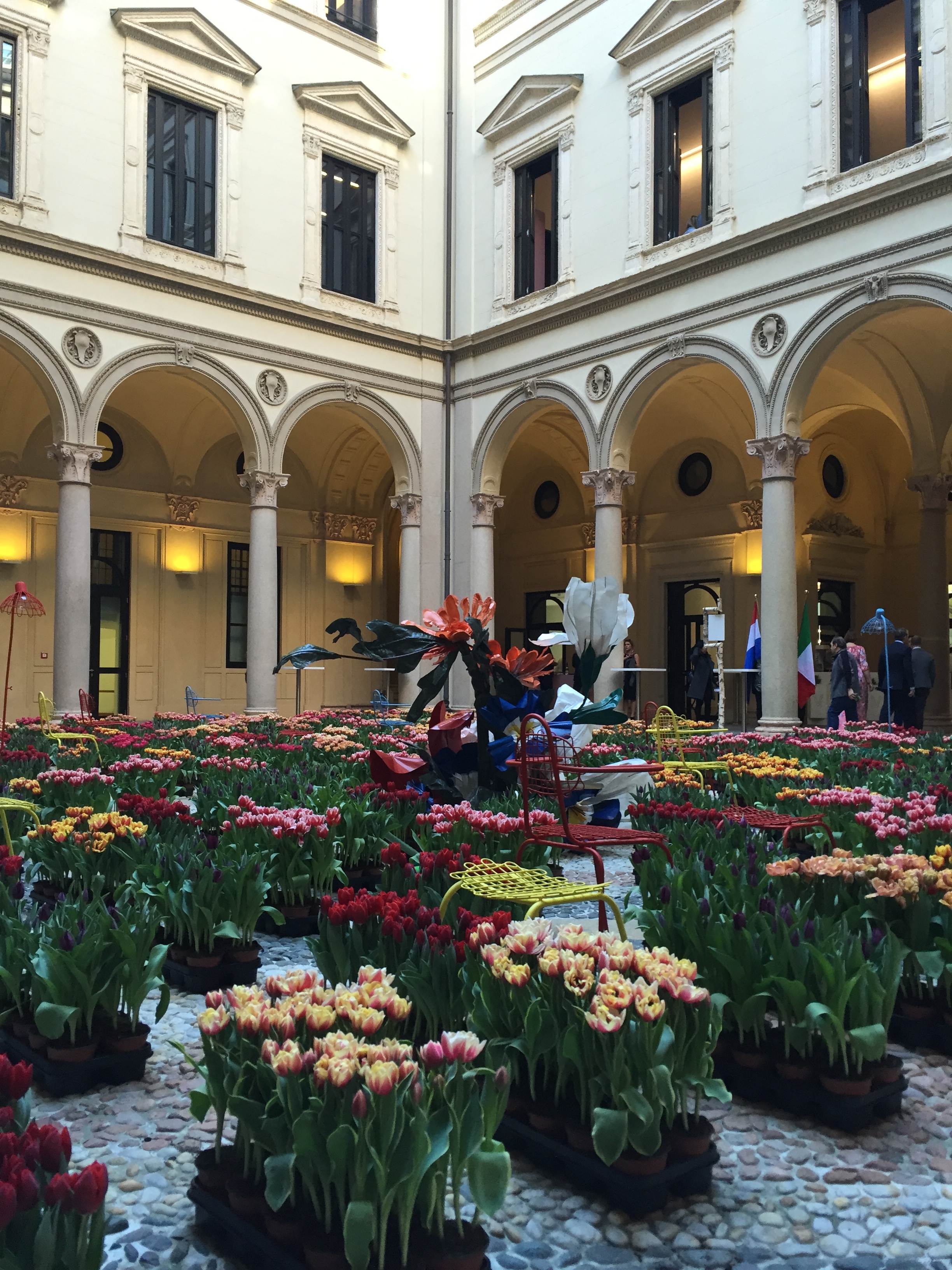
Off the plane and into a palazzo. The courtyard at Palazzo Francesco Turati was filled with beautiful tulips for Masterly, The Dutch in Milano exhibition. 

Off the plane and into a palazzo. The courtyard at Palazzo Francesco Turati was filled with beautiful tulips for Masterly, The Dutch in Milano exhibition. 

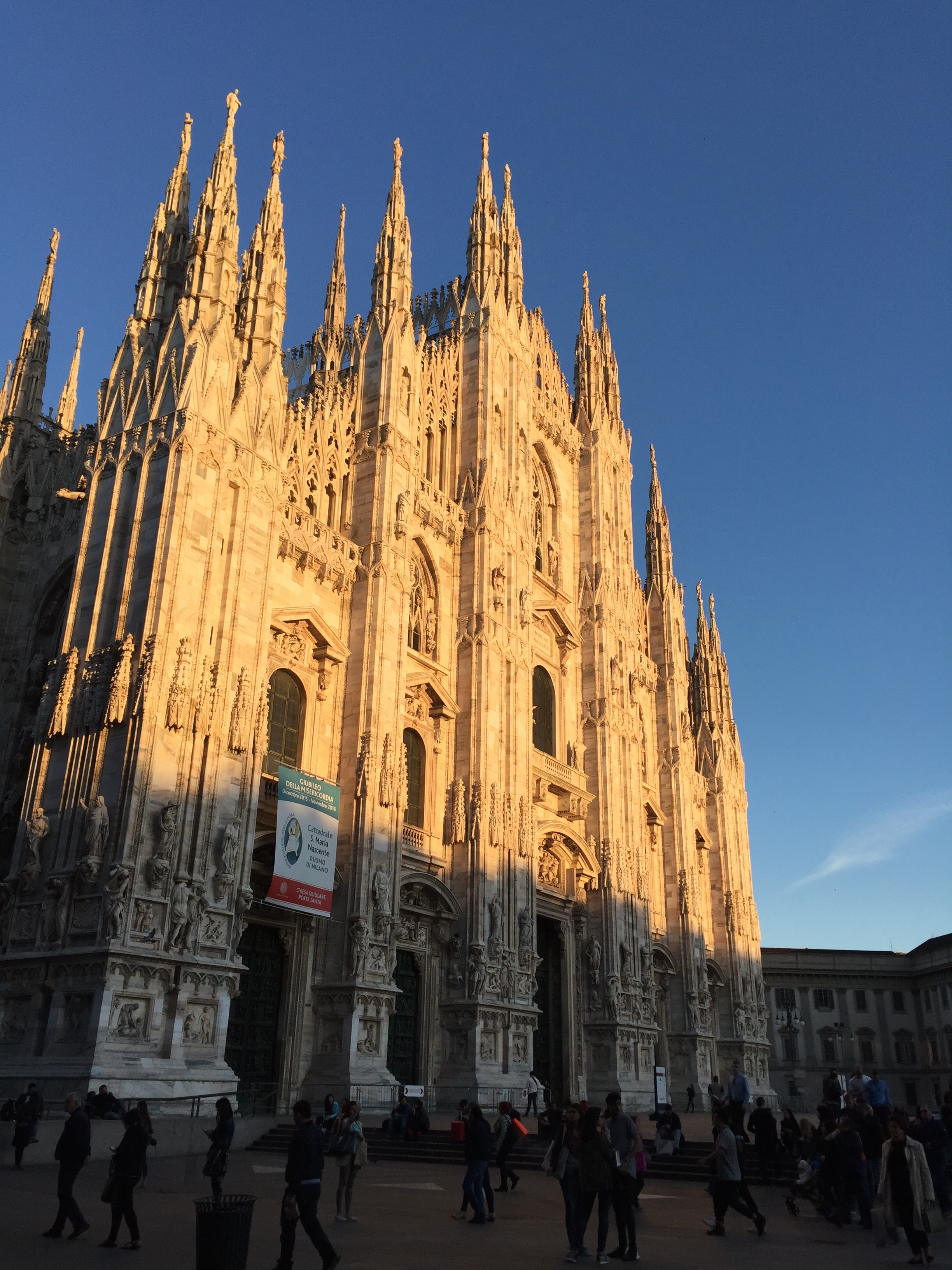
Milan has a magnificent cathedral, the Duomo

Milan has a magnificent cathedral, the Duomo

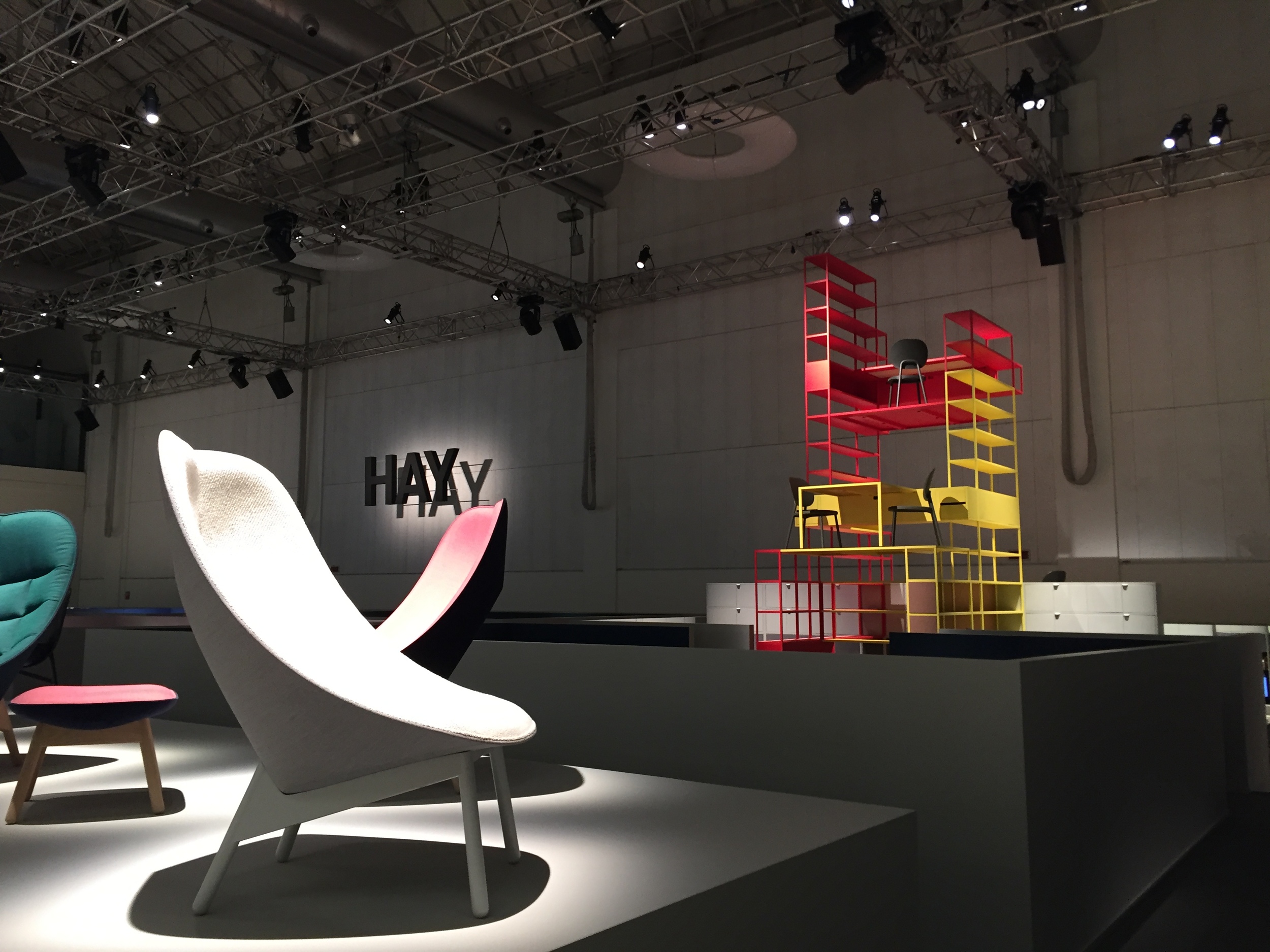
Danish modern furniture brand Hay had an impressive product launch at the vast La Pelota space. 

Danish modern furniture brand Hay had an impressive product launch at the vast La Pelota space. 

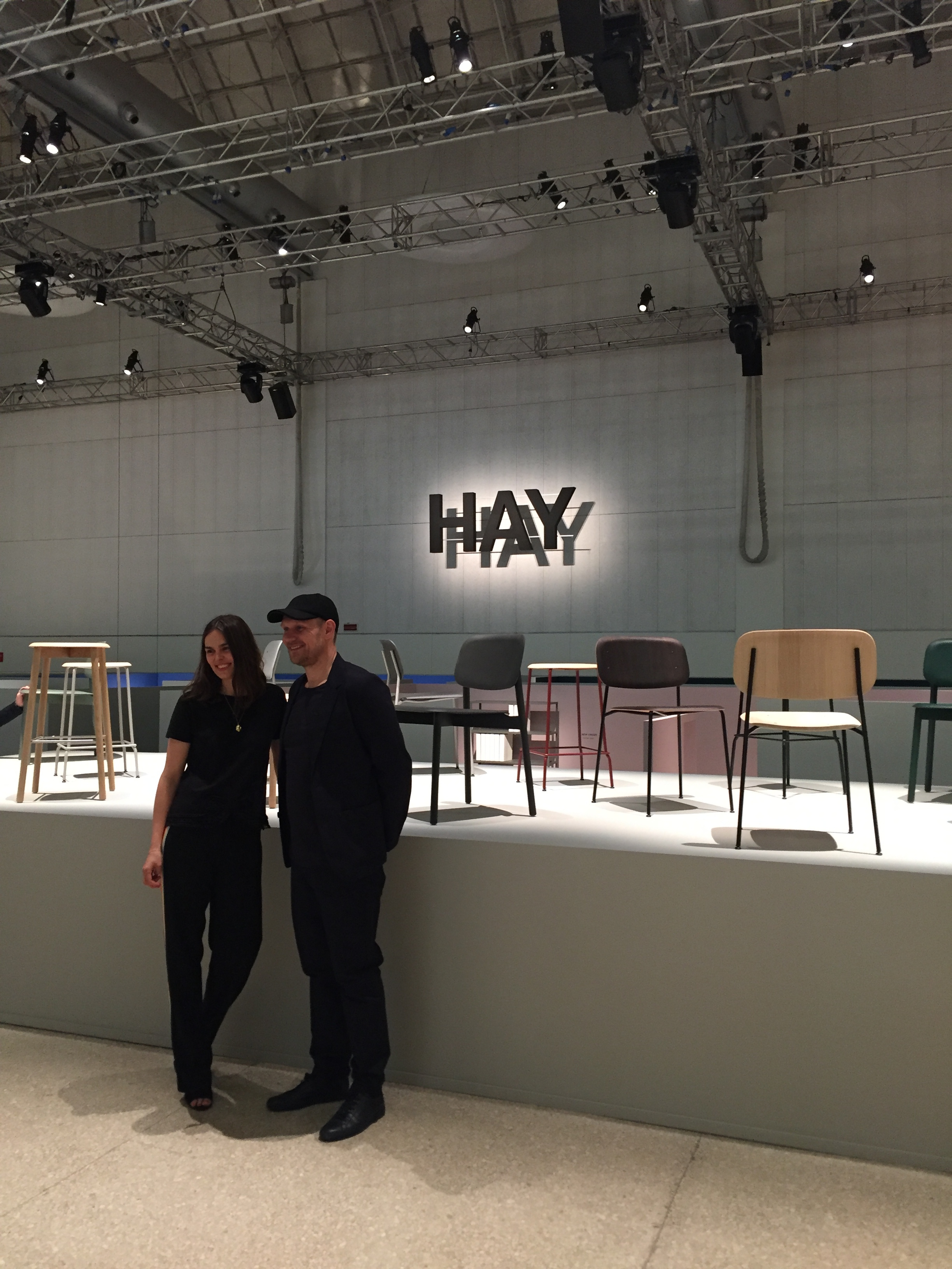
Mette and Rolf Hay gave a presentation. Quite fascinated by married couples who work together. 

Mette and Rolf Hay gave a presentation. Quite fascinated by married couples who work together. 

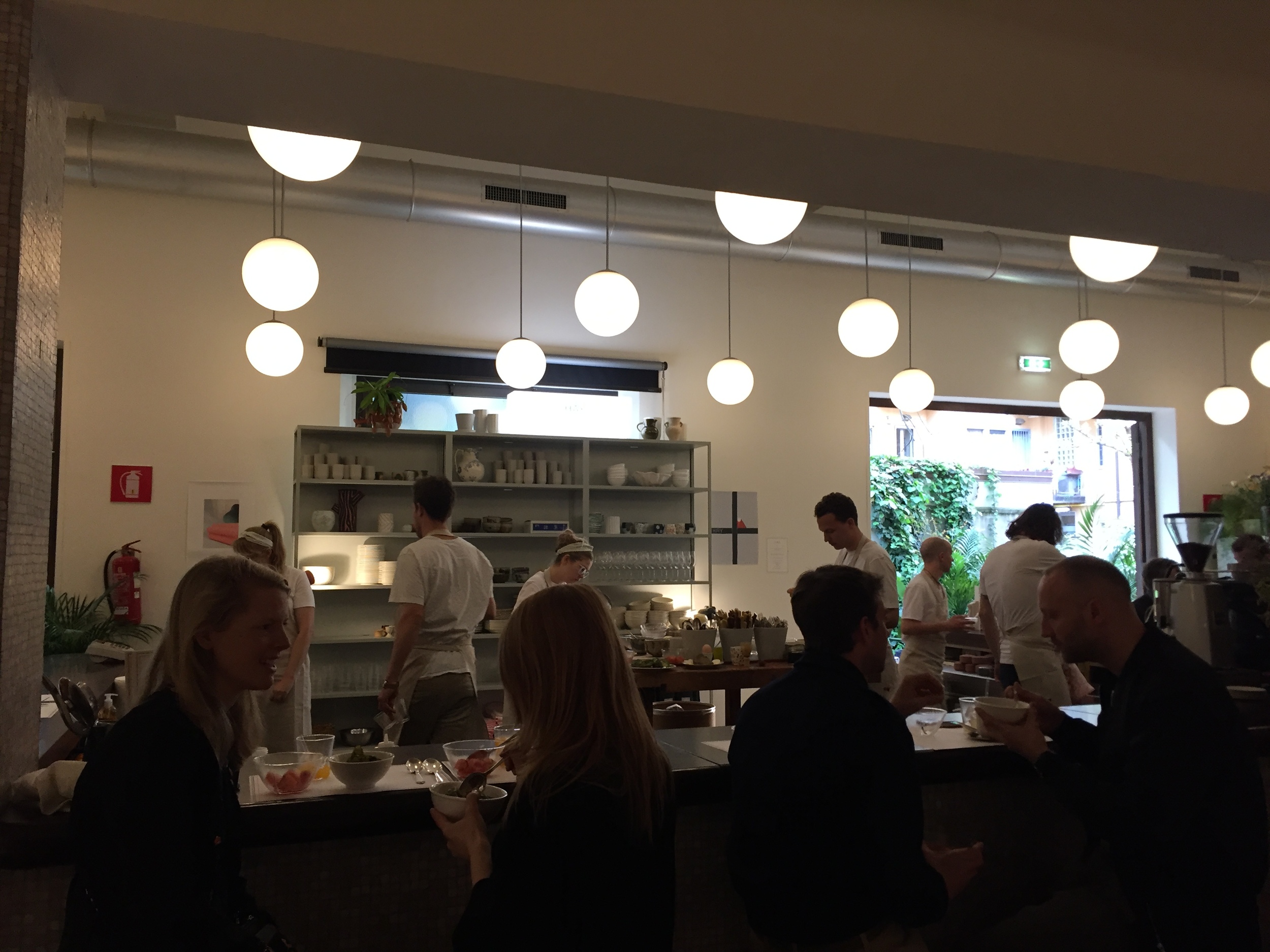
They'd even set up a temporary café and brought over their favourite chef from Denmark, Frederik Bille Brahe.

They'd even set up a temporary café and brought over their favourite chef from Denmark, Frederik Bille Brahe.

His menu featuring 'candied zucchini'.

His menu featuring 'candied zucchini'.

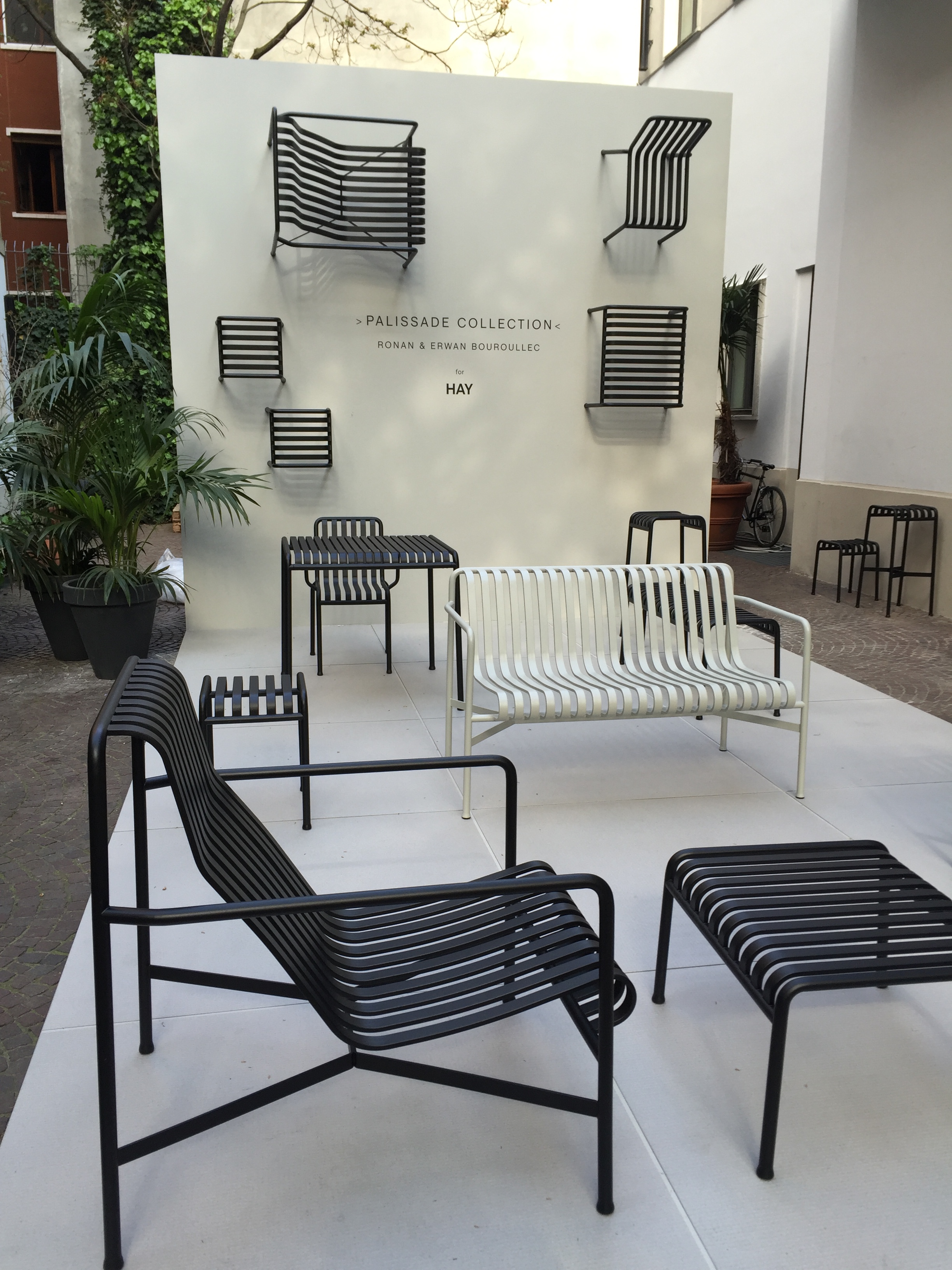
Ronan and Erwan Bouroullec's Palissade Collection of outdoor furniture for Hay looked good.

Ronan and Erwan Bouroullec's Palissade Collection of outdoor furniture for Hay looked good.

Beautiful desk by British designers Pinch. Incidentally, also a husband and wife duo Russell Pinch and Oona Bannon. 

Beautiful desk by British designers Pinch. Incidentally, also a husband and wife duo Russell Pinch and Oona Bannon. 

Speaks for itself

Speaks for itself

Some of the presentations were very conceptual such as the MindCraft Exhibition based on the workings of the human brain with objects on rotating discs. 

Some of the presentations were very conceptual such as the MindCraft Exhibition based on the workings of the human brain with objects on rotating discs. 

The sky says it all

The sky says it all

Spectacular interiors at Atelier Clerici

Spectacular interiors at Atelier Clerici

Bold shapes: the New/Old Divider by KIMU from Singapore-based design company Industry+ 

Bold shapes: the New/Old Divider by KIMU from Singapore-based design company Industry+ 

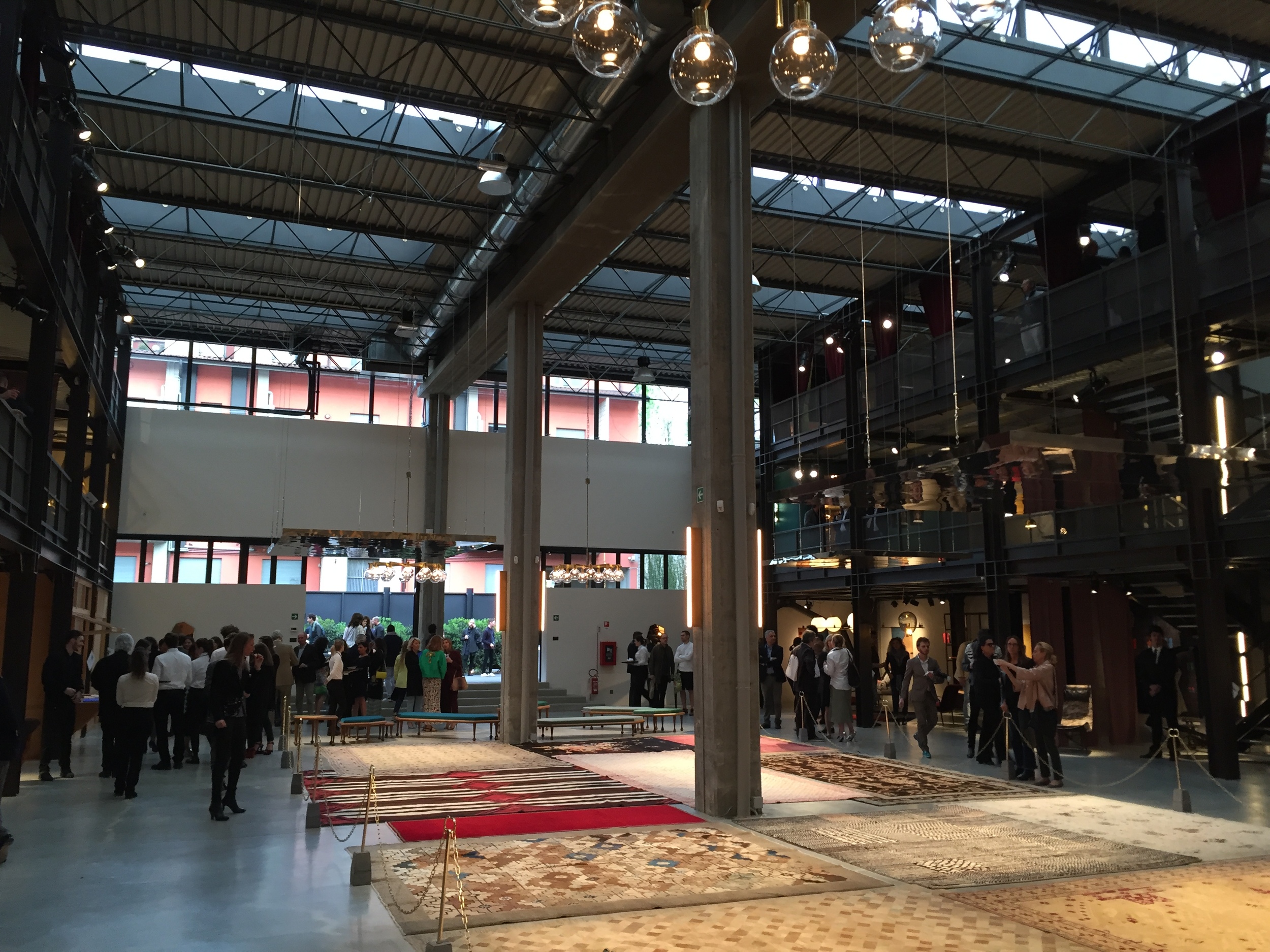
High-end design on show at the Nilufar Depot

High-end design on show at the Nilufar Depot

Fabio Novembre's glitzy, mirrored, womb-like room inspired by Milan Kundera's book 'The Unbearable Lightness of Being' part of the 'Rooms: Novel Living Concepts' exhibition at La Triennale di Milano. I love the way the Italians are comfort…

Fabio Novembre's glitzy, mirrored, womb-like room inspired by Milan Kundera's book 'The Unbearable Lightness of Being' part of the 'Rooms: Novel Living Concepts' exhibition at La Triennale di Milano. I love the way the Italians are comfortable philosophising about interior design, not saying I always understand it though. 

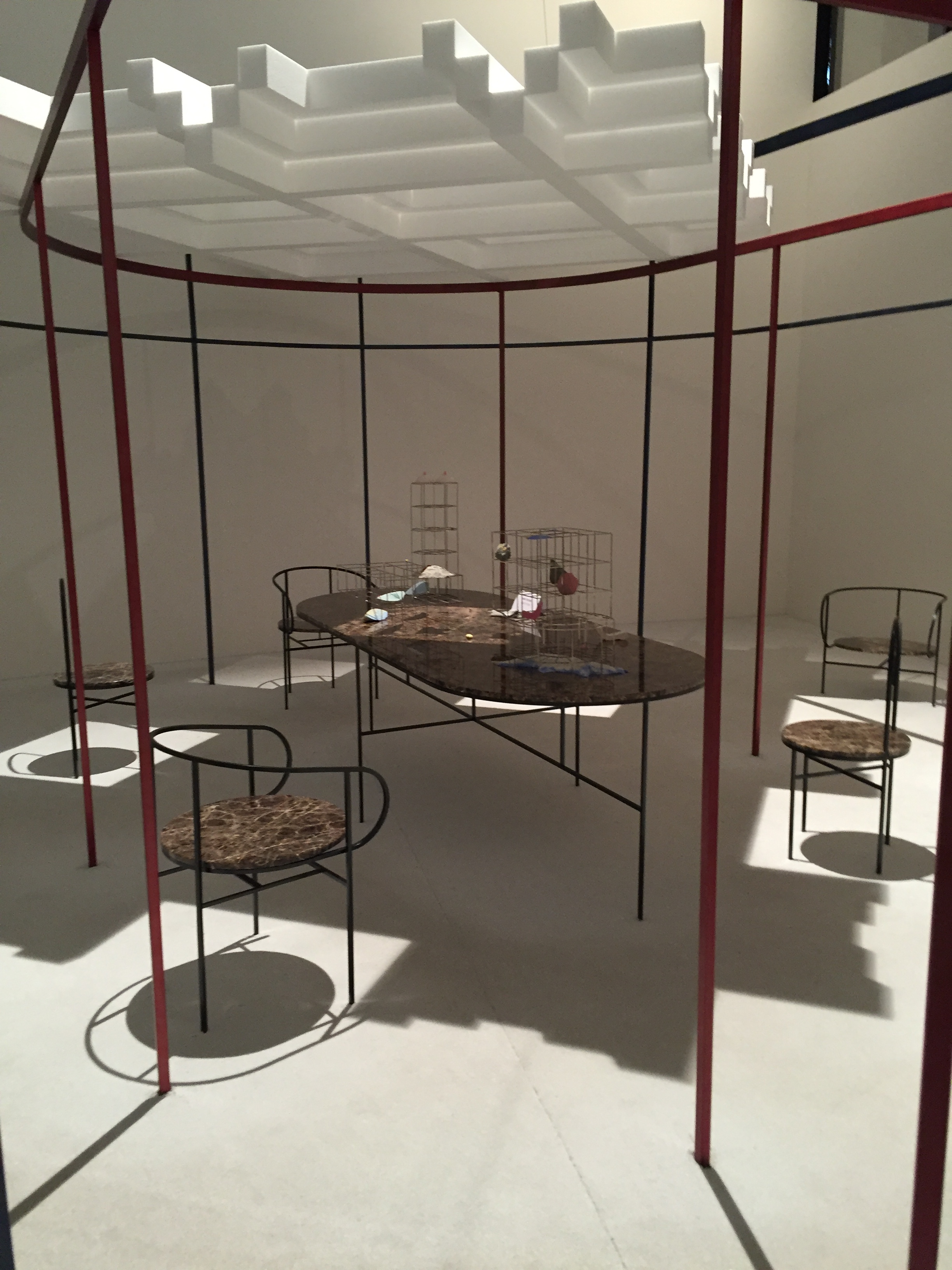
Also part of the 'Rooms' exhibition, this one by Francesco Librizzi caught my eye. I like the way a metal framework is enough to create a sense of an enclosed space, ie without walls. 

Also part of the 'Rooms' exhibition, this one by Francesco Librizzi caught my eye. I like the way a metal framework is enough to create a sense of an enclosed space, ie without walls. 

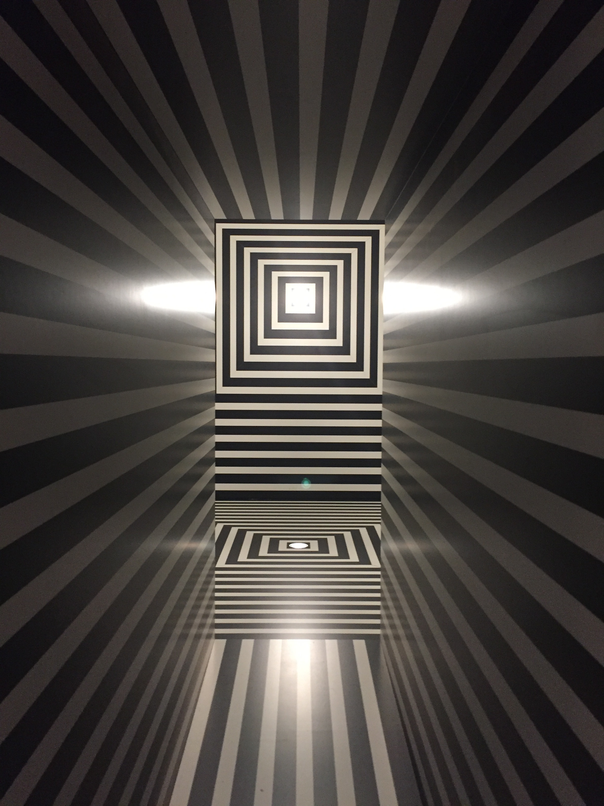
Monochrome madness, also part of 'Rooms'. 

Monochrome madness, also part of 'Rooms'. 

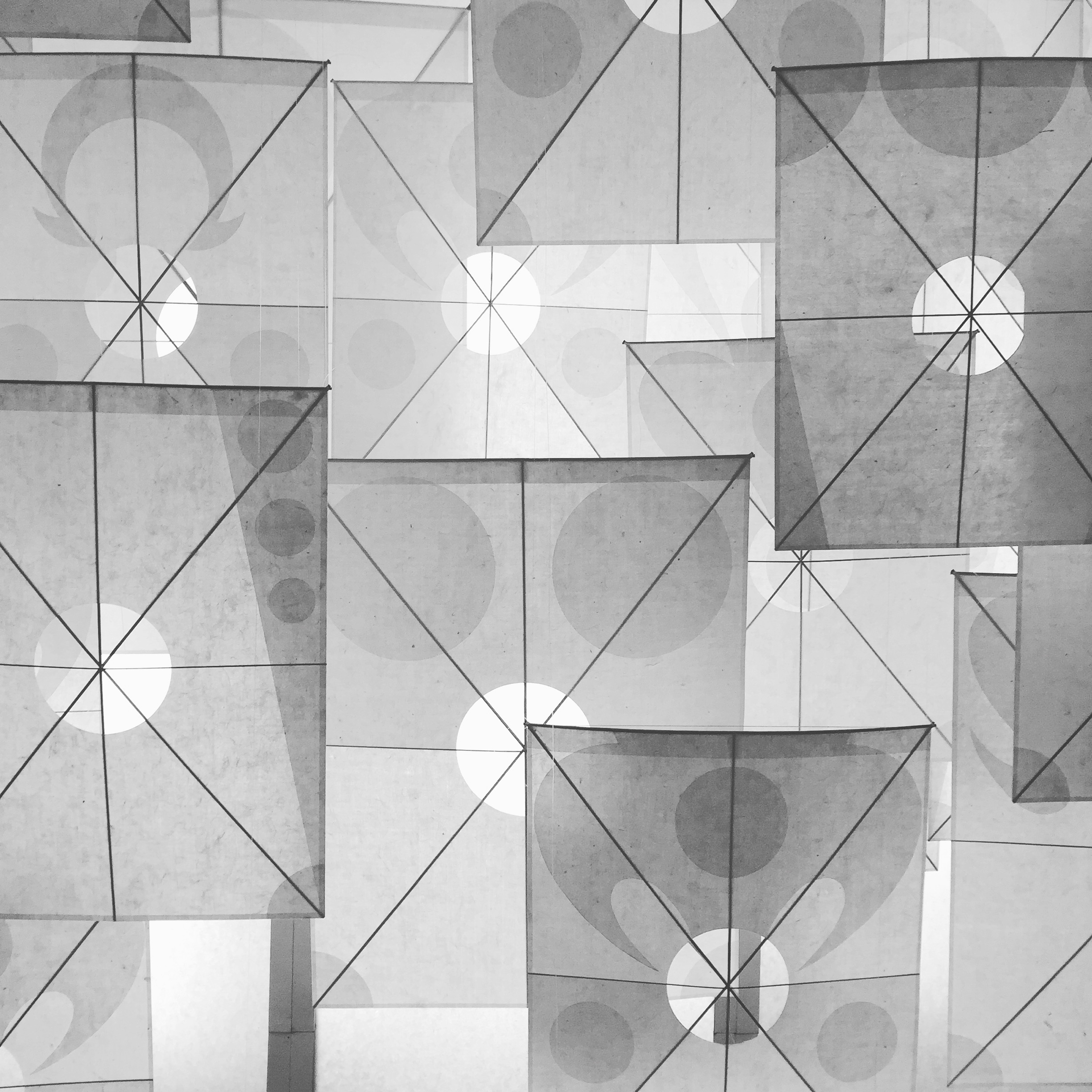
The Takeo Paper Show: Subtle was exhibited upstairs at La Triennale. It was thoughtful and almost meditative, everyone was taking pictures of this incredible paper creation above. 

The Takeo Paper Show: Subtle was exhibited upstairs at La Triennale. It was thoughtful and almost meditative, everyone was taking pictures of this incredible paper creation above. 

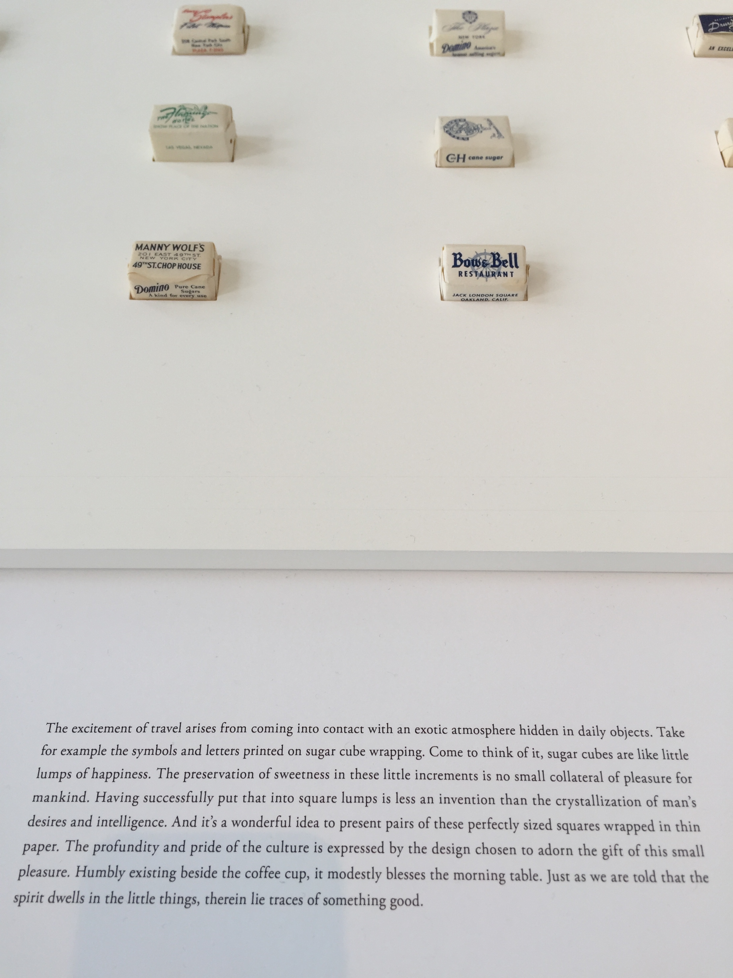
Fantastic quote about travel from the Takeo Paper Show expressed through paper-wrapped sugar cubes: "The excitement of travel arises from coming into contact with an exotic atmosphere hidden in daily objects". Explains my love of foreign superm…

Fantastic quote about travel from the Takeo Paper Show expressed through paper-wrapped sugar cubes: "The excitement of travel arises from coming into contact with an exotic atmosphere hidden in daily objects". Explains my love of foreign supermarkets.

Stunning ceramics by Kueng Caputo created using a specialist technique of airbrush painting called 'fukitsuke' which allows for soft gradients of colour and texture to be applied to the surface. Part of an exhibition to celebrate and promote the 400…

Stunning ceramics by Kueng Caputo created using a specialist technique of airbrush painting called 'fukitsuke' which allows for soft gradients of colour and texture to be applied to the surface. Part of an exhibition to celebrate and promote the 400 year old history of ceramics from Arita, Japan organised in partnership with Scholten and Baijings among others.

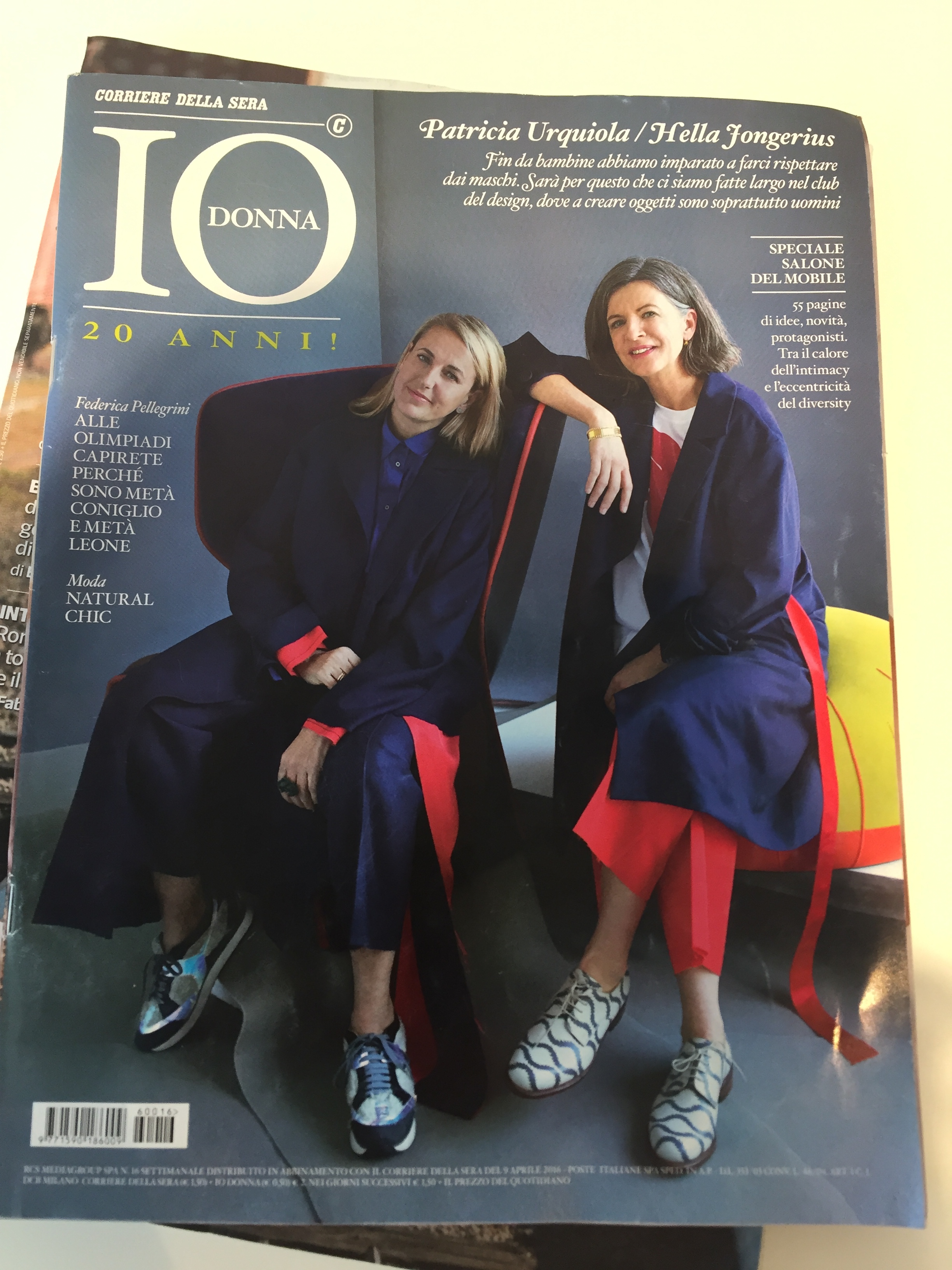
Love this cover on an Italian magazine featuring designers Patricia Urquiola and Hella Jongerius. 

Love this cover on an Italian magazine featuring designers Patricia Urquiola and Hella Jongerius

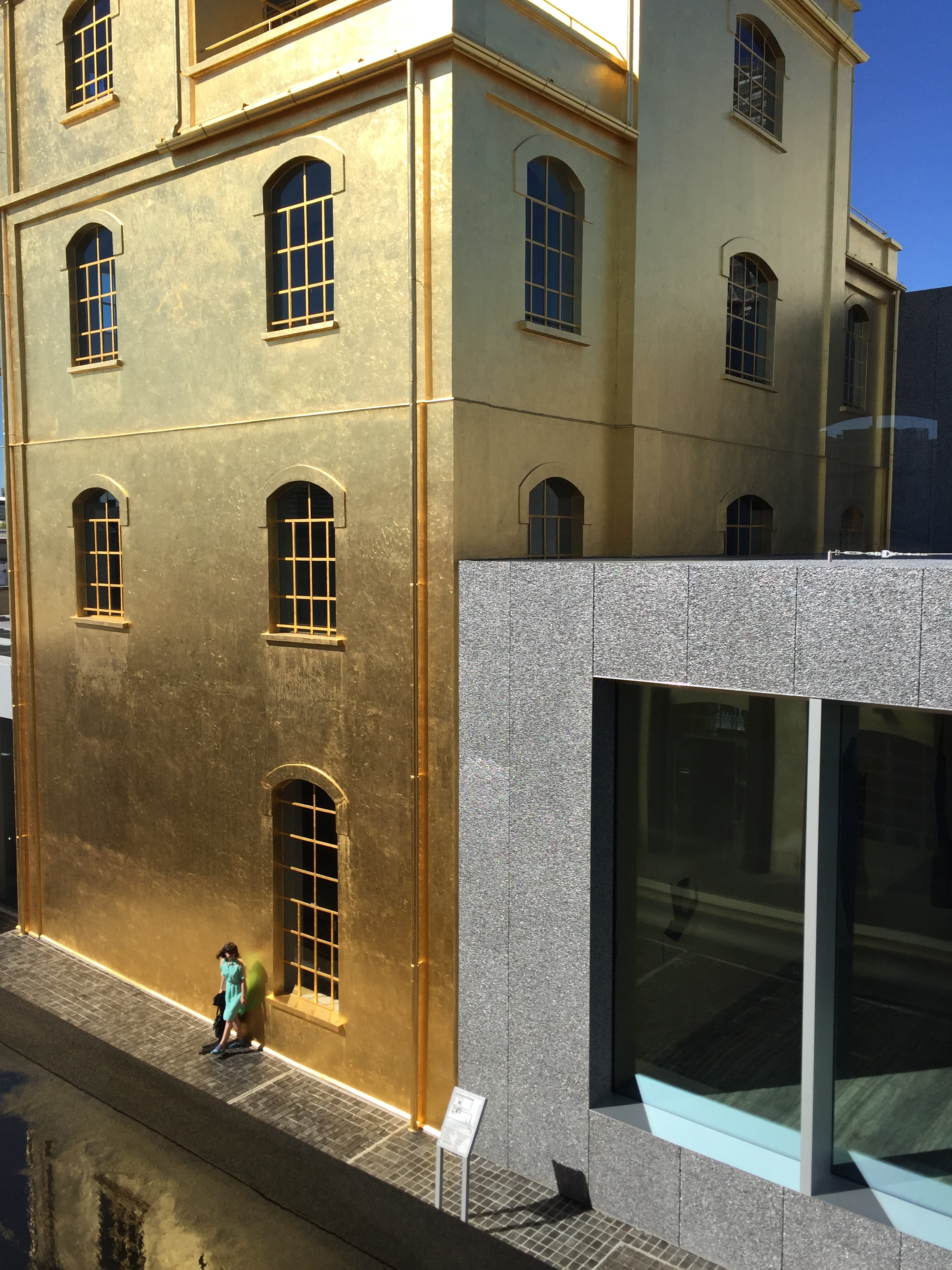
Fondanzione Prada in Milan is very gold and very Fashion. And Bar Luce, designed by Wes Anderson, does have a Life Aquatic pinball machine :) 

Fondanzione Prada in Milan is very gold and very Fashion. And Bar Luce, designed by Wes Anderson, does have a Life Aquatic pinball machine :) 

Some recent magazine articles

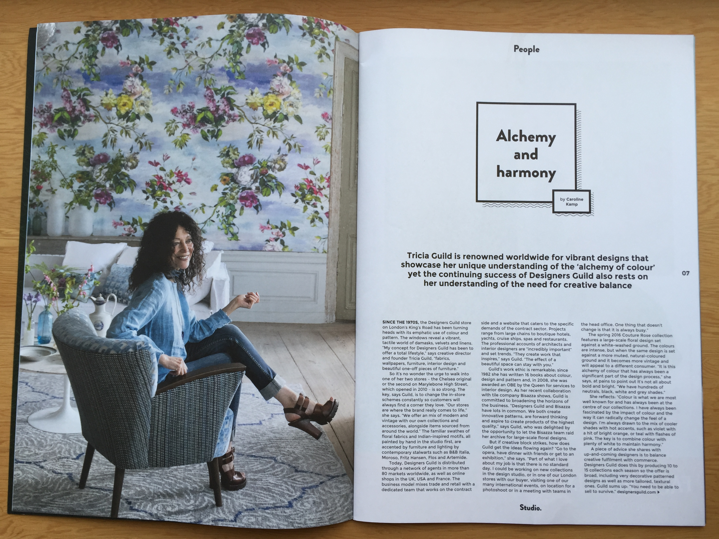
I was delighted to be asked to write a profile on the fabulous Tricia Guild, of Designers Guild, for Studio Magazine. Since the 1970s the company has been selling colourful, patterned textiles from its King's Road store. A piece of advice she shares with up-and-coming designers is to balance creative fulfilment with commerce: "You need to be able to sell to survive", she says.

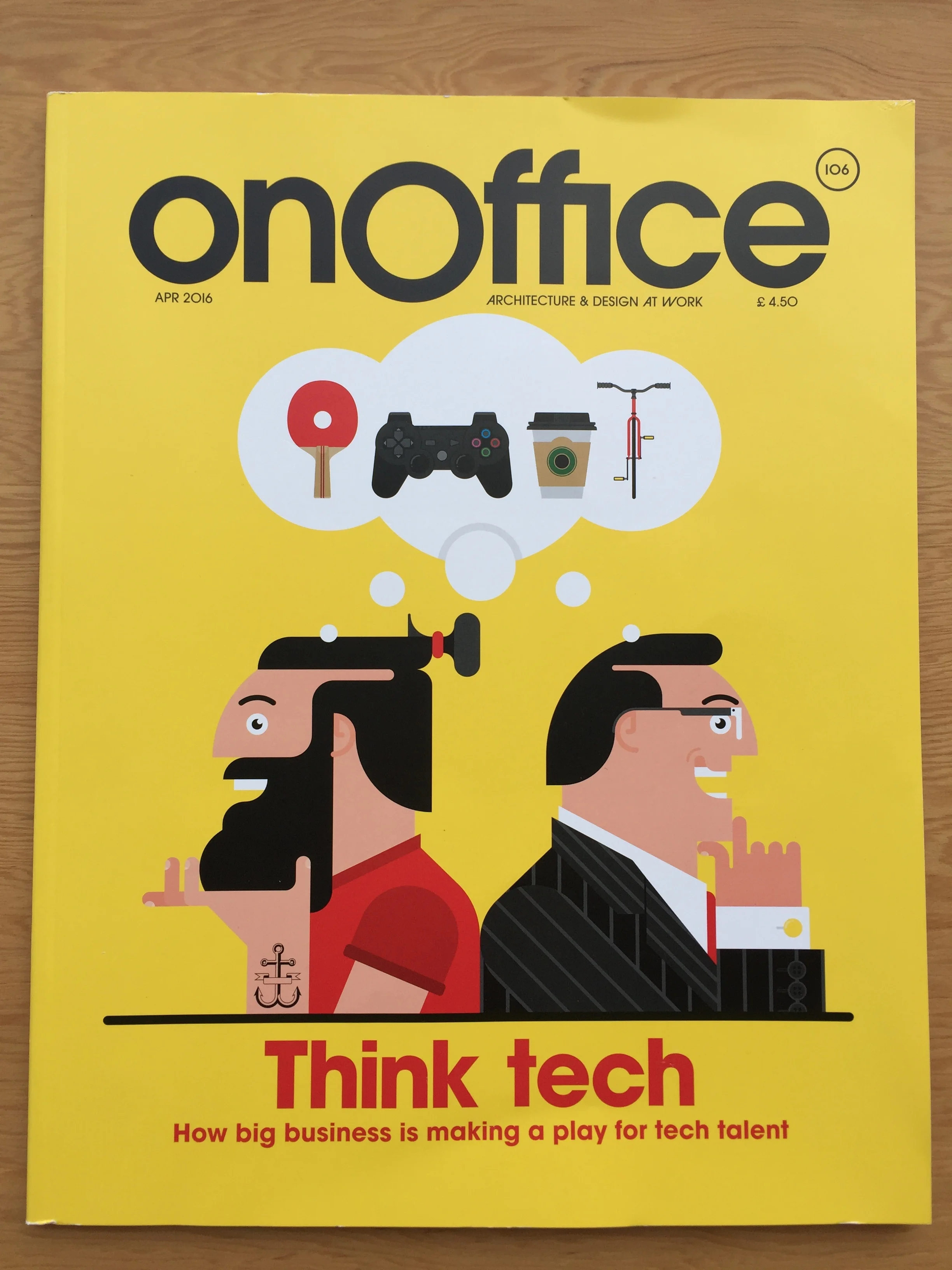
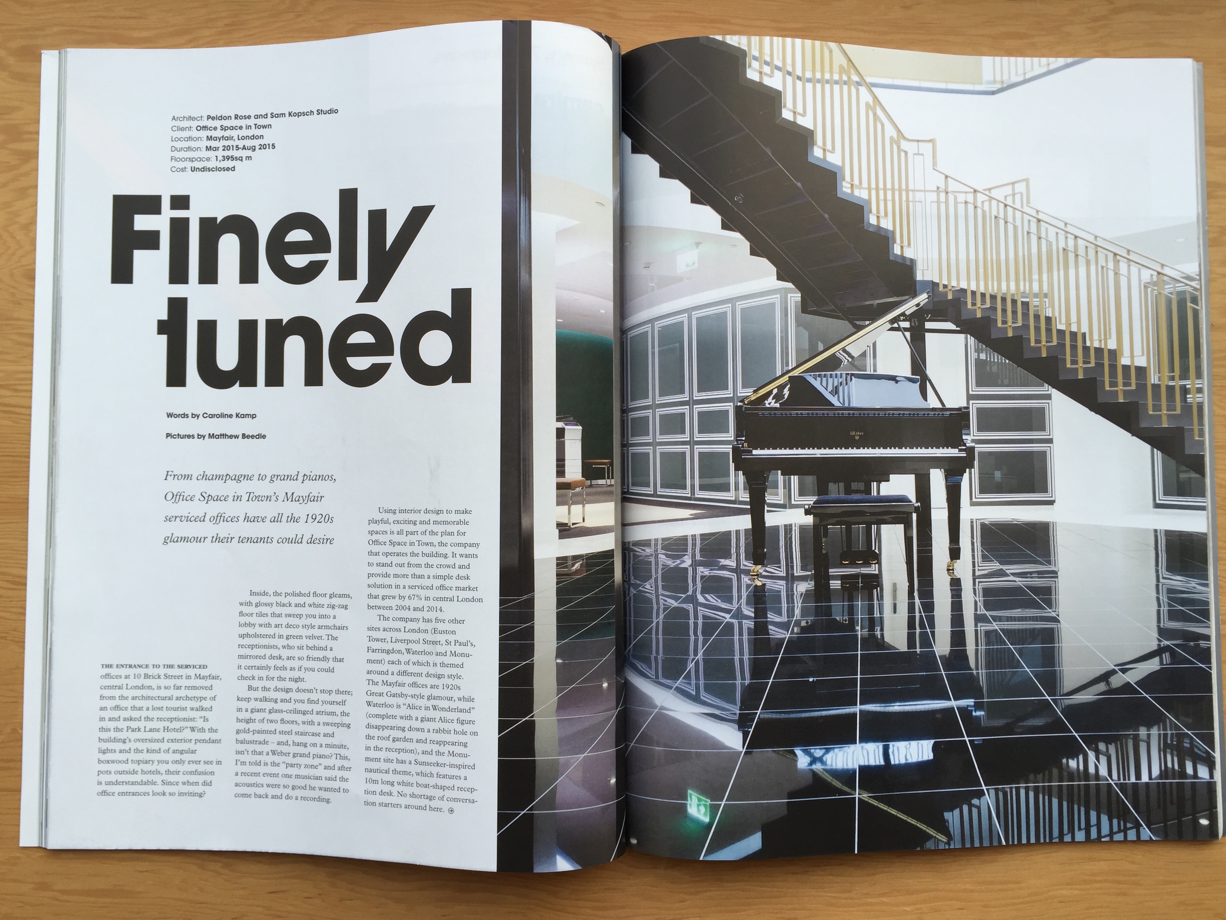
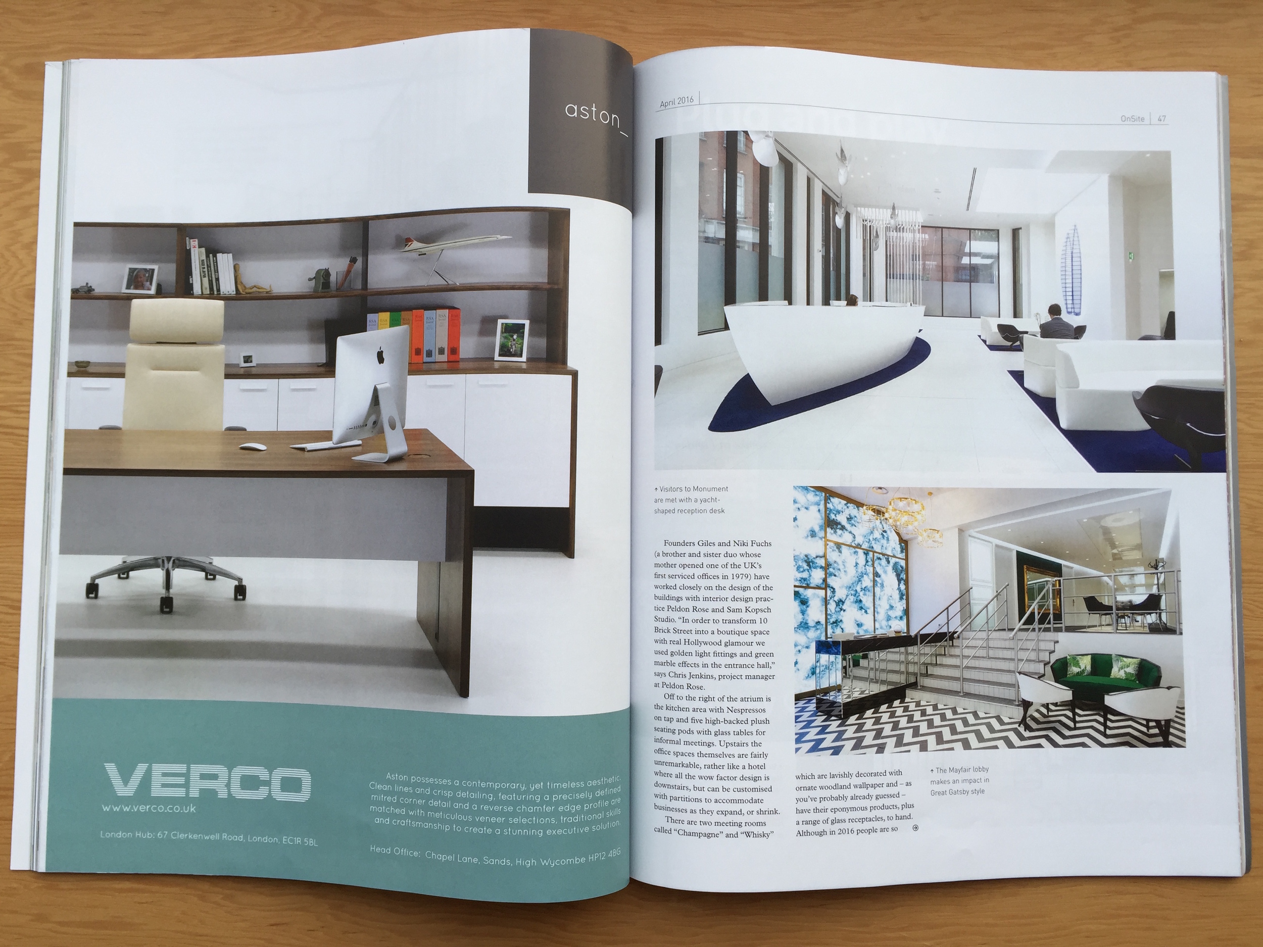
I was fascinated to hear more about the rapidly expanding world of boutique serviced offices when I interviewed Giles Fuchs co-founder of Office Space in Town for OnOffice Magazine. It's all about beautifully designed working environments which foster collaboration. 

Some recent articles

I travelled to Newcastle for this piece about the Northern Design Festival for the FT's House & Home section. There are some great designers producing interesting furniture in the north of England - and it's a lot cheaper to set themselves …

I travelled to Newcastle for this piece about the Northern Design Festival for the FT's House & Home section. There are some great designers producing interesting furniture in the north of England - and it's a lot cheaper to set themselves up there. 

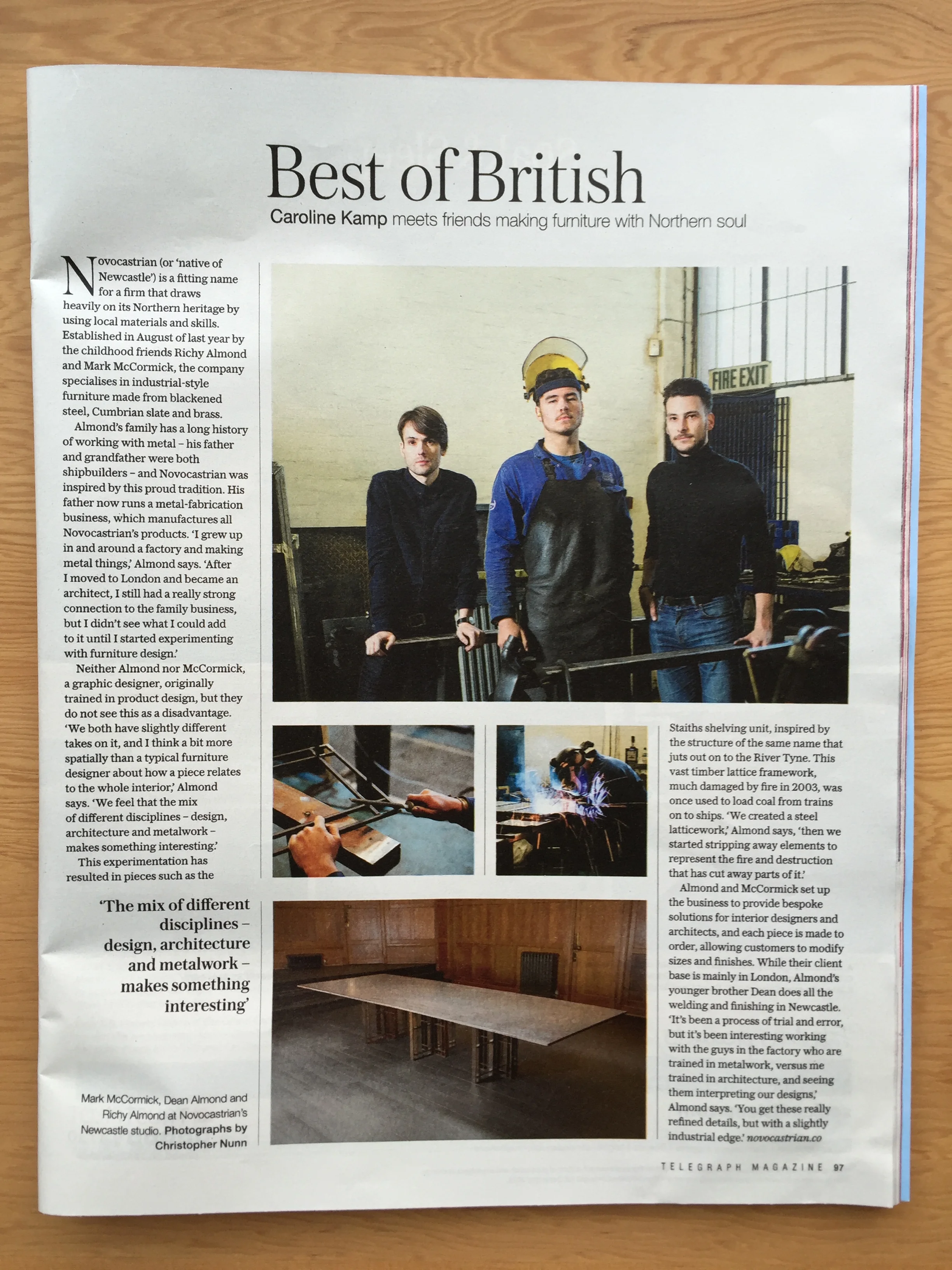
I interviewed Richy Almond of new British design company Novocastrian for The Telegraph Magazine (Saturday). 

I interviewed Richy Almond of new British design company Novocastrian for The Telegraph Magazine (Saturday). 

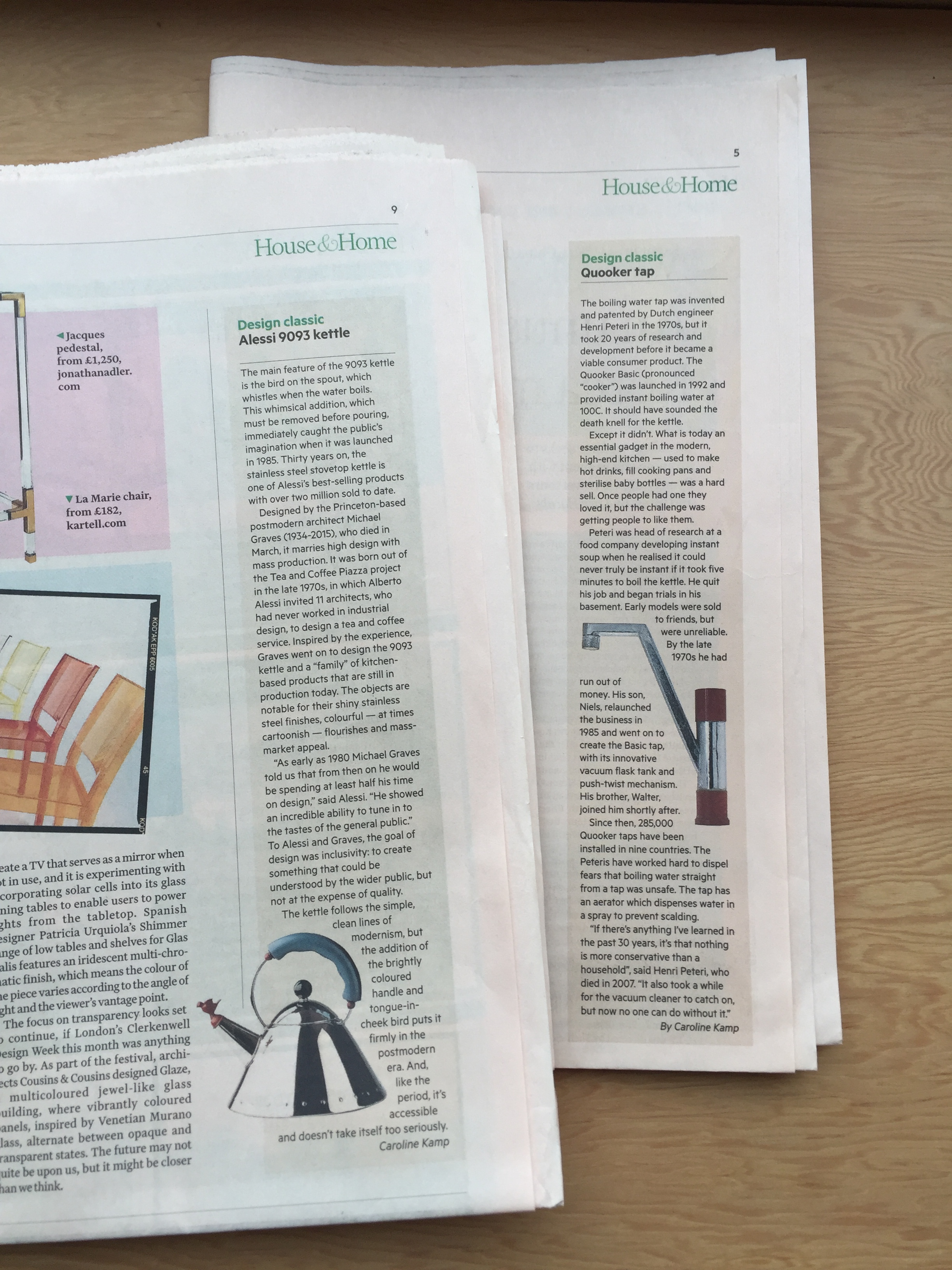
I've written a few Design Classics for The FT's House & Home.

I've written a few Design Classics for The FT's House & Home.

The first low energy bulb that actually looked appealing: the Plumen 001.

The first low energy bulb that actually looked appealing: the Plumen 001.

I wrote a piece about the companies re-issuing classic furniture designs and what it means for the originals, for the FT's House & Home. 

The world of Rubelli

Rubelli's elegant Milan HQ in the neoclassical Palazzo Greppi on Via San Maurilio. 

Rubelli's elegant Milan HQ in the neoclassical Palazzo Greppi on Via San Maurilio. 

Last week I spent two days in Milan immersed in the world of high end fabrics with Rubelli. The family-run Venetian textiles company was established in 1889 and is now run by fifth-generation Nicolò Rubelli.

I was there as part of a European press trip including British, French and German journalists for a party at the new showroom at via Fatebenefratelli, 9 and to visit the Rubelli mill in Cucciago, Como. The mill was bought in 1985 and has 28 (incredibly loud) jacquard machines producing over half a million metres of fabric a year. 

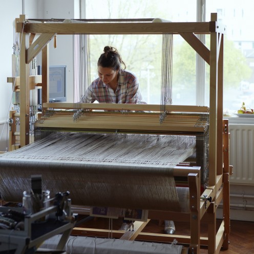
There are a few 18th century hand looms still in operation, but on a very limited basis with only one highly skilled - and irreplaceable - weaver. To the untrained eye the difference between hand and machine-made fabrics is hard to spot, but I'm told it's all in the feel.

The Italians have their priorities right. First food, then business. 

The Italians have their priorities right. First food, then business. 

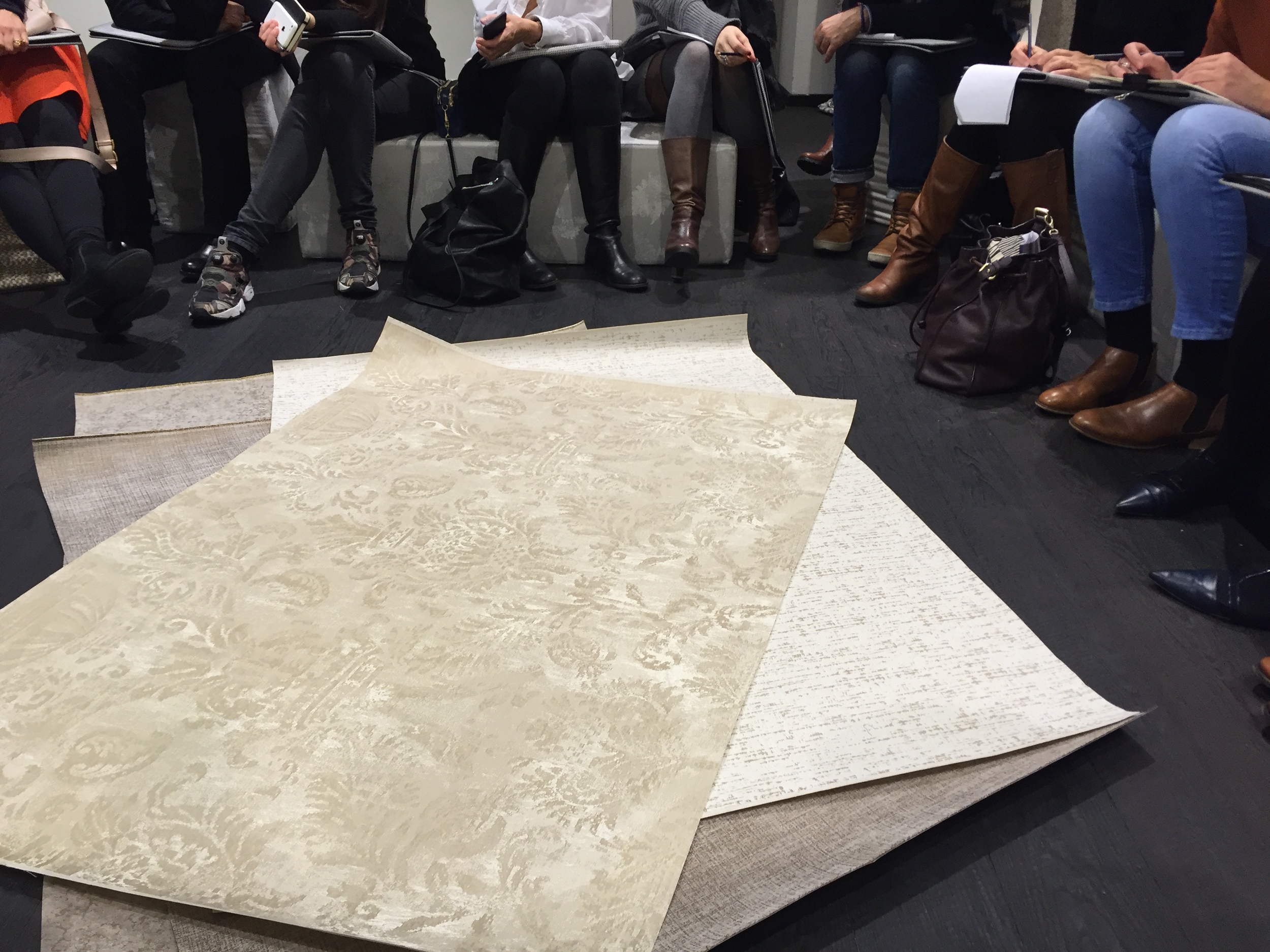
We were given a presentation of the 2016 Rubelli Collection. High points: metallic yarns, velvety textures, bold florals in contemporary colours.

We were given a presentation of the 2016 Rubelli Collection. High points: metallic yarns, velvety textures, bold florals in contemporary colours.

Taking notes.

Taking notes.

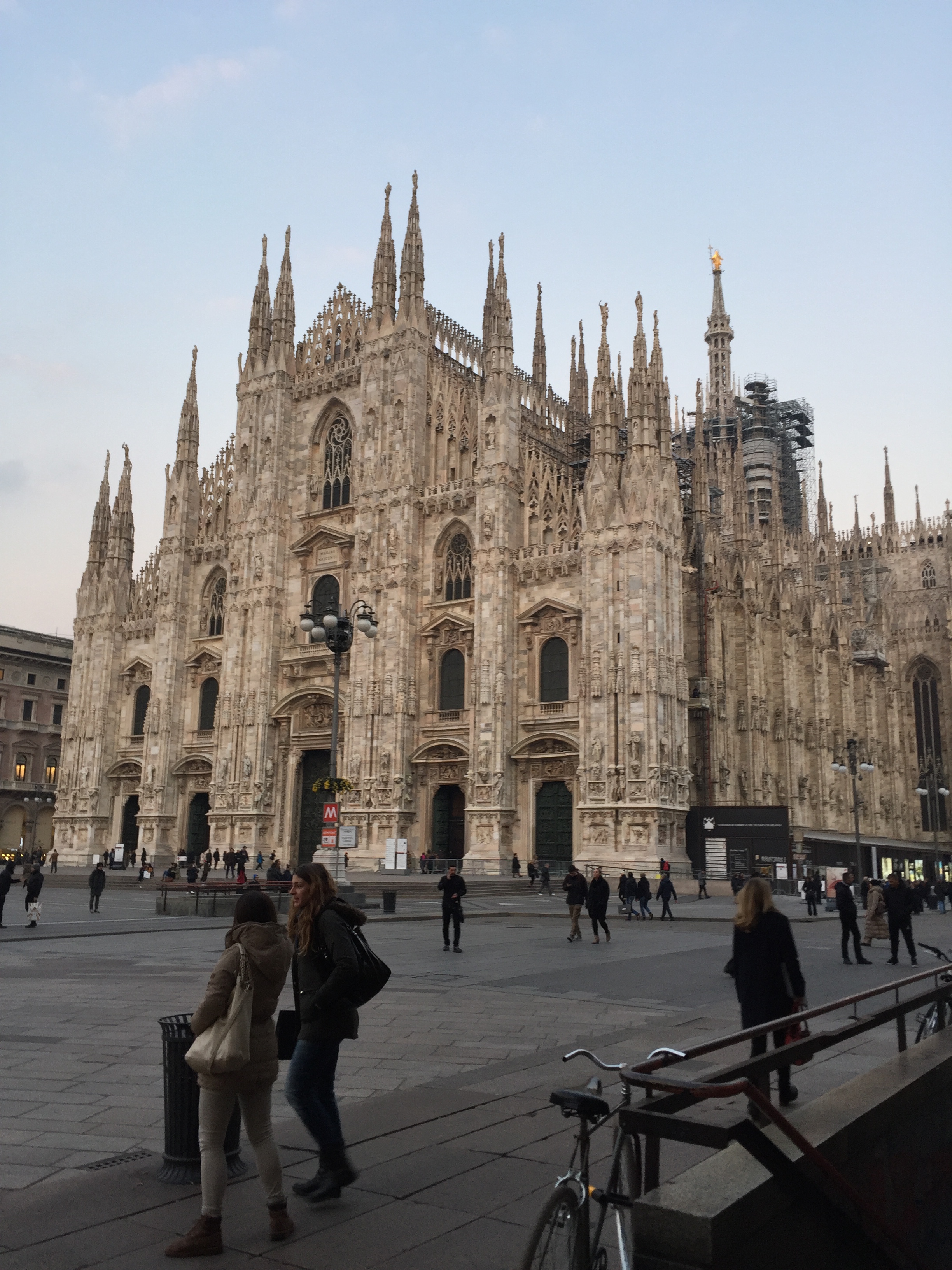
The incredibly ornate Duomo di Milano.

The incredibly ornate Duomo di Milano.

They know how to shop in Milan, the Galleria Vittorio Emanuele II.

They know how to shop in Milan, the Galleria Vittorio Emanuele II.

Party at the Rubelli showroom.

Party at the Rubelli showroom.

Stunning yellows and greys: bold florals + contemporary colours.

Stunning yellows and greys: bold florals + contemporary colours.

This bucket chair is part of the new Rubelli furniture collection. 

This bucket chair is part of the new Rubelli furniture collection. 

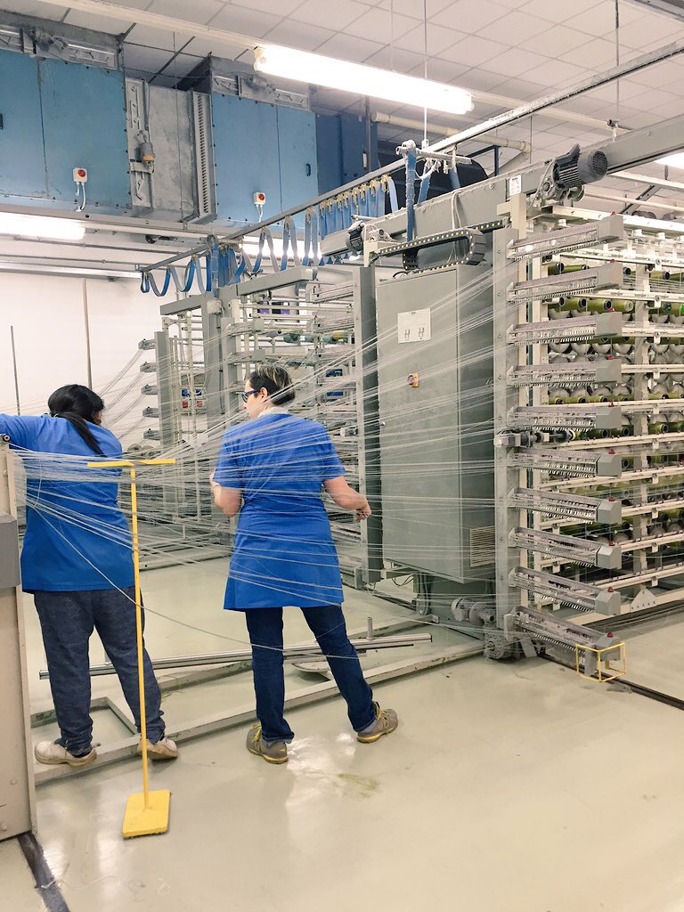
Behind the scenes at the mill - take your pick from thousands of yarns.

Behind the scenes at the mill - take your pick from thousands of yarns.

The large and loud jacquard machines.

The large and loud jacquard machines.

The stuff of nightmares.

The stuff of nightmares.

Intricate machine-made patterns.

Intricate machine-made patterns.

From the machine age...

From the machine age...

... to the 18th century. Rubelli's last-remaining hand-loomer. 

... to the 18th century. Rubelli's last-remaining hand-loomer. 

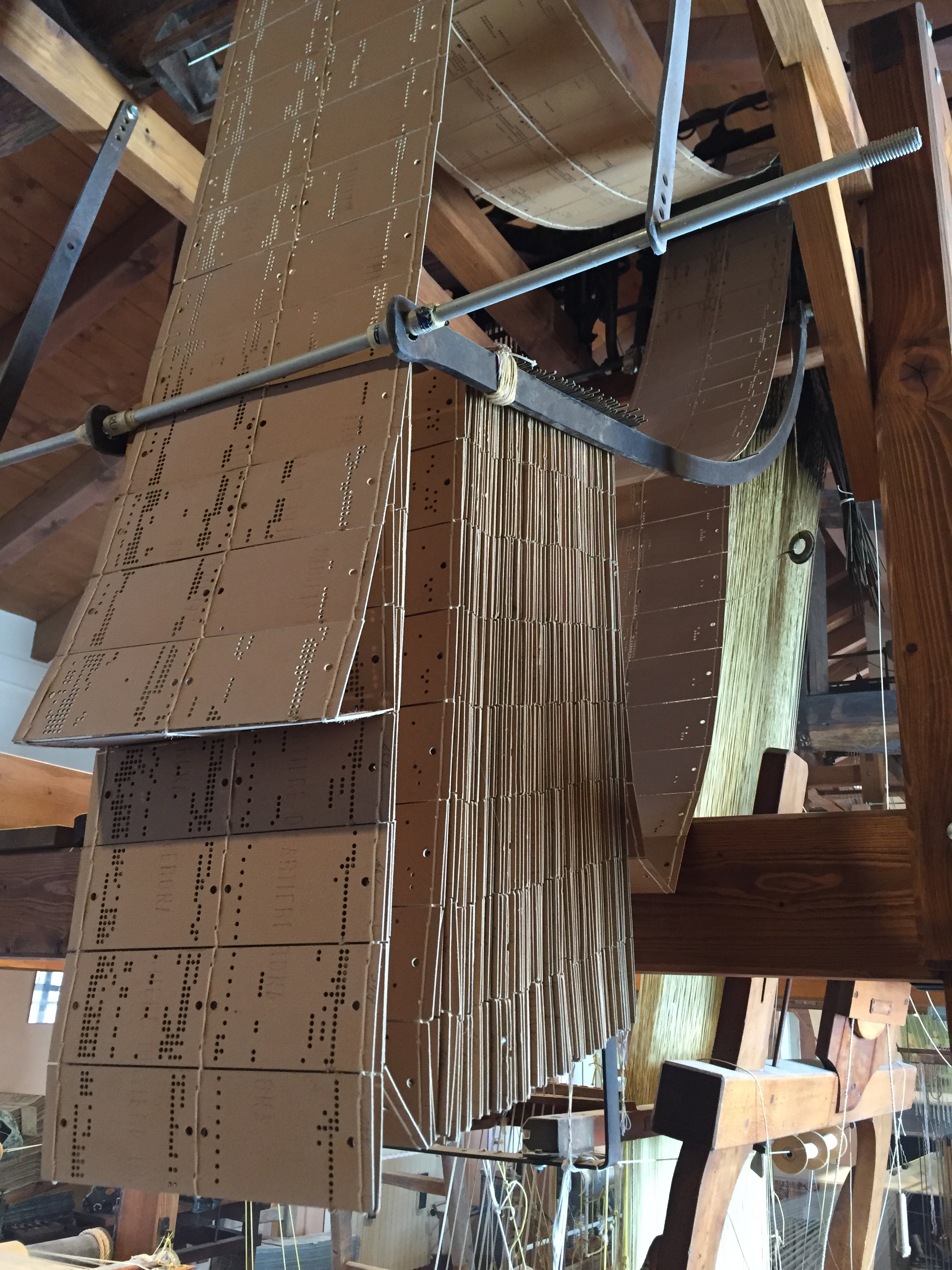
The wonderful old fashioned jacquard pattern cards.

The wonderful old fashioned jacquard pattern cards.

Rubelli did the curtains for the Bolshoi Theatre in Moscow, an epic undertaking which was two years in development as they had to blend in fire retardant yarns with spun gold. 

Rubelli did the curtains for the Bolshoi Theatre in Moscow, an epic undertaking which was two years in development as they had to blend in fire retardant yarns with spun gold. 

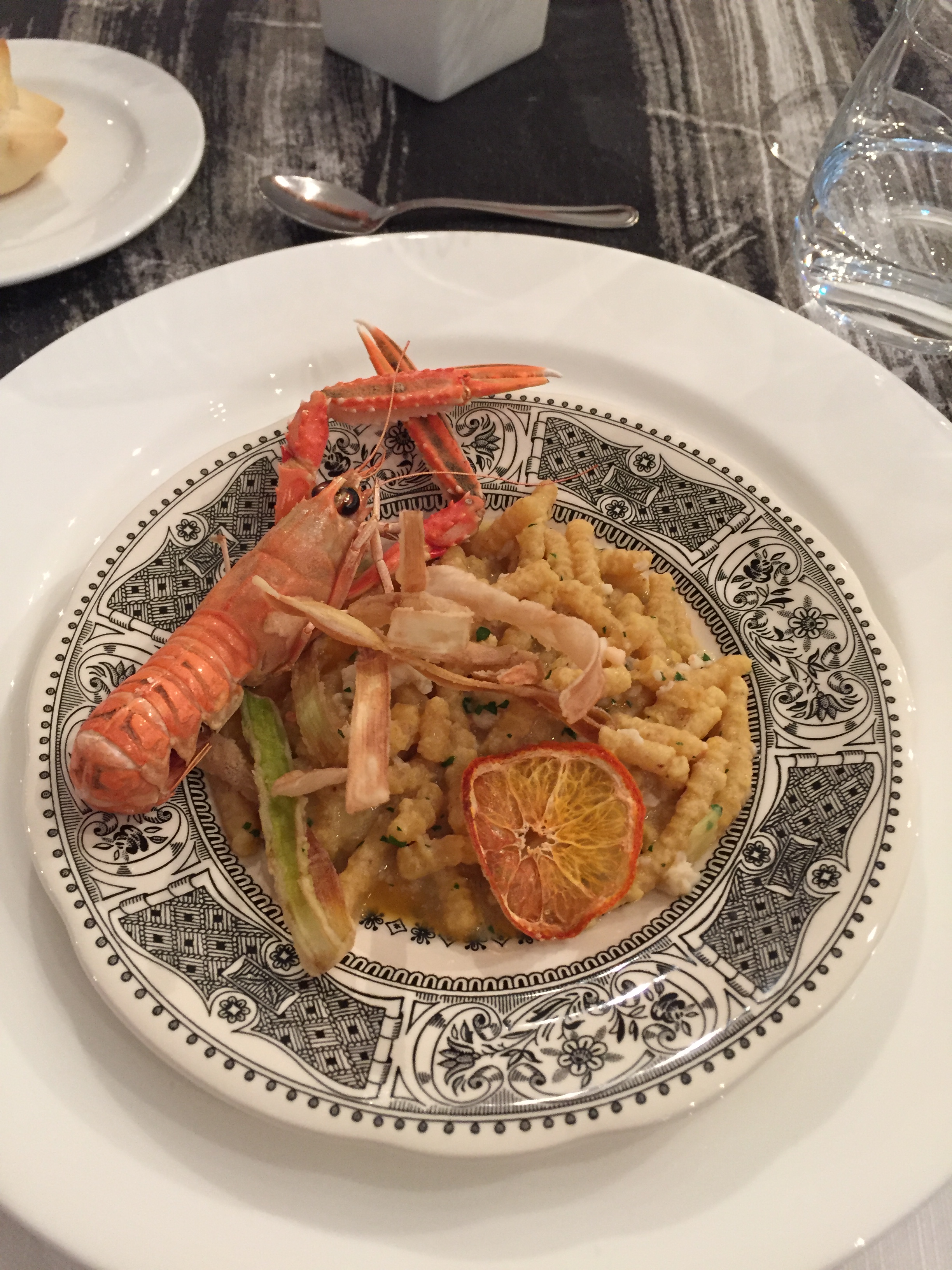
The trip ended as it had begun, with food. Lunch at the fabulous Ristorante Alice. I love Italians. 

The trip ended as it had begun, with food. Lunch at the fabulous Ristorante Alice

I love Italians.


London Design Festival 2015

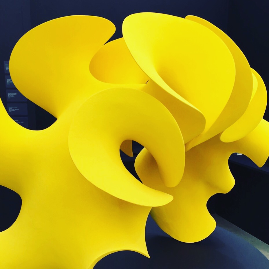
Sculptural ceramic shapes in zingy colours by Merete Rasmussen, part of the Future Heritage exhibition, at Decorex.

Sculptural ceramic shapes in zingy colours by Merete Rasmussen, part of the Future Heritage exhibition, at Decorex.

This year's London Design Festival spanned nine days and a multitude of venues and, as ever, there was way too much to see. Instead of freaking out over choice paralysis, my attitude was this: pick a few things, talk to people, have a laugh and roll with it. It is a festival after all. 

So here's a very personal selection of highlights as observed through my camera phone and in scribbled notes. I definitely took more pictures of things I saw near the start of the week, as opposed to the end. 

Taking ordinary to extraordinary was this ceramic typewriter, part of Future Heritage at Decorex, made by Katharine Morling. Check out the ceramic pencils in pencil pot too - I'm sure it was much instagrammed, and rightly so.  
Taking ordinary to extraordinary was this ceramic typewriter, part of Future Heritage at Decorex, made by Katharine Morling. Check out the ceramic pencils in pencil pot too - I'm sure it was much instagrammed, and rightly so.  

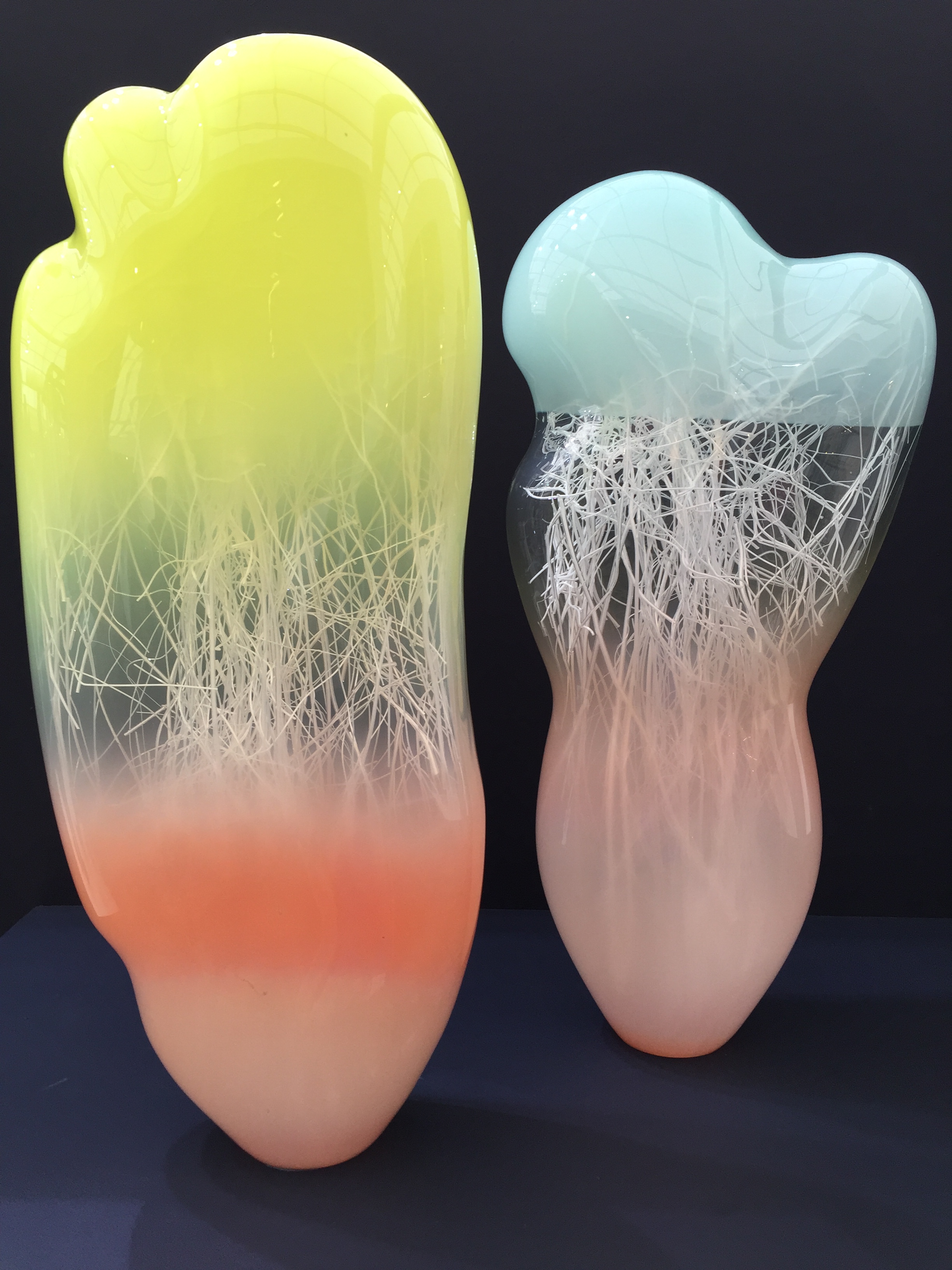
Ghostly, otherworldly glass by Enemark and Thompson, again from Future Heritage at Decorex. The exhibition, curated by journalist Corrine Julius, put the spotlight on craftsmen working at the top of their game and creating the antiques of the f…

Ghostly, otherworldly glass by Enemark and Thompson, again from Future Heritage at Decorex. The exhibition, curated by journalist Corrine Julius, put the spotlight on craftsmen working at the top of their game and creating the antiques of the future. 

Could not resist these crazy spoons/vessels by silversmith David Clarke at Future Heritage, they have a generosity about them. 

Could not resist these crazy spoons/vessels by silversmith David Clarke at Future Heritage, they have a generosity about them. 

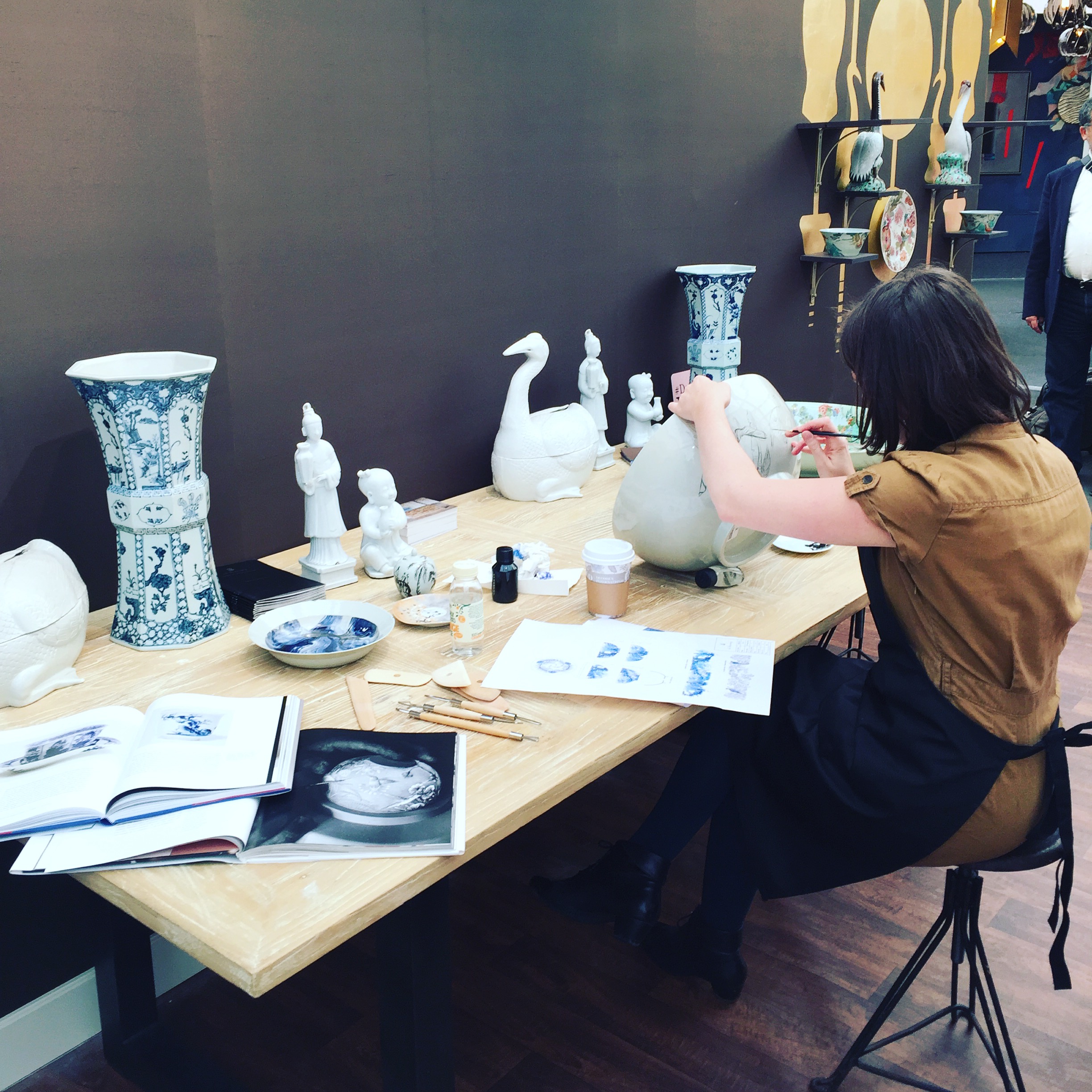
It is always a pleasure to see a bit of artfulness in action, also at Decorex. 

It is always a pleasure to see a bit of artfulness in action, also at Decorex. 

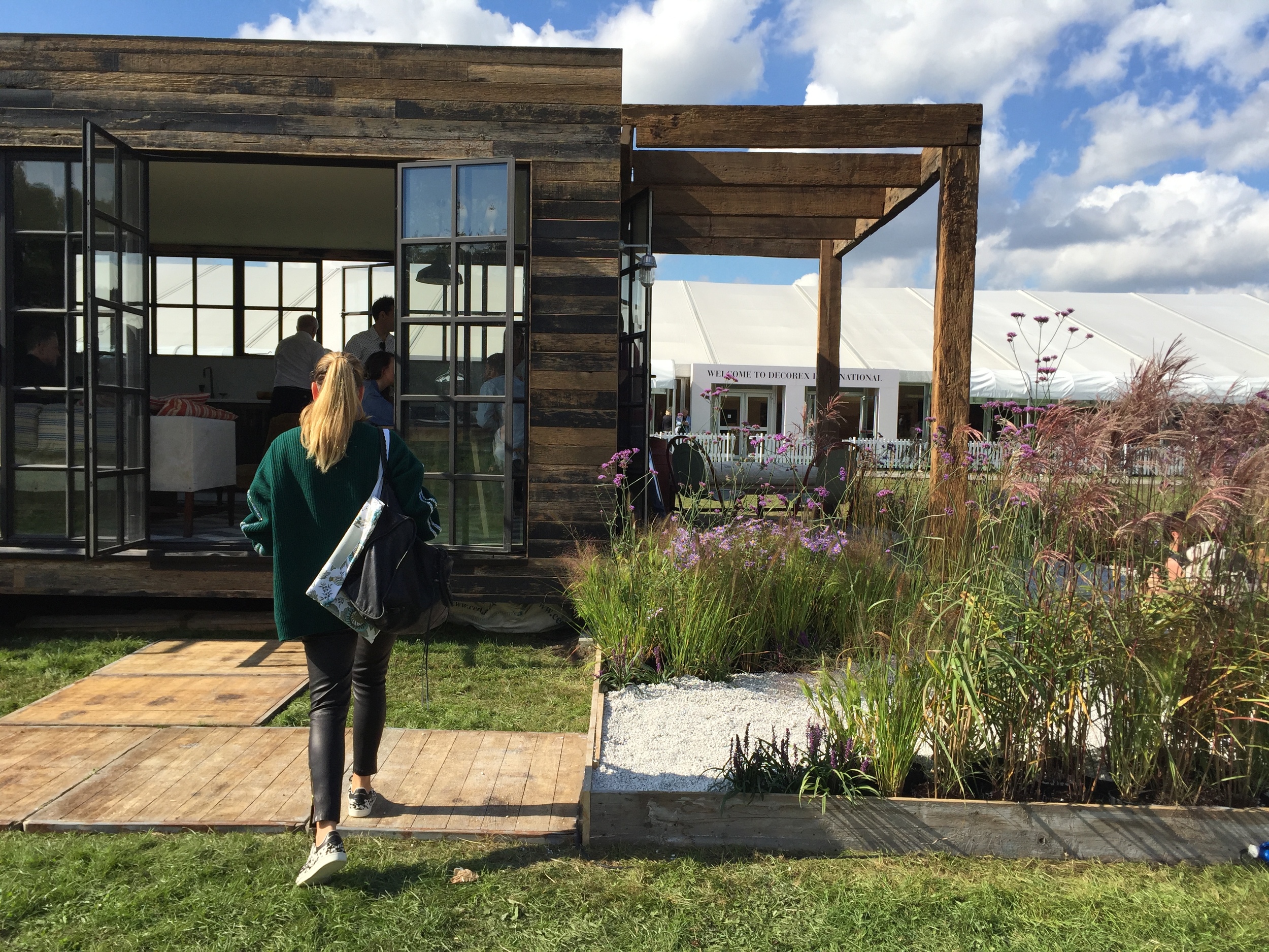
Not me, that's my friend Laurence who accompanied me to Decorex. Outside the main event was a modular structure called Bert's Box, by Bert & May, with a beautiful meadow garden planted by RHS Young Gardener of the Year finalist Josh Chapman. I'l…

Not me, that's my friend Laurence who accompanied me to Decorex. Outside the main event was a modular structure called Bert's Box, by Bert & May, with a beautiful meadow garden planted by RHS Young Gardener of the Year finalist Josh Chapman. I'll be honest it was the plants that caught my eye. 

I had the honour of attending an event at the Norwegian Ambassador's Residence in Kensington with Nadja Swarovski and designer Kim Thomé to celebrate the Zotem installation at the V&A during the London Design Festival. It was a bit of an upgrade…

I had the honour of attending an event at the Norwegian Ambassador's Residence in Kensington with Nadja Swarovski and designer Kim Thomé to celebrate the Zotem installation at the V&A during the London Design Festival. It was a bit of an upgrade on my usual Friday lunch. 

That's Nadja talking to Kim. One word: candelabra. 

That's Nadja talking to Kim. One word: candelabra. 

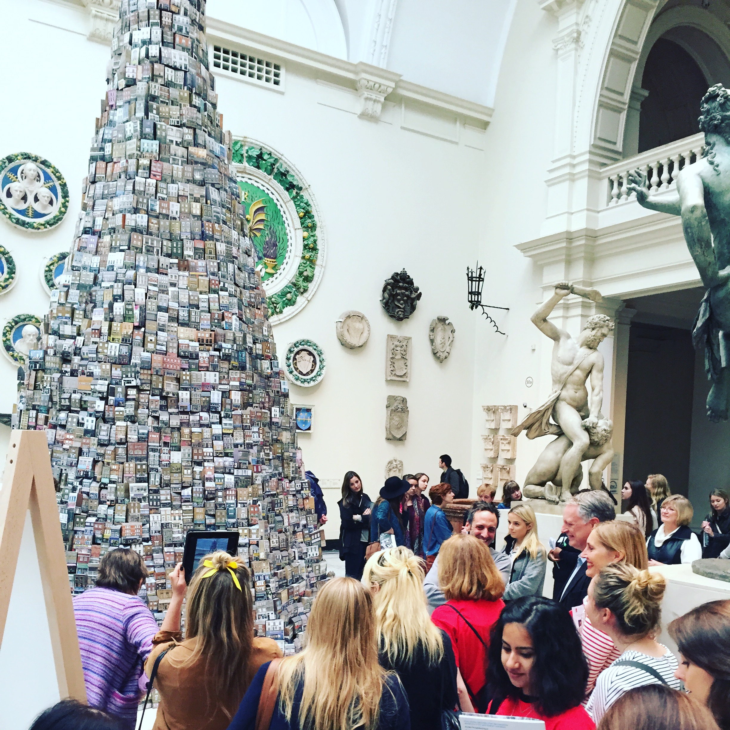
This was truly brilliant. Barnaby Barford's Tower of Babel at the V&A - a monument to the British love affair with shopping made of 3,000 bone china London shop fronts. All are available to buy (natch) the cheaper streets are at the bottom …

This was truly brilliant. Barnaby Barford's Tower of Babel at the V&A - a monument to the British love affair with shopping made of 3,000 bone china London shop fronts. All are available to buy (natch) the cheaper streets are at the bottom with Bond Street and Regent Street at the top. It's on show until 1st November. 

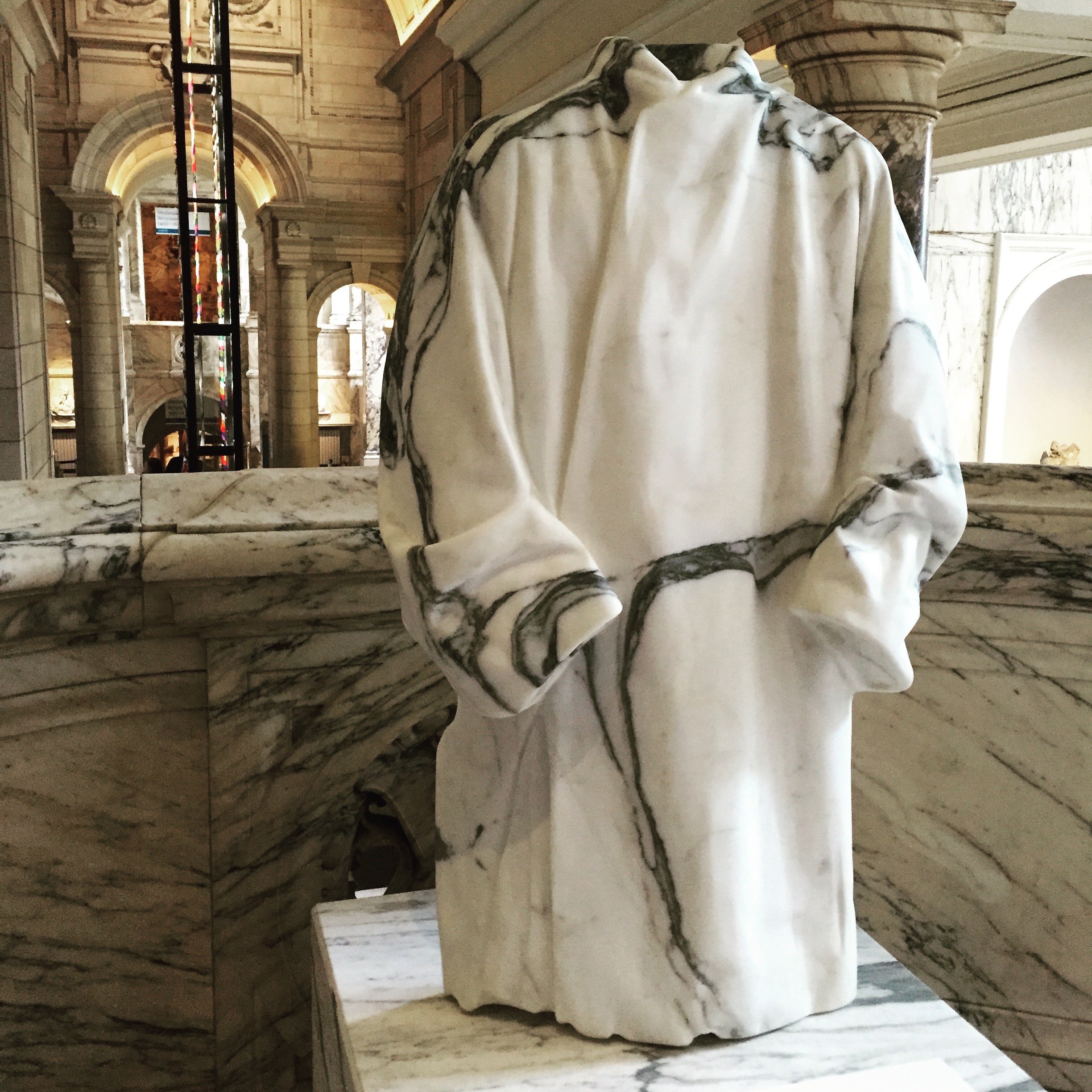
I loved this marble cloak, also at the V&A, which blends in with the marble staircase. It was part of an imaginative site-specific installation called The Cloakroom by Faye Toogood (and you can see the Zotem in the background).&nb…

I loved this marble cloak, also at the V&A, which blends in with the marble staircase. It was part of an imaginative site-specific installation called The Cloakroom by Faye Toogood (and you can see the Zotem in the background). 

There was a talk at the V&A about 'Slowmaking' featuring rug maker Jan Kath (left), interior designer Daniel Hopwood (second from right) and journalist Helen Chislett (right). Kath produces rugs which are basically works of art and can…

There was a talk at the V&A about 'Slowmaking' featuring rug maker Jan Kath (left), interior designer Daniel Hopwood (second from right) and journalist Helen Chislett (right). Kath produces rugs which are basically works of art and can take around 6-8 months to make. If you've got time there's a lovely National Geographic style video of the hand-crafted Nepalese rug-making process, very chillaxy soundtrack. 

The delightful Tomoko Azumi at the Margaret Howell shop on Wigmore Street where she was launching her beautiful beech bentwood chair called Flow.

The delightful Tomoko Azumi at the Margaret Howell shop on Wigmore Street where she was launching her beautiful beech bentwood chair called Flow.

Design and Crafts Council of Ireland put on an evocative show called 'O' which means 'from' in Irish at Tent London which featured beautiful, tactile, hand-crafted items, including these textiles by the talented duo Superfolk. 

Design and Crafts Council of Ireland put on an evocative show called 'O' which means 'from' in Irish at Tent London which featured beautiful, tactile, hand-crafted items, including these textiles by the talented duo Superfolk

Saw this show in Milan, but I enjoyed it just as much a second time. Constancy and Change in Korean Craft, also at Tent London, showed work by 23 artists under the theme of simple, calm, subtle. 

Saw this show in Milan, but I enjoyed it just as much a second time. Constancy and Change in Korean Craft, also at Tent London, showed work by 23 artists under the theme of simple, calm, subtle. 

The wild and stormy Nim coffee table by the London-based husband and wife design team Pinch deserves a special mention. It's made of Jesmonite, a moldable composite which is safer than fibreglass and lighter than cast concrete. 

The wild and stormy Nim coffee table by the London-based husband and wife design team Pinch deserves a special mention. It's made of Jesmonite, a moldable composite which is safer than fibreglass and lighter than cast concrete. 

The smartphone backlash has begun... with the launch of the MP01 from Punkt, a mobile phone which only calls and texts, old school style. Punkt's mantra is: 'one device one function'. I love the idea of not being in thrall to my smartphone, but…

The smartphone backlash has begun... with the launch of the MP01 from Punkt, a mobile phone which only calls and texts, old school style. Punkt's mantra is: 'one device one function'. I love the idea of not being in thrall to my smartphone, but I'm not sure how I'd fare without it. They talk about the MP01 as a training device, ie use it in the evenings/weekends, take it on holiday so you can stay in touch, but it stops you checking your emails all the time - and pack a real camera. I sort of feel we should blame the workman, not the tool, but I get where they're coming from. 

And finally, I overheard someone say that Shoreditch is like Brooklyn and this may be why: the Mast Brothers chocolate factory shop/gallery (and beard-fest) on Redchurch Street. Made me smile, but the chocolate is amazing. 
And finally, I overheard someone say that Shoreditch is like Brooklyn and this may be why: the Mast Brothers chocolate factory shop/gallery (and beard-fest) on Redchurch Street. Made me smile, but the chocolate is amazing. 

Advice on hiring a craftsman

Textile designer/maker Catarina Riccabona works on bespoke projects with The New Craftsmen.

Textile designer/maker Catarina Riccabona works on bespoke projects with The New Craftsmen.

The inaugural London Craft Week kicks off today with a programme of events across the city until Sunday.

I wrote a piece for this month's The London Magazine about the Mayfair craft 'atelier' The New Craftsmen where you can work with a skilled designer/maker to create a bespoke piece of work - whether it's an embroidered quilt or a decorative mirror - for your home. Here's the link

You can commission and work with award-winning potter Billy Lloyd through The New Craftsmen

You can commission and work with award-winning potter Billy Lloyd through The New Craftsmen


Milan 2015

Tumbling wisteria on the streets of Milan

Tumbling wisteria on the streets of Milan

Last week I was in Milan for the annual furniture fair Salone del Mobile which is the big international product launch event in the design calendar. The fair is in its 54th year and is centred on the giant furniture and lighting show at the Fiera di Milano convention centre, but over the years it has sprawled into town and there are installations and events across shops, galleries and historic palazzos. These days it is as much about socialising as the latest chair.

Dissenting voices question the point of design weeks as there seem to be more and more taking place each year and whether the media's insta-reporting via social media only reinforces the superficial image of the industry. For me it was a fantastic opportunity to make contact with companies, and the people who represent them, who I usually only encounter through my computer screen. The digital revolution is well underway, but you still can't beat face to face.

Any round up of Milan excludes as much as it includes so this is very much how I saw it. 

The exuberance and playfulness of putting swings inside a palazzo completely took me by surprise. What was it for? To promote quartz surfaces, just visible on the floor, from a company called Caesarstone. The installation was con…

The exuberance and playfulness of putting swings inside a palazzo completely took me by surprise. What was it for? To promote quartz surfaces, just visible on the floor, from a company called Caesarstone. The installation was conceived by Patrick Malouin. If I had to choose only one image to sum up the week it would be this. 

The MINDCRAFT15 exhibition of Danish craft and design curated by design duo GemFratesi was absolutely beautiful and hidden away in a historic courtyard in the Brera district. It was a tranquil and contemplative spot and I co…

The MINDCRAFT15 exhibition of Danish craft and design curated by design duo GemFratesi was absolutely beautiful and hidden away in a historic courtyard in the Brera district. It was a tranquil and contemplative spot and I could have spent all day just sitting here. 

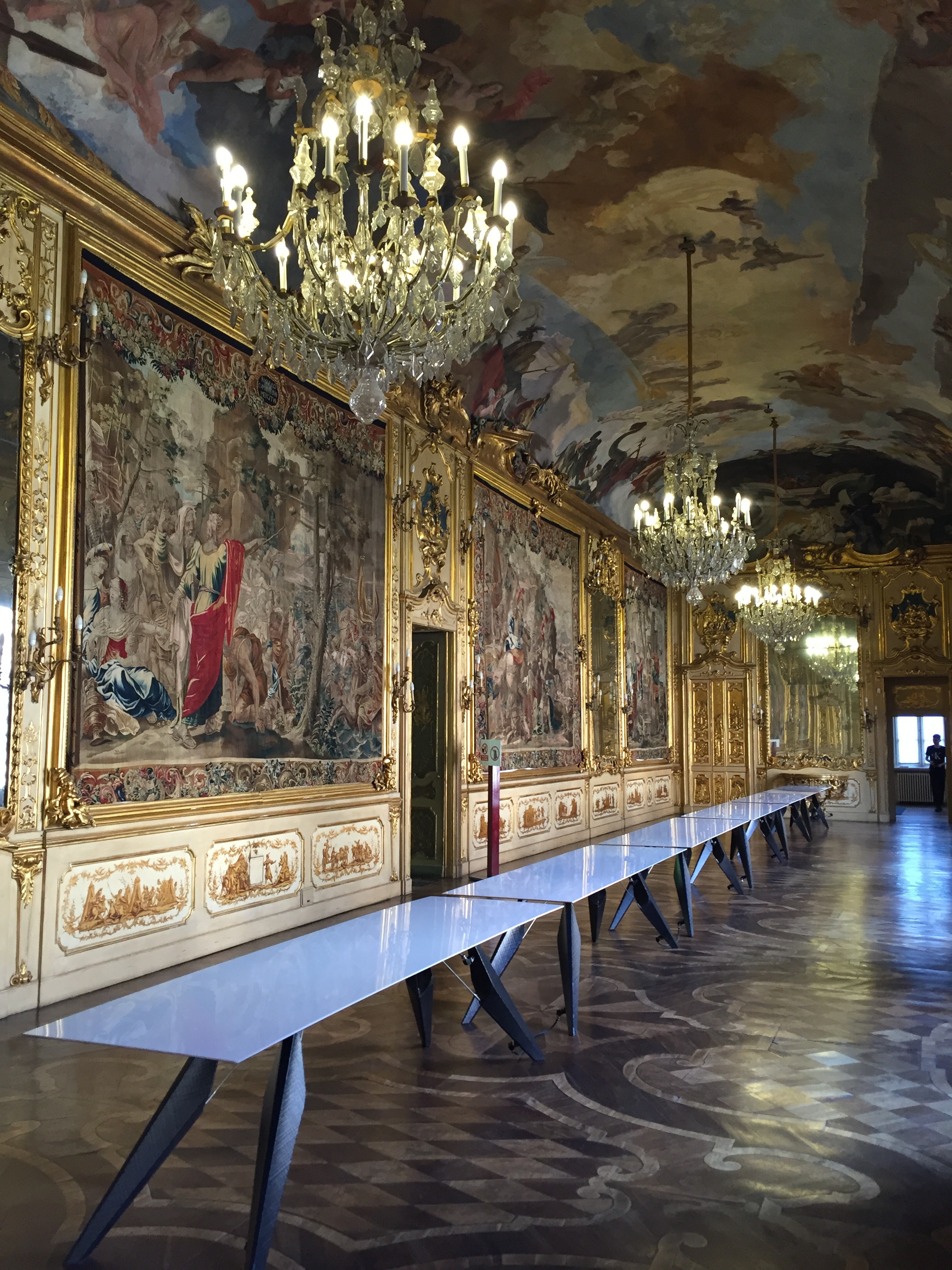
No photos were allowed inside Palazzo Crespi, a private home in the centre of Milan. Airbnb, in conjunction with Fabrica, somehow managed to persuade the Crespi family to open it up to visitors as part of their exploration into the no…

No photos were allowed inside Palazzo Crespi, a private home in the centre of Milan. Airbnb, in conjunction with Fabrica, somehow managed to persuade the Crespi family to open it up to visitors as part of their exploration into the notion of welcome. As you can imagine it was stunning inside with centuries old artworks, furniture and ceiling frescoes. I'm afraid the Fabrica installation which included someone screen printing tote bags rather paled in comparison to the extraordinary interior. 

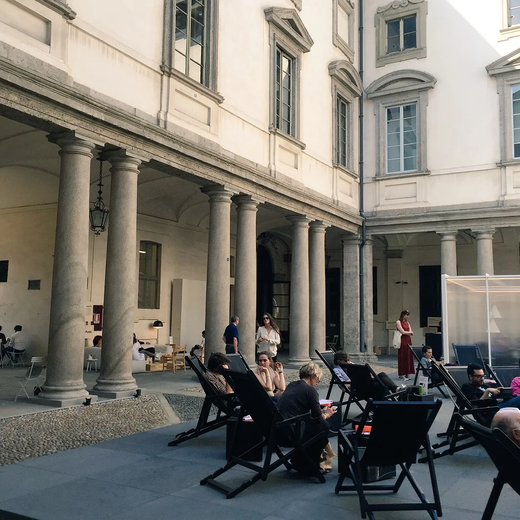
In the light-filled 17th century courtyard of Palazzo Litta, in the 5Vie district, there were USB charging stations supplied by Punkt next to the deckchairs in a neat juxtaposition of the very old and the very new.…

In the light-filled 17th century courtyard of Palazzo Litta, in the 5Vie district, there were USB charging stations supplied by Punkt next to the deckchairs in a neat juxtaposition of the very old and the very new. I learnt that if you put your phone into airplane mode it charges faster.  

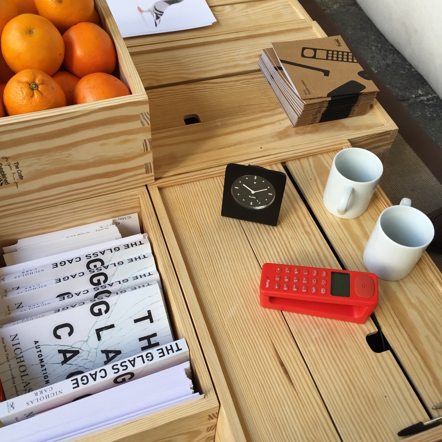
At the Punkt stand they were showing an alarm clock that is just an alarm clock. Radical. Well, it is when it's not your phone beside your bed with its distractingly easy access to emails, social media, the internet. In an era of mult…

At the Punkt stand they were showing an alarm clock that is just an alarm clock. Radical. Well, it is when it's not your phone beside your bed with its distractingly easy access to emails, social media, the internet. In an era of multi-functional devices Punkt want to make life simpler: one device, one function. It had a nice weighty feel to it too. They were handing out copies of The Glass Cage by Nicholas Carr which is an eye-opening look at how we've become slaves to automation. 

I took this photo inside Palazzo Litta where there was an exhibition called 'Materials: A Matter of Perception' organised by DAMN Magazine and Mosca Partners. To my shame I have to confess that I took the picture above without actuall…

I took this photo inside Palazzo Litta where there was an exhibition called 'Materials: A Matter of Perception' organised by DAMN Magazine and Mosca Partners. To my shame I have to confess that I took the picture above without actually noting down the name of the designer and was possibly thinking more in terms of instagramability.

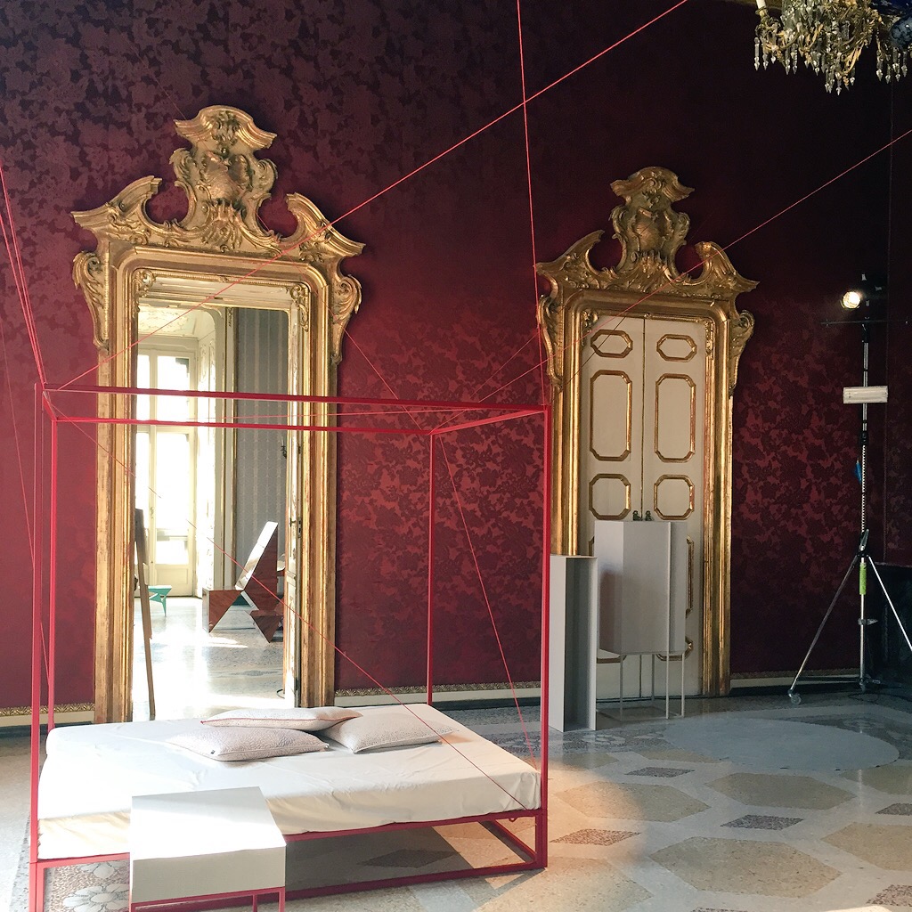
Here's another picture from inside Palazzo Litta with no designer's credit, but it is a fabulous interior. My insta-thumb was twitching I couldn't help myself. 

Here's another picture from inside Palazzo Litta with no designer's credit, but it is a fabulous interior. My insta-thumb was twitching I couldn't help myself. 

In the Brera district British architect Nigel Coates had got together with the owners of a castle in Tuscany called Castello di Potentino to create a collection called Paracastello. The idea being to reinstate the traditional rol…

In the Brera district British architect Nigel Coates had got together with the owners of a castle in Tuscany called Castello di Potentino to create a collection called Paracastello. The idea being to reinstate the traditional role of the castle as the hub of activity it once was for the surrounding area. They've worked with local craftsmen and local materials to design a range of furniture for this 21st century castle. It's not remotely edgy, but it's easy to grasp and I think has something positive to say about provenance, longevity and all round good vibes. They took over the very cool offices of a company called H+.

Check out their courtyard. With a curvy piece of furniture from Paracastello to the right, by Jono Nussbaum.

Check out their courtyard. With a curvy piece of furniture from Paracastello to the right, by Jono Nussbaum.

Over at the Fiera in the giant convention centre I couldn't resist the adorable mini-me Panton chairs at the Vitra stand. 

Over at the Fiera in the giant convention centre I couldn't resist the adorable mini-me Panton chairs at the Vitra stand. 

Office furniture gets a makeover in a softer, pastel colour palette as seen on the Aava Chairs by Antti Kotilainen at Arper. There's definitely something going on regarding the blurring of boundaries between the office and the home.&n…

Office furniture gets a makeover in a softer, pastel colour palette as seen on the Aava Chairs by Antti Kotilainen at Arper. There's definitely something going on regarding the blurring of boundaries between the office and the home. 

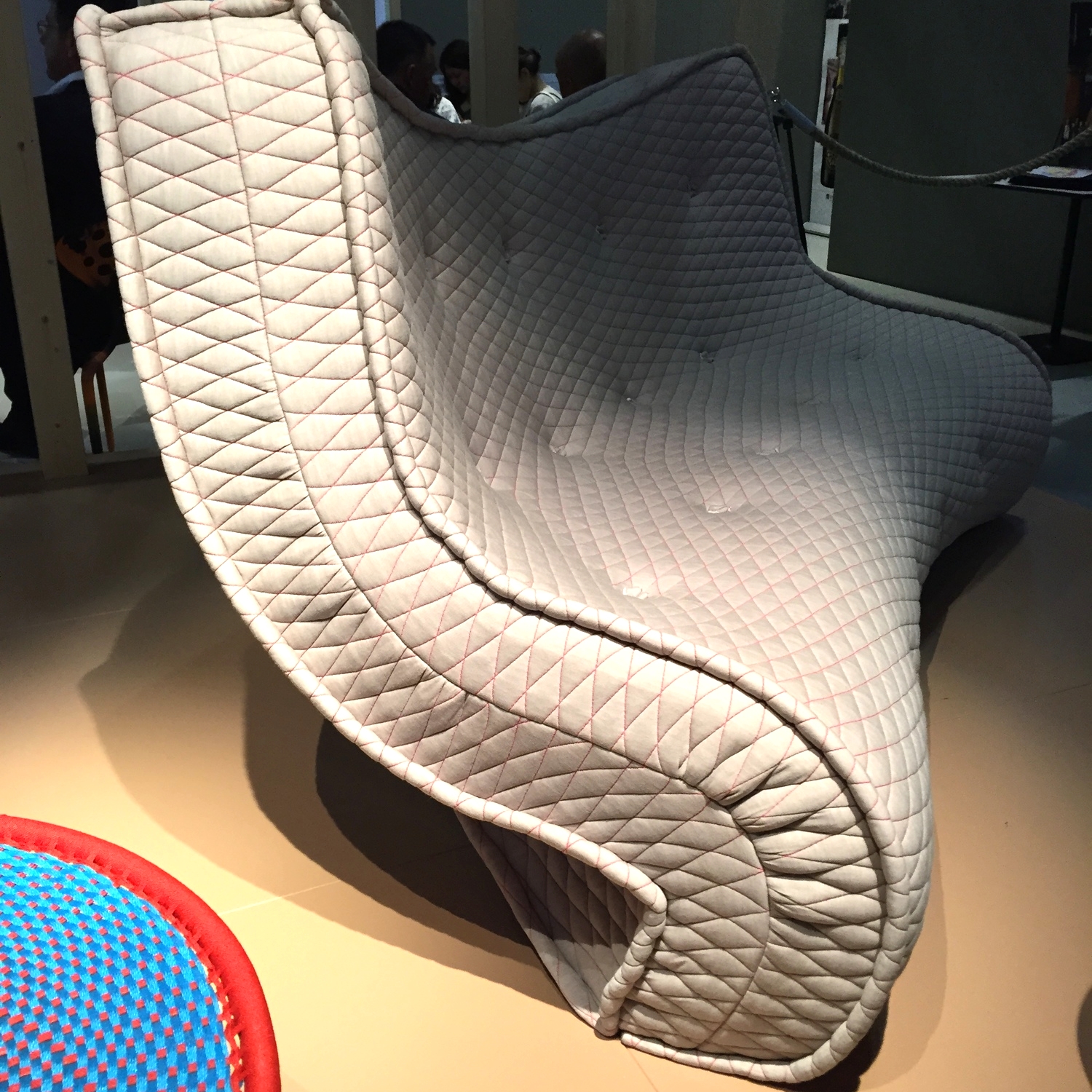
The Matrizia sofa by Ron Arad for Moroso, inspired by a mattress he saw on the streets of New York, is the kind of divisive object that will either make you smile or want to throw something. 

The Matrizia sofa by Ron Arad for Moroso, inspired by a mattress he saw on the streets of New York, is the kind of divisive object that will either make you smile or want to throw something. 

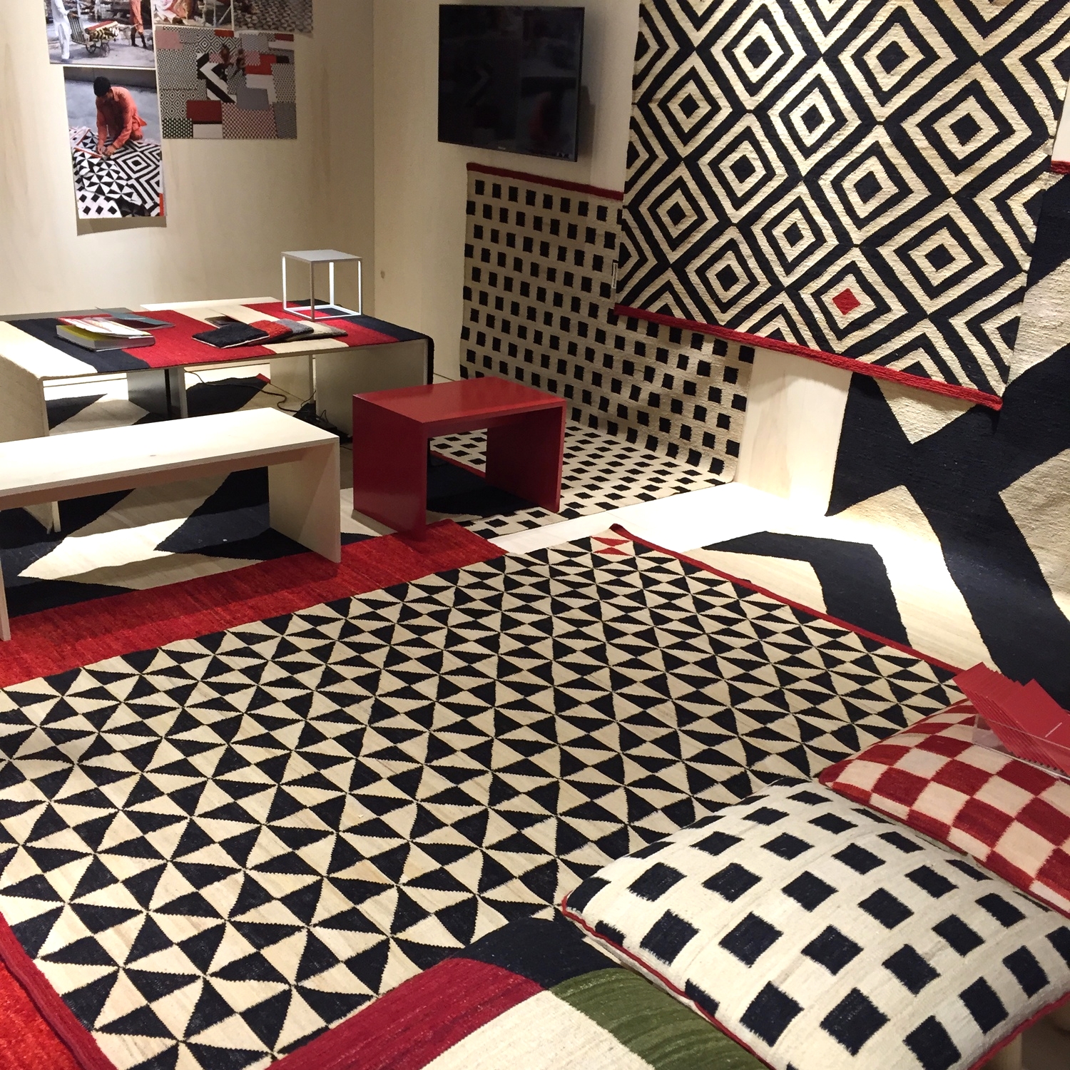
Black, white and red Melange Rugs by Sybilla which are handcrafted in Pakistan stood out on the Nanimarquina stand. 
Black, white and red Melange Rugs by Sybilla which are handcrafted in Pakistan stood out on the Nanimarquina stand. 

Back in the Brera district British designer Lee Broom created an old fashioned department store in what was one of the most ambitious presentations of the week. His lights and furniture were displayed to dramatic effect against a backdrop …

Back in the Brera district British designer Lee Broom created an old fashioned department store in what was one of the most ambitious presentations of the week. His lights and furniture were displayed to dramatic effect against a backdrop painted entirely in a powdery grey.

Lee Broom's Drunken Chair and Table gave more than a nod to the 1980s.

Lee Broom's Drunken Chair and Table gave more than a nod to the 1980s.

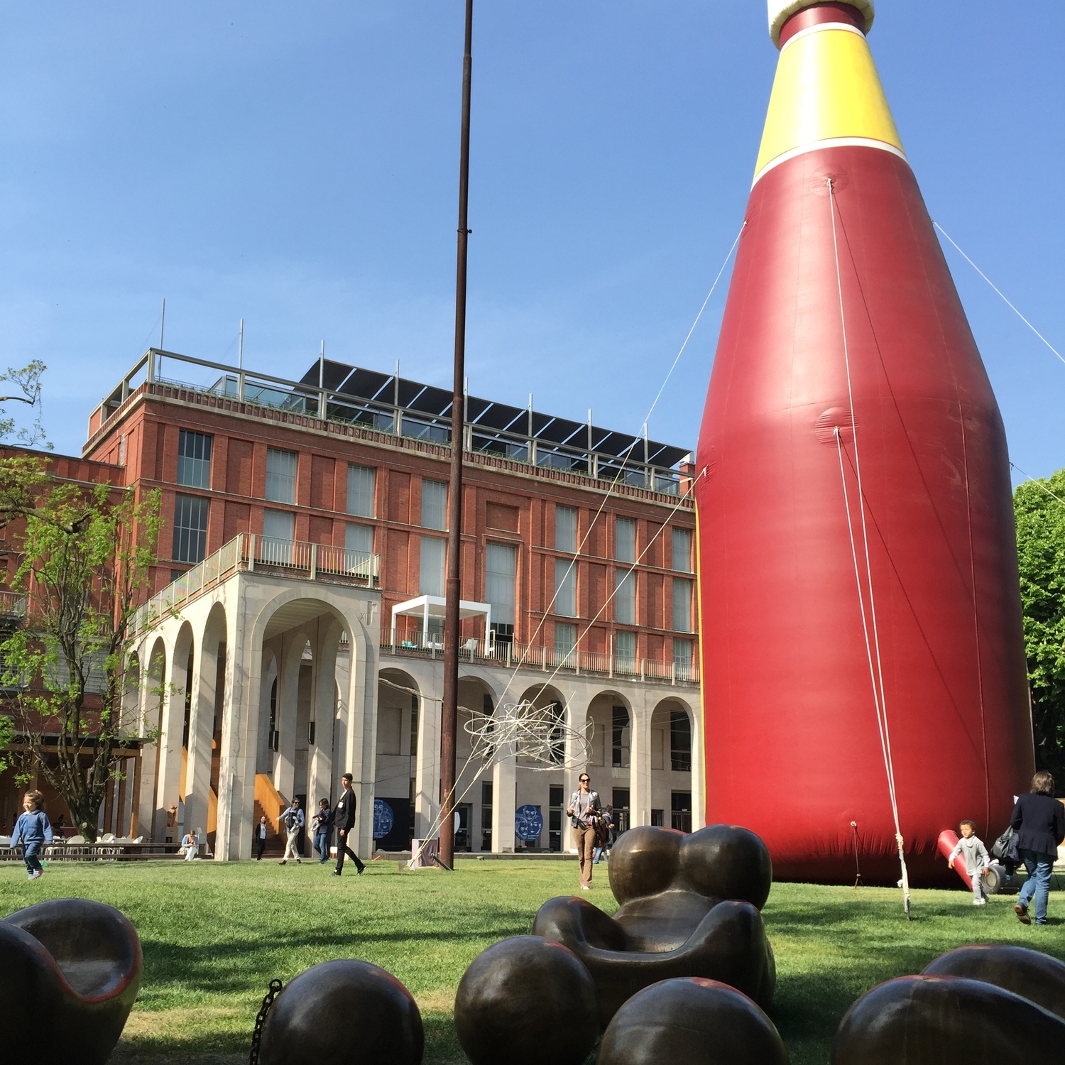
La Triennale, Milan's design museum in Sempoine Park, is hosting a fantastic exhibition which spills out in the gardens called "Arts and Food: Rituals from 1851" and is a beautifully curated antidote to all the newness on display. It's on until…

La Triennale, Milan's design museum in Sempoine Park, is hosting a fantastic exhibition which spills out in the gardens called "Arts and Food: Rituals from 1851" and is a beautifully curated antidote to all the newness on display. It's on until November as part of the Expo Milano. 

Woven baskets on display at La Triennale as part of the Constancy & Change in Korean Traditional Crafts presentation. I loved their exhibition at the London Design Festival last year when they showed zen-like mediation bowl bells.

Woven baskets on display at La Triennale as part of the Constancy & Change in Korean Traditional Crafts presentation. I loved their exhibition at the London Design Festival last year when they showed zen-like mediation bowl bells.

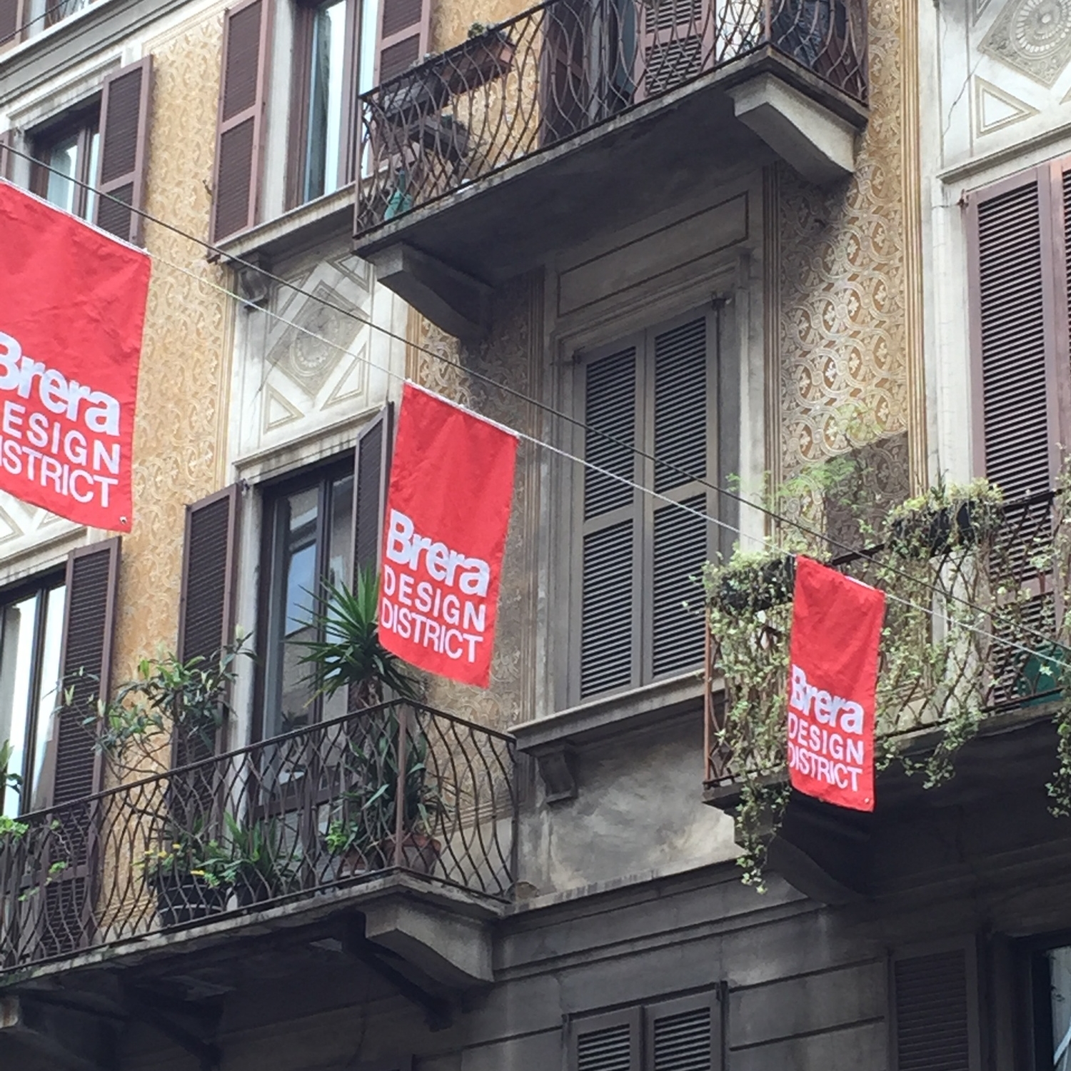
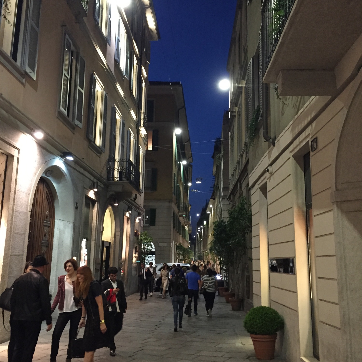
Brera is one of the nicest districts to wander around. 

Brera is one of the nicest districts to wander around. 

The streets were buzzing in the warm evenings. Arrivederci! Until next year.

The streets were buzzing in the warm evenings. Arrivederci! Until next year.


Design Classic: Hexagonal Table

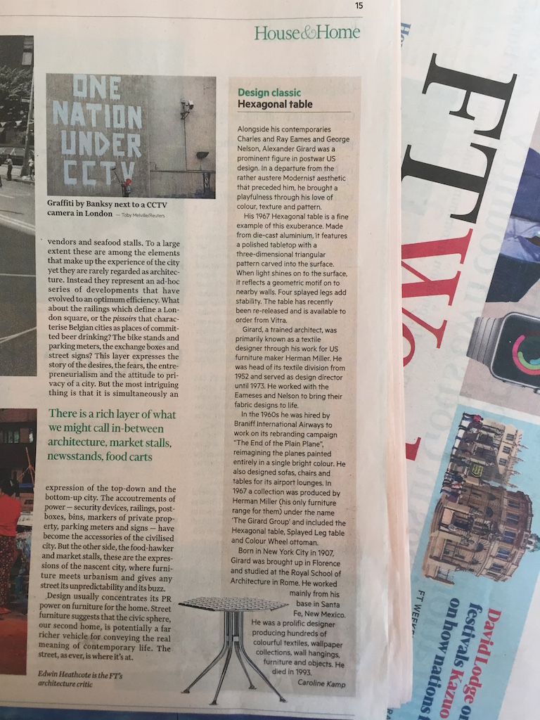
I wrote a short piece about the Hexagonal Table by Alexander Girard in the FT House & Home supplement the other week. One of the reasons I wanted to do it was to learn a bit more about Girard who was a prominent figure in post-war American design, but I would say isn't as well known as his colleagues Charles and Ray Eames.

Girard lived in Santa Fe, New Mexico with his wife Susan where he worked for US furniture makers Herman Miller and turned his hand to all sorts of design projects (textiles, furniture, graphic design, Braniff International Airways) as well as amassing a collection of over 100,000 pieces of folk art. He was crazy about pattern and colour. Click here.

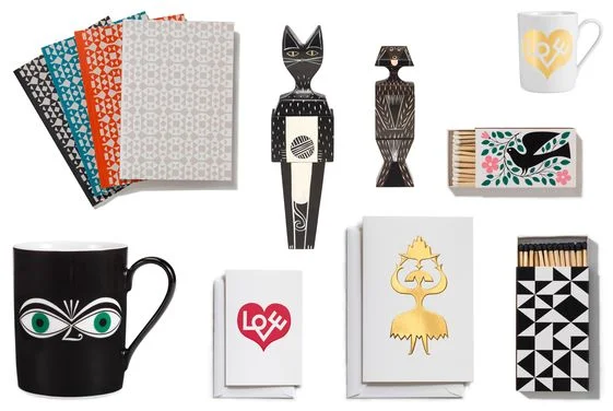
It's timely then that Vitra recently launched their Home Complements Collection featuring some distinctly folk-art influenced patterns and objects from the archive of Alexander Girard. The accessories range is based in the principle that "small things play a major role in our emotional attachment to the home" - a nice sentiment that explains our love of knick knacks - but also: "to bring a bit of joy to the everyday". Amen to that.

Alexander Girard's designs are the latest additions to the Home Complements Collection from Vitra. 

Alexander Girard's designs are the latest additions to the Home Complements Collection from Vitra. 

Despite being from Girard's archive I think it looks pretty fresh and 2015-ish. 


High fives to the sisterhood

womens-day-logo.jpg

It's International Women's Day on Sunday. YEAH!!!!!! 

But what does it mean? I was wondering that myself so after a bit of research I discovered that it happens every year on 8th March, it's global, in some countries it has become so important it's a national holiday, and it celebrates female achievement and equality in all aspects of life. We may take our right to vote for granted, but that freedom is obviously not the case worldwide.

Anyway, politics aside, while the day has its roots in the socialist movement of the early 1900s it seems like a good opportunity to take a minute to think about some rad women in design today.

Dutch designer Hella Jongerius stands for quality over novelty

Dutch designer Hella Jongerius stands for quality over novelty

What got me thinking about this was an article I read on Dezeen about Hella Jongerius, the Dutch industrial designer, who said this week that the design industry has lost touch with its social and cultural values and is producing "too much shit design".

I love a good quote and this one made me sit up and listen. She argues that design companies need to take a more ethical approach and focus on quality rather than novelty: "there's too much shopping without thought" (er, guilty). You can read the full article here. She is currently design director of Dutch company Danskina which makes beautifully crafted rugs. 

Ilse Crawford, launch editor of Elle Decoration and founder of StudioIlse.

Ilse Crawford, launch editor of Elle Decoration and founder of StudioIlse.

A few weeks ago, another comment grabbed my attention when designer Ilse Crawford announced her new StudioIlse furniture range with Ikea. One of the materials she's decided to use is cork because, apart from its acoustic qualities, "no one wants wine corks any more". You can read the full article hereI love the idea of re-purposing a material and cork is a fantastic environmentally friendly product - cork is stripped from the bark of trees, so it's sustainable as they don't need to be chopped down, and there are huge cork oak forests in Portugal.

Ilse Crawford was the launch editor of Elle Decoration (in 1989). She's been running StudioIlse since 2001 and created the much emulated laid-back interiors of Soho House and Babington House. Her focus is always on how the space makes you feel and with consideration for life's "messy realities". The normal, over the spectacular. I love that.

Italian designer Paola Navone has a feel for textiles

Italian designer Paola Navone has a feel for textiles

I heard Paola Navone introducing her fabric collection for high-end Italian textile company Rubelli a few months ago and I thought she was fantastic. Not just for rocking oversized jewellery, but because she said, in the context of explaining why one fabric was a bit rough around the edges that was meant to look "like your cat has destroyed it". 

She has spent twenty years living in SE Asia learning about craft and takes a painterly approach to fabric. She says: "I try to promote imperfection. Those little accidents - I like them. Things get old, textiles age, the industry doesn't like to talk about it". 

"I work fast. I don't look back, I don't have a sense of history. My favourite project is the one I'm working on, or the next one. And if we don't have a client we go to the beach". She's got attitude. 

London-based Greek designer Afroditi Krassa has redesigned Curzon cinemas

London-based Greek designer Afroditi Krassa has redesigned Curzon cinemas

Afroditi Krassa works mainly in hospitality design which is something we can all have an opinion on as we actually get to experience it. Do you like the feel of Itsu, the packaging at Pret, the cosiness of the upgraded Curzon cinemas? Afroditi's design studio was behind them all. She even did my local Cafe Rouge and has just won an award for the design of Heston Blumenthal's The Perfectionist's Cafe at Heathrow's Terminal 2. I was introduced to Afroditi during the London Design Festival last year at the bar she had designed for the SuperBrands exhibition and I was impressed with her intelligent approach to designing social spaces. 

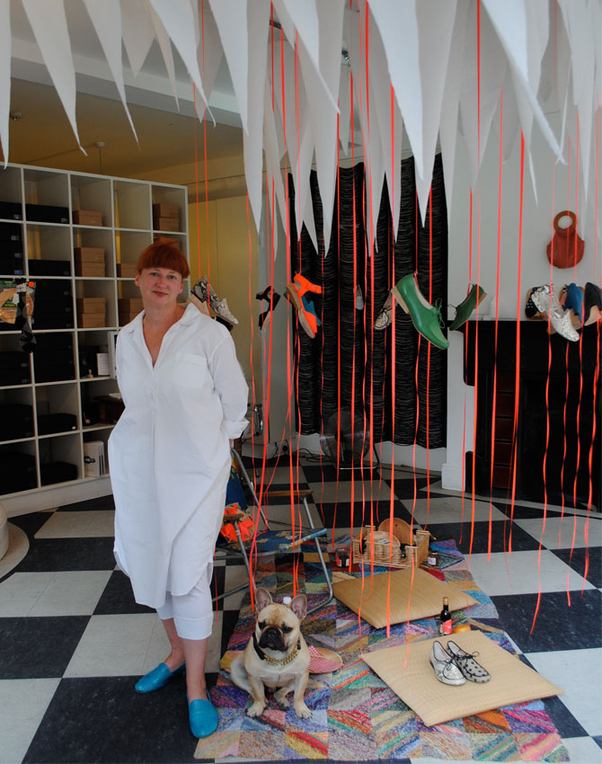
Tracey Neuls designs shoes that make you feel empowered, not impeded. Picture from The Women's Room blog.

Tracey Neuls designs shoes that make you feel empowered, not impeded. Picture from The Women's Room blog.

I stumbled across Tracey Neuls shoes at last year's Designs of the Year media preview at the Design Museum where she was nominated for her rubber-soled Geek shoe for cyclists. Tracey is an Australian-born designer, based in London, whose design ethos resonates with me. "Good design is something you feel as well as see", she says. "You wear the shoes, the shoes don't wear you".

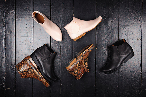
She launched her business in 2000 and takes a traditional approach to shoe-making by designing all the toe and heel shapes from scratch - no pre-fabricated components - so they're not cheap, but they will last. She displays them in her Marylebone and Redchurch Street shops by dangling them from the ceiling. As a recent convert to flat ankle boots I can walk around town in all day I'm going nuts for her new collection (pic below).

Made for walking: good design is timeless and never goes out of fashion. 

Made for walking: good design is timeless and never goes out of fashion. 

As with any list it's completely subjective and I've only picked five awesome women today, there are many more. But this post has been done in the spirit of an upbeat quote I read the other day: "celebrate what you want to see more of". 

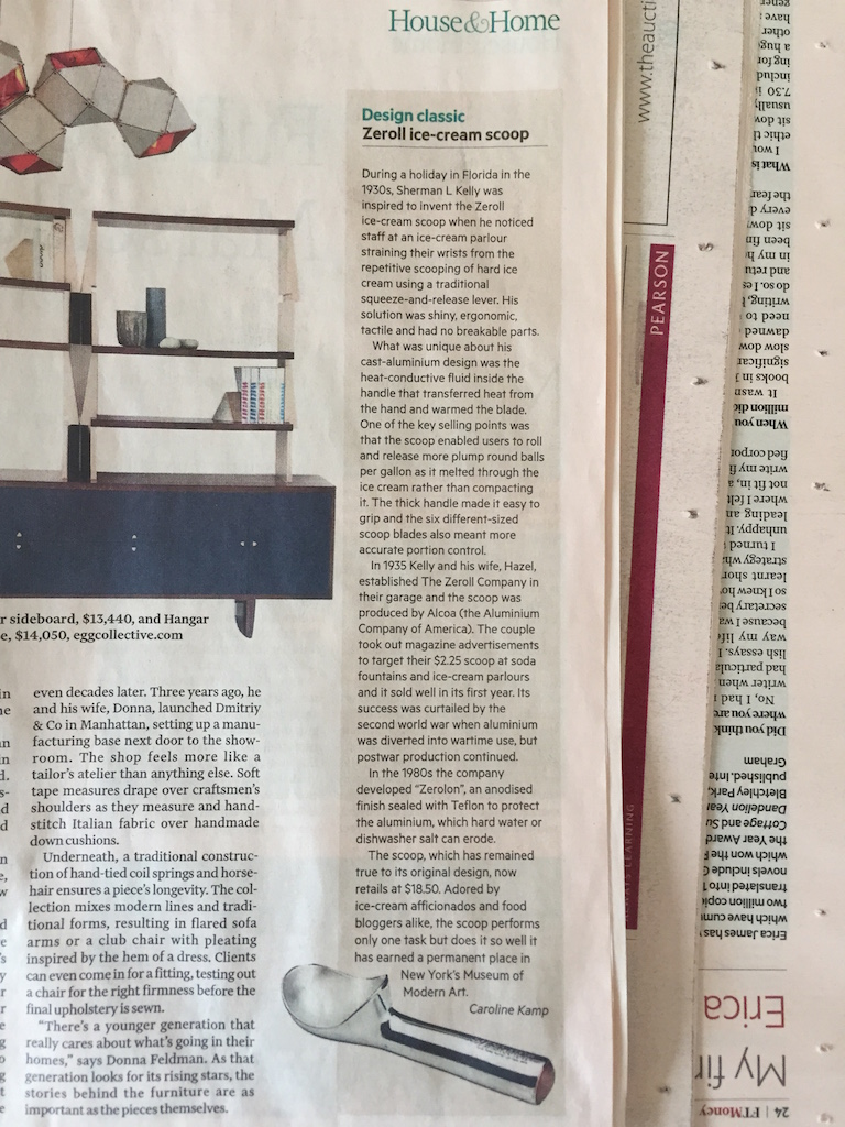
Design Classic: Zeroll ice-cream scoop

I love it when seemingly humble household items have an interesting design story behind them. The Zeroll ice-cream scoop (I wrote about it in FT House & Home 21st February) is a great example of this. It has heat-conductive fluid in the handle which transfers heat from your hand to warm the blade thus enabling you to roll and release balls of ice-cream more easily. Intended for commercial use in ice-cream parlours (the more you use it the better it works) it has become a favourite with ice-cream afficionados and food bloggers.