Streetwires, Cape Town

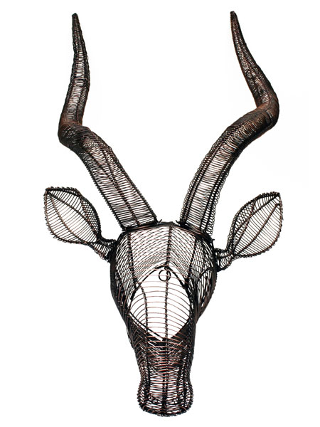
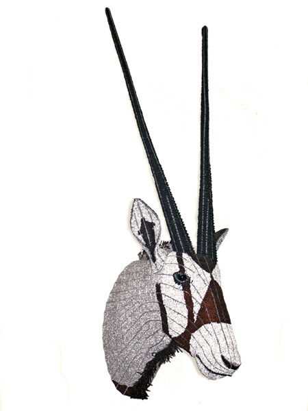
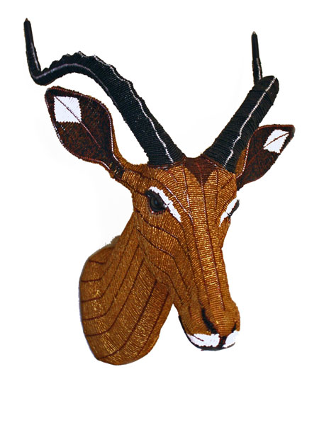
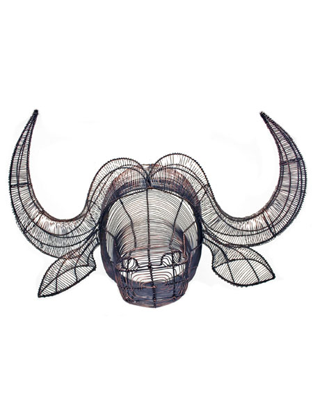
Step aside Nordic antlers... 

A friend from South Africa was telling me about these wire and bead beauties over the weekend as apparently they are big in Cape Town. 

And I can see why, I think these "trophy heads" are hugely appealing and they feel like a very modern way of acknowledging the wonder of African animals rather than say killing and mounting the real thing, so 19th century. They are made by a local Fair Trade company called Streetwires which also makes some lovely wire 'n' bead baskets and bowls.  


Indie of the Week #44: The Artful Project

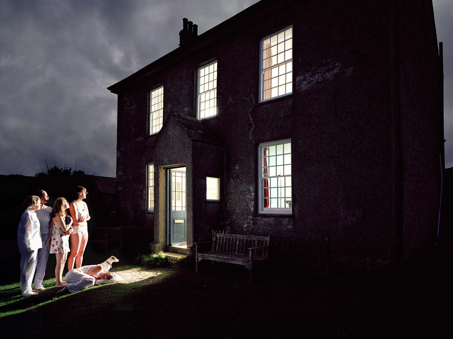
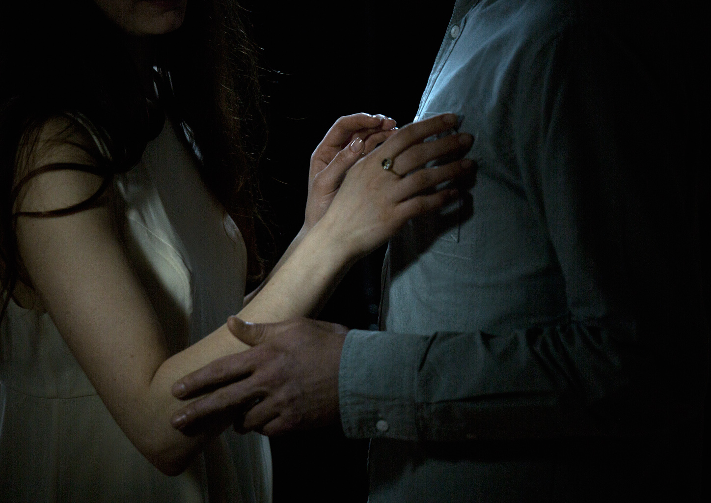
'Untitled' by photographer Frank Herholdt

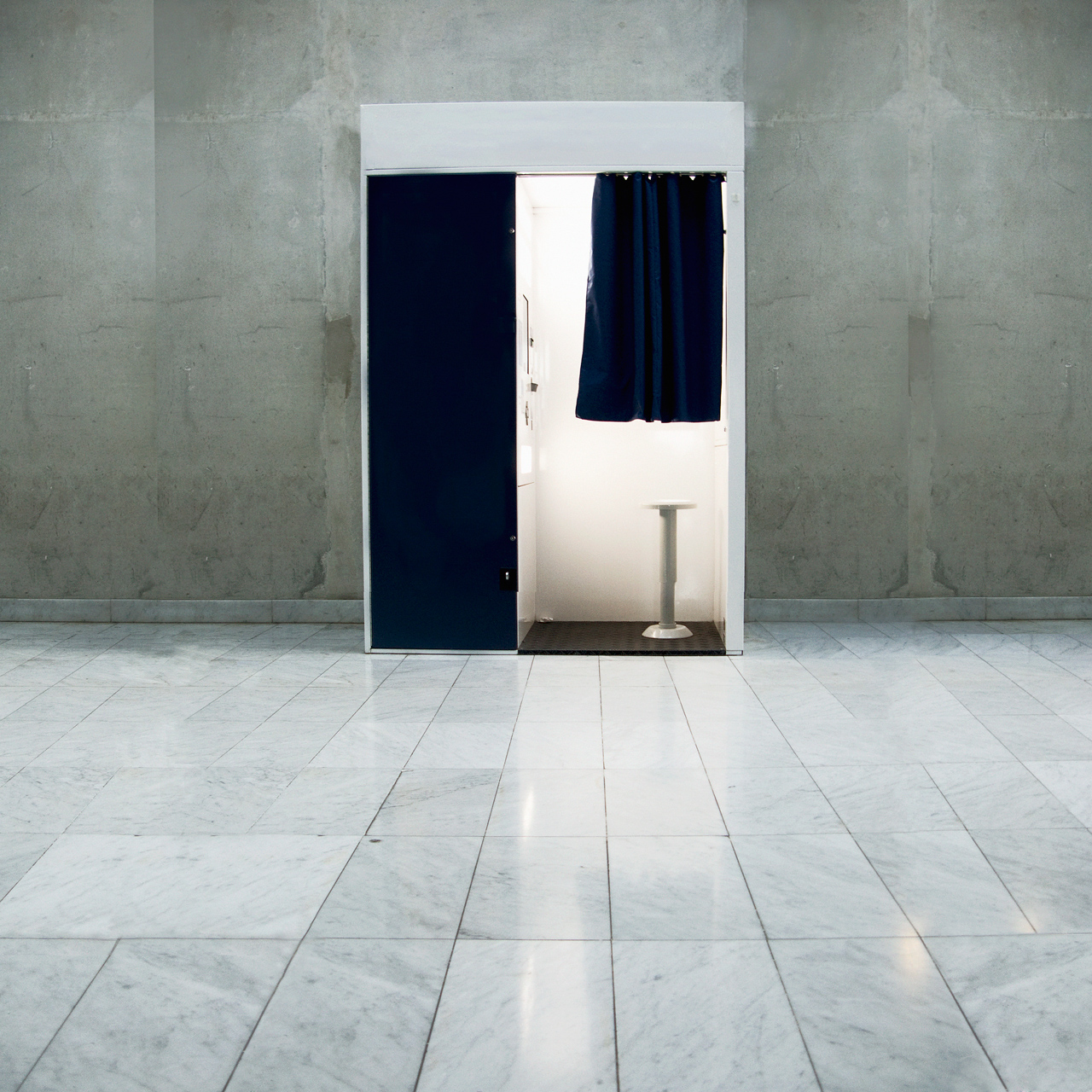
'Untitled' by photographer Frank Herholdt

I met the founders of The Artful Project when I was at Clerkenwell Design Week last month and was immediately struck by what a good idea it was - and also what a great Indie of the Week they'd make. Set up by a creative husband and wife team, with years of experience in the design/photographic/creative industries, The Artful Project is a gallery that wants you to come in. It's the antithesis of the snooty, off-putting, we don't really want your custom and you probably can't afford it anyway art gallery vibe. And it's online only, so you don't even have to face the terrifying person with the asymmetrical haircut.

The idea is to democratise the process [very now] and turn us all into art collectors by making it affordable. I like the sound of that and after a scroll through the galleries I was pleasantly surprised. Lately I've been wondering what the future is for proper photography now we've all got smart phones and Instagram's moody filters in our pockets, but actually there is a difference. And when it's done well a photograph really can make you stop and want to look again. 

Who are you? Joshua Blackburn, co-founder of The Artful Project, a new online art gallery.

Where can we find you? theartfulproject.com

Describe your website in five words: “The new home of affordable art” (Please forgive that extra word…)

What makes you different? We sell extraordinary art at an ordinary price. The real difference, however, is our mission to challenge the traditional gallery formula and inspire a new generation of art buying by making great work accessible and affordable to everyone.

How do you decide what makes the cut? If it’s exciting, original, evocative, thoughtful, bold and impeccably well crafted, it makes the cut.

What were you doing before you did this? I ran a design agency called Provokateur for ten years and Rachel, our co-Founder and Head Curator, was the Creative Director of a large photography agency.

If you were starting again what advice would you give yourself? Erm… not have a new baby at the same time as launching a business.

What are you most proud of? In terms of Artful, it would be launching a business with such a stunning collection of original work that immediately got people talking. And doing this while dealing with a newborn baby (see above).

Do you have a favourite thing in the store right now? It depends who you ask! Josh loves pretty much everything by Frank Herholdt – whose work is truly one of a kind. Rachel loves James French’s Boats (as do most people) and Jump #01.

What's hot for 2014? Extending the collection to include illustration, graphic design, letterpress and screenprints. It’s going to get exciting.

'Indie of the week' celebrates the best independent stores around. These places sell interesting and varied collections of design-related things you don't see everywhere else. They may support young or local designers or be great at finding unique things from around the world. By thinking a little more creatively about what they stock they are fighting the bland homogenisation of so much of the high street. And since I'm down with the realities of modern life, online only stores count too, because a beautiful and easy to use website is just as delightful an encounter in cyberspace.

Do you you have a favourite store? I'd love to hear from you.

GROW London

There's a hip new gardening fair coming to Hampstead Heath this Friday it's called GROW London (20-22nd June) and it's aimed at urban gardeners. According to the press release "black is the new green" ... “Black fences, black-stained raised beds and black planters are a perfect foil for green leaves and bright blooms. The English summer suits a black garden with its cool light and shady trees.”

You heard it here first. 

Steampunk walls

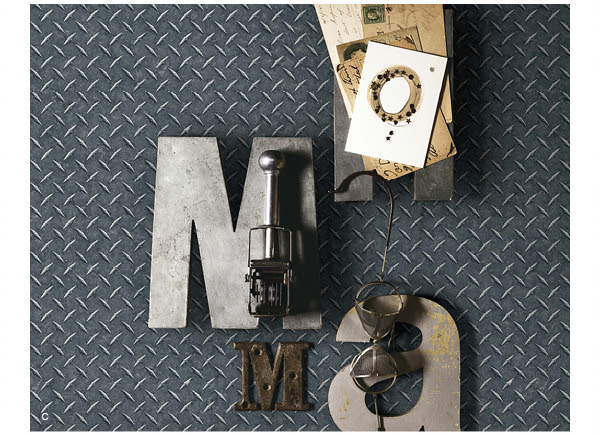
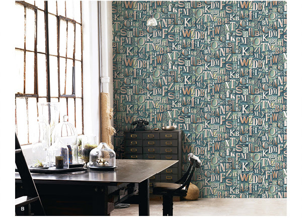
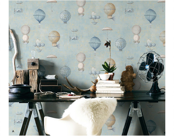
Now you can fast track your space to a more industrial look with these Steampunk wallpapers from Galerie. So instead of having to actually move to inner city loft style premises you can stay where you are and cheat your way to exposed brick, concrete or etched metal walls. Gritty.


June issue

The June issue of The London Magazine is out and this month I wrote my column about the pop-up Scandinavian mid-summer cafe which is taking over the Platform space (upstairs) in Habitat on the King's Road. You can read the text online here. It's been organised by hip London design show designjunction as a preview of what will be coming to the big show in September. The London Magazine are media partners for the event which I'm very excited about.  

Felicity Jones looks pretty hot on the cover and I like the Instagrammy colour palette too. 

Lavender Print School

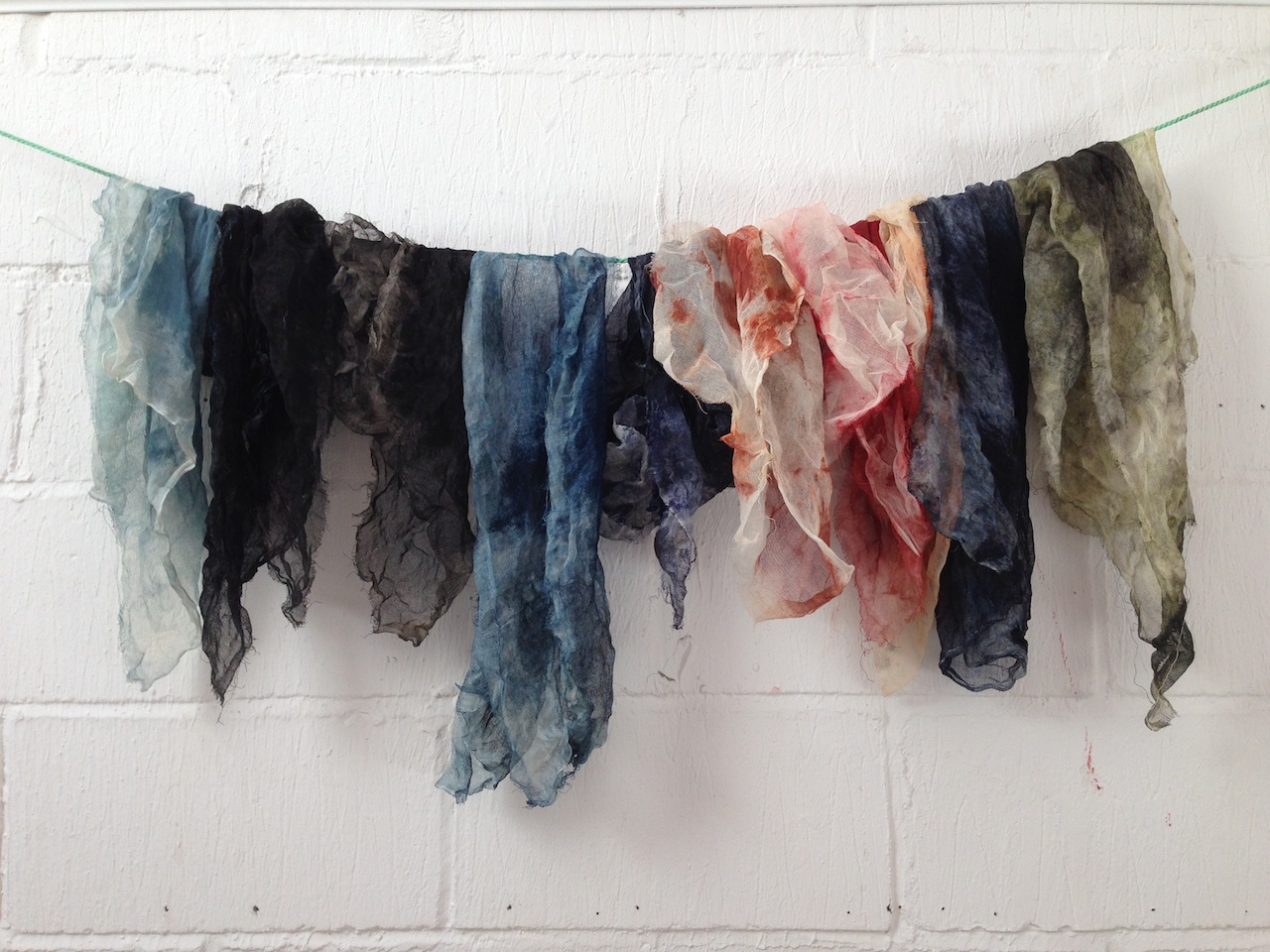
Even the rags looked good here

Even the rags looked good here

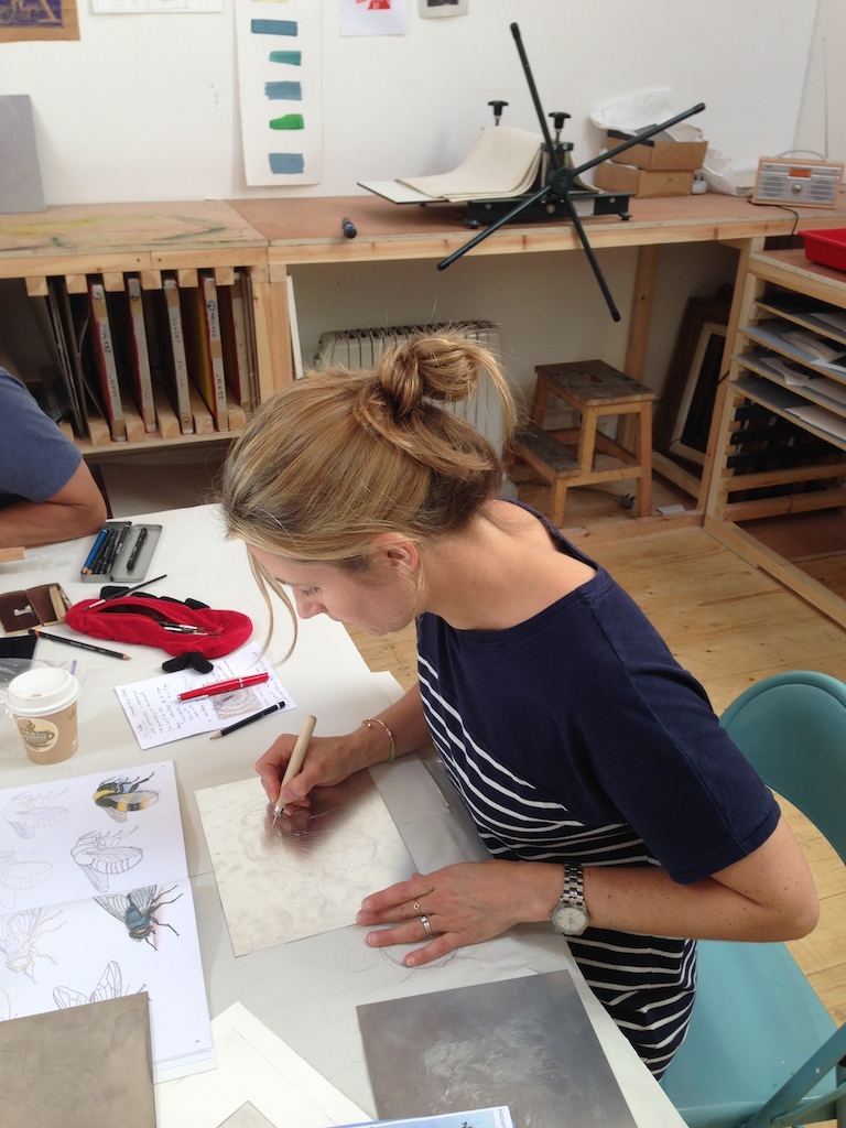
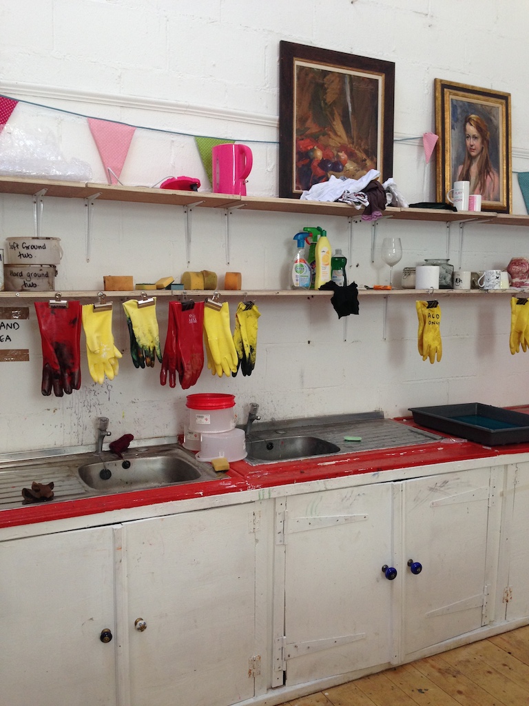
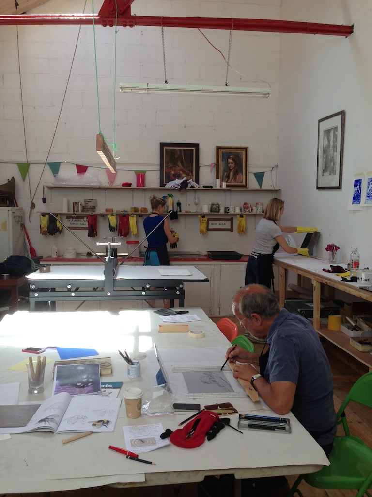
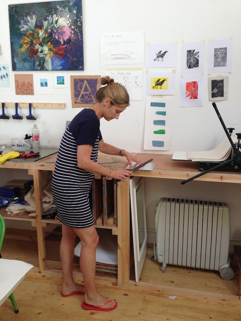
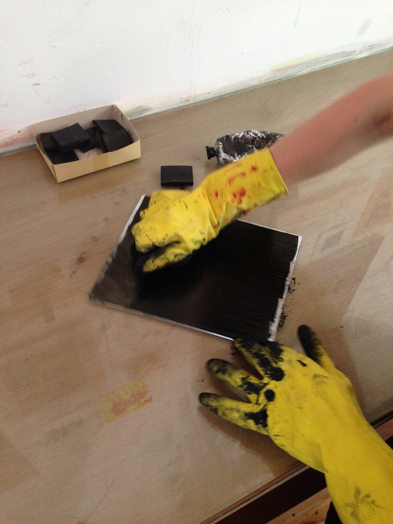
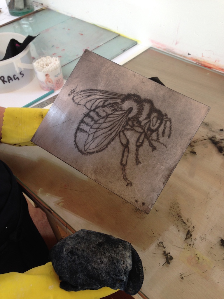
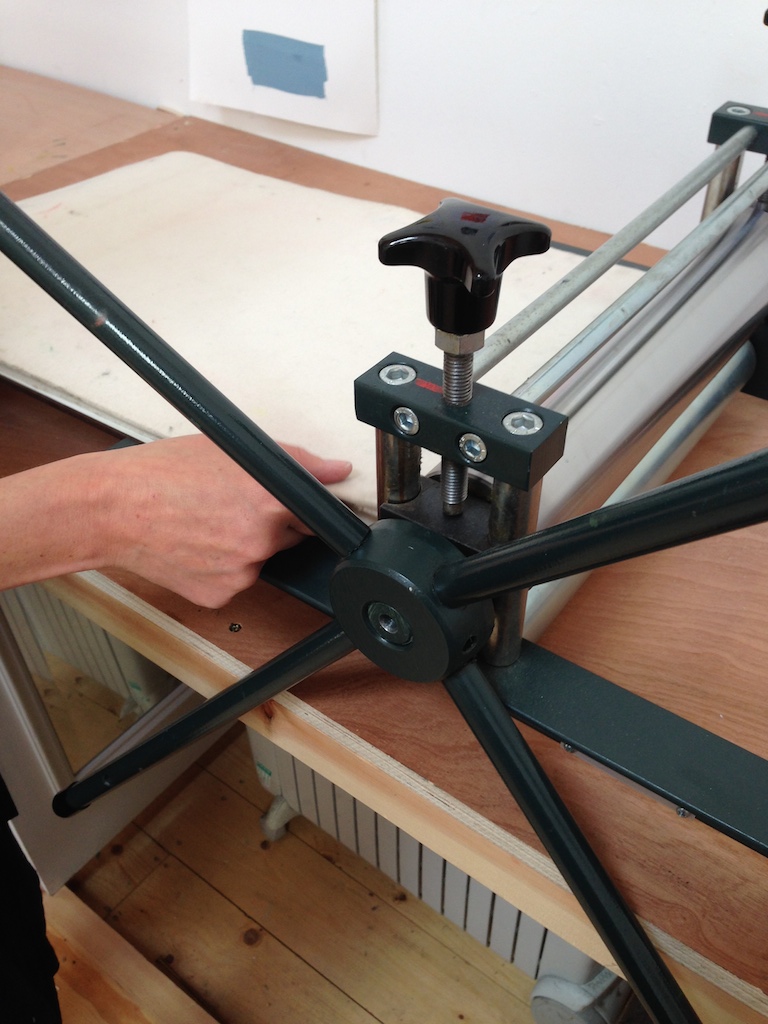
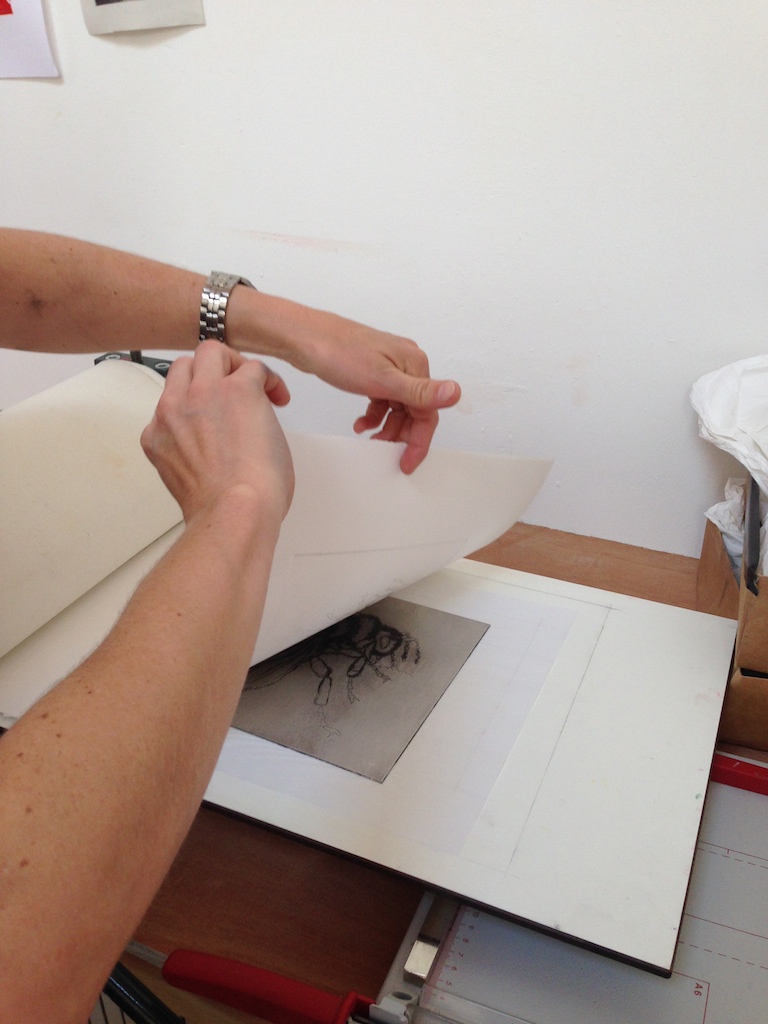
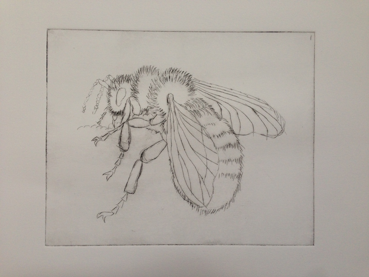
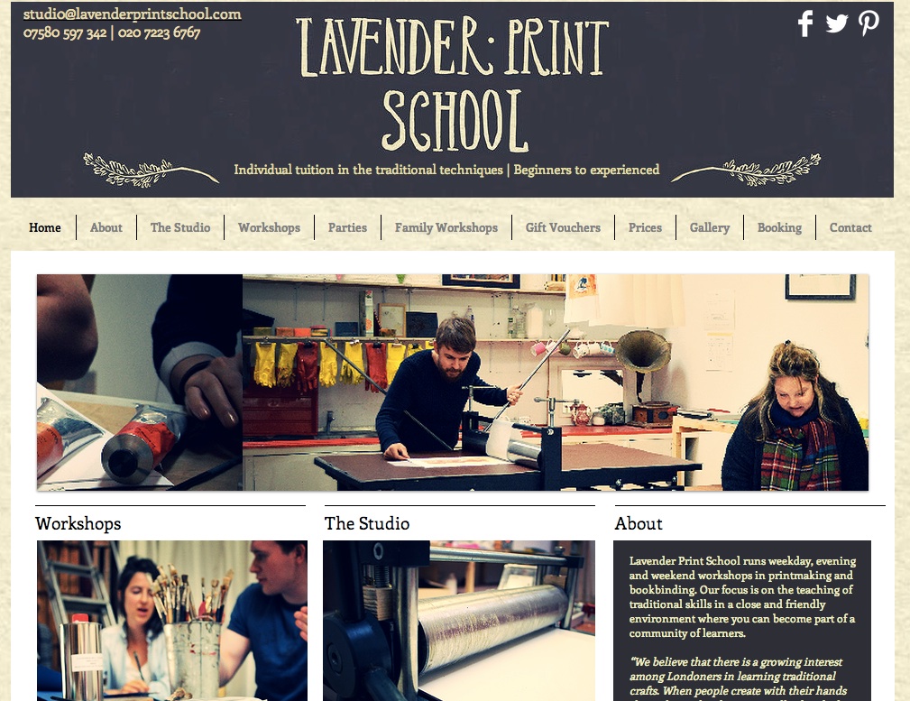
I had a great day at the Lavender Print School in Battersea last week. As I mentioned in a post a couple of weeks ago they invited me along to see what printmaking is all about. As someone who left art behind after GCSEs this was a total joy, even the smell of the place brought back memories. Under the instruction of artist and printmaker Liz Miller I scratched out an etching of a bee, copied from a book I hasten to add, on an aluminium sheet in a process known as 'dry point' which I, or rather, we, then inked up and printed onto lovely heavy-duty paper. 

Lack of time is obviously a major hindrance to booking something like this - who has time for themselves? But they do evenings 7-9pm for £30 per person and half a day at the weekend am or pm for £40 per person. If you fancy some handmade art for your walls - whether it's an etching or lino cutting, both very much the look of the moment - then I'd urge you to have a go. They do family printing days when you can bring the kids and they've got a hen party coming in this weekend. 

The school is run by Izzy Moreau and Nick Bashall (read more about them here) who between them have some pretty serious artistic chops; Izzy also runs Lavender Leonardo's children's art school (very popular), and Nick runs Lavender Hill Studios which teaches traditional painting and drawing. 

Crypt on the Green at St James's Church

This is the last Clerkenwell post, I promise . . . The Crypt on the Green at St James's Church hosted a collection of retail friendly interior accessories from some great designers which I can guarantee will be coming to shops near you soon. It was …

This is the last Clerkenwell post, I promise . . . The Crypt on the Green at St James's Church hosted a collection of retail friendly interior accessories from some great designers which I can guarantee will be coming to shops near you soon. It was sponsored by Triitme - a Spanish online design company - the spelling of which sticks in my throat slightly. 

There were some very appealing textiles from Etoile Home 

There were some very appealing textiles from Etoile Home 

Capturing the mood for all things geometric and metal was this I'll take it all please stationery and jewellery from Lovely Pigeon

Capturing the mood for all things geometric and metal was this I'll take it all please stationery and jewellery from Lovely Pigeon

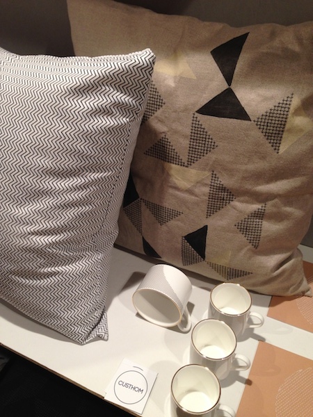
I really liked the very delicate pattern and print from Custhom

I really liked the very delicate pattern and print from Custhom

Also these lovely copper and ceramic vessels from Tunisia by Hend Krichen (slightly fuzzy pic above)

Also these lovely copper and ceramic vessels from Tunisia by Hend Krichen (slightly fuzzy pic above)

Keeping it real over at the House of Detention, a subterranean former Victorian prison, were some up and coming designers. 

Keeping it real over at the House of Detention, a subterranean former Victorian prison, were some up and coming designers. 

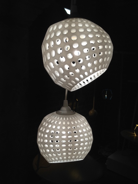
You can design your very own 3D printed light shade with Alexa Getting from Get Bli Designs. She told me she'd designed a light for a band so their name would project across the stage. Pretty cool. 

You can design your very own 3D printed light shade with Alexa Getting from Get Bli Designs. She told me she'd designed a light for a band so their name would project across the stage. Pretty cool. 

I really liked this desk and stool by James Tattersall.

I really liked this desk and stool by James Tattersall.

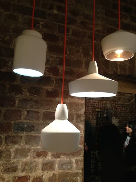
Ditto these earthenware spinning top lights by Room 9. Again, slightly fuzzy pics on account of the prison darkness.

Ditto these earthenware spinning top lights by Room 9. Again, slightly fuzzy pics on account of the prison darkness.

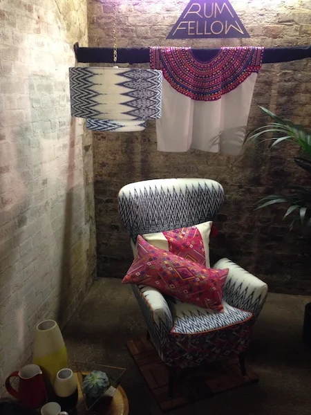
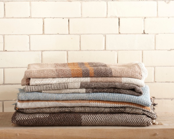
And, finally, I was very taken by the global traveller vibe of these textiles from A Rum Fellow. Good name too.

And, finally, I was very taken by the global traveller vibe of these textiles from A Rum Fellow. Good name too.

Clerkenwell continued . . .

The wondrous Farmiloe Building on St John Street played host to the main events at Clerkenwell Design Week. This Foscarini lighting installation was pretty dramatic.

The wondrous Farmiloe Building on St John Street played host to the main events at Clerkenwell Design Week. This Foscarini lighting installation was pretty dramatic.

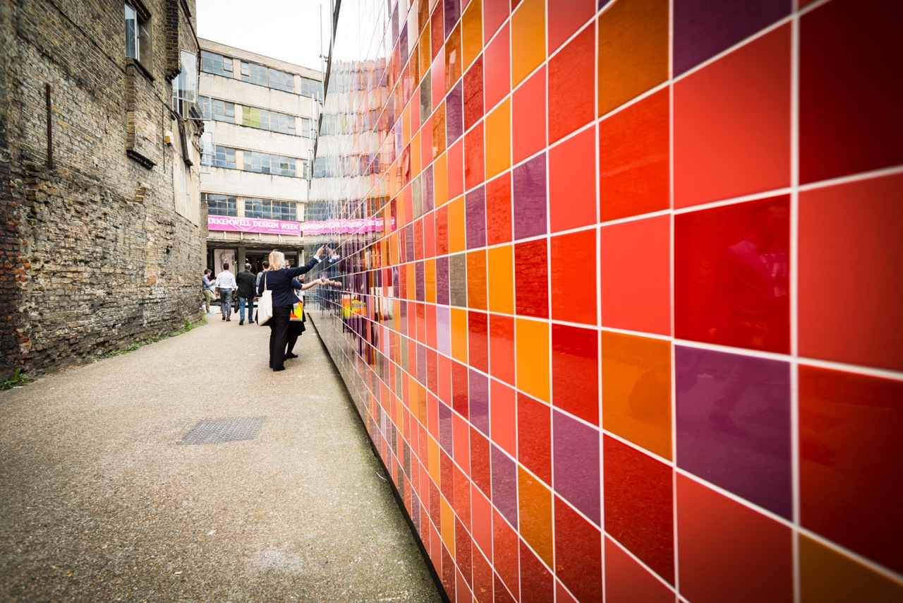
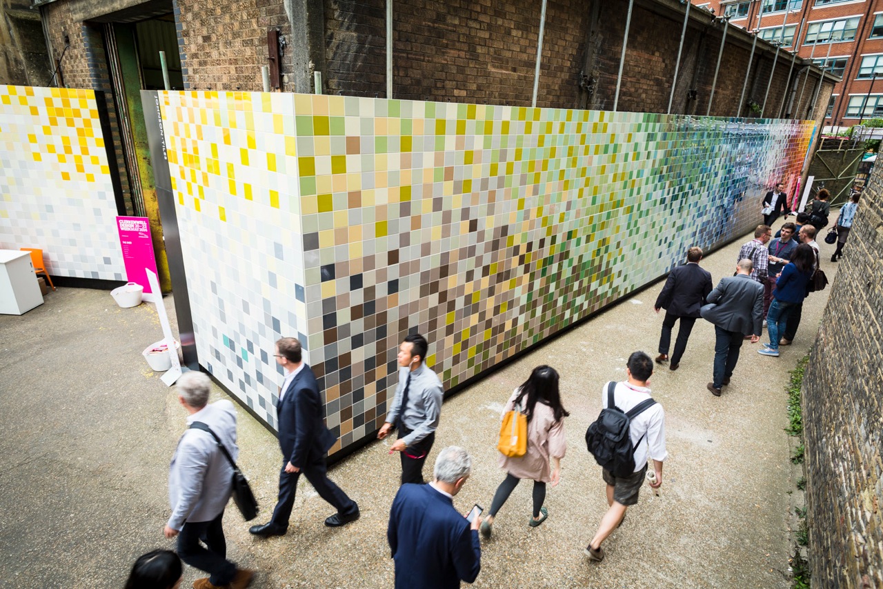
Walking in to the Farmiloe Building off the street it was impossible to miss the giant mural of tiles by textile artist Ptolemy Mann (pictured, right). It was made up of over 4,000 tiles - using only 68 colours although it looks like much more - from the new Johnson Tiles Prismatic collection

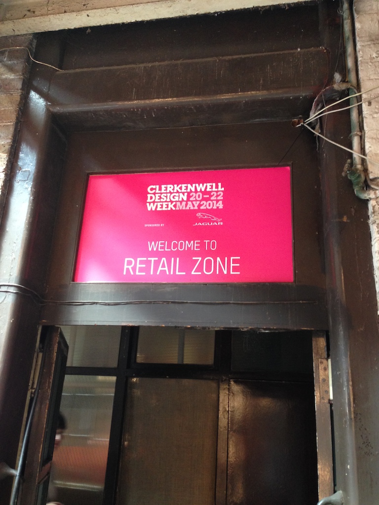
Upstairs I knew I was in the right place when I saw this sign.

Upstairs I knew I was in the right place when I saw this sign.

In the retail zone I spoke to Eddie from Dyke & Dean purveyors of pic n mix lighting fixtures. If you are a fan of retro filament light bulbs and enamel shades dangled from colourful cord then you can get all you need from here. They also h…

In the retail zone I spoke to Eddie from Dyke & Dean purveyors of pic n mix lighting fixtures. If you are a fan of retro filament light bulbs and enamel shades dangled from colourful cord then you can get all you need from here. They also have concessions in several Heal's stores and are definitely candidates for Indie of the Week, watch this space. 

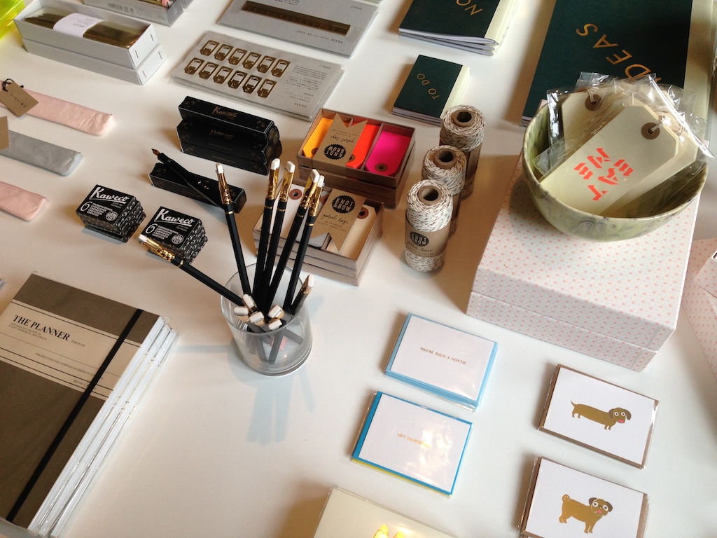
I also caught up with Lucy from Quill London, a former Indie of the Week, and I spent probably slightly too long stroking her beautiful new stationery collections.

I also caught up with Lucy from Quill London, a former Indie of the Week, and I spent probably slightly too long stroking her beautiful new stationery collections.

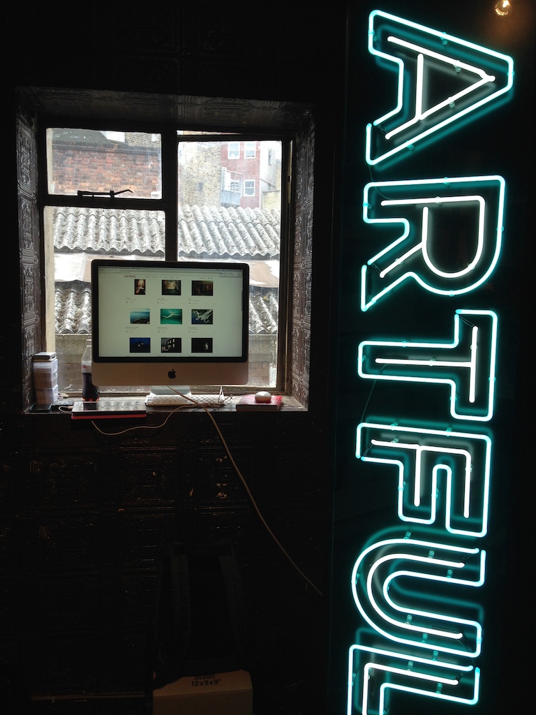
This picture didn't turn out quite as I'd hoped, apologies, but The Artful Project is a great idea - it's a new online art gallery where you can buy affordable art (initially photography) with ease. "Anybody can be an art collector" they s…

This picture didn't turn out quite as I'd hoped, apologies, but The Artful Project is a great idea - it's a new online art gallery where you can buy affordable art (initially photography) with ease. "Anybody can be an art collector" they say, they want to open up art buying, democratise the process and inspire a broader love of art. Noble ambitions, I like the sound of it.  

I also chatted to Bruno of Bruno + Bean, a Scandi/Nordic/British/Irish online design shop which is hopefully becoming a bricks and mortar shop in London soon. And I spoke briefly with Holly of Holly's House a furniture and home accessories shop on the New King's Road which also offers an interior design service. Again, I think they'd all make great Indie of the Weeks.

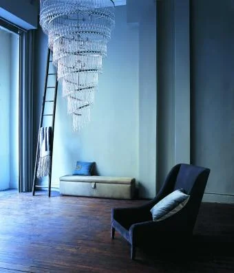
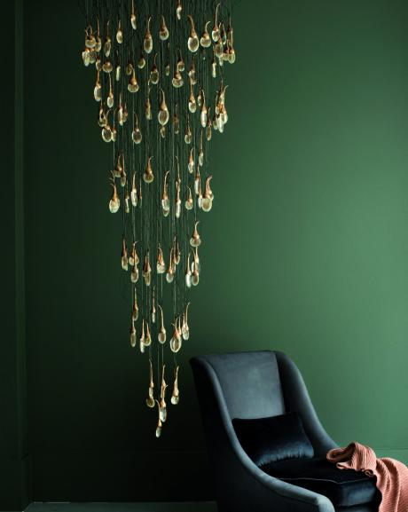
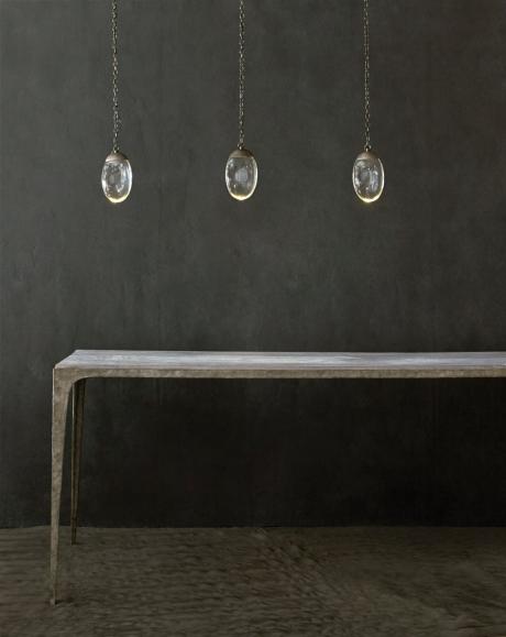
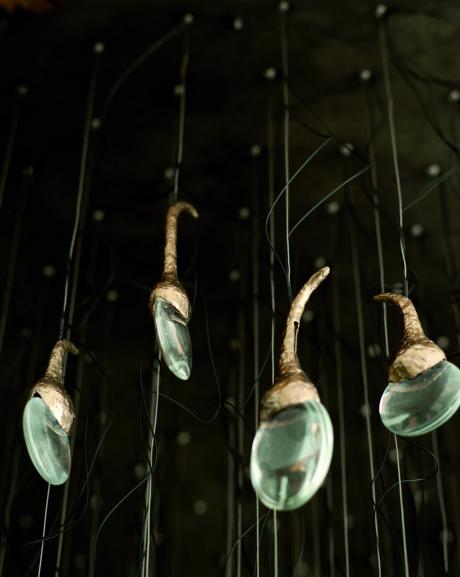
I visited the beautiful Ochre showroom and was inspired not only by the three women behind this established design business, but also the stunning craftsmanship on display. They specialise in understated, beautifully crafted lights such as the celestial pebble and seed cloud (above) and they've just launched two new leather-bound chairs with scallop stitched edges (like a handbag): the slim and sturdy 'sable' and 'carbou'. It's fabulously high end, moodily styled, dreamy stuff. I'm sold. Apparently they do a good sale.

The SCIN Gallery on Old Street was hosting an exhibition of furniture and tableware made from sustainable American hardwoods. To celebrate five years of Clerkenwell Design Week, they used five different woods - tulipwood, ash, hard maple, red oak an…

The SCIN Gallery on Old Street was hosting an exhibition of furniture and tableware made from sustainable American hardwoods. To celebrate five years of Clerkenwell Design Week, they used five different woods - tulipwood, ash, hard maple, red oak and cherry - and five design teams from OKAY Studio to come up with these completely new products (pictured below).

Why should you care about American hardwoods? The short answer is this is good wood... it's sustainable, harvesting is below the rate of growth, so these natural forests (not plantations) are actually growing not depleting. Right on.

The Order of St John in Clerkenwell

A collaboration between the Campana brothers and Italian furniture brand Edra on display in the crypt at The Order of St John during Clerkenwell Design Week 2014

A collaboration between the Campana brothers and Italian furniture brand Edra on display in the crypt at The Order of St John during Clerkenwell Design Week 2014

I was in London on Tuesday for the first day of Clerkenwell Design Week, now in its fifth year, it's a three day event which brings together the many creative businesses in the area (architects, design studios..) and invites companies from around the world to exhibit their latest wares. 

What sets it apart from other Earl's Court style trade shows (yawn..) is you get to wander around the historic streets of EC1 (actually outside and in the sunshine) and the exhibitions are held in the most brilliantly titled venues, such as the Order of St John above, a former monastery and now a museum, and my personal favourite: the House of Detention, a former Victorian prison.

It was just a shame this year they'd decided to add such anodyne exhibition names as "Detail" (at the Order of St John) and "Platform" (at the House of Detention) to the already memorable building names. Even the stunning, industrial, historic Farmiloe Building - the heart of the event where there are product displays, a retail section where you can actually buy stuff, and a series of talks - was shackled with the yawnsome "Design Factory" moniker. 

However, moaning aside, the picture above (of the Vermelha Chair by the Campana brothers for Edra) on show downstairs in the dark and chilly crypt pretty much summed up the event for me: modern design juxtaposed with an ancient backdrop. 

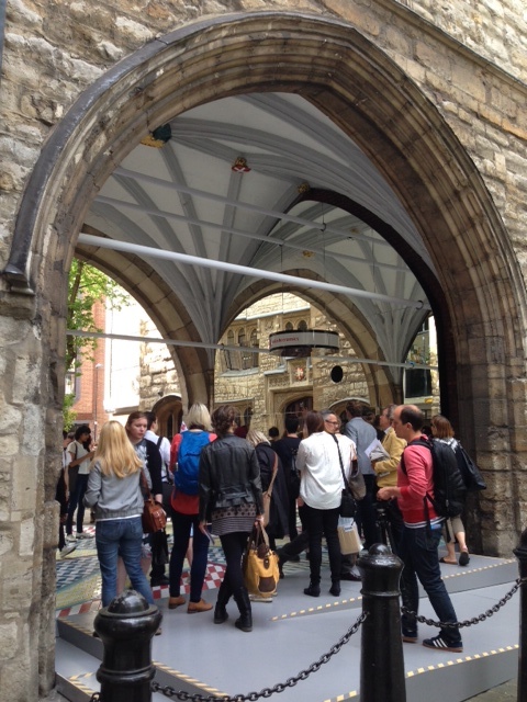
The Tile Mile installation by architects Russ + Henshaw at St John's Gate

The Tile Mile installation by architects Russ + Henshaw at St John's Gate

I joined the press tour for a walk around the main events and eye-catching highlights such as this one, pictured above and below, of the Turkish Ceramics pattern-tastic installation called Tile Mile by Russ + Henshaw in the arch of the historic St John's Gate. If you stood in the right spot, in the centre, the tile pattern on the floor was reflected for miles in the curved mirrors. It was very effective. 

tilemile2 copy.jpg
The event is on until Thursday, so if you are in the area why not head on down. It's free to enter and open to anyone - not just "creatives" - all you have to do is register 

The event is on until Thursday, so if you are in the area why not head on down. It's free to enter and open to anyone - not just "creatives" - all you have to do is register 

I saw loads more interesting things, and took lots of snaps to remember what I'd seen, so I'll be bringing you some more posts over the next few days.


The Cloister Garden at the Order of St John where the press tour started

The Cloister Garden at the Order of St John where the press tour started

Days out

Really excited to have been invited to spend a day at the Lavender Print School in Battersea next Monday. I love any excuse to spend a day doing something creative away from my computer screen. Art GCSE feels like a long time ago (because it was) but the art department was my absolute favourite place at school and we got to do so many cool things like etching, lino cutting, silk screen printing, sketching with pencil and charcoal etc. The more I think about it now the luckier I realise I was. It's never too late to rekindle an interest, right!?

Spirit of Summer

House & Garden magazine's Spirit of Summer Fair is at Olympia next week

House & Garden magazine's Spirit of Summer Fair is at Olympia next week

I do love a bit of House & Garden, I don't know if it's an age thing, quite possibly, or the fact I love nothing better than a nose around other people's country piles, but it always feels so incredibly English. If I lived overseas I'm fairly sure I would subscribe and gaze longingly at the green and pleasant countryside through the windows of the houses inside.

I've also got a bit of a fascination developing with Elle Decoration Country a weighty tome which comes out from time to time and which when I first saw it I thought pah! who would spend £10 on a magazine. Turns out I would. I've got all three 'volumes' which feature the requisite country-luxe rural retreats.

Next week House & Garden are bringing their Spirit of Summer Fair to Olympia 14th-17th May with stands selling a slice of chic country living in the form of interiors, food and all things posh. It's open to anyone, you can buy tickets online, I'm going to take my mum.

Rustic-luxe ceramics at the fair

Rustic-luxe ceramics at the fair

Indie of the Week #43: Sparrow & Co

Reindeer Skin Rug: sustainably sourced from the Sami people in Scandinavia

Reindeer Skin Rug: sustainably sourced from the Sami people in Scandinavia

Samuel Sparrow runs his online shop Sparrow & Co from Glasgow where he designs and sources items with a utilitarian feel. What started as a concept in 2010 moved fast - so fast that he only had a blog up and running, no proper website, when people started taking an interest. On the day that he was sitting in front of a panel from the Prince's Trust seeking funding for his start-up he was featured on the hugely popular blog Design Sponge: his stats went from 50 a day to around 5000.

He got the cash and subsequently his range of candles was picked up by the American company that owns Anthropologie and Urban Outfitters; they bought his entire collection and stocked them in hip US garden/home store Terrain. He spent his first year in business packing up candles. 

Sparrow remains sanguine about this dramatic beginning; he knew they would only stock them for a short while (they did) and he was keen to diversify into new product areas anyway, in fact they're not a big part of the business any more. The current range is small and ethical sourcing and sustainability are key principles behind it. The reindeer skin rug made by the nomadic Sami people comes from Scandinavia, via a distributor, and he's comfortable stocking it. "There’s sometimes a bit of controversy about animal skins, but I wanted to show the provenance and the story of where and how it's made" he says, "They use every single part of the animal, it’s not just being killed for its skin".

Whereas five or ten years ago people didn't really care where their homewares came from it's a much more commonly asked question today. "Now people are thinking about how they were made and what conditions they were made in" he says, "It's the style of it as well - we're not making it fit any sort of fashion, so it’s got longevity and it won’t date. I don’t want my products to fall apart; I like the idea that they’d be passed down in a family". With his newborn son Elliot and two year old son Rowan, and his photographer wife Laura supporting behind the scenes, he may yet grow a business he can pass on to the next generation. 

Who are you? I’m Samuel Sparrow, the owner and creative director at Sparrow and Co. – a British homeware brand based in Scotland.

Where can we find you? www.sparrowandco.com

Describe your store in five words: Simple. Quality. Lifestyle. Uncompromising. Authentic

What makes you different? Our vision at Sparrow & Co. is to design and source products that will stand the test of time, products that aren’t designed to fit a passing fashion. We’re the antithesis of mass produced products and we’re proud of it.

How you decide what makes the cut? At Sparrow & Co. we celebrate the imperfect and inherent beauty that comes with functional, handmade products. Our products need to have provenance - a story to tell and share.

What were you doing before you did this? After graduating from the Glasgow School of Art I cut my teeth working for homeware giants Habitat and Ikea. Uneasy with the throwaway culture synonymous with brands such as Ikea I decided to create my own brand and carve a path based on my own design principles.

If you were starting again what advice would you give yourself? I’ve had to learn that there are certain jobs that require an expert’s help. While it’s important to have a grasp of all the responsibilities associated with running a business – I simply wouldn’t have a business if my time was focused on these tasks. Sparrow & Co. launched November, 2011 - the same month our son Rowan was born - people said we were mad to attempt both at the same time, and there have certainly been some difficult moments, but I wouldn’t change it for the world!

What are you most proud of? The Sunday Times listing us in their Top 10 online home stores. 

Do you have a favourite thing in the store right now? Our Reindeer Skin Rugs – they’re warm, soft, durable and perfect at the end of your bed or positioned in front of the fire. Our rugs are sustainably sourced from the Sami people – nomadic tribes who travel across Scandinavia in rhythm with the seasons. The reindeer provide meat, milk and raw materials for clothes and tools.

What's hot for 2014? I’m more interested in what’s not hot! But to answer your question, I do hope that interest in artisanal, ethical products will continue to grow.

'Indie of the week' celebrates the best independent stores around. These places sell interesting and varied collections of design-related things you don't see everywhere else. They may support young or local designers or be great at finding unique things from around the world. By thinking a little more creatively about what they stock they are fighting the bland homogenisation of so much of the high street. And since I'm down with the realities of modern life, online only stores count too, because a beautiful and easy to use website is just as delightful an encounter in cyberspace.

Do you you have a favourite store? I'd love to hear from you.

Shoreditch tourist

I was in Shoreditch the other week feeling like a tourist and wandering around taking pictures. When you don't live or work in the area, like me, you really notice all the amazing art all around you and it's hard to keep your camera/phone in your po…

I was in Shoreditch the other week feeling like a tourist and wandering around taking pictures. When you don't live or work in the area, like me, you really notice all the amazing art all around you and it's hard to keep your camera/phone in your pocket. The area is buzzing with creativity and people are quite literally colouring the place in. If you haven't been there for a while, why not? There are so many little shops and cafes and restaurants to visit.

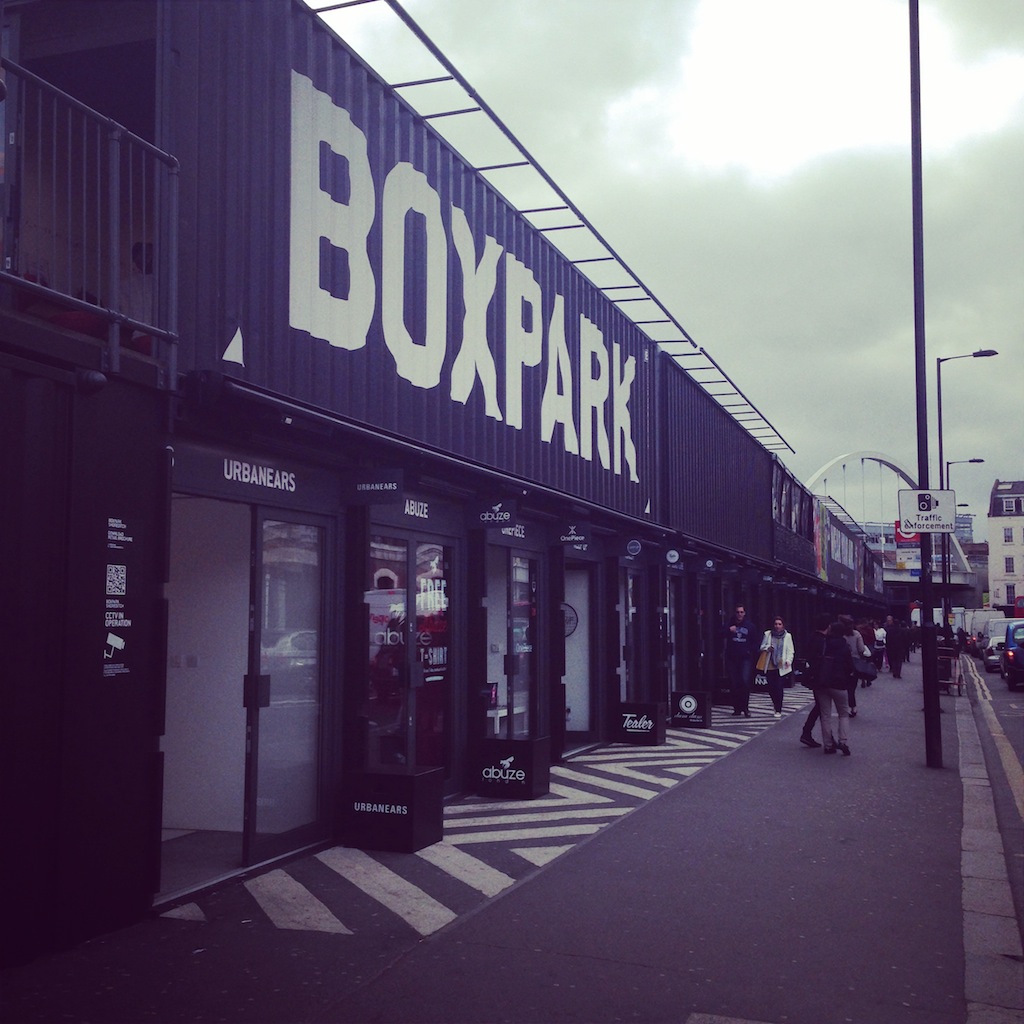
I did notice that the hipster Boxpark "pop-up shopping mall" which has mainly independent shops in its re-purposed shipping containers has been co-opted by, whisper it... Gap. They'd taken two containers. Shhh. Don't tell anyone. 

No one's really doing this on the buildings around where I live tbh.

No one's really doing this on the buildings around where I live tbh.

Or this.

Or this.

The high net worth home

I wrote a piece for the March issue of The London Magazine about the dizzyingly high end homes of the high net worth (HNW) brigade. If you're interested in jaw-droppingly lavish details you may enjoy the piece here's the link. It is fascinating what they choose to spend their money on, such as a fridge for perfume and a diving board in a basement pool. I had a lot of fun doing the research; the interior designer I interviewed for the piece had some great stories to tell about what goes on behind closed doors. Let's just say that a nomadic jet-set lifestyle and multiple homes doesn't necessarily make you happier.

Designs of the Year 2014

The crowd-pleasing Lego Calendar designed by Vitamins Design, UK

The crowd-pleasing Lego Calendar designed by Vitamins Design, UK

Earlier this week I went along to the press preview of the Design Museum's 7th annual Designs of the Year exhibition. It's a collation of the best global innovations of the last 12 months from seven categories: Architecture, Digital, Fashion, Furniture, Graphic, Product and Transport design.

I was impressed by the breadth of subjects being tackled

... from a crowd-pleasing Lego Calendar (pictured above) which works in the traditional analogue format - the bricks represent the projects people are working on - but when you photograph it with your smartphone it synchs with your digital diary, so it works on the go too. Vitamin Designs, UK, who came up with the idea actually use it in their studio and love the tactile nature of it (bagsy the Wonder Woman mini figure, 3rd from top).

... to the Fairphone, an ethical mobile phone, in that every aspect - from sourcing of materials to manufacture - is open and fair. Designed by Bas van Abel in Holland and funded by a Kickstarter campaign it takes an ethical approach to the provenance of our pocket technology, much like we already do with other consumer goods like coffee or beef. It's always good, if painful, to be reminded of the environmental impact of our mass consumption.

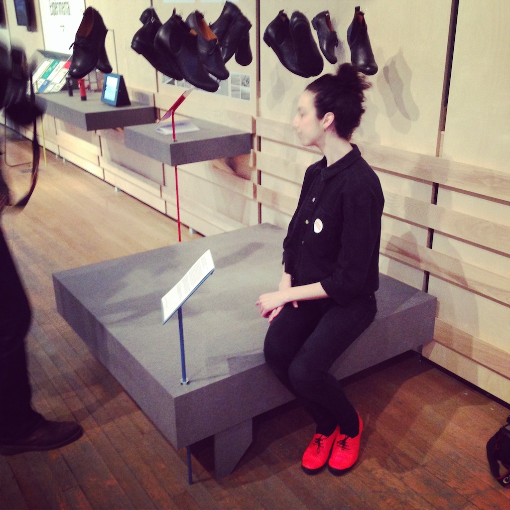
... to a lighter-hearted solution to that conundrum of what shoes to wear when you want to cycle to work: they need to be practical, but not toooo practical, enter Tracey Neuls's rubber-soled Reflector Geek Bike Shoes a hybrid cycling shoe (pictured below). Loving the fluoro orange version.

Cool cycling footwear... Reflector Geek Bike Shoes by Tracey Neuls

Cool cycling footwear... Reflector Geek Bike Shoes by Tracey Neuls

Not forgetting

... the viral public-safety film about being safe around trains Dumb Ways To Die an app which features cute characters who meet increasingly grisly ends and has an insanely catchy song - it went nuts on You Tube (76 million views so far)

... also the PEEK portable eye examination kit which uses smartphone technology to revolutionise eye care in developing countries.

The exhibition reminded me how design is all around us and has the power to make things, experiences, people's lives, the environment... better. And it affects all of us, it's not just an exclusive club. I sometimes think the Design Musuem, which is in Shad Thames, by Tower Bridge, is a bit stand-offish, not least because it's a bit of a hassle to get to. I hope when it relocates in 2015 to the former Commonwealth Institute building in Kensington High Street, West London, it will be more easily accessible to more people.

As the slogan for Designs of the Year goes: "Someday The Other Museums Will Be Showing This Stuff". It matters to all of us.

The exhibition runs until 25th August.

And you can vote for your favourite in the Visitor Vote.

Walking back to London Bridge station I saw a depressing building under construction which looked like a giant air conditioning unit. It made me think of the NLA exhibition London's Growing Up about the explosion of tall buildings threatening t…

Walking back to London Bridge station I saw a depressing building under construction which looked like a giant air conditioning unit. It made me think of the NLA exhibition London's Growing Up about the explosion of tall buildings threatening to change the London skyline... there are an astonishing 230 towers over 20 storeys planned for the city. Gulp.

Indie of the Week #42: The New Craftsmen

okrneychair_GarethNeal_KevinGauld.jpeg

The New Craftsmen is an online shop which is about to make the leap into becoming a bricks and mortar one. This is craft, but not as we know it - it's the bespoke Savile Row version. They are taking the best of the best and bringing what people expect from a luxury brand eg. beautiful presentation, availability all year round (rather than just at craft fairs) and online, and now very soon in a permanent retail space.

One of the problems with the craft maker is to be able to price their products appropriately and then get it to the right market, this is where The New Craftsmen come in. They have spotted a gap in the market as there are very few permanent outlets for beautifully crafted pieces and if, like most people, you've not got the time to go round to endless fairs and spend that necessary time developing an appreciation for quality, you can come here.

At their last pop-up it was not just casual passers by who visited, people were coming with a purpose, to share information, it was both educational and experiential. The prices may feel high, but so is the quality. 

Who are you? Catherine Lock, co-founder of The New Craftsmen (on the right, pic below)

Where can we find you? We’ve got a small selection of our products on our online shop at www.thenewcraftsmen.com and excitingly we’re also opening a permanent retail space this May in North Mayfair.

Describe your store in five words: strong, tactile, storied, authentic, contemporary, discerning.

What makes you different? We look for iconic pieces rooted in the craft traditions of Britain, and collaborate with makers to combine values of tradition and quality but in an utterly contemporary way. Most of all, we’re dedicated to celebrating the role of the maker by connecting customers to the skills, processes and materiality behind the product. Our focus is functional pieces, rather than ‘art’. There are very few companies in this country, definitely in the heart of the luxury quarter of London, who have both a shop and website dedicated to selling the best of British craft.

How you decide what makes the cut? We take a layered approach. We start off by looking at the roots of British craft; British material, making and cultural traditions. We then choose and develop pieces which are relevant to our customer. Our general aesthetic is one of stripped-back luxury, functionality, and a raw appeal; pieces that show off the materiality of the product and skill of the maker. Contemporary pieces and shots of seasonal colour are layered on top. Best quality is fundamental to what we do. 

What were you doing before you did this? Working as a product developer for Habitat and Sainsbury's. Following that I took to the road on a journey around Britain to explore vernacular craft and why things were traditionally made – how they link to culture and locality. I met an extraordinary network of craftspeople from the length and breadth of the country and this knowledge I acquired helped form the basis for what we are doing today. My co-founders have backgrounds in luxury, fashion, and the arts: Mark (Henderson) was the CEO of Savile Row tailor Gieves and Hawkes and is now its chairman, while Natalie (Melton) was commercial director for Arts and Business. The two of them met running “Crafted” - a mentoring scheme for makers - and we all started plotting together in 2011.

If you were starting again what advice would you give yourself? Be prepared to work very hard, and warn your friends that they won’t be seeing so much of you.

What are you most proud of? Taking a risk. I left my career on the high street to help create something that I care for very much indeed. I feel fulfilled and constantly motivated as a result. 

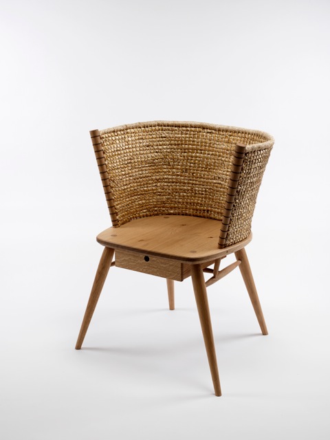
Do you have a favourite thing in the store right now? Always the Brodgar Chair. It embodies so much about who we are, what we do, and what we stand for.

What's hot for 2014? We are developing new lighting pieces and turning our attention to more ancient arts - blacksmithery is going to be turned on its head.
Every Wednesday 'Indie of the week' celebrates the best independent stores around. These places sell interesting and varied collections of design-related things you don't see everywhere else. They may support young or local designers or be great at finding unique things from around the world. By thinking a little more creatively about what they stock they are fighting the bland homogenisation of so much of the high street. And since I'm down with the realities of modern life, online only stores count too, because a beautiful and easy to use website is just as delightful an encounter in cyberspace.

Do you you have a favourite store? I'd love to hear from you.

Indie of the Week #41: Guinevere

Guinevere shop front.jpg

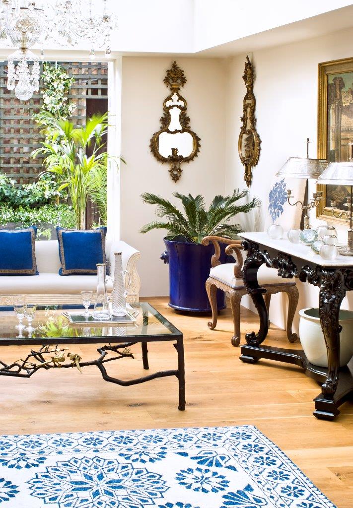
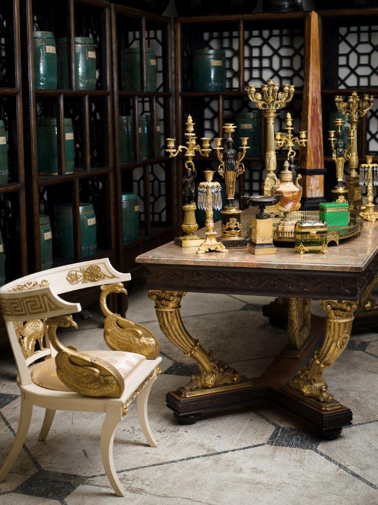
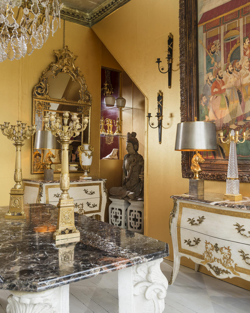
Spread over four adjacent units and covering 8,000 square feet on London's King's Road Guinevere is not your average independent shop. In fact there is nothing remotely average or ordinary about it which is why it has made the Indie of the Week list. This is a shop where a 19th century Russian neo-classical side chair in carved giltwood sits alongside a 20th century Egyptian brass octagonal side table with arabesque decoration.

Since its opening in 1963 this family-run enterprise has sourced and sold extraordinary things from around the world and is a favourite with interior designers. "People often describe it as an Aladdin's cave", says co-owner Marc Weaver, "a lot of people don't get past the windows, but once you come in it's a big space and you're meant to feel a bit lost. There are no windows - and no clock!"

It's all about the visual impact: people are looking for inspiration whether they are regular clients, designers or "incorrigible buyers". They'll come in, have a coffee, see what's new and often "walk away with something to add to their already quite full houses". 

Marc, who co-owns with his wife Heather and brother Kevin, grew up with the business. Their French born mother Genevieve founded the shop and as children the boys would come in after school and in the holidays scrub furniture for pocket money. Marc recalls spending hours searching for secret drawers in an old piece of furniture, his mother dismissed the endeavour saying he wouldn't find anything, when he found some silver sovereign boxes, she said: "they're mine". 

Who are you? Marc Weaver, one of the owners of Guinevere

Where can we find you? www.guinevere.co.uk / 574-580 King’s Road, London SW6 2DY

Describe your store in five words: An Aladdin’s Cave (a phrase not a word, but it's what people say when they walk in the first time). Eclectic and Unique.

What makes you different? It’s a large gallery with antique and vintage pieces and some modern items. Due to our scale we are able to source these from literally all over the world. It's not any one item, it's the mix.

How you decide what makes the cut? I may have to live with it one day if no one buys it. So I must like it.

What were you doing before you did this? I was at school. 

If you were starting again what advice would you give yourself? Look, look and look again and don't buy anything just because it's cheap.

What are you most proud of? 50 years in business.

Do you have a favourite thing in the store right now? A Chinese Ming dynasty dry lacquer life size court figure.

What's hot for 2014? Wild Murano glass furniture.

Every Wednesday 'Indie of the week' celebrates the best independent stores around. These places sell interesting and varied collections of design-related things you don't see everywhere else. They may support young or local designers or be great at finding unique things from around the world. By thinking a little more creatively about what they stock they are fighting the bland homogenisation of so much of the high street. And since I'm down with the realities of modern life, online only stores count too, because a beautiful and easy to use website is just as delightful an encounter in cyberspace.

Do you you have a favourite store? I'd love to hear from you.

Bouncing bunnies

hamcopper2.jpg

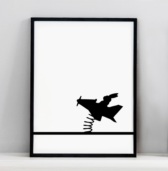
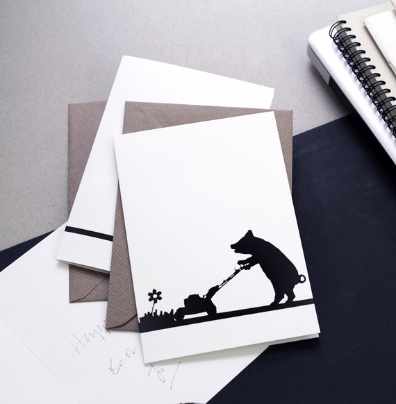
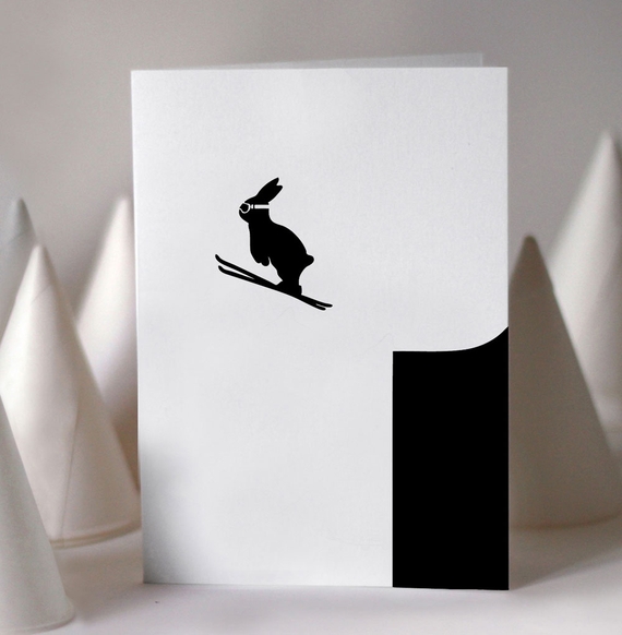
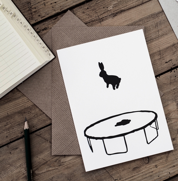
Move over LOL cats there are some bouncing bunnies in town. As the internet has proven we love nothing better than looking at pictures of animals doing human things so why not design a range of cards featuring trampolining rabbits and pigs mowing the lawn. Jo Robinson of HAM has hit the zeitgeist running with her deceptively simple black and white litho printed cards. 

And this month you can feel the warm glow of doing the right thing as she has teamed up with Maggie's Cancer Centres to produce a limited edition copper foil blocked print (30x40cm) of the bouncing rabbit. It costs £60 and all £60 will go direct to Maggie's.


Sensing Spaces

sensingspaces5.copy.jpg

It's not often you get this up close and personal with such a decorative ceiling, but at the Sensing Spaces exhibition at the Royal Academy you can climb up one of the architectural installations until you are staring into this angelic face. 

I didn't take a picture of the installation, but there are some great pics of it by other people here. It was designed by glamorous Chilean-based duo Pezo von Ellrichshausen and fits the brief of evoking the experience and power of architecture within a gallery environment. It is a huge structure, but you get to climb up it, walk around it, touch it - and admire the cornicing too.

sensingspaces3.copy.jpg

The clue is in the title of this exhibition as it's all about the way a space makes you feel, not think, feel. It is definitely a plus not to be surrounded by dry architectural drawings and instead just be able to walk through the real thing.

This was by far the most photogenic structure which encouraged audience participation with colourful straws and will only get better as the weeks go by and more and more straws are attached. 

sensingspaces2.copy.jpg

It was designed by the architect Diébédo Francis Kéré who built an award-winning primary school in Burkina Faso and he talks engagingly in this video about bringing elements of that project into this one, it's the second one down. In fact, the videos really bring the show to life and you can watch them all online for free.

sensingspaces4.copy.jpg

I loved that someone had done this.