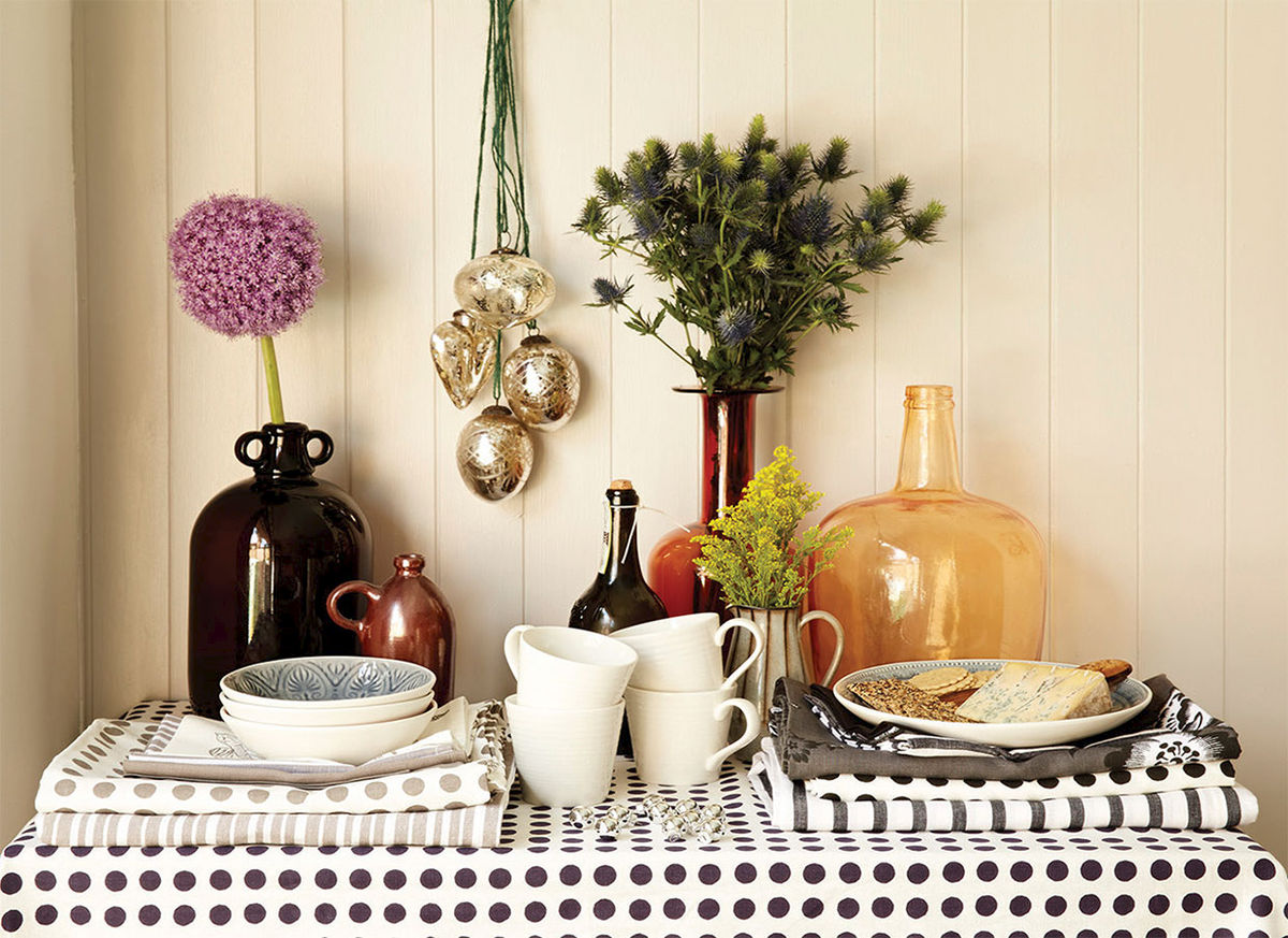
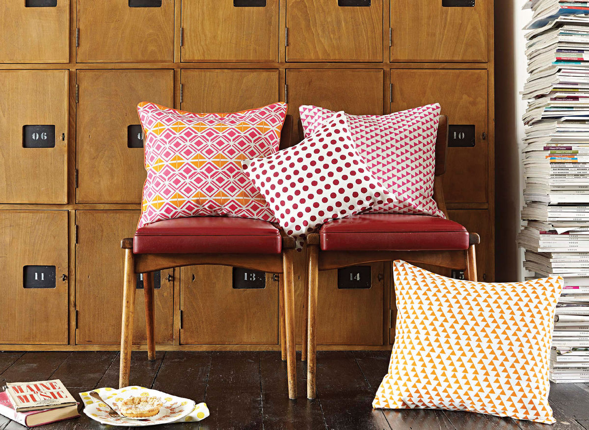
Etsy pop up at West Elm

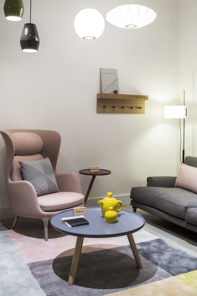
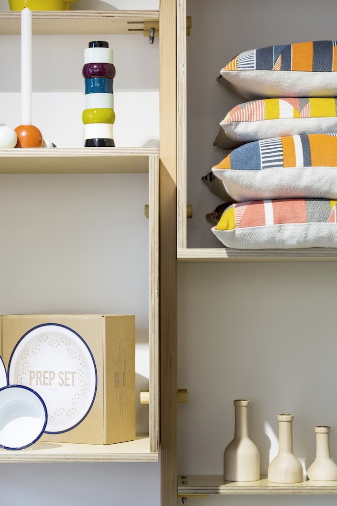
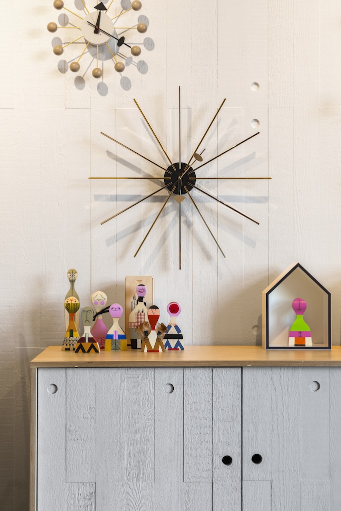
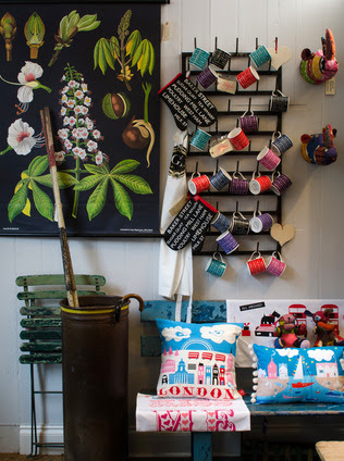
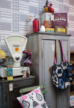
Fans of online craft phenomenon Etsy can meet the makers in person as a selected group will be popping up at West Elm on Tottenham Court Road this week.

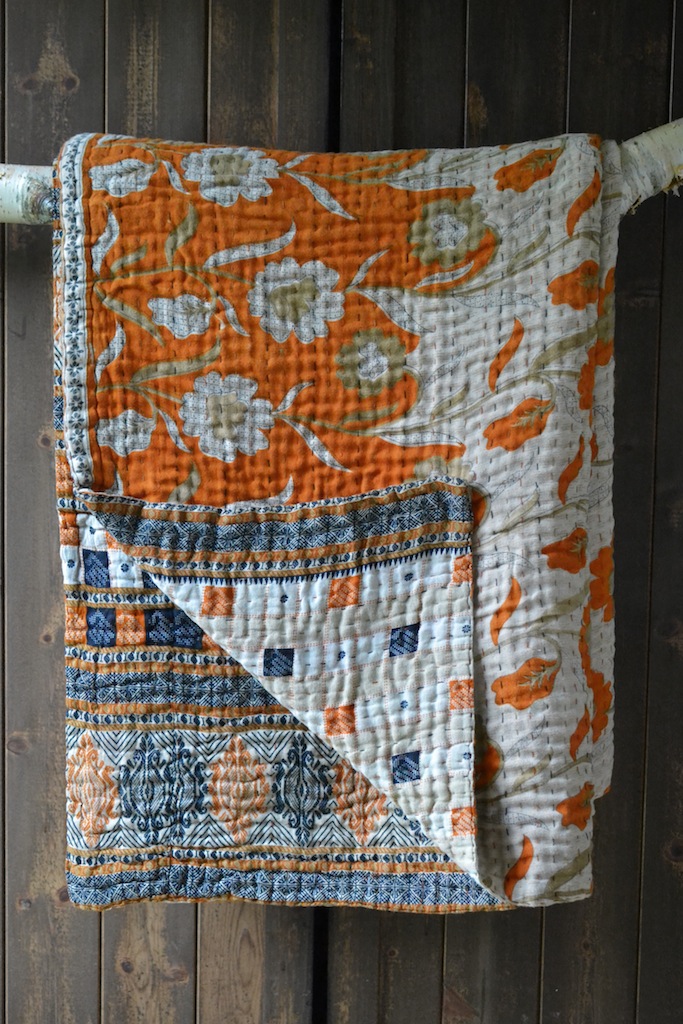
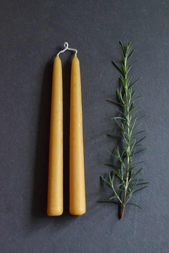
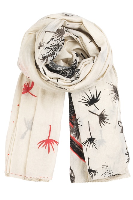
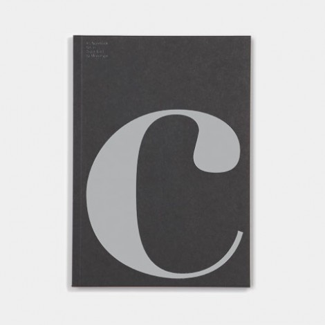
On Thursday 6th March from 1pm-8pm you can shop at a shop within another shop... got that? All the Etsy makers - including those pictured above, clockwise from top left: JimbobartChocolate CreativeMengsel DesignRachel Loves Bob - have been chosen by Arianna Trapani and Carole King from online interiors mag Heart Home Magazine

ArtRebels at Ikea

6719.jpg

I do struggle a bit with pastels, all that sugary sweetness is a bit bleurghhhh

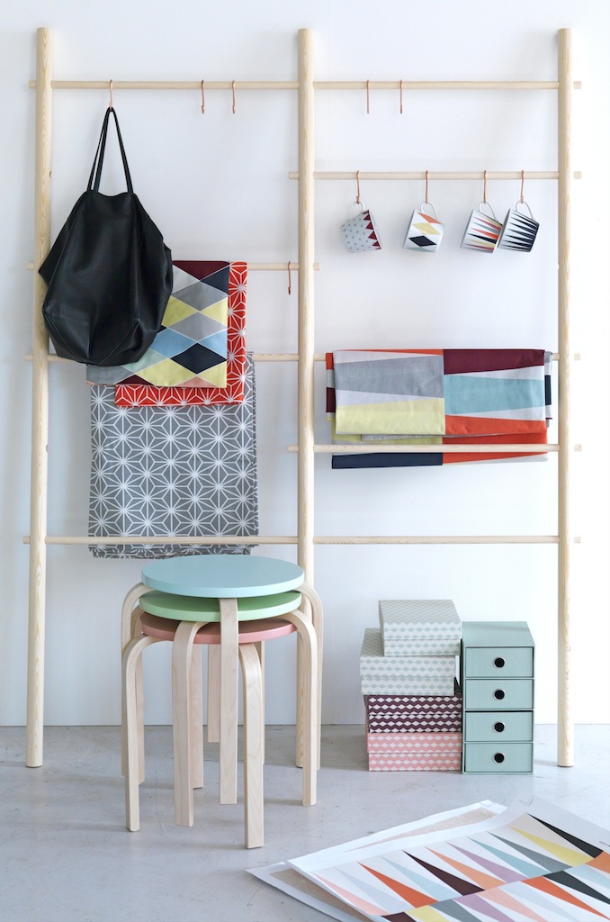
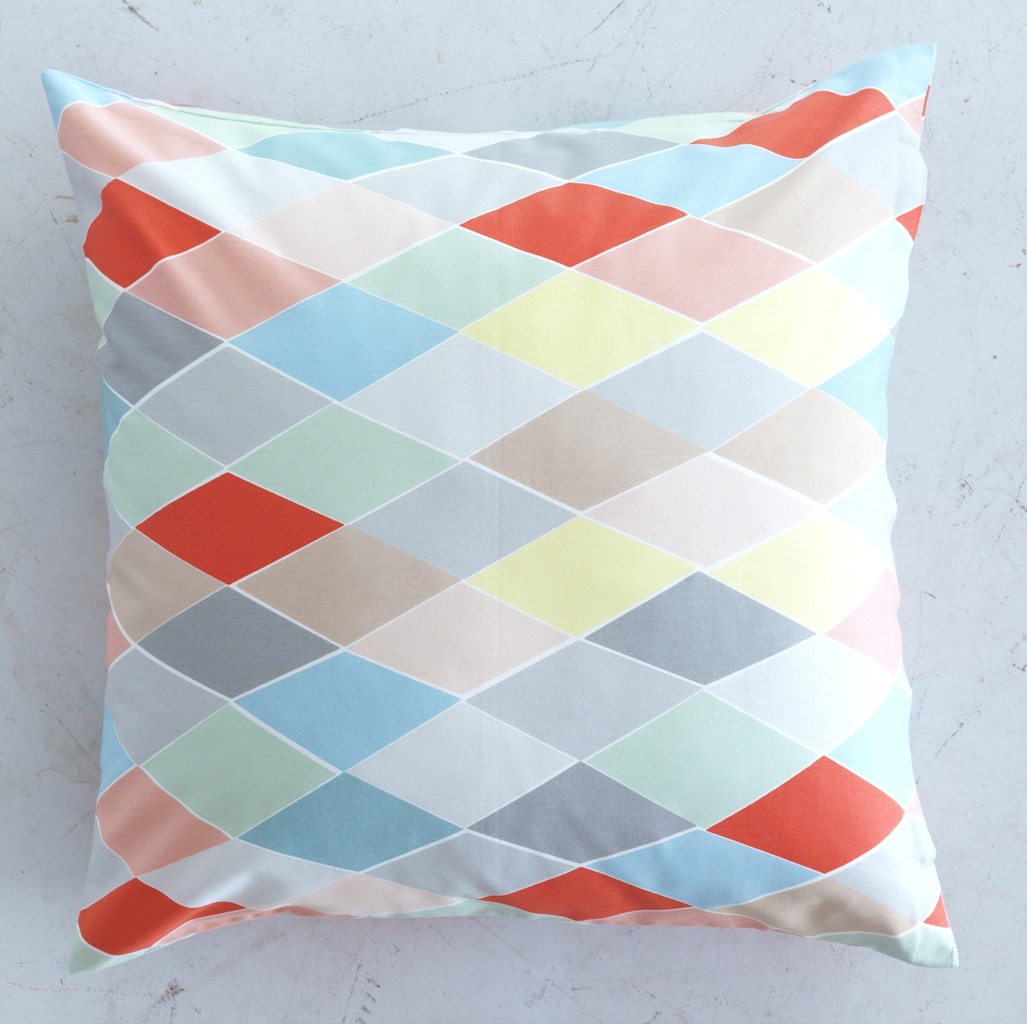
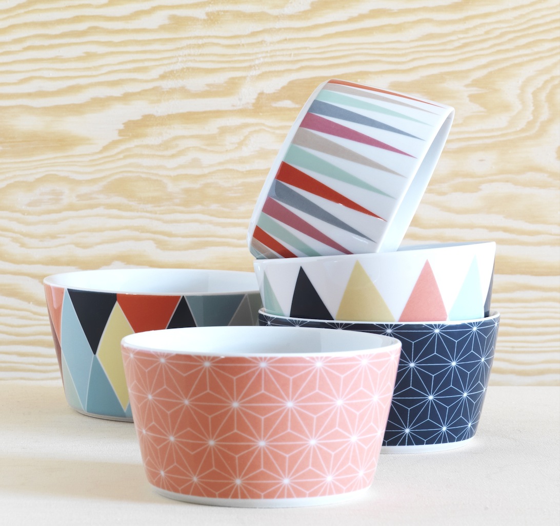
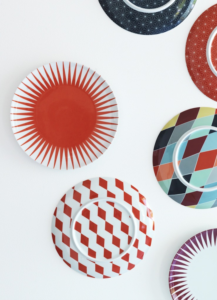
Ikea have got together with hip Copenhagen-based creatives ArtRebels to produce their latest Limited Edition range called the BRAKIG Collection (which means rebellious). It is full to bursting with ice-cream coloured prettiness made more palatable by the addition of bold colours and graphic shapes.

I think it rides out the twee very nicely - I like it. What do you think?  

Indie of the Week #40: Nest.co.uk

__V1C1247 _Reception One - Donna Wilson.jpg

Launched in Sheffield in 2002 Nest.co.uk is both a shop and a website and could be considered something of a pioneer of internet-based interiors shopping. Back in the early 2000s very little design was sold online in fact ‘design’ wasn’t really a word that had hit the mainstream quite like it has now. So founder and managing director Christian Hawley bet on a winner.

In the past 12 years he has seen his business grow to a point where his website holds 15,000 stock options, which in layman’s terms means it could be one chair, but in five colours. They don’t keep all of that in stock, just the popular items, and a lot of the bigger items, such as oak dining tables, will be made to order. They mainly sell high end classic design - no fakes! - from the likes of Vitra, Artek, Fritz Hansen, Muuto and Hay. But they are increasingly taking on new talent such as French brand Le Chance and the New Zealand-based Resident, as well as supporting British talent like Miller Goodman. Their biggest sellers are the Eames DSW chairs in white and the Uten.silo wall organiser.

In the past two or three years they have seen more interest locally - the fact John Lewis are now stocking more modern with a capital ‘M’ furniture in their stores has helped - customers who come in now are familiar with brands like Kartell. Their new 1,500 square foot showroom (designed by Kiwi & Pom) opened on the outskirts of Sheffield last December, but London remains their biggest online market. And to cap it all they cite the high priestess of designer life-styling The Conran Shop as their biggest rival. Not bad going.

Who are you? Christian Hawley, founder and Managing Director of Nest.co.uk 

Where can we find you? We have a showroom and shop located in Sheffield’s vibrant outskirts at 9 Parkway Rise, Sheffield S9 4WQ. But, you can shop online 24 hours a day at www.nest.co.uk 

Describe your store in five words: Contemporary, aspirational, creative, friendly and fun.

What makes you different? We truly believe we are the world’s best modern interiors store. We work hard to source the latest up-and-coming designers and brands, and we’re always on the lookout for new items we think our valued customers will like. We believe it is this dedication to new design that sets us apart from our competitors. 

How you decide what makes the cut? Quality – we really just do not compromise on this. If we are to stock and support a product, we really have to believe in the product, and quality is the over-riding factor in this. Nothing short of perfection makes it to the Nest.co.uk shop!

What were you doing before you did this? I founded a number a small businesses before I set up Nest.co.uk. I have always had a keen interest and passion for design though, so  I suppose I always knew I would end up working in this field.

If you were starting again what advice would you give yourself? Just get started. There really is never a perfect time for anything. I truly believe that to get ahead in life, you just need to begin, and go from there.

What are you most proud of? Nest.co.uk was one of the earliest adopters of online retail within our field. In fact, we have been trading over the internet for over 12 years and it is this experience that has allowed us to develop and grow in the international market. So I would say that I am proud of establishing ourselves in the ecommerce industry at such an early stage – it really has made us who we are.

Do you have a favourite thing in the store right now? I particularly love the Vinge Table Lamp from Swedish lighting specialists Örsjö. I love its structured simplicity. Plus, it has a wonderfully tactile ‘slide’ switch which really makes using the product enjoyable. It’s a classic in the making.

What's hot for 2014? There are so many up-and-coming designers and brands right now that it’s hard to choose just one. Having said that, the brand I am really excited about at the moment is Hay. They are always creating new and exciting products year-on-year, and always have a fresh perspective. Keep an eye out for their latest addition of colourful accessories landing at Nest.co.uk very soon.

Every Wednesday 'Indie of the week' celebrates the best independent stores around. These places sell interesting and varied collections of design-related things you don't see everywhere else. They may support young or local designers or be great at finding unique things from around the world. By thinking a little more creatively about what they stock they are fighting the bland homogenisation of so much of the high street. And since I'm down with the realities of modern life, online only stores count too, because a beautiful and easy to use website is just as delightful an encounter in cyberspace.

Do you you have a favourite store? I'd love to hear from you.

Indie of the Week #39: Decorator's Notebook

Wooden bowl and spoon set - £60 - Decorator's Notebook Shop.JPG

"People think 'how on earth can a brother and sister work together?'", says Bethan John of Decorator's Notebook the blog and webshop she runs with her younger sibling. "We have a really strong shared vision of where we want it to go, but we have very different roles. It's always clear whose job it is and it's easy to hand the trust over". With her brother Joe she set up a blog three years ago and last October an online shop selling dreamy country living from Somerset - well she's based in Somerset, he's in Newcastle, but let's not dwell on that.

It's all about provenance and authenticity. If you're an interiors fan [guessing you are if you're reading this] then you want to surround yourself with things which mean a lot to you and when buying for your home the internet can seem a cold place. But the rise of the lifestyle blog plus shop fills that gap: you trust the source, you like the way they write - this is a thoughtfully written blog with beautiful photography - they introduce you to new things, it makes buying much more personal. And, I don't know about you, but I'm converted to laptop shopping in my PJs.

Decorator's Notebook can exist online without the crippling overheads of a bricks and mortar shop and in a way their creativity is less compromised - they don't have to sell certain things just to cover their costs. They can spend ages, as Bethan did, searching for the perfect beeswax candles or really investigate the ethics behind the kantha bedspreads. 

Bethan is delighted that people really engage with what they are doing and notes that most of their webshop traffic comes via the blog, as well as social media and in the press: "If you launched a shop out of nowhere I don’t know how you’d get anyone to visit it. We haven’t spent any money at all on marketing; it's all been through word of mouth."  

Who are you? Joe and Bethan John, the brother and sister team behind Decorator’s Notebook.

Where can we find you? The Decorator’s Notebook shop is at www.decoratorsnotebook.co.uk and our blog (where it all began) is at http://decoratorsnotebook.wordpress.com

Describe your store in five words: Beautiful homewares with interesting origins.

What makes you different? Online shopping can sometimes be bit of a cold and clinical experience so with Decorator’s Notebook we wanted to help people reconnect with the products they choose by sharing the stories of the people, places and processes behind them. You’ll find workshop tours and interviews with makers on our blog and we have plenty of styled photographs and in-depth information on our product pages so people can learn how things are made and where they come from. Of course we still offer simple ordering and speedy shipping - the things that make online shopping brilliant - but with a more personal touch.

How you decide what makes the cut? With a very big knife! Our collection is intentionally small and tightly curated so every product has to be really special to earn its place. We look for pieces with an effortless beauty that have been made with love and care. Our suppliers include British designer-makers, charities, social enterprises and fairtrade groups and we like to promote traditional crafts and the use of sustainable and recycled materials where we can, from foraged local wood to discarded saris.

What were you doing before you did this? Bethan worked for a number of years as a writer for interiors magazines in London and started the Decorator’s Notebook blog about three years ago. Joe has a background in finance and webstore management. Together we make a pretty useful team.

If you were starting again what advice would you give yourself? We only launched the shop in October last year, so it seems a little early to be offering words of advice – we’re still working through new challenges each day and learning as we go along. However in the run-up to launching we enrolled on School for Creative Startups, a course in entrepreneurship and practical business advice designed for creative thinkers by ex-Dragon Doug Richard. We gained so much from it and it saved us from making a lot of beginner’s mistakes – we’d recommend it to anyone thinking of starting a creative business.

What are you most proud of? That despite the doubters, we’ve made a sibling business partnership work! People usually find it really surprising that a brother and sister can work together but we think we owe a lot of our success to our close-knit family. Saying that, we each have quite different skills  which is really important too. Bethan is the interiors geek who sources the products for our collection and uses her journalism background to handle our PR and social media, while Joe keeps tabs on our finances and keeps the shop running smoothly and looking good. 

Do you have a favourite thing in the store right now? Our exclusive Campfire Screen Print is a personal favourite of both of ours. We commissioned it from Merrick Angle (Double Merrick), a British illustrator living in France. He gets lots of his inspiration from old schoolroom wall charts and the design shows different ways to build a campfire. It captures a lot of the spirit of Decorator’s Notebook – our love of nature combined with the home comforts of a warming fire and cosy surroundings at the end of the day. It says a lot about us and our childhood memories… we love sending them out to fellow explorers young and old.

What’s hot for 2014? We started selling kantha bedspreads made from vintage saris just before Christmas and they’ve proved really popular, so we think our new designs in fresh spring colours will be a real hit. Bethan actually shed a tear when she was unpacking the first box because they were so beautiful and we have no doubt the new ones will be just as lovely. They’re made in Bangladesh by Basha, a social enterprise that helps women escape sex trafficking and start afresh with training, stable employment, free childcare and daily education classes. Each bedspread is hand-sewn by just one woman and finished with a label embroidered with her name and a link to her personal story.

Every Wednesday 'Indie of the week' celebrates the best independent stores around. These places sell interesting and varied collections of design-related things you don't see everywhere else. They may support young or local designers or be great at finding unique things from around the world. By thinking a little more creatively about what they stock they are fighting the bland homogenisation of so much of the high street. And since I'm down with the realities of modern life, online only stores count too, because a beautiful and easy to use website is just as delightful an encounter in cyberspace.

Do you you have a favourite store? I'd love to hear from you.

Valentine's

It's right around the corner so I thought I'd have a scroll through some Indie of the Week's to see what thoughtful and original ideas they've come up with for Valentine's Day. One of the best things about independent shops is their freedom to think big, be as creative as they want to be and put an idea into action without having to run it past a ton of other people first. 
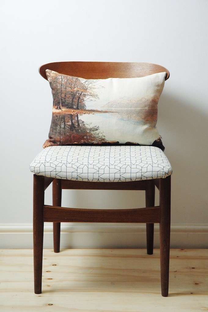
Remember The Hambledon that beautiful Liberty-like interiors shop in Winchester, well check out their Valentine's ideas. I like the sweet and romantic Forever banner and the punchy Hell Yeah! print and ooh how about the He Loves Me scarf, any excuse for a scarf as far as I'm concerned, and haha they've even got a Ryan Gosling 'Hey Girl' tea towel.

mintlist.jpg

The Mint List is a bit like an online antiques market in that you never know quite what you might find, but you'll have a lot of fun looking for it, so how about a neon 'I heart you' sign, it's crazy pricey, but it's very romantic. 

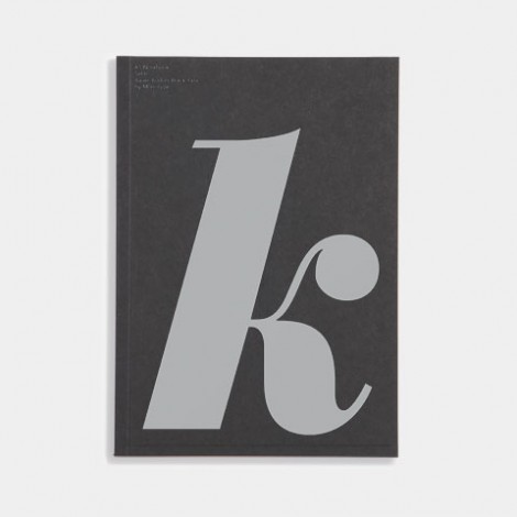
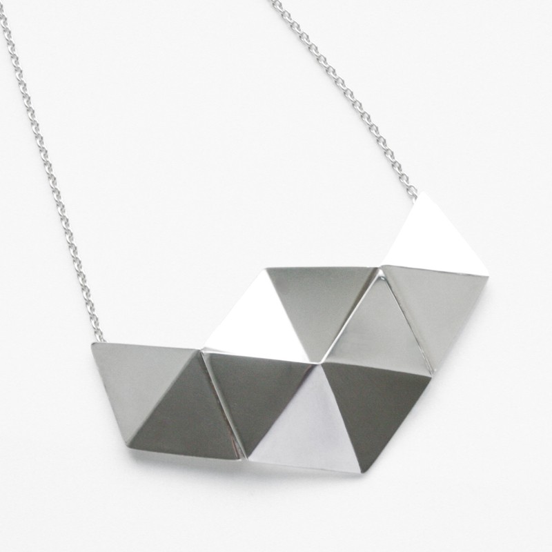
Typography and geometric shapes rule over at FAO Shop which stands for Fashion. Art. Object. I'm quite taken by these monogrammed notebooks, who doesn't love a bit of personalisation, and I'm really feeling this silver necklace having recently bought a cheap similar-ish knock off at Top Shop, and for the proper typeface nerd how about this cute Penguin poster

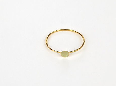
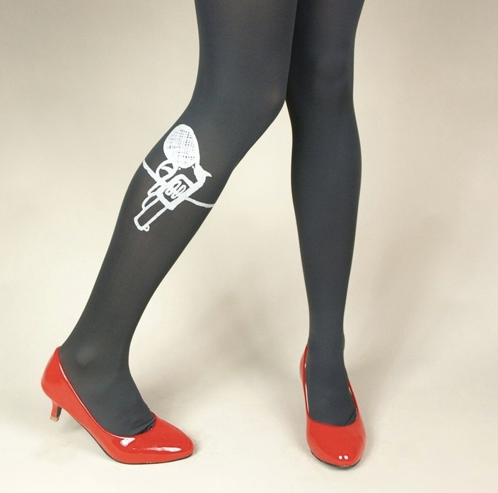
Or try the appropriately titled independent shop Luna & Curious for a range of sweet Valentine's related things such as the very simple and appealing and reasonably priced stackable Spot Ring, I can't resist a bit of anthropomorphism (who can?) so this Fox card made me smile, I don't know what came over me but I love these hilarious Bonny Tights and I can report that this bone china ABC mug by We Love Kaoru is lovely as I have one which incidentally was given to me by Camilla at The Mint List

Mason and Painter

masonpainter.jpg

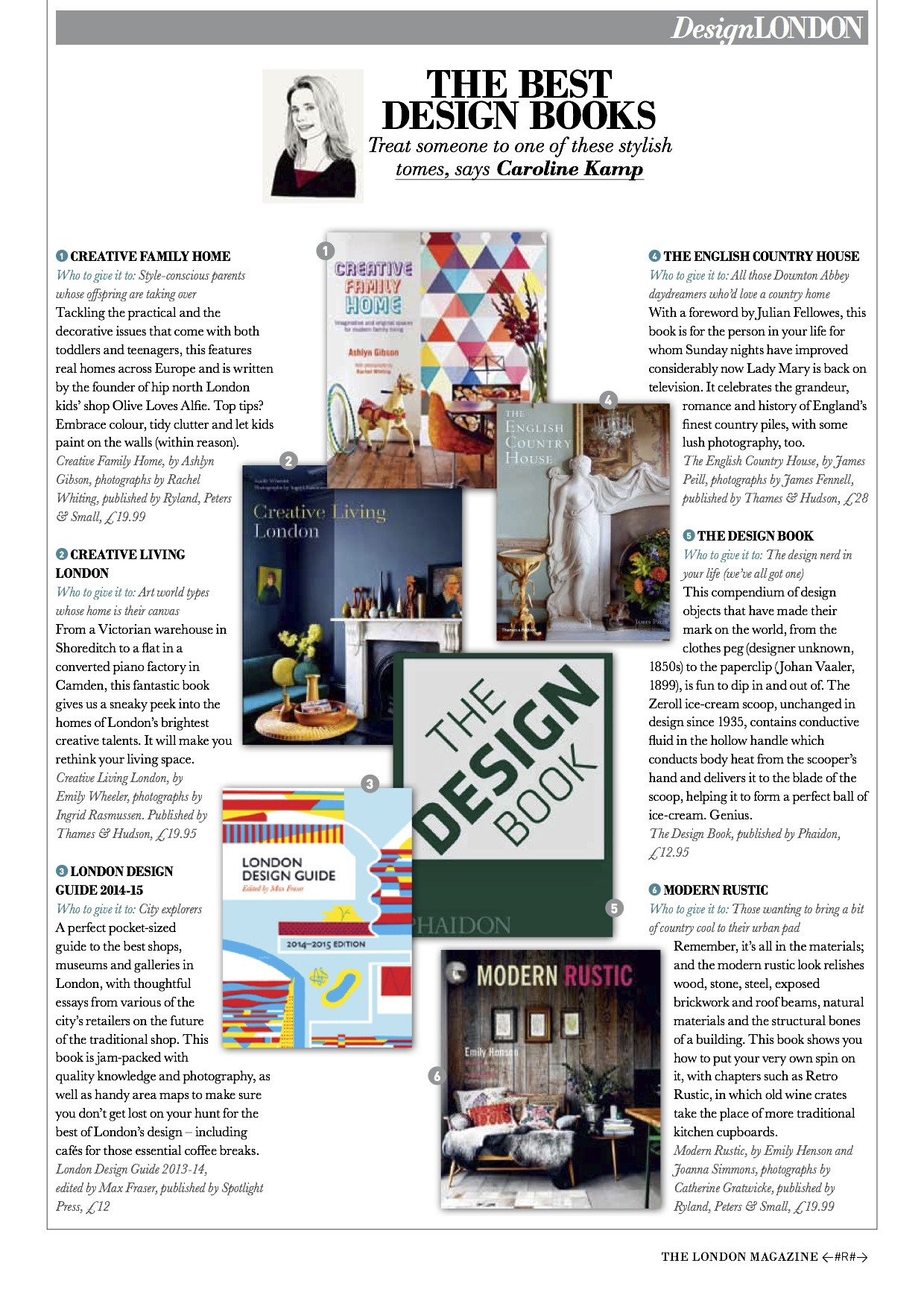
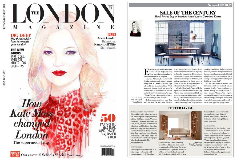
This month I've written a piece for The London Magazine about museum shops and how bloody brilliant they are. It'll be out soon and when it is I will post a link. While I was doing my extensive and hard-hitting research I had it in mind to include the Southbank Centre Shop until I realised that technically it's not actually a museum shop it's just got the same sort of high brow shopping vibe what with it being attached to something cultural. So I was delighted to hear about a collaboration they are doing with the lovely printmaker Michelle Mason (who I've been writing about for years) which means I now have an excuse to talk about them both.

Michelle recently launched an interiors shop in partnership with Tim Painter on Columbia Road called Mason & Painter which is open Fridays, Saturdays and Sundays and sells a collection of very appealing vintage, up-cycled, new - and always colourful - items for the home (pictured here). They are brining their idiosyncratic style to the Southbank Centre Shop which already sells a great range of items such as philosophical stationery from Alain de Botton's The School of Life plus mugs, prints and other gifty things. For the month of March Mason and Painter will be taking over the space with a curated collection of existing products and a selection of items they've chosen. The right styling can make or break a shop so it will be interesting to see what they do. 

Plantini

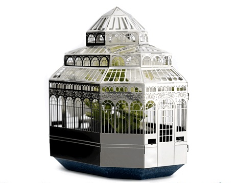
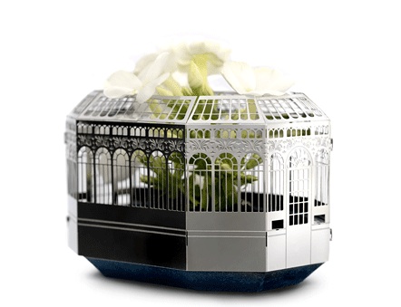
It does look like it might be a headache to put together, but I'm going to ignore my nagging doubts and enjoy the whimsy of this tiny, quirky, original and post-able object.

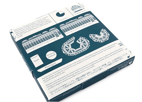
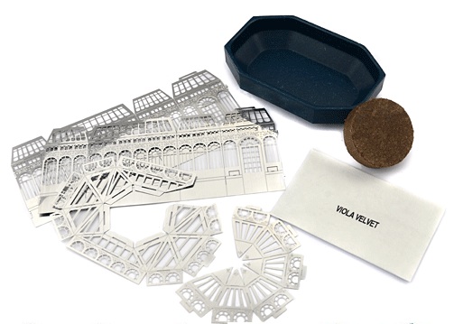
The Plantini is a 9.5cm tall miniature hothouse made from flat-pack etched metal which comes with a planting pot, compost disc and viola seeds - and from which will grow a beautiful flower. Ahh

It's made by Another Studio an independent London design studio based at Cockpit Arts in Holborn who make, in their words, and I can't actually think of a better description "gifts for thoughtful givers". Have a scroll around the site, there are some brilliantly creative things on there including miniature architectural models of Battersea Power Station, Tower Bridge and - new to the range - Sir John Soane Museum.

Also, this cute pop-out paper 'diamond' ring - well, it is nearly Valentine's Day.

Brighter Lives for Refugees

brighterlives.jpg

I hate buying lightbulbs. It's more complicated than it needs to be and even when I do manage to get the right bulb I still find myself moaning about the colour of the light: too orangey, too bright, too blue. However, things are improving all the time, or at least that's what we keep being told, so we shouldn't complain and instead should be thankful we're not wasting so much energy. I know this is what I should be feeling. 

A bit of perspective is required then and over at IKEA they've come up with a way to encourage us to buy low energy LED bulbs. For every one bought they will give €1 to support the UN Refugee Agency (UNHCR) in their work lighting refugee camps.

The campaign 'Brighter Lives for Refugees' runs from 3rd February until 29th March and money raised will go towards solar lanterns and solar street lights which improve safety, help children study after dark, enable small shops and kiosks stay open later, and encourage more community and social gatherings. There are around 10.5 million refugees worldwide, of which half are children. 

Perspective regained.


Material Lab

36_480.jpg

I've been meaning to write about Material Lab for some time. It's a showroom for surface coverings... wait... don't nod off yet... if only there was a more seductive way to describe the myriad materials on offer - plastic, leather, vinyl, ceramic, paper, textiles, glass - than the slightly disappointing words 'surface coverings'. Anyway, we're basically talking wall and floor tiles, and places like this are usually only for architects and designers who come seeking inspiration and swanky new textures for their latest projects, but this one (while technically still being a resource for architects and designers) is open to all, and is located at 10 Great Titchfield Street, London W1. Funded by UK tile manufacturer Johnson Tiles there are free samples to take away. Go on, embrace your touchy feely side. 

Etoile Home

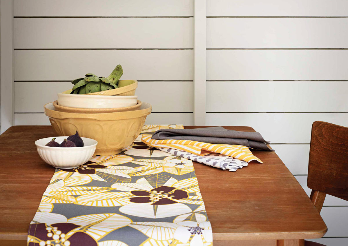
It must be January as my eyes were locked on to the photograph of the Tiki floral table runner in stone grey and yellow (above) from Etoile Home as soon as it popped into my inbox. It's bold, it's bright, it screams let's have an awesome Hawaii 5-O time. In short it's the cheerful antithesis of the po-faced weather we've got going on around us right now.

How handy then that Etoile Home, an independent textile label run by former fashion and interiors stylist Shani Beadle, has just launched a new website - which is looking good, nice photography, very slick - and is also offering 20% off if you type ETOILE20 in at the checkout (until 2nd Feb). My heart is saying Tiki florals, but my head is saying Palermo stripes

Christopher Jenner

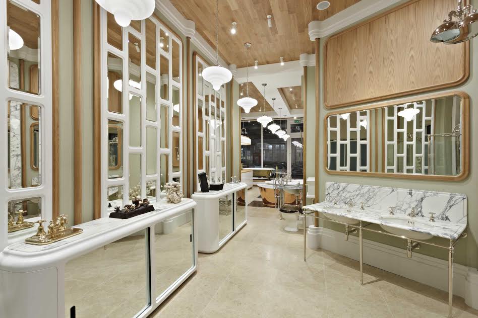
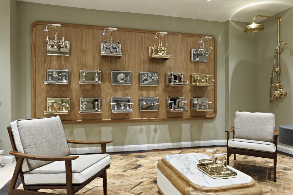
Today’s post features some lush photographs taken by Michael Franke of the new Christopher Jenner designed showroom for ultra posh bathroom company Drummonds, in Notting Hill.

I was first drawn to Jenner’s work by his kaleidoscopic design for the Penhaligon’s store in Regent Street which I wrote about in this blog post last year. It just leapt out at me, and I think he’s achieved the same thing here. While it’s a completely different colour palette, he’s captured the mood beautifully, there’s a kind of dreamy luxury about it.

And yeah I know us mere mortals are never going to be able to afford a Drummonds bath, I get that, seeing as it takes several weeks to even make one, in a process which involves casting the raw metal, shotblasting and enamelling, then hand polishing, copper cladding and finally hand painting in your chosen colour... But that’s not the point, Jenner has designed a beautiful space which makes you feel something. And I’m ok with that today. 

Universal Expert

I spoke to Sebastian Conran (son of Sir Terence, brother of Jasper) at Home London earlier this week where he was enthusiastically talking about his new kitchenware brand Universal Expert which is sold in John Lewis and in West Elm, the new American homes emporium on Tottenham Court Road.

The idea behind it is good quality, multi-functional, thoughtfully designed products which work well. Sounds simple enough.

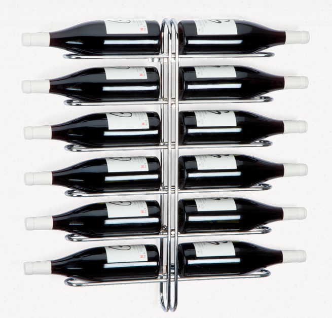
There are stackable mugs, horizontal wine racks to save on space so you could store them in a narrow corridor, knife blocks for easy access and storage, a box grater and cookbook stand which fold flat, a jug which pours from under the ice cubes and doesn't drip, and several versions of sharing plates/boards. Much of it suits the small space reality of urban living. 

"I'd like to think people will keep this stuff", he says, "It's designed to take you through life". It'll need to as it's not exactly cheap. "It's not Ikea or Tesco on price", he notes, "it's what we'd call reassuringly expensive". He told me he used to be head of product design for Mothercare where every product had to be able to be used with one hand, and that sense of practicality has never left him - it's evident in the hand mixer which has all the fiddly cords and attachments neatly stored in a box underneath. 

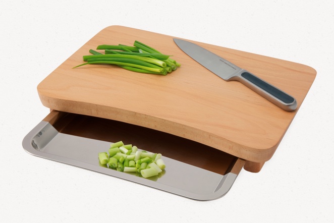
I'm quite taken by the wooden chopping station with a stainless steel tray underneath for transferring the chopped food, or scraps. And the stackable wine glasses which go in the dishwasher. Handy.

50 years of Unikko

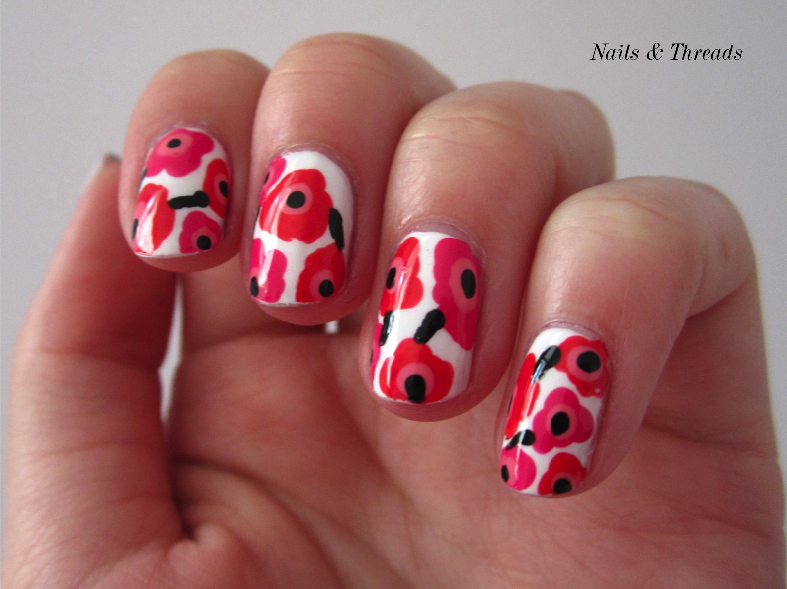
If you're a fan of Scandinavian interiors then you may be interested to learn that the instantly recognisable and, dare I utter the word, iconic Unikko 'poppy' print from Marimekko is 50 years old this year. Back in 1964, designer Maija Isola p…

If you're a fan of Scandinavian interiors then you may be interested to learn that the instantly recognisable and, dare I utter the word, iconic Unikko 'poppy' print from Marimekko is 50 years old this year. 

Back in 1964, designer Maija Isola painted a series of floral prints including this graphic poppy print despite her boss, and Marimekko founder, Armi Ratia telling her not to since she felt flowers were more beautiful in nature than on fabric. But, after seeing the bold design Ratia included it in the range and it became an instant hit. Big in the sixties and pretty big in the nineties too, the poppy is a happy and uplifting motif that appeals to all, comes in a range of colours and can mainly be found on fabrics and ceramics. 

There's a lot to be said for a signature print when it comes to brand recognition, not including what happened to the Burberry check in the late nineties. Yes Daniella Westbrook, I mean you. In comparison Unikko seems to have come out relatively unscathed and is looking pretty fresh for 50.

The special anniversary edition tea pot above is from Skandium

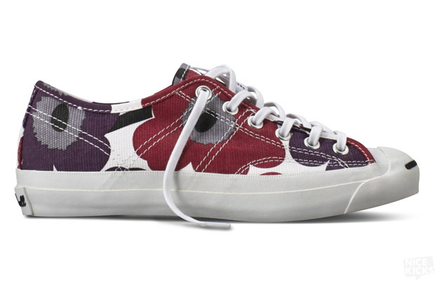
Clockwise from top left: Marimekko meets Converse, a match made in design heaven; the Unikko print adorns a hot air balloon to launch Marimekko's Beverly Hills flagship store in 2012; yep, they've nailed it; and fuselage art in partnership with Finnair. 

Happy New Year

I've taken a pretty long break from the blog over the past few weeks, so much so that when I logged on the formatting had been changed and for a frustrating few minutes I couldn't work out how to upload a photograph, however, I persevered [new year'…

I've taken a pretty long break from the blog over the past few weeks, so much so that when I logged on the formatting had been changed and for a frustrating few minutes I couldn't work out how to upload a photograph, however, I persevered [new year's resolution: don't immediately fall at techie hurdles] and of course it's blindingly obvious once you spot the little + sign, but anyway, it's great to be back.

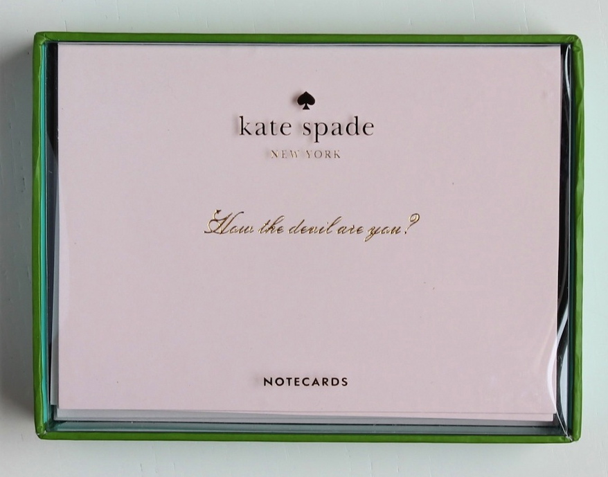
I had a nice email from Lucy at Quill London last week tantalising me with a headline which read: "New Year, New Notebook" which sent me straight to her site to check out the new Kate Spade stationery range. If you're not familiar with Kate Spade, she's a New York-based designer of up town handbags and accessories whose signature style is chic and polished. So if your correspondence is in need of a lift there are some lush new things to buy, I love the How The Devil Are You cards above and the Rotating Stamp which right now I would set to Start Something New. Bring on 2014 yeah!!

ps - there's also a sale going on if you're feeling the pinch.


Indie of the Week #38: Aria

Aria furniture.jpg

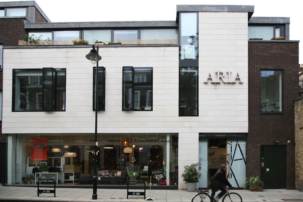
Aria was opened on Islington’s Upper Street in 1989 by Pushpa and David a local couple who shared a passion for art and design. Their vision was to bring quality design to the area at a time when there was nothing else like it around - and Islington was only just beginning to rejuvenate. As Aria approaches its 25th anniversary, look at Upper Street now - it's full of boutiques and restaurants and hums with life.   

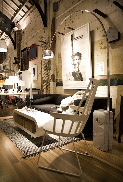
The shop hasn’t always been in the same place, but for the past six years it's been in Barnsbury Hall, an old music hall, built in 1850, which had been derelict since the 1930s. It was in a sorry state, but undeterred the couple bought it and set about renovating it into a 4,000 square feet showroom. Most noticeably they have kept the walls which have a beautiful patina of exposed brick and layers of paint. The lofty space has inspired the couple to run events such as supper clubs and book launches which are popular with customers who are often struck by how big the building is inside. 

Who are you? Pushpa Gulhane and David Smith, owners of Aria

Where can we find you? Barnsbury Hall, Barnsbury Street, Islington, London N1 1PN www.ariashop.co.uk

Describe your store in five words: Contemporary, Eclectic, Inspiring, Independent, Friendly.

What makes you different? There are several things: longevity in the business, good customer service, our wedding and gift lists, our in-house cafe with complimentary tea and coffee, and the events we host in our showroom. Aria collaborates with designers and brands on product launches and hosts regular events including an ongoing series called 'After Hours at Barnsbury Hall' which reflects a change in how retail spaces are perceived and re-purposed. Occasionally, after closing time, our beautiful 150 year old hall transforms into an exclusive supper club. 

How you decide what makes the cut? Our products are carefully sourced from leading British and international brands, as well as including hand-selected vintage pieces and special collaborations with local designers. We value quality materials and a high standard of finish in our products, as well as the experimentation and innovation shown by both leading and up and coming designers. We believe that high quality design should be infused into all parts of our lives and surroundings. 

If you were starting again what advice would you give yourself? Always trust your instincts. If you really love it, it will work in your space. And remember to step off of the beaten path to find your creative ideas. The less obvious places offer the most inspiration.

What are you most proud of? We are most proud of our staff - Aria employs a friendly and knowledgeable team many of whom have been with us for over a decade. 

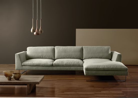
Do you have a favourite thing in the store right now? The Tokyo sofa is a proven customer favourite because it strikes the balance between style and comfort. We offer it in an extensive fabric range, but right now we’d like it in a richly coloured velvet.

What's hot for 2014? Stutterheim raincoats made with skill, passion and authenticity in the small town of Borås, in Sweden. Their motto is: “Let’s embrace Swedish melancholy. Embracing rain is a good start.” It is in that spirit that a 1960's raincoat [as worn by Alexander Stutterheim's grandfather] has been updated to fit the modern man and woman, so it's now possible to be well-dressed - even in bad weather.

Every Wednesday 'Indie of the week' celebrates the best independent stores around. These places sell interesting and varied collections of design-related things you don't see everywhere else. They may support young or local designers or be great at finding unique things from around the world. By thinking a little more creatively about what they stock they are fighting the bland homogenisation of so much of the high street. And since I'm down with the realities of modern life, online only stores count too, because a beautiful and easy to use website is just as delightful an encounter in cyberspace.

Do you you have a favourite store? I'd love to hear from you.