Christmas specials

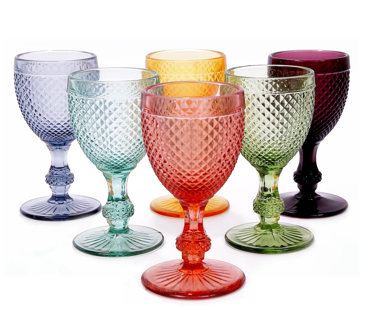
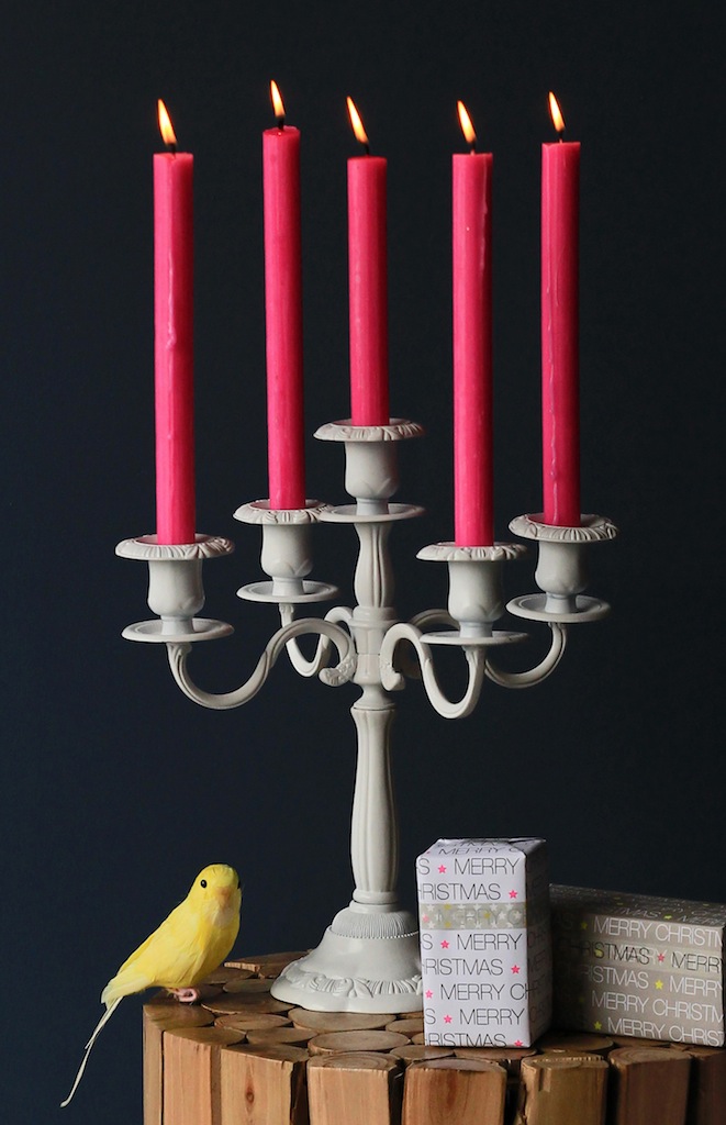
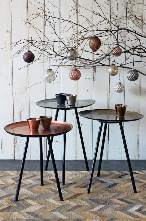
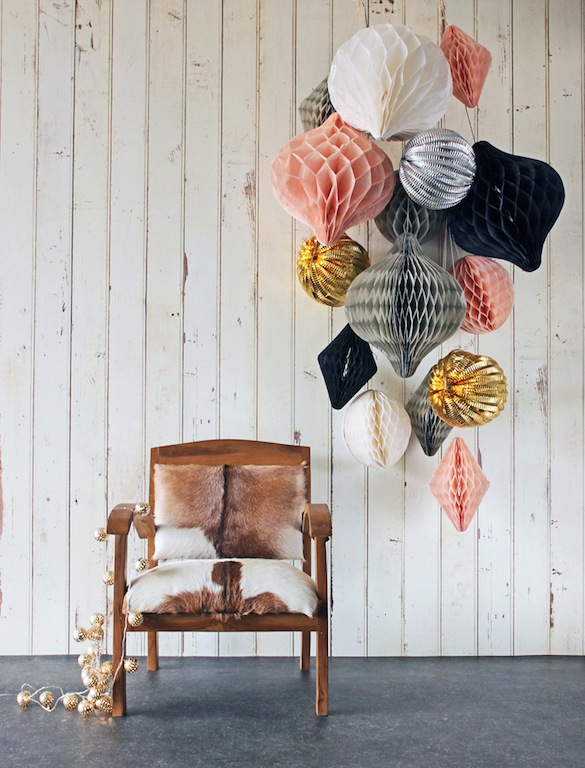
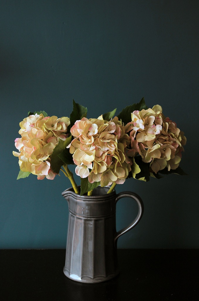
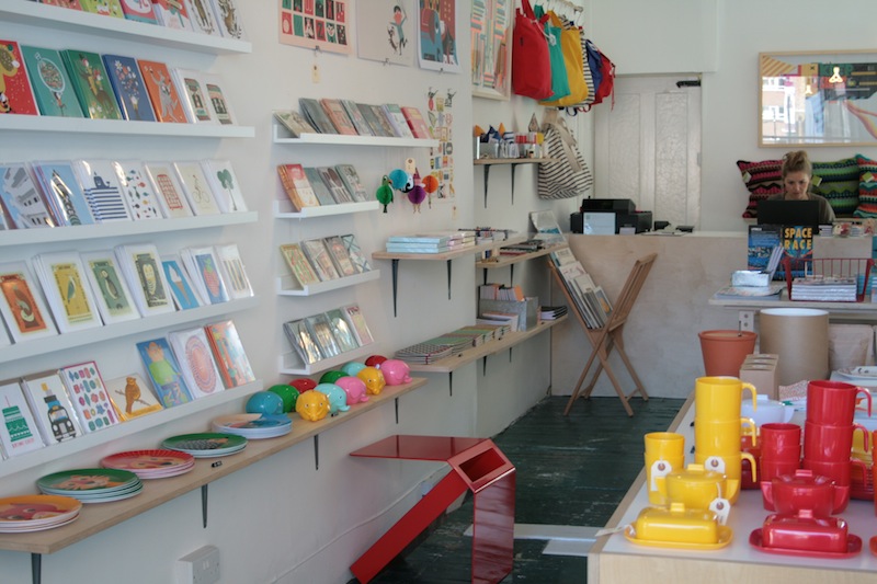
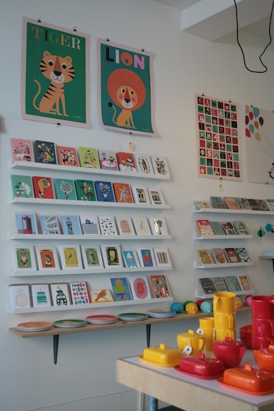
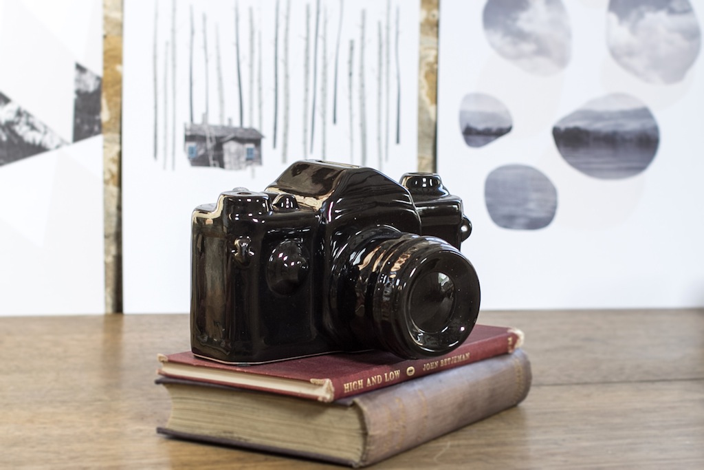
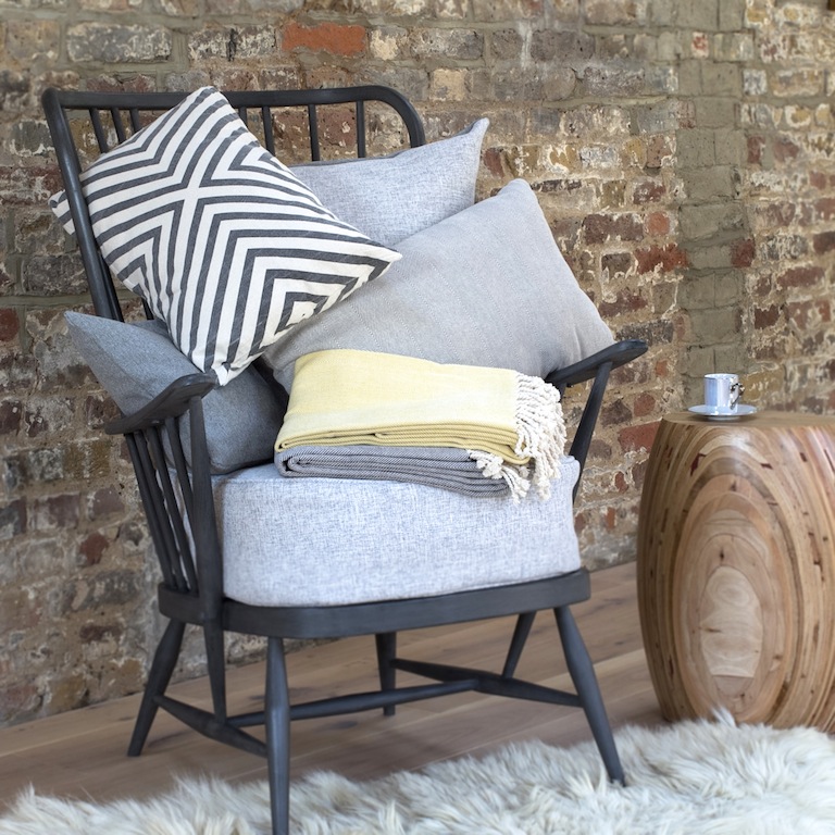
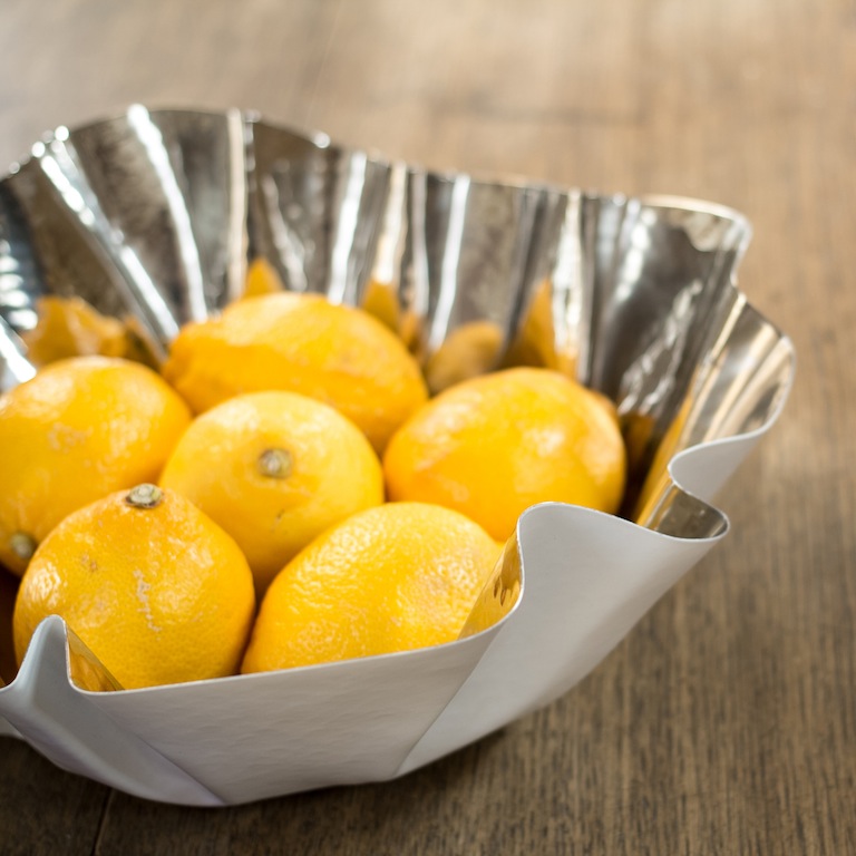
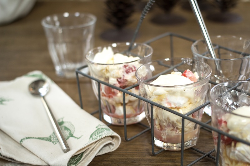
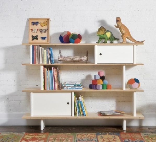
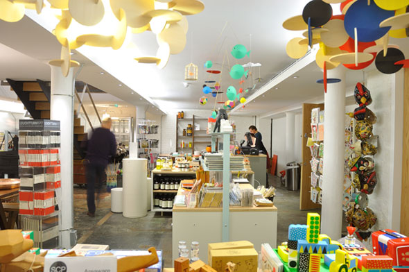
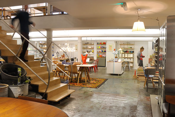
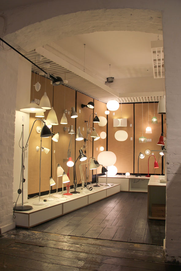
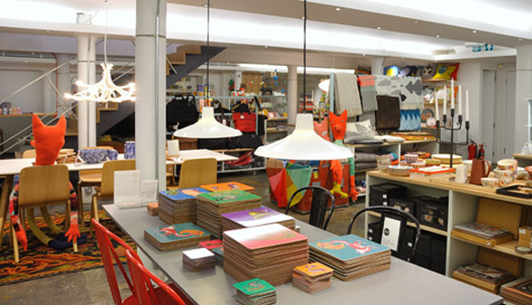
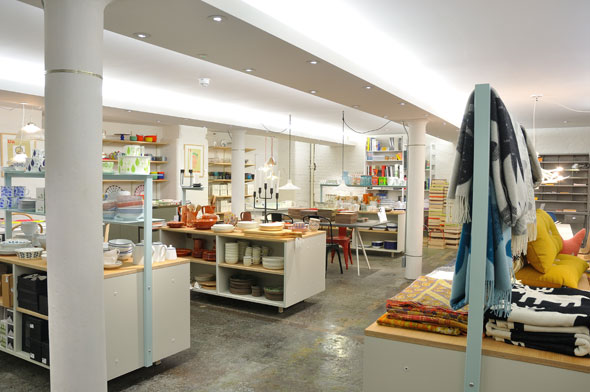
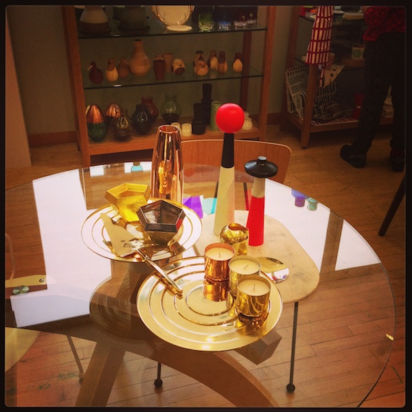
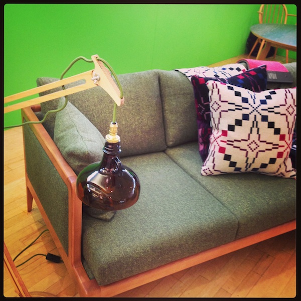
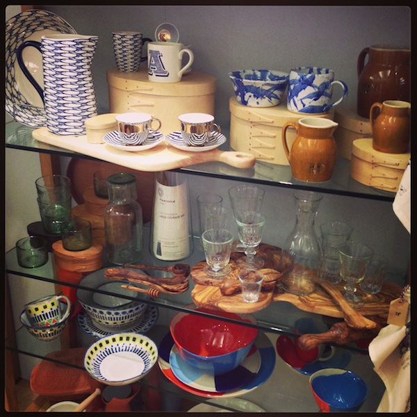
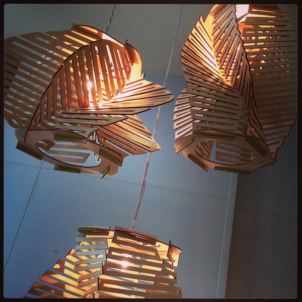
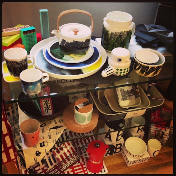
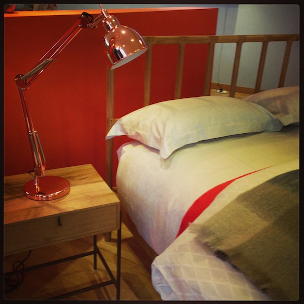
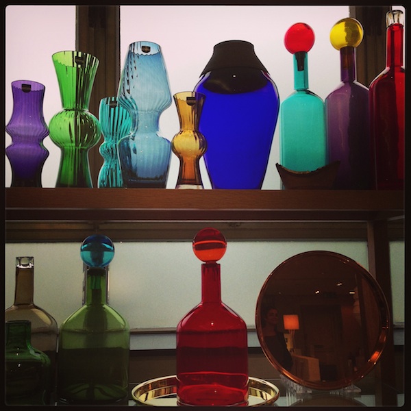
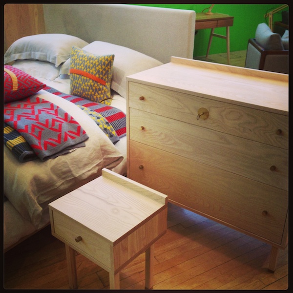
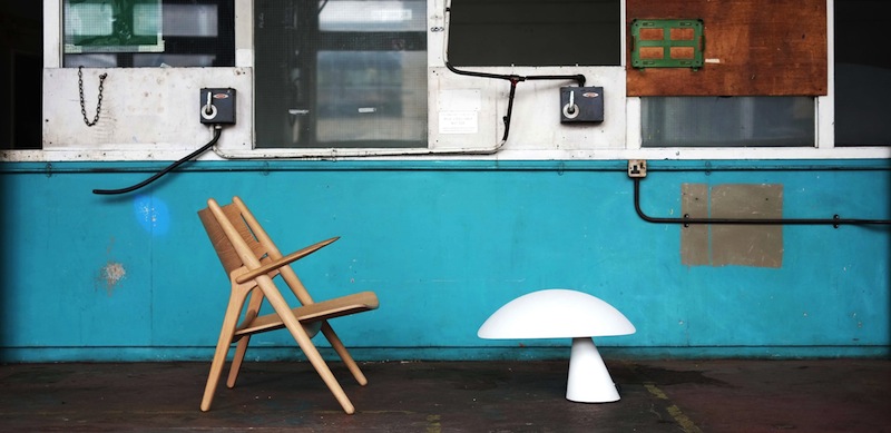
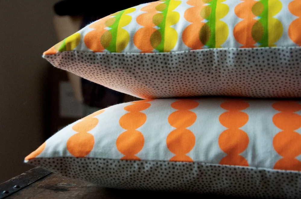
Drag yourself away from your computer... and try some actual real life shopping in an actual real life shop at these Christmas pop-ups. Online design shop clippings.com (which is a virtual market space for independent designers and shops to help them reach a wider audience) has got together with the people over at Design Junction to create bricks and mortar pop-up shop at 53 Monmouth Street, Seven Dials in Covent Garden until 5th January. It's full of colouful, playful, handmade items (see above).

somerset.jpg

As well as hosting the hottest (coldest?) ice-skating spot in town Somerset House is also upping its retail game by inviting a number of independent companies to join its pop-up Christmas Arcade. Back for a second year the arcade includes companies such as quirky design shop Theo, British hat makers Christy's Hats, chocolatier William Curley and crafts from Handmade in Britain. It's open until 5th January. 

CHRISTMAS_SUNGLASSES-590x442.jpg

It's not a pop-up, it's a triangle, the Shoreditch Christmas Triangle to be precise. Twenty-eight local designers, shops, studios, galleries and cafes are open late every Thursday night from 5th December in the weeks leading up to Christmas. The festive eyewear pictured is from Maiden

Indie of the Week #37: Rockett St George

BLACK_CABINET.jpg

“We always intended to just be a website”, says Jane Rockett of online interiors emporium Rockett St George, “we couldn’t see the point of having a shop when you have an unlimited market online - and sitting in a shop all day was not feasible in our lives at that time”. With roots in PR, Jane and her business partner Lucy St George have always worked with the press - the first bit of coverage when they launched six and a half years ago was in Vogue, something she puts down to “sheer luck”, but which conveniently put them on the map very quickly.

Selfridges have since asked whether they want to do a concession in the lower ground floor of the department store, but the duo decided the time and energy could be better put to use in doing a catalogue. So, this spring they produced their first catalogue - having always said they’d never do one as they’d previously put all their budget into PR and promotion - and found it “thoroughly enjoyable”. Photographed by Jane and styled by Lucy St George and Annie Redfern, all in-house, it is more of a styled look-book than a catalogue as it doesn’t feature everything they sell. It got a huge response from both customers and press.

Their dark and moody look is distinctive. In a sea of all-white websites their black background - which they were advised against doing, but did it because “if Chanel can have one so can we” - stands out. It’s become their brand colour to the point where items not shot on a black background don’t sell as well. And, yes, for the record, Jane’s sitting room walls are a very dark charcoal grey, but her kitchen is white. 

Who are you? Jane Rockett & Lucy St George of online shop 'Rockett St George'

Where can we find you? www.rockettstgeorge.co.uk

Describe your store in five words: Dynamic, unique, strong, edgy & seductive.

What makes you different? We stand out from other high-street shops because of the products we have on offer. We source and buy unusual and often bespoke items that are out-of-the-ordinary and make a statement. It can be risky choosing a really quirky product, but our vast customer base seem to love it and usually its a case of the weirder and wilder the better. 

How you decide what makes the cut? If we love it, and it's priced well - then we go for it. we try to be as diverse as possible in choosing the right products for our customers.

What were you doing before you did this? Jane: I used to work in PR before I had children. The industry has changed a lot, but it still helped us a lot when Rockett St George really started to take off. Lucy: I was a florist for many years and loved it.

If you were starting again what advice would you give yourself? Jane: I would say life is what you make it.

What are you most proud of? Lucy: There have been many proud moments in the past six years, from seeing our name on 100 rolls of packing tape to travelling the world in search of unique products for our online collection.  Team that with working with my best friend and its been a great laugh. Jane: Our meeting with Selfridges also sticks in my mind as a very exciting and proud moment.

Do you have a favourite thing in the store right now? Lucy: Definitely the Leather Dining Chairs, they're amazing.  Jane: This time of year I love buying tea light holders - my favourite at the moment is the Little Silver Tea Light. Oh and I also love the Star Studded Stool.

What's hot for 2014? Anything metallic - copper, bronze, silver & gold will be winners for SS14 - try our Metallic Side Tables, a beautiful Bronze Swan Vase, or Copper Light Fitting with flex. Neon is also staying strong for next year - our neon pink candles look really amazing on a dinner party table.

Every Wednesday 'Indie of the week' celebrates the best independent stores around. These places sell interesting and varied collections of design-related things you don't see everywhere else. They may support young or local designers or be great at finding unique things from around the world. By thinking a little more creatively about what they stock they are fighting the bland homogenisation of so much of the high street. And since I'm down with the realities of modern life, online only stores count too, because a beautiful and easy to use website is just as delightful an encounter in cyberspace.

Do you you have a favourite store? I'd love to hear from you.

Robotslayer

Robotslayer: a graphic novel for kids written and illustrated by my husband

Robotslayer: a graphic novel for kids written and illustrated by my husband

You know how some people like to get up really early in the morning and get loads done before breakfast, well, on and off for the past four years my husband Vince been getting up at 4 or 5am to draw robots before going to work. 

I'm not exactly what you'd describe as a morning person.

But he has persevered with his early starts and it is with huge excitement and pride that I can now tell you he has finished writing and illustrating a 56-page graphic novel for children called Robotslater. Inspired by our two sons, it's about a boy called Leo and his brother Benny who must work together to defeat the evil robots and reclaim the city of Robotolis. 

You can read more about it here www.robotslayer.com

And you can now buy it on Amazon

Our sons Leo and Benny squaring up to the giant robot

Our sons Leo and Benny squaring up to the giant robot

So, I was pretty cool about the early mornings.

Then he decided to start building robots.

The shed was turned into the 'Robot Lab' and from a giant block of polystyrene he proceeded to carve out an 8ft high and 8ft wide robot which he spray painted up to look like rusty metal. He also moulded life-size figures of the Leo and Benny characters out of clay and had them cast in glass fibre.

This stage was pretty all-consuming. 

You can see the progress pictures on Facebook

The app has got a movie-like soundtrack, and farting rats 

The app has got a movie-like soundtrack, and farting rats 

But that's not all.

While all this was going on he got together with the creative minds at Hover Studio to turn the book into an interactive app with a movie-like soundtrack, farting rats and a shoot 'em up game called Robotslayer 3000. 

The app will be in the Apple app store on 11th December. 

3000.jpg

Robotslayer has been in the background of my life for so long that I can hardly believe it is finally done - he's been saying 'it'll be finished by Christmas' for the last three Christmases. 

I'm not going to pretend that there haven't been times when I have rolled my eyes at the latest stage of this crazy endeavour, but now I look back on it I'm really proud of the creativity, humour and single-minded bloody mindedness (he is completely self-taught) that it took to make this thing happen. 

So, yeah, I may be a teeny bit biased, but I think it's pretty amazing. 

What do you think? 

Indie of the Week #36: Nook

From left to right: Gemma, Jack and Kate of Nook

From left to right: Gemma, Jack and Kate of Nook

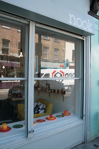
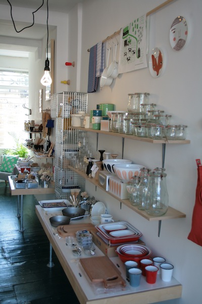
Nook on Stoke Newington Church Street in north London is located on what can confidently be described as a hipster indie high street. In the past few years there has been a surge in independent businesses from a "fancy butchers" to a wine merchants and fashion boutiques [the local supermarket is a Wholefoods]. All of which has been great timing for the trio behind design shop Nook - siblings Kate and Jack Simpson and his girlfriend Gemma Ridgeway. They opened in April 2012 and have found that a bit of healthy indie competition is good for business, plus it makes for a very sociable working environment.

The popularity of the area has taken them a bit by surprise as Kate and Jack grew up in nearby Highbury and as children came to the local park - fast forward a few years and Kate is now on the committee of the local business association. Despite enjoying the buzz of being in the right place at the right time, they are still up on their social media: Jack and Gemma do Instagram, Kate does Facebook and they all do Twitter, which Kate acknowledges is “massively important, but it feels a bit un-English”.

They also split their business duties and time in the shop: Kate does PR and marketing and writes the newsletters, Jack does the buying (recent finds include beautiful soaps from France, stationery from Portugal and some interesting things from Poland) he goes to shows, does the accounts and fitted out the shop, and Gemma sorts out the look of the shop, the windows and their identity. 

Who are you? Gemma Ridgway, Jack Simpson & Kate Simpson and we run Nook.

Where can we find you? 153 Stoke Newington Church Street, London N16 0UH www.nookshop.co.uk

Describe your store in five words: Classic, Local, Friendly, Useful, Tactile.

What makes you different? We hand pick every single item we sell, even if it means working with dozens of suppliers, we won't compromise on quality or have a product in the shop that we wouldn't have in our own homes.

How you decide what makes the cut? Things have to have a purpose and be well made, whether that is a practical purpose or an aesthetic purpose, it doesn't matter, but it has to do something and do it well.

What were you doing before you did this? Gemma worked in visual merchandising and styling, Kate ran a shop and workshops, and has a background in PR, and Jack worked in retail management.

If you were starting again what advice would you give yourself? Be brave! In reality we are still learning, you never stop, we are very new to this in the big scheme of things and there is so much more for us to learn and do.

What are you most proud of? Having come this far. The day we opened the shop to the public and stood behind the till was a great day - and we still carry that feeling with us. After being open a year and a half all three of us are now at Nook full time which was our aim from the beginning, so that's a great achievement for us. 

Do you have a favourite thing in the store right now? Hampson Woods wooden boards were part of our in-store exhibition of Hackney designers for the London Design Festival in September and we have continued working with them since, they are made from fallen trees in the UK and are a great example of good British ethical design. 

What's hot for 2014? It’s very hard to pick one particular product, but we have seen a real movement towards products made from natural materials. So we’ll be heading back to nature for 2014.
Every Wednesday 'Indie of the week' celebrates the best independent stores around. These places sell interesting and varied collections of design-related things you don't see everywhere else. They may support young or local designers or be great at finding unique things from around the world. By thinking a little more creatively about what they stock they are fighting the bland homogenisation of so much of the high street. And since I'm down with the realities of modern life, online only stores count too, because a beautiful and easy to use website is just as delightful an encounter in cyberspace.

Do you you have a favourite store? I'd love to hear from you.


Wonky ware

Your eyes are not deceiving you, it's definitely wonky

Your eyes are not deceiving you, it's definitely wonky

My word of the day is 'wonky ware' which is a brilliant descriptive term for ceramics which have a deliberately uneven shape, as seen at Habitat's spring/summer 2014 press show last week.

I think the appeal of wonky things has got a lot to do with the Japanese aesthetic of wabi sabi, or the beauty of things that are imperfect (which I talked about in this post a few months ago) and can be explained by the more general trend towards hand-crafted items. In case you hadn't noticed there's been a huge resurgence in craft and making things so it's inevitable that a brand like Habitat, which has always had a slightly ethnic/global traveller vibe going on, would respond to it.

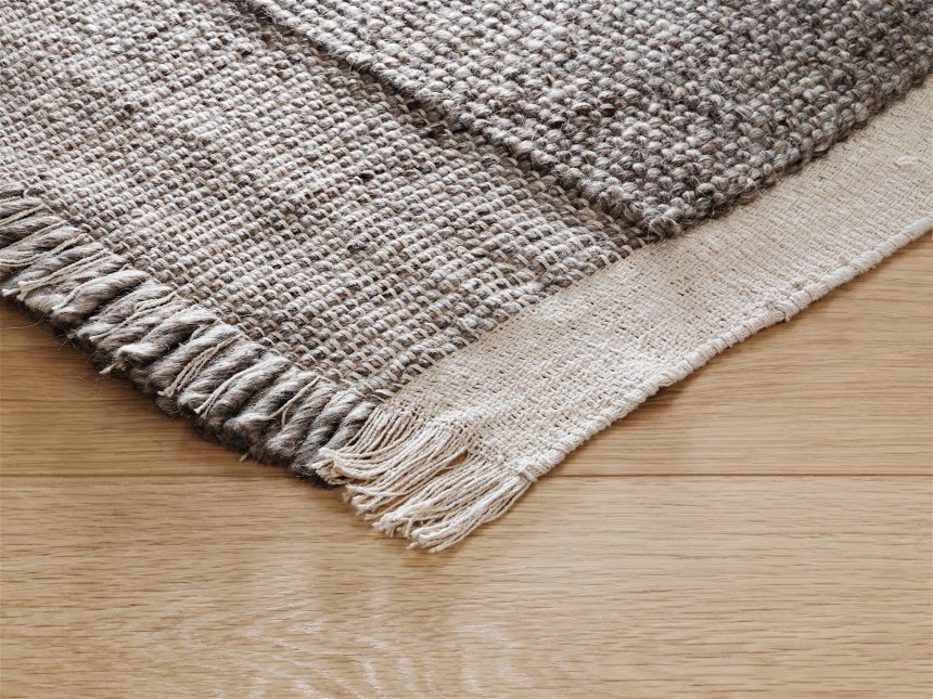
And there will be lots of things with a hand-crafted feel coming into the stores next spring... I liked the Agnus ceramics with high gloss and matt finishes and the organic-shaped Esterban recycled glass vessels. Good value rugs, and I mean good value and nice rugs, Habitat excels at affordability. I liked the Bowan rug made of off-cuts put together in a geometric pattern, it's just the right side of gap year, and I also liked the very easy to live with woven Bortollo rug. There are colourful textiles as always, look out for the Sebbi throws, they also do a £12 cushion in new funky prints each season (includes cover and cushion) it's a bestseller. They've done a sort of take on the Arco floor lamp - the Bip overreach light - for a fraction of the price, plus floor lights which look like weebles and don't tip over. There's also some neon-colour-popping-skinny-legged furniture which is quite sharp. 

High gloss and matt finishes on the Agnus ceramics

High gloss and matt finishes on the Agnus ceramics

Great shapes: Esterban recycled glass vessels

Great shapes: Esterban recycled glass vessels

Bowan rug in foreground and weeble (not it's real name) light on the left 

Bowan rug in foreground and weeble (not it's real name) light on the left 

A very easy to live with rug, the Bortollo

A very easy to live with rug, the Bortollo

Come spring you will want one of these Sebbi throws

Come spring you will want one of these Sebbi throws

This cushion will cost you £12

This cushion will cost you £12

The adjustable Bip overreach light, on the left, and some skinny-legged furniture

The adjustable Bip overreach light, on the left, and some skinny-legged furniture

And while I'm being a one-woman Habitat PR machine, I might as well mention that in December at Platform, the exhibition space within their King's Road store, they've teamed up with rather beautiful and very hip by the look of it new magazine Hole & Corner to do some fun foodie events, click here.  

In praise of messy desks

2013-11-14 10.40.31 copy.jpg

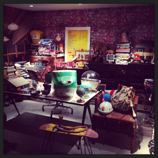
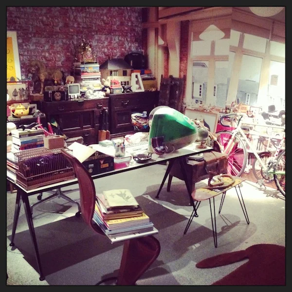
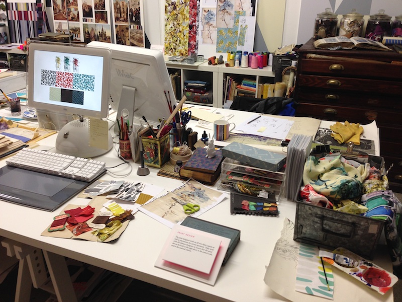
In my haste to post about the Paul Smith exhibition last week I forgot to include the photos I took of his recreated Covent Garden office, so here they are.

I love that his office is so messy; in the exhibition notes he describes it as a "madhouse" and "the equivalent of my brain". There are books, bicycles, cameras, rabbits, robots, letters, bills, bits and bobs all over the place, and only one tidy surface - a huge rosewood table that is always empty. But it's from this accumulation of stuff picked up on his travels over the years that he often gets ideas for a new collection or the design of a new shop. 

So maybe don't spend today tidying your desk and instead revel in your creative chaos for a bit longer. 

ps - I wonder if he actually uses that old computer

2013-11-14 10.41.30 copy.jpg

Behind every great man

Paul Smith faces a scrum of photographers at the opening of his exhibition 'Hello, My Name Is Paul Smith' at the Design Museum in London yesterday

Paul Smith faces a scrum of photographers at the opening of his exhibition 'Hello, My Name Is Paul Smith' at the Design Museum in London yesterday

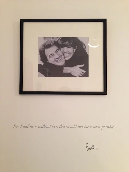
It’s very telling that the first thing you see when you enter the Paul Smith exhibition at the Design Museum is a dedication to his wife. “For Pauline - without her, this would not have been possible”. It sets the tone of the show. He's been wildly successful, he works relentlessly on his fashion collections and other projects and travels all the time, yet he remains modest - and we can thank Pauline for that. "She's kept my feet on the ground", he says in the audio commentary in one room.

She's also the one who set the whole thing in motion as it was her who studied fashion at the RCA and came to Nottingham in the 1970s (where he was) to work as a part time tutor at the School of Art and Design. He credits her with "teaching me the importance of quality, cut, proportion and an understanding of how clothes are made". She took him to Paris couture shows and taught him the key elements of the business of fashion and encouraged him to set up on his own. Which left me thinking 'I wonder if Pauline Smith ever does interviews?' 

Ahhhhhh

Ahhhhhh

She was not there yesterday, but he was and he seemed very affable and relaxed as he wandered around talking to journalists and posing for photographers. Here's a man who has 300 shops worldwide and his fans send him presents, many of which he has on show in his office which is renowned for being full of curious objects. It's hard not to like him. 

He loves street markets - they’re one of his favourite places to go whether he's in Delhi or on Portobello Road. He takes his camera everywhere he goes, it’s his visual diary - he also carries a notebook. Pauline taught him the importance of simplicity - something as simple as his handwriting on a piece of fabric. He doesn’t like sitting still, he likes exploring new places, even when he only has 24 hours. "You can find out a lot about a city from its shops", he says. "Think laterally, be curious. Ideas can come from anywhere, you just need to look and see - most people don’t see". 

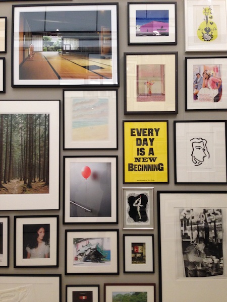
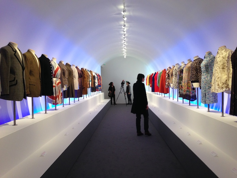
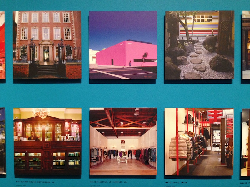
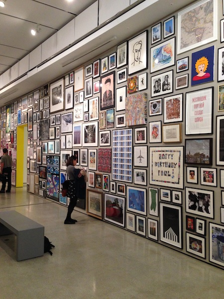
The highlights for me were the wall of pictures which he has been collecting (and receiving) for years and the recreation of his Covent Garden office in all its creative chaos. Plus there are photographs of his eponymous shops around the world, which are all completely different, and not forgetting the clothes featuring his signature bold prints. Go, have a wander, it will inspire you. 

Indie of the Week #35: The Perching Post

The Perching Post.JPG
Barnes in south west London could quite possibly the spiritual home of Indie of the Week. After talking with Anna Sparshatt, the owner of The Perching Post, I've discovered they have a very supportive community headed up by the Barnes Community Association which actively helps independent businesses (just don't mention the Pizza Express or Cafe Nero on the high street). Within this family-oriented, affluent community The Perching Post is a little design outpost selling restored furniture and new accessories with a slightly retro Swedish lots of grey vibe; she is adamant that the look is "not shabby chic". Despite the support it has still been a struggle, with the quiet periods of summer holidays and half-terms being a particular challenge, but she is taking on more private commissions for clients wanting old furniture updated and is finding her niche on this indie high street.
Who are you? Anna Sparshatt, Owner of The Perching Post.
Where can we find you? You can find us at 55 Barnes High Street, London, SW13 9LF; www.theperchingpost.co.uk 
Describe your store in five words: Eclectic, unusual, furniture, homeware, gifts.
What makes you different? We have a fantastic mix of old furniture which has been rejuvenated or restyled, new furniture, homeware, and we’re now selling gifts such as bags, jewellery, and scarves. We like to source goods made in the UK if we can. We have also started to do some interesting pop-ups in the shop, this week we have Poule De Luxe who make beautiful gowns, tops and nighties from fine organic linens, silks and cobweb fine cotton English lace using traditional methods. So I guess we're a bit like a mini department store.
How do you decide what makes the cut? It has to be something that I like and would buy. It also helps, especially with the antique/retro furniture and items made in the UK, if there is an interesting story behind it. I also look out for items that are reasonably priced and good quality.
What were you doing before you did this? Well I'm 24 and I pretty much went straight from university into opening the shop. I studied Theatre Design at Wimbledon College of Art, but realised I just enjoyed scouting furniture and transforming items that would otherwise be destined for landfill. It is a great way to channel my artistic side. 
If you were starting again what advice would you give yourself? To trust your instincts, learn to say no and be able to walk away. Market your business early and get the message out there asap.
What are you most proud of? Surviving! We've been open for nearly two years and having a bricks and mortar shop is tough. With such large overheads and very limited experience in business it's been particularly hard this year, but I'm very hopeful for the future and love what I’m doing. Word is getting out now and I am working on a few commissions that came my way through people visiting the shop.
Do you have a favourite thing in the store right now? Well, our stock constantly changes, but at the moment I love our herringbone throws as all I want to do these days is wrap up warm by the fire.
What's hot for 2014? As blue is tipped to be next year’s colour we’re working on restoring some lovely cocktail chairs and Ercol sofas in beautiful blue fabrics.


Every Wednesday 'Indie of the week' celebrates the best independent stores around. These places sell interesting and varied collections of design-related things you don't see everywhere else. They may support young or local designers or be great at finding unique things from around the world. By thinking a little more creatively about what they stock they are fighting the bland homogenisation of so much of the high street. And since I'm down with the realities of modern life, online only stores count too, because a beautiful and easy to use website is just as delightful an encounter in cyberspace.
Do you you have a favourite store?  I'd love to hear from you.


Nubie

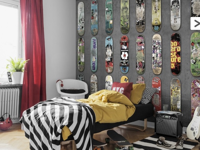
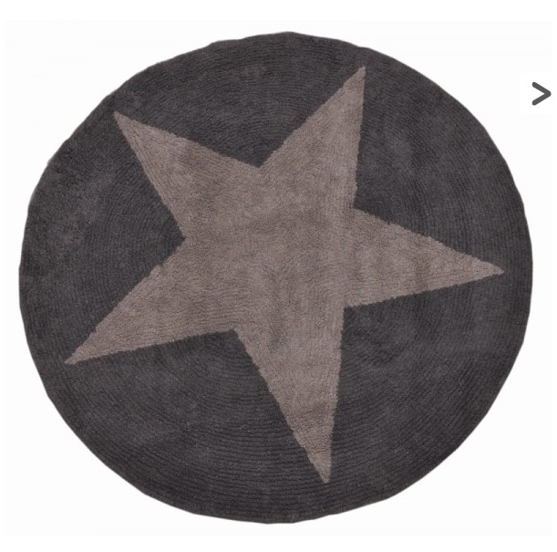
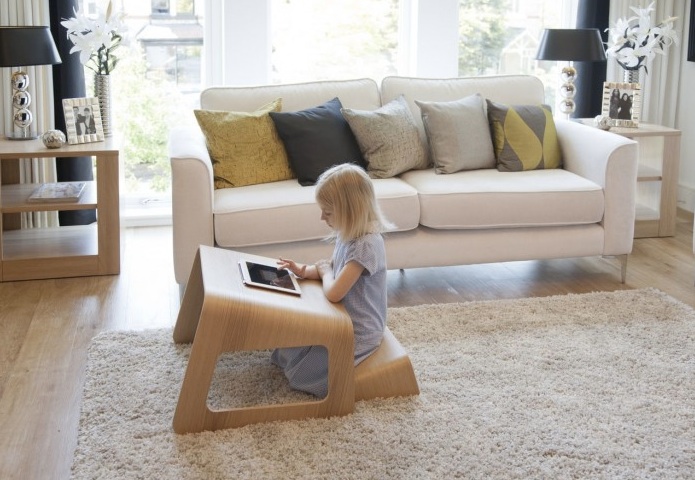
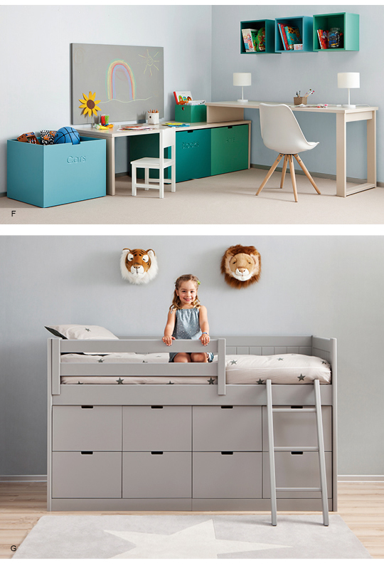
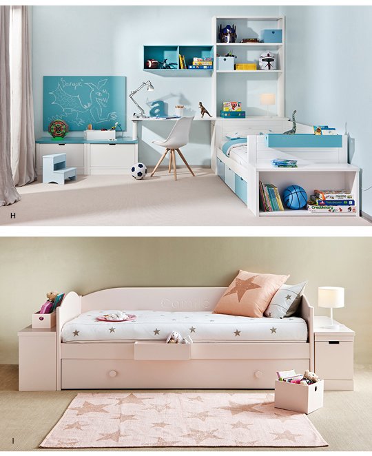
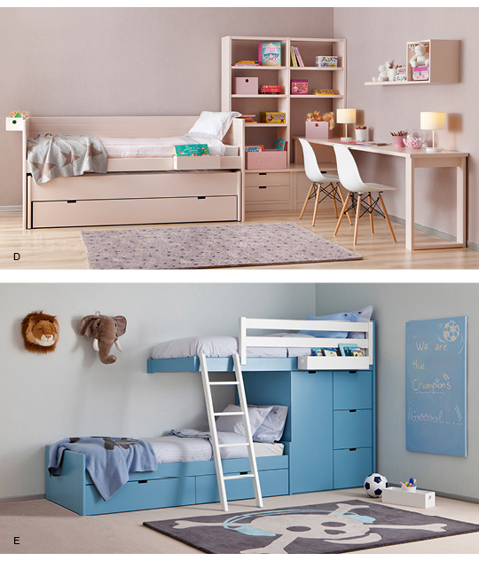
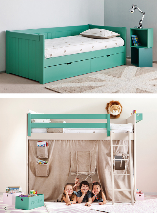
Someone was asking me about good websites for kids the other day and what should pop into my inbox but an email from the people at 'modern kids boutique' Nubie. They do a whole range of items from rugs to wall stickers to tiny chairs, plus they sell a collection of modular furniture (called RoomPlanner) with some pretty cool loft-style beds in lots of different colours and some neat storage ideas. And before you ask, no it's not cheap, worth a look for ideas though. 

Gloom busting windows

Have you seen The Conran Shop's windows on the Fulham Road?

I was walking through London yesterday on what was a classic wet and grey November day when I caught a glimpse of something very pink and neon pulsing in my peripheral vision. I actually crossed the street to get a closer look and immediately felt compelled to take some pictures. WOW. What do you think? Now I'm not saying I'm going to do a day-glo Christmas this year, but it is quite the sight to behold - and really made me think about the extraordinary power colour has to affect mood. 


2013-11-06 11.44.47 copy.jpg
2013-11-06 11.45.01 copy.jpg
2013-11-06 11.44.33 copy.jpg
2013-11-06 11.48.19 copy.jpg
2013-11-06 11.48.29 copy.jpg

SCP East

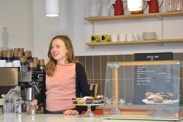
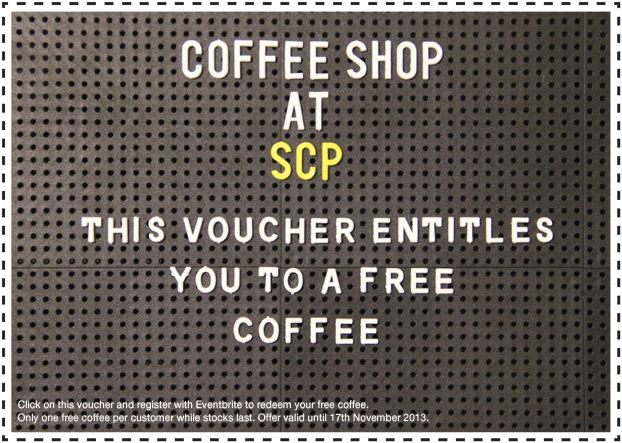
Ooh they've opened a coffee shop inside SCP East at 135 Curtain Road, EC2 and they're offering all their customers a free coffee CLICK HERE (until 17th November). The coffee is from Allpress and the cakes are from east London bakery Violet, purveyors of American-style deliciousness. The new cafe is part of their recent renovations which sees the shop now spread over three floors - with gifts and accessories in the basement, coffee shop and lighting department on the ground floor, and upholstery upstairs.

Pop Art Design at The Barbican

Hot Stuff: The Studio 65 Bocca Lip Sofa, from 1972  

Hot Stuff: The Studio 65 Bocca Lip Sofa, from 1972  

I'm filing this one under 'things to do on a rainy Sunday afternoon'... the Pop Art Design Exhibition at The Barbican is now open and runs until 9th February.

What makes this take on an admittedly very familiar art scene different is that it focuses on the role of both the designers and the artists in the Pop Art era - and inevitably features a lot of wacky chairs. 

"Pop artists commented on the cult of celebrity, commodity fetishism and the proliferation of media that permeated everyday life in America and the UK after WWII. Radically departing from all that had gone before, artists delighted in adopting the design language of advertising, television and commerce to create work that was playful but often also intentionally irreverent and provocative. In turn, designers routinely looked to Pop Art as a source of inspiration. Pop Art Design paints a new picture of Pop – one that recognises the central role played by design."

Jane Alison, Senior Curator, Barbican Art Gallery said: ‘Pop emerged in the 1950s yet, amazingly, this is the first major show to throw light on the relationship between Pop Art and design. Featuring key Pop artists and groundbreaking designers it’s a must see for anyone fascinated by this iconic period and its enduring legacy.’

The London Magazine : October

Modo chandelier by Jason Miller for American brand Roll & Hill, at SCP. The clocks go back this weekend which means it's time to think about lighting. Are you happy with yours, have you got the right bulbs, could you do with some …

Modo chandelier by Jason Miller for American brand Roll & Hill, at SCP.


The clocks go back this weekend which means it's time to think about lighting. Are you happy with yours, have you got the right bulbs, could you do with some more mood lights..? I've written about this in my October design column for The London Magazine. 


Brogue tables by Bethan Gray at FAO Shop.


In other design news this month: Bethan Gray's Brogue table is now available in these delectable colours (above); Diptyque has launched an electric diffuser with an eye-watering price; India Mahdavi, the interior designer behind the Coburg Bar at the Connaught hotel, has a book out. 


Indie of the Week #34: Howkapow

coral-dip-shell-lamp-02.jpg
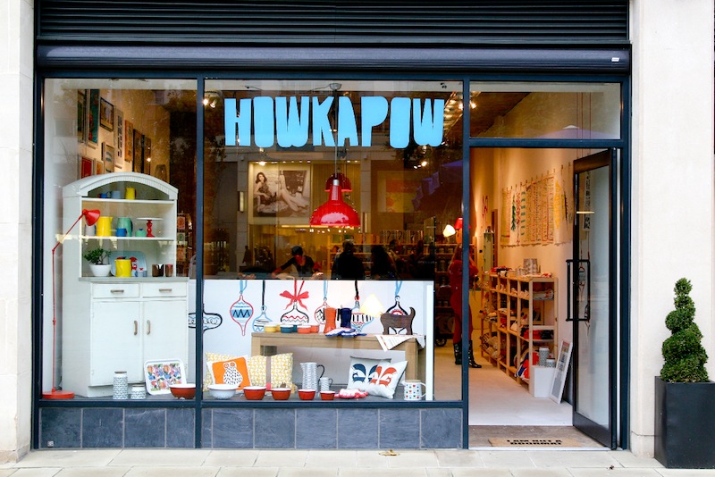
As husband and wife teams go Cat and Rog How of online design shop Howkapow seem to have got it dialled. With over 4,000 followers on Twitter and over 9,000 likes on Facebook, plus an active Pinterest page, this couple are a text book example of how to run a successful web business in the social media age. “There’s quite a clear division of labour,” says Rog, “she’s the creative driving force behind the business and I do logistics and accounts and all the kind of nuts and bolts”.
They started out in October 2010 and have organically grown their fan-base with regular competitions on Facebook, going to design shows and talking to a lot of people - not that everyone was ready to listen to them back then. “Quite a few people were unwilling to work with us, even suppliers who were trying to sell stuff”, says Rog. Their pop-up shop in Bristol last Christmas [it stayed open until April, but is now closed] changed that, even among their friends. It galvanised the Howkapow brand and made people realise exactly what it was they were doing. They have since relaunched their website based on the look of the pop-up.
Who are you? We are Cat and Rog How from Howkapow!
Where can we find you? You can find us physically at 11 Backfields Lane, Bristol, but browse our entire shop online at www.howkapow.com
Describe your store in five words: Colourful. Fun. Unique. Independent. Strong.
What makes you different? We only stock things that we like no matter where they're from. This sounds like we're stating the obvious, but this means that we gather things from all over the world - from friends from art school, people we've found at design markets, on Pinterest or other social media - anywhere. We have strong brand values which influence what we buy and who we buy from.
How you decide what makes the cut? If an item is bold, bright and colourful; if is a good price and made by someone or a group of people who make stuff in a moral/ethical way then it usually makes the cut.
What were you doing before you did this? I worked in journalism and then graphic design. Rog worked in radio production and marketing. We also sold my jewellery and his photography at artist markets in Melbourne and London on our days off.
If you were starting again what advice would you give yourself? Simplify! Simplify! Simplify!
What are you most proud of? The fact that we've been able to work out a way of working together every day. That, more than anything else, was the main reason for starting the shop.
Do you have a favourite thing in the store right now? Ah, they're all my favourites. But if I was pushed I've got a soft spot for our new Coral Dip Lamp. Mmmm.
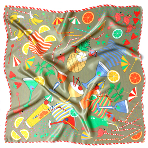
What's hot for 2014? We have a new 100% silk Cocktail O'Clock scarf launching in the next few weeks which we think is going to be big in 2014. It's gold and light blue (two colours tipped by Pantone to be big in 2014) and cocktails are a perennial favourite so what's not to like?


Every Wednesday 'Indie of the week' celebrates the best independent stores around. These places sell interesting and varied collections of design-related things you don't see everywhere else. They may support young or local designers or be great at finding unique things from around the world. By thinking a little more creatively about what they stock they are fighting the bland homogenisation of so much of the high street. And since I'm down with the realities of modern life, online only stores count too, because a beautiful and easy to use website is just as delightful an encounter in cyberspace.
Do you you have a favourite store?  I'd love to hear from you.

Mr Jones Watches

mrjones2.jpg

Can you tell what time it is?


mrjones1.jpg

How about now?

This playful, imaginative, obfuscatory... call it what you will design deliberately confuses the uninitiated who, quite naturally, may not immediately realise that two marlins among the shoal of fish indicate the hours and minutes. It represents the defensive manoeuvring of fish under attack and once every hour the chaos of the fish align to make a harmonious circle. 

My initial 'WTF?!' reaction has softened and it's sort of growing on me. It's quite Johnny Utah in Point Break circa 1991.

Love it? Hate it? I would love to know what you think. 

Baitball watch by Mr Jones Watches, £175

MEATliquor in Brighton

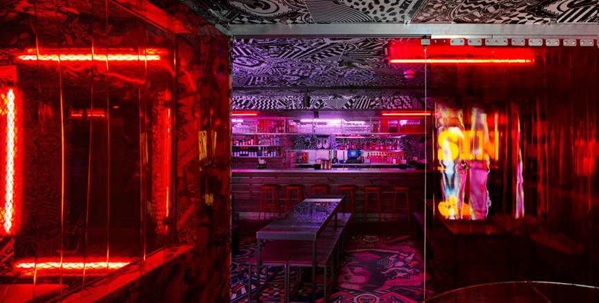
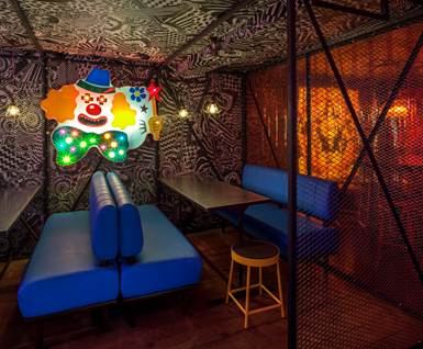
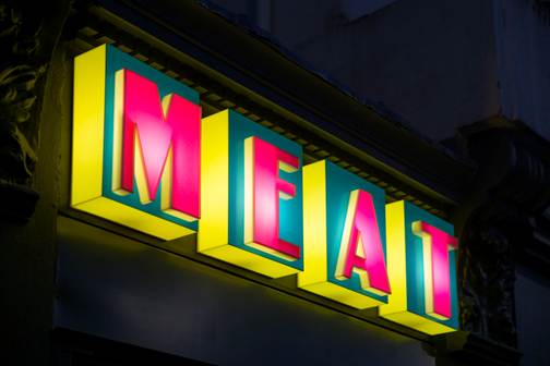
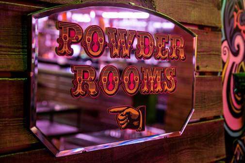
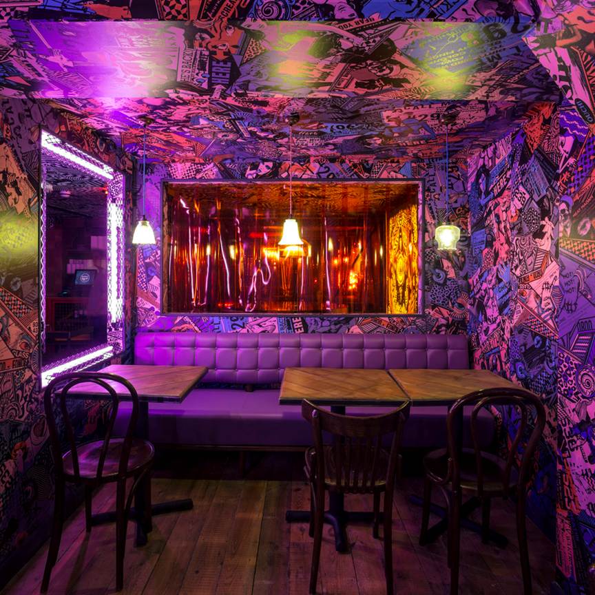
Check out the fantastical, garish, slightly sinister new MEATliquor burger joint in Brighton designed by their go-to interior architects Shed. If you've been to MEATliquor on Welbeck Street, W1 you'll know that it's theatrically down and dirty and this new one follows suit. Inspired by the location the design references Brighton's fairgrounds and arcades with surreal patterns, a palette of red, purple and pink, plus a tattooed deep sea diver, neon flamingo and creepy clown. It's their first restaurant outside of London [there's a MEATmarket in Covent Garden and a MEATmission in Hoxton Market] you can't book, you'll probably have to queue and it may give you a headache - I predict it'll be a hit. 

MEATliquor, 22-23 York Place, Brighton, BN1 4GU  

Heal's revival

It's all change this autumn at department store Heal's on Tottenham Court Road with new management and creative direction. It was a smart move to hire Michelle Alger (formerly of Liberty) as Head of Home and her influence is visible. Chic items include bedroom furniture by Another Country, a diverse range of ceramics, glass and accessories, and the new Eiger jewellery by Terence Woodgate (yep, jewellery... at Heal's). So if you haven't been there in a while I'd recommend a visit as it is looking pretty darn good.

There's also a new lighting showroom with brands such as Tom Dixon, Plumen and Original BTC, plus they now offer a lighting consultation service in the tiny Light Box room. It's at the back of the store, just off the newly renovated 1916 Cecil Brewer staircase and under a 64-arm Bocci (remember them from the V&A during LDF) chandelier which hangs from the fifth floor. And once you've taken all that in you can stop off at their cute cafe, below, and play spot the Ercol furniture. 

photo (17).JPG

LDF: Design Junction

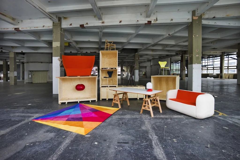
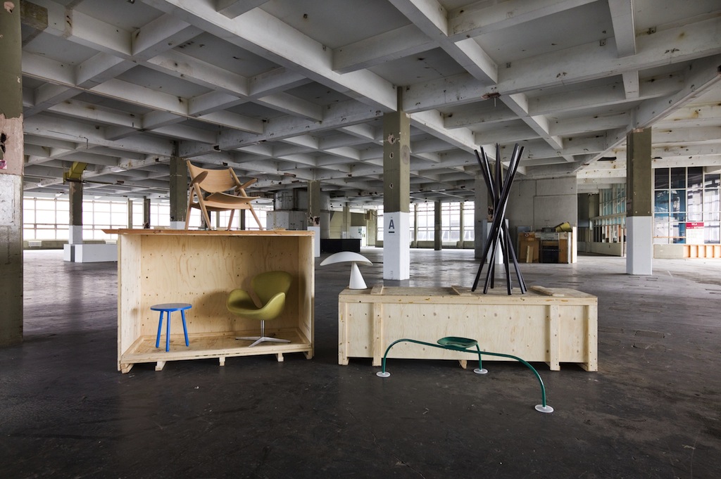
Design Junction was set up for four days during LDF at the enormous, industrial and atmospheric Old Postal Sorting Office on Oxford Street. These pictures show what it looked like before everyone arrived.

Design Junction was set up for four days during LDF at the enormous, industrial and atmospheric Old Postal Sorting Office on Oxford Street. These pictures show what it looked like before everyone arrived.

There was a lot of hype about Design Junction this year, not just from the media, but from the promotors of the event itself. I received nearly 50 pre-show newsletter emails in the lead-up to it. The show had been a hit last year, and it seemed like they were determined to repeat it.

I know I wasn't alone in finding the scale of this year's show daunting; on the upper two floors there was so much to see it was actually quite overwhelming and hard to process. The Old Sorting Office is gargantuan and has a light industrial past that is visibly peeling off its concrete walls which creates a brilliant atmosphere, and it certainly made you feel like you were in a place where things were happening - with a pop-up Jamie Oliver Barbecoa restaurant and Transport for London micro-brewery - but it was hard to pick individual things out... there was just SO MUCH stuff.

However, I did love the ground floor retail section which hosted over 30 independent design-led pop-up stores. It seemed to me a great way for them to meet not only industry insiders, but also meet the general public (it was free to get in to the show) - and for the public to be able to meet them.

Since I started doing Indie of the Week, I've spoken to lots of people who run independent shops and labels, and I've noticed that they often start online first and only go for bricks and mortar shops once they have established a following. As I wandered around this colourful, buzzy, dynamic space [it reminded me a bit of the old Kensington Market, apols if you're under 35] I was struck by how many exciting independent traders there were and how - without a middle man/shop front between brand and consumer - shows like this are vital for these businesses. Pictured below are few of the things that caught my eye:

Beautiful, tactile, simple designs by aelder who are Natasha Lawless and Floyd Maclean

Beautiful, tactile, simple designs by aelder who are Natasha Lawless and Floyd Maclean

Lovely copper cards by Scottish-based Lovely Pigeon who also make prints and jewellery

Lovely copper cards by Scottish-based Lovely Pigeon who also make prints and jewellery

Powerful colour and print combos by Kangan Arora  who is based in North London but comes from Northern India. I just love saying her name

Powerful colour and print combos by Kangan Arora  who is based in North London but comes from Northern India. I just love saying her name

A fun and clever idea from Not Another Bill  : you sign up and once a month you, or a friend, receive a surprise present in the post. They say: you'll be happier to see the postman and you'll discover new artists and designers.

A fun and clever idea from Not Another Bill  : you sign up and once a month you, or a friend, receive a surprise present in the post. They say: you'll be happier to see the postman and you'll discover new artists and designers.

I do like the Eley Kishimoto wallet notebook with zip lock pouch for receipts, business cards etc from Quill London 

I do like the Eley Kishimoto wallet notebook with zip lock pouch for receipts, business cards etc from Quill London 

After the event I quizzed Lucy Edmonds from Quill [who was one of the first Indie of the Week's and was exhibiting there for the first time] about her experience. She said it had been a great way to interact with a huge number of people who had never encountered her brand or product before. She had felt she'd done well on sales, but this was counteracted by expensive stand costs. However, she acknowledged there was unquantifiable PR value to doing such a well publicised show. As an online only venture it’s important to take advantage of shows like this to meet the public and she found it valuable to observe what products people were drawn to and conversely what wasn't catching people's eyes. Because of the tactile nature of the products she sells it was good to show them in the flesh, she noted several lines that well well at pop-ups, but less well online, and vice versa. 

So, while trade shows are often preaching to the converted, I felt that Design Junction was doing a good job of bringing new design to a wider audience.