Indie of the Week #33: Material

Hilts.JPG


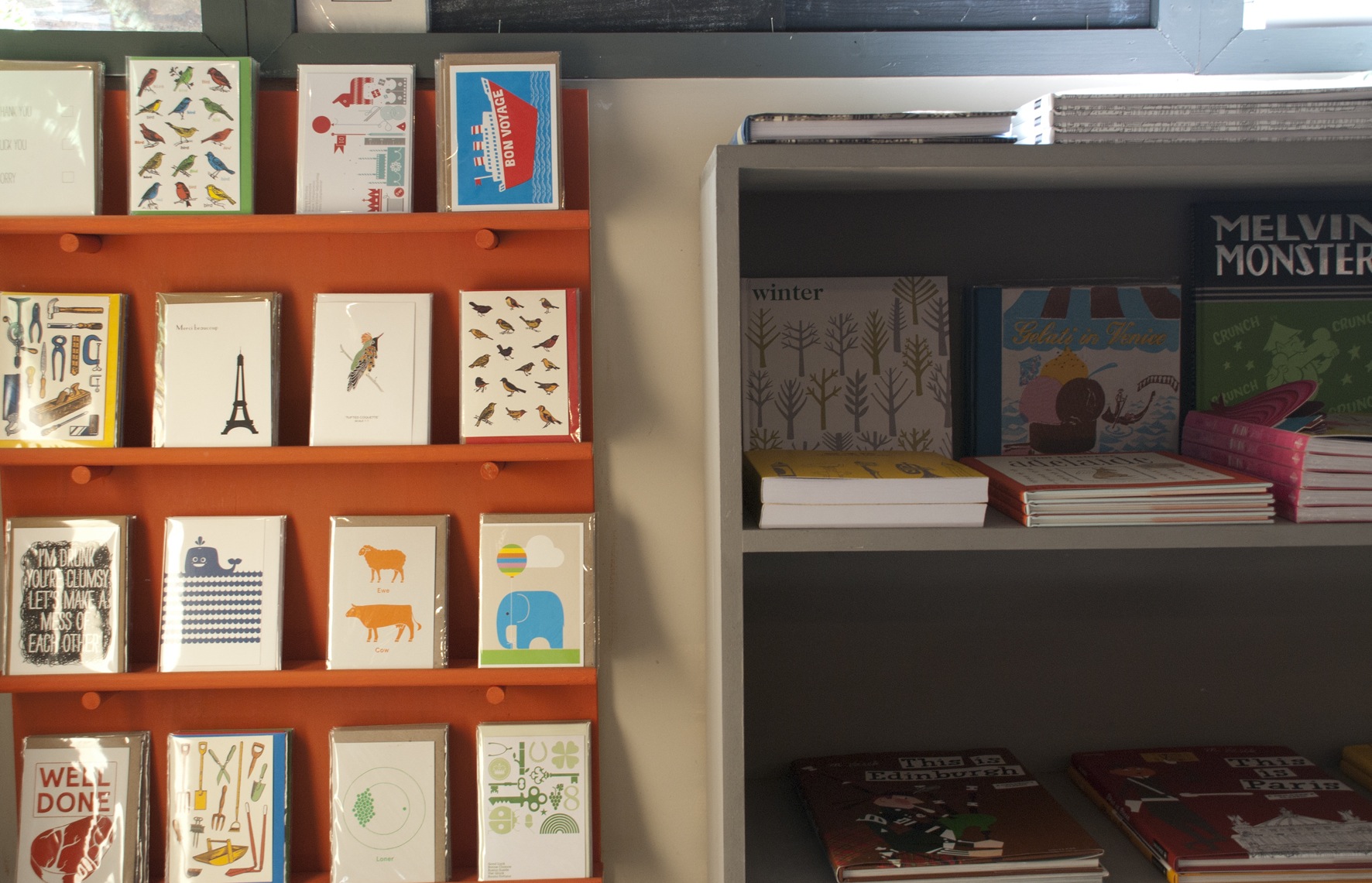
“We always had an aspiration to run a shop of this ilk, but [back in 2007] we had no experience and no financial backing”, says Lucy Payne, one half of the husband and wife team behind the gallery and bookshop Material. With London out of the question the couple returned to Lucy’s home town of Ludlow, in Shropshire, where they had spotted a gap in the market for a gallery with a slightly edgier, urban aesthetic. Much of the local population either works in London, or used to, and were looking for that in their lives. Incidentally, many of their early customers were Londoners weekending in Ludlow. 
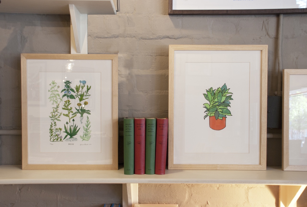
The couple have since opened a shop on Rivington Street in Shoreditch with the books and artworks laid out much as you might imagine them in your own home. Lucy acknowledges that their style has developed dramatically since they started and they’ve noticed a shift towards food books with more of a design sensibility. It’s one of their main draws, along with children’s books, and now with paper-cutting workshops with Poppy Chancellor running twice monthly in the shop they seem to be comfortably navigating the zeitgeist.
Who are you? Lucy A Payne, partner at Material.
Where can we find you? 3 Rivington Street, London EC2A 3DT & 131 Corve St, Ludlow SY8 2PG www.materialmaterial.com
Describe your store in five words: inspirational, eclectic, innovative, creative, colourful.
What makes you different?  All of the above.
How you decide what makes the cut? After an item is presented to us, we have to still be thinking about it the next day/ week/ month. Our joy is obsession. Be it a book, original artwork or a gift card, in our minds, it has to be something we couldn't live without and, once they've seen it, neither will our customers. Even with unfinished products or work in progress, if the design or product is right and we see the potential for development or even a collaboration opportunity, it makes the cut.
What were you doing before you did this? I studied Surface Textile Design for Fashion at LCF and spent a few years interning, working freelance and part time in a Vintage clothing store. My business partner and husband, Joe, studied Graphic Media Design and Illustration at LCP and is also an interaction designer.
If you were starting again what advice would you give yourself? Trust your instincts but don't overlook or judge anything before you give it a chance. Never spend time worrying about what everyone else is doing as that is time wasted and stay ahead of the game with admin and paperwork- it's a full time job in itself. 
What are you most proud of? Our progress. We started in the midst of the recession with very little and have slowly grown and built up a solid business.
Do you have a favourite thing in the store right now? This changes from day to day. Right now, I would have to say my favourite item (although I am slightly biased) is the tea towel we produced in collaboration with Marcus Walters for the Toast Festival we participated in at the beginning of June.
What's hot for 2013? Fool Magazine
Every Wednesday 'Indie of the week' celebrates the best independent stores around. These places sell interesting and varied collections of design-related things you don't see everywhere else. They may support young or local designers or be great at finding unique things from around the world. By thinking a little more creatively about what they stock they are fighting the bland homogenisation of so much of the high street. And since I'm down with the realities of modern life, online only stores count too, because a beautiful and easy to use website is just as delightful an encounter in cyberspace.
Do you you have a favourite store?  I'd love to hear from you.


Indie of the Week #32: The Calm Gallery

Back in 2007, a couple of students unwittingly set a slogan in motion. Typography fans Hayley and Lucas Lepola were at university when they decided to do a screen-print of the old wartime poster ‘Keep Calm & Carry On’ in different colours. And so, the Keep Calm Gallery was launched with just three prints.
They could never have predicted the extraordinary popularity of the slogan, or its many tedious parodies - 'Freak Out and Break Stuff' - anyone? Fed up with people asking them for the parodies on mugs and laptop cases, which they don't sell, they changed their name to The Calm Gallery last year.
“We still like the sentiment of the original phrase”, says Lucas, diplomatically, “but we just wanted to distance ourselves from it all as it’s such a small part of what we do”. The pair still sell the prints they originally started with, along with nearly 200 others by artists such as James Brown and Chase and Wonder, plus postcards and tea towels. They also run a sister site called Alphabet Bags.
Who are you? We are Hayley & Lucas Lepola and we run The Calm Gallery.
Where can we find you? www.thecalmgallery.com which we run from our studio in rural Cambridgeshire.
Describe your store in five words: Handsome prints, fun thoughtful gifts.
What makes you different? We like to think that our large collection of beautiful designs sets us apart from the rest. We take great pride in attention to detail in everything we do and ensuring our lovely customers have the best possible experience when visiting The Calm Gallery.
How you decide what makes the cut? Generally if something captures our attention and is something we would hang in our own home, or give as gift ourselves, then it would definitely be the sort of thing we would like to add to our collection. It’s also important to us that prints are being made with great care and using the best materials. We want the prints which we send out to be enjoyed for many years to come.
What were you doing before you did this? We started The Calm Gallery whilst still at university in Birmingham back in 2007, so to be honest we haven’t really done much of anything else. Lucas worked briefly freelancing for a marketing company, but since we left university our focus has been on working with artists we admire and experimenting with our own designs. 
If you were starting again what advice would you give yourself? Organise paperwork from day one. Boring we know, but so important. Stop working from home earlier, before there is stock taking over every room in the house. When it comes to book-keeping and accounts, learn the basics but then outsource when you have got the grasp of these so you can focus time and attention where your real skills lie.  
What are you most proud of? When we look back at the last six and a half years we feel pretty proud to have created and grown The Calm Gallery together as a couple. It has not always been easy but we feel extremely lucky to be able to work together every day and collaborate on things that we love doing. Aside from this, we feel most proud thinking of the fact that people all over the world are hanging our prints on their walls and giving our products as gifts to loved ones. This makes us pretty darn happy.
Do you have a favourite thing in the store right now? That’s a tough one, there are so many items we love right now. But if we had to choose we would probably pick Double Merrick’s three prints La Lune, La Terre and Le Soleil. We love the vintage classroom wall chart style of these big, bold screenprints. They look really impressive hung together and could hang just about anywhere.
What's hot for 2013? Our postcards have been pretty popular this year. Perhaps people are making the time to write to each other more often but they also make great mini prints that you can pop easily in an off-the-shelf picture frame. The cheery messages and bright colours are particular popular; who wouldn’t love receiving a friendly card in the post?
 
Every Wednesday 'Indie of the week' celebrates the best independent stores around. These places sell interesting and varied collections of design-related things you don't see everywhere else. They may support young or local designers or be great at finding unique things from around the world. By thinking a little more creatively about what they stock they are fighting the bland homogenisation of so much of the high street. And since I'm down with the realities of modern life, online only stores count too, because a beautiful and easy to use website is just as delightful an encounter in cyberspace.
Do you you have a favourite store?  I'd love to hear from you.


LDF13 East

My personal highlight from last week's London Design Festival was going on a Tokyo Bike tour around East London with a group of British and American journalists and a couple of Danish interior architects. We set off from Design Junction, cruise…

My personal highlight from last week's London Design Festival was going on a Tokyo Bike tour around East London with a group of British and American journalists and a couple of Danish interior architects. We set off from Design Junction, cruised along the Regent's Canal and popped in to see what was going on at Established & Sons, Twentytwentyone, Tord Boontje, Donna Wilson, SCP to name a few... tough break, I know.


They're really easy to ride, a bit like Dutch bikes, as they're quite upright, but just have a few more grip-twist gears. And don't they look pretty all lined up in a row... Their name is self-explanatory: mountain bikes were designed for mountains, Tokyo Bikes were designed for Tokyo. Simple. 

I took this picture of Faye Toogood's installation "The Conductor" [fluorescent lights controlled by analogue switches which you're allowed to touch] at Established & Sons. Some wag in our group jokingly referred to this as an "Instagram trap". …

I took this picture of Faye Toogood's installation "The Conductor" [fluorescent lights controlled by analogue switches which you're allowed to touch] at Established & Sons. Some wag in our group jokingly referred to this as an "Instagram trap". Haha.

On a slightly different wavelength was the fantastic Vernacular exhibition at Tent London organised by the Crafts Council of Ireland. There were some beautiful hand-crafted pieces on display including these lovely ceramics by Jack Doherty. Also Make…

On a slightly different wavelength was the fantastic Vernacular exhibition at Tent London organised by the Crafts Council of Ireland. There were some beautiful hand-crafted pieces on display including these lovely ceramics by Jack Doherty. Also Makers & Brothers' Jerpoint Water Carafe & Glass, Designgoat's Gray Chair, Clancy Moore's Strand Lamps and Donna Bates's parlour lights.

3D printing at 100% Design

I know I'm a bit late to the party on 3D printing so I was pleased to come across the 'Home Factory' stand at 100% Design yesterday. The picture above is of 3D printed cutlery in gold plated brass by some people in Belgium called Eragatory. I'm not …

I know I'm a bit late to the party on 3D printing so I was pleased to come across the 'Home Factory' stand at 100% Design yesterday. The picture above is of 3D printed cutlery in gold plated brass by some people in Belgium called Eragatory. I'm not sure you'd get much use out of the teaspoon, but it certainly caught my eye.  

Domestic 3D printing is the future. As in, you may actually have one of these machines in your home one day. Quite frankly it's about as aesthetically pleasing as a microwave. 

Domestic 3D printing is the future. As in, you may actually have one of these machines in your home one day. Quite frankly it's about as aesthetically pleasing as a microwave. 

3D printed jewellery? Now I'm listening. 
The nice man from iMakr Store assured me "the only limit is your imagination"... Oh and the price, resolution, size of machine [they can be huge] and reliability. So, basically, it's wild and radical and totally futuristic, but you don't n…

The nice man from iMakr Store assured me "the only limit is your imagination"... Oh and the price, resolution, size of machine [they can be huge] and reliability. So, basically, it's wild and radical and totally futuristic, but you don't need to start making space for one just yet. 

Wrong for Hay

2013-09-13 12.21.59 copy.jpg

Wrong for Hay? This puzzling title for a new collection of furniture intrigued me as much as it confused me. Turns out it's London-based designer Sebastian Wrong's range of lighting, ceramics, textiles, glassware and furniture for Danish brand Hay.

Hay is an interesting brand, and one you need to know about, because they make the kind of elegant, pared down Scandi-style furniture that looks like it should be absurdly expensive, but actually isn't - and that's a huge part of their appeal. In fact it's one of the guiding principles of this company which was set up in 2003 by Rolf and Mette Hay to bring us good design at accessible prices.


2013-09-13 12.20.29 copy.jpg

Sebastian Wrong is creative director of this new London venture 'Wrong for Hay' which means he both designs and curates, hence the fact the bold textiles aren't by him but are archive patterns by Natalie Du Pasquier, a founding member of the Memphis group (look it up). These are hugely appealing to any fan of strong graphic prints (me) and they start at £50. He's also recruited emerging designers such as the talented Lucien Gumy whose deceptively simple 'The Wooden Shelf' has already won an award.

And, wow do they know how to put on a show. I went along to the launch last Friday at a grand old Georgian townhouse with sky-high ceilings, original paintings, two blue plaques outside, the works... on Queen Anne's Gate in St James [inside scoop: it is owned by the Hay's business partner who has been slowly refurbishing it for around six years]. Talk about a juxtaposition of old and new, and as you can see from the pictures it was pulled of with serious flair. I could have happily hung out there all day. 


LDF 13: The V&A

Last Friday I went to the official launch of the London Design Festival at the V&A which was an excellent excuse to wander around this wonderful museum in the name of "work". Here are a few of the things I saw.

The theme of this year's festival is "Design is Everywhere" which has been boldly rendered in this red and white typographic identity by legendary design agency Pentagram. The signs are up all over town reminding us that design is all around us…

The theme of this year's festival is "Design is Everywhere" which has been boldly rendered in this red and white typographic identity by legendary design agency Pentagram. The signs are up all over town reminding us that design is all around us - it doesn't always have to mean something beautiful, expensive or on a plinth.

You can't miss this in the Cromwell Road atrium of the V&A. It's an extraordinary chandelier by designer Omer Arbel for Canadian company Bocci called 28.280 [there are 280 of their '28 Series' handmade glass pendant lamps]. It's hung from the cu…

You can't miss this in the Cromwell Road atrium of the V&A. It's an extraordinary chandelier by designer Omer Arbel for Canadian company Bocci called 28.280 [there are 280 of their '28 Series' handmade glass pendant lamps]. It's hung from the cupola, the highest point in the museum, and falls 30 metres. The copper cables all had to be unrolled and bent into shape meaning that it can never be exactly recreated again. It's absolutely beautiful and will be up for two months so there's time for you to see it. 

It's quite Christmassy actually. 

It's quite Christmassy actually. 

The man himself, Omer Arbel, in front of his creation. I snapped this while he was posing for someone else.

The man himself, Omer Arbel, in front of his creation. I snapped this while he was posing for someone else.

 'The Wind Portal' by Lebanese designer Najla El Zein is an installation of "5,000 paper windmills turning in the breeze" and it's beautiful. What this picture can't capture is the lovely rushing water sound it made. 

 'The Wind Portal' by Lebanese designer Najla El Zein is an installation of "5,000 paper windmills turning in the breeze" and it's beautiful. What this picture can't capture is the lovely rushing water sound it made. 

Clockwise from top left: 'God is in the Details'  a project with Swarovski (and their magnifying lenses) encouraging us to stop and take a closer look at something, which is a good way to deal with the overwhelming amount of stuff to see at the V&A; the mind-bending things you can do with seaweed; touring the V&A with deputy festival director Max Fraser; cork floors are back in fashion people, this time with a geometric twist. 

Wallography

These lovely wall charts popped into my inbox this morning and I thought I'd share them with you immediately. There's something so appealing about large scale scientific illustrations.

Originally designed for classrooms in the 1890s, but tweaked in the 1950s, new company Wallography is bringing them out of retirement and into your living rooms. Paper mounted on canvas and fitted with retro looking wooden rods they are not only very aesthetically pleasing, but also rather whimsical and nostalgic.

I'd put them in a similar style bracket as a bookshelf full of orange-spined Penguin books. Chic, in a clever clogs way. Nothing wrong with that. It's a shame the Garden Pea is already sold out though. 

Endless Stair: kicks off LDF 2013

The London Design Festival (LDF) rolls into town later this week (14-22 Sept) for 9 days of shows, talks and new products a plenty. It's astonishing how this event has grown in popularity and scale over the past 10 years to become an internationally significant event which attracts global attention.

And the shows, my god, the shows, they keep on growing... I've been sitting at my computer for the last few days in a state of too-much-to-process-paralysis as I try and decide what to go and see. Most of the events are free to attend, you just need to register online, so even if you're not a member of the press you can still go along. It's very democratic in design-world (unlike fashion-world which is only open to the very select few, just sayin).

The one very big not-to-miss thing, well you can't miss it as it's LIFE SIZE, is the Endless Stair pictured above. It's in pride of place outside Tate Modern and is - yes, you guessed it - inspired by that trippy MC Escher picture of old. Some crazy people at dRMM Architects decided it would be a brilliant idea to try and build one [15 interlocking staircases using 44 cubic metres of tulip wood "it's the new concrete" donated by AHEC] and I am dying to see - and have a go on - the result. Climbing up it is encouraged. So that's the big wow-factor eye-catching thing that you'll probably see in the papers next week, if you've not done so already. 

LDF itself centres on the V&A, it's the hub of the show with some interesting things happening such as an eight-storey lighting installation in the main entrance, so I'll definitely go there. I'll also head to the three big trade shows: Design Junction at The (old postal) Sorting Office on Oxford Street;  Tent London and Superbrands off Brick Lane; and 100% Design which 10 years ago was pretty much all this whole design week thing was.

There is a lot more going on, like the fact that there are specific Design Districts covering East, West, Central... where local streets and businesses have got together to do something for the festival. These are great to visit in a not really sure what I'm doing here but it seems a good place to mooch about capacity.

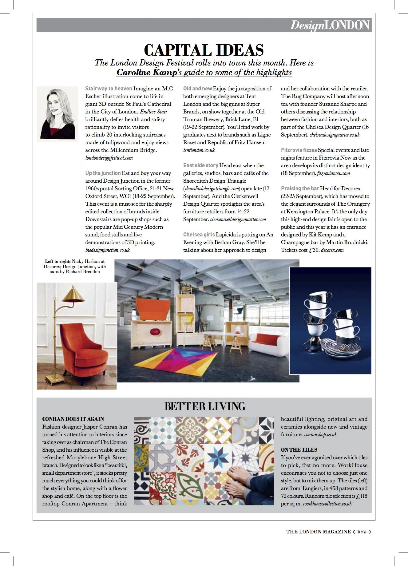
I did a preview of LDF for The London Magazine's September issue (with ooooh Tom Ford on the cover) so when that goes online I will put up a link.

In the meantime here's a link the official online LDF guide to whet your appetite - I warn you, it is DAUNTING. 

London Design Guide - new edition

ldg.jpg

One for the Christmas list here, it's design commentator and author Max Fraser's latest edition of the wonderful London Design Guide. A comprehensive and fully up to date compendium of all that is cool and cutting edge and serving a decent cup of coffee in the capital. He has once again scoured the city to seek out the top shops, museums, galleries and cafes and grouped them together in ten neighbourhood chapters, with maps. 

I'm particularly delighted to see he's bigging up independent shops some of which have already featured on this blog as Indie of the Week. The book also features essays by design experts and retailers who discuss the future of bricks and mortar shops, a subject which is particularly topical right now with high rents, a shaky economy and the surge in internet shopping. 

The London Design Guide, out 12th September, published by Spotlight Press, £12.  


Indie of the Week #31: Nordic Elements

BY NORDSS13_SIDE19.jpg
There’s something about Scandinavian culture that has us Brits enthralled - from moody television dramas and chunky knitwear to their well documented prowess with flat-pack furniture - there’s an enviable cool, calm, collectedness about these nations. So it’s no surprise that since its launch in 2008 Nordic Elements has been steadily growing. An online only enterprise it sells interiors items with clean lines and bold prints for "the 21st century family". It also acts as the UK agent for several Scandi brands including the appealing Finnsdottir ceramics and colourful children’s label RoomMate
Who are you? Helle Moyna of Nordic Elements
Where can we find you? Online only www.nordicelements.com
Describe your store in five words: Unique Nordic design home-ware 
What makes you different? We focus on smaller, new and upcoming design brands from Scandinavia with a strong design ethos and not mainstream
How you decide what makes the cut? Is it something I would have in my home and does it have timeless elegance
What were you doing before you did this? I was working in the City in client relations and event management
If you were starting again what advice would you give yourself? TIME and lots of it...
What are you most proud of? Our reputation as a great support and home to our brands as we often get recommended to other brands as a unique home for them to launch their products.
Do you have a favourite thing in the store right now? Too many to pick just one, but I do love the new Log Lamp from The Oak Men and the beautiful illustrations from Kristina Dam.
What's hot for 2013? All our brands of course, but our porcelain brand Finnsdottir is having great momentum at the moment


Every Wednesday 'Indie of the week' celebrates the best independent stores around. These places sell interesting and varied collections of design-related things you don't see everywhere else. They may support young or local designers or be great at finding unique things from around the world. By thinking a little more creatively about what they stock they are fighting the bland homogenisation of so much of the high street. And since I'm down with the realities of modern life, online only stores count too, because a beautiful and easy to use website is just as delightful an encounter in cyberspace.
Do you you have a favourite store?  I'd love to hear from you.

School of Life

schooloflife.jpg

This caught my eye from the Southbank Centre shop, it's a box of Twenty Aphorisms printed on A5 cards which you can post to friends or stick up around the house. Produced by the philosophical/cultural enterprise that is The School of Life they also do other stationery items including One Hundred Questions handy smart cards if you're ever short of small talk. Fun. Thoughtful. Entertaining. And good cheat sheets for when your brain is still on the beach.

Back on it

cowz.jpg

Back from holiday and back to work. Missing these guys already.

avoriaz_architec.jpg

I didn't completely forget my work head and snapped a pic of the very non-traditional-Alpine architecture in the resort of Avoriaz which was purpose-built in the 1960s to mimic the height and sharp angles of the mountains. 

montriond.jpg

Most people go to the mountains in the winter, personally I think the summers up there rule. 

Indie of the Week#30: Nobrow

2013-07-08 14.03.36-1.jpg
In 2008, in the midst of a financial crisis - and the small matter of a digital publishing revolution - this little indie was born. Nobrow is an independent publisher and passionate promotor of graphic art, comics and illustration run out of a small shop in east London. The timing was certainly bold and refreshingly counter-intuitive, but it fits in line with the shop's identifiably different graphic style and general attitude. In the words of founders Sam Arthur and Alex Spiro, it wasn't going to be enough just to champion new artists and content, the books themselves had to "deserve to be printed". Hits such as Time To Make a Monster and their (limited to 3,000 copies) self-titled magazine featuring work from the finest new illustrators have elevated this shop to cult status. 
Who are you? Simon Hacking, manager of the Nobrow shop.
Where can we find you? 62 Great Eastern Street, London EC2A 3QR, and online at www.nobrow.net
Describe your store in five words: Independent, contemporary, kaleidoscopic, illustrated and inspiring.
What makes you different? Not only are we a book shop selling a selection of the finest art books, kids books, comics and zines from across the world, we're also the home of Nobrow Press, publisher of some of the most beautiful books in existence.
How you decide what makes the cut? Nobrow Press make a point of only using the best materials and printing methods in the design and manufacture of their books, and this is a standard to which we hold the rest of the books and prints we stock in the shop.
What were you doing before you did this? I've worked in a number of comic book shops across London, and studied comics theory before that, so I'm steeped in words and pictures.
If you were starting again what advice would you give yourself? Practice is much more fun than theory. Get involved in the scene you love.
What are you most proud of? The expansion of the store from a small gallery with a smattering of small press titles to a fully fledged book shop.
Do you have a favourite thing in the store right now? Rob Hunter's new graphic novel Map of Days is incredible.
What's hot for 2013? We have some fantastic books coming from our children's line Flying Eye Books this year, that will be some of the best, most beautiful books we've ever published. 


Every Wednesday 'Indie of the week' celebrates the best independent stores around. These places sell interesting and varied collections of design-related things you don't see everywhere else. They may support young or local designers or be great at finding unique things from around the world. By thinking a little more creatively about what they stock they are fighting the bland homogenisation of so much of the high street. And since I'm down with the realities of modern life, online only stores count too, because a beautiful and easy to use website is just as delightful an encounter in cyberspace.
Do you you have a favourite store?  I'd love to hear from you.

The London Magazine: latest

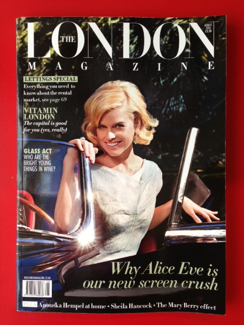
As well as writing this blog, I also write for The London Magazine, here are some snaps I took of the magazine's front covers and my recent columns, which you can read less fuzzily online. It's essentially a magazine about life in London covering arts, style, food, beauty and homes, with some glossy property porn ads at the back. New editor Harriet Cooper is doing a great job with it IMHO.

July 2013 issue with the fabulous Zaha on the cover

July 2013 issue with the fabulous Zaha on the cover

This month I talk about the very cool Citizen M hotels and how the boundaries between hotels and homes are merging, the online antiques market that is The Mint List, cheerful textiles from Michelle Mason and paint guru Annie Sloan's new book. Click …

This month I talk about the very cool Citizen M hotels and how the boundaries between hotels and homes are merging, the online antiques market that is The Mint List, cheerful textiles from Michelle Mason and paint guru Annie Sloan's new book. Click here to read it online.

The June 2013 issue featuring dinner party recipe king Yotam Ottolenghi 

The June 2013 issue featuring dinner party recipe king Yotam Ottolenghi 

This month I talk about the return of Habitat, the latest luscious Toast catalogue, Artek stools at The Lollipop Shoppe and Alice Rawsthorn's fascinating book "Hello World". Click here to read it online.

This month I talk about the return of Habitat, the latest luscious Toast catalogue, Artek stools at The Lollipop Shoppe and Alice Rawsthorn's fascinating book "Hello World". Click here to read it online.

The June 2013 issue 

The June 2013 issue 

This month I talk about Rory Dobner and other designers being inspired by bugs and butterflies, the must-visit Clerkenwell Design Week, fab online shop Fate London and what's new from Iittala. Click here to read it online.

This month I talk about Rory Dobner and other designers being inspired by bugs and butterflies, the must-visit Clerkenwell Design Week, fab online shop Fate London and what's new from Iittala. Click here to read it online.

Indie of the Week #29: Geoffrey Harris

GeoffreyHarris_012.jpg
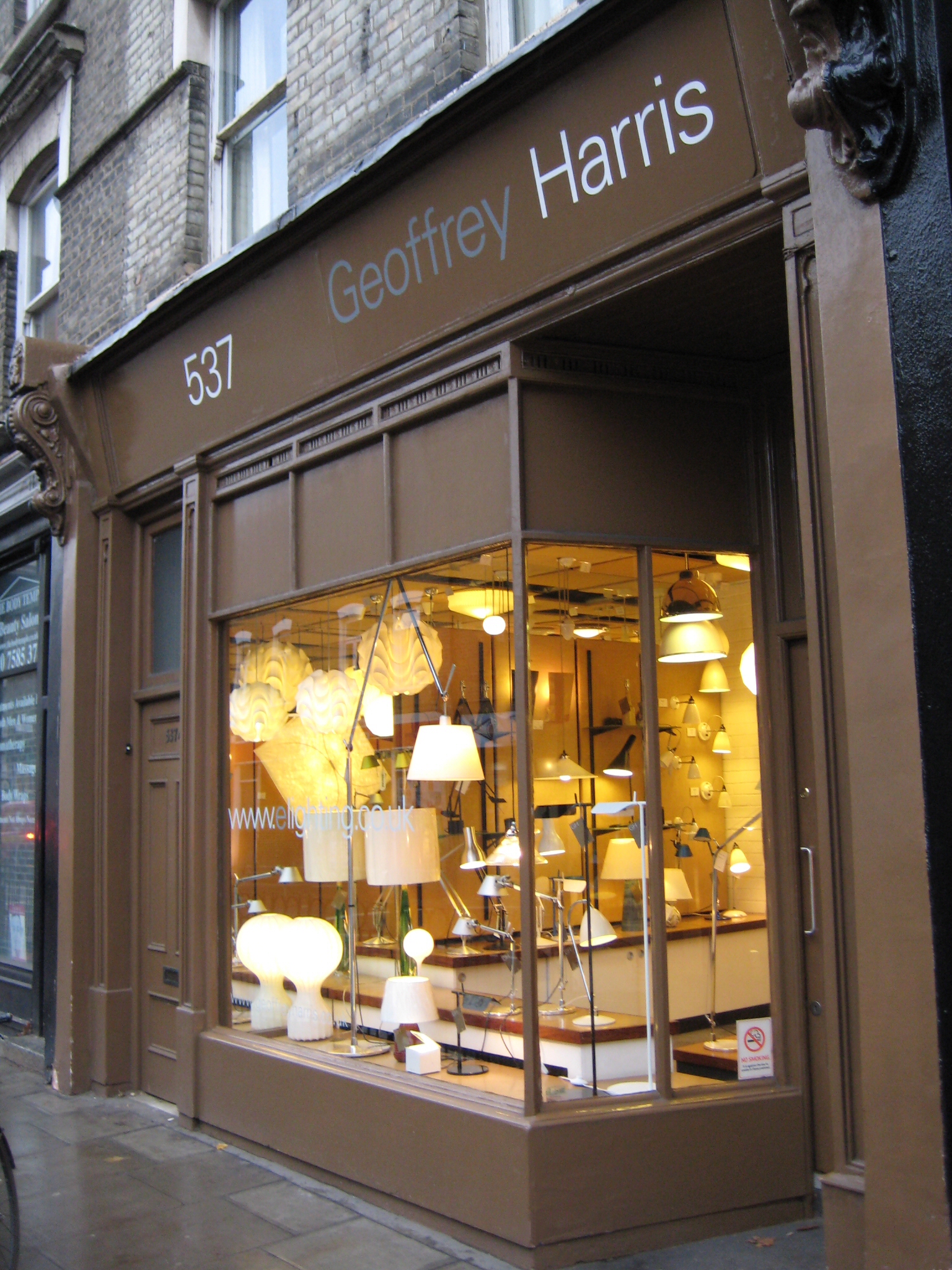
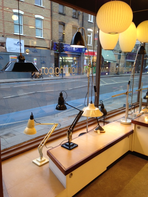
Geoffrey Harris's lighting shop is a place we should be thankful for when it comes to the brow-furrowing experience that is... buying a low energy lightbulb. "It's a bit of a nightmare", says Harris, "two or three years ago I got very annoyed about it - but I'm over it now. The main problem was that it was launched on the public very badly: the first wave of bulbs were pretty rubbish - and people don't like being told what to do”. 
Harris opened his shop on Battersea Park Road in 1999, but he’s been selling lighting since 1969 when he got his first job in Habitat, aged 17. He went on to set up The London Lighting Company on the Fulham Road in 1973 and ran it for nearly twenty years.
Now, he concedes, the compact fluorescents and LEDs are pretty good (although the cheap LEDs give off a cold light) and whereas he used to change bulbs all the time when he came into his shop in the morning, he hardly ever does now. But consumers still have to be fairly clued up as all bulbs are not alike - some of them poke out of the fittings. He’s tackled the issue by pairing bulbs and lights on his website. All he has to do now is make us believe spending a tenner on a light bulb is a good idea.
Who are you? Geoffrey Harris of Geoffrey Harris Lighting Ltd.
Where can we find you? 537 Battersea Park Road, London, SW11 3BL; www.geoffreyharris.co.uk 
Describe your store in five words: Unique original modern lighting store.
What makes you different? We stock everything we sell for immediate despatch or collection at the shop.
How you decide what makes the cut? Do I like it – is it the correct price – is it readily available.
What were you doing before you did this? Only ever sold lighting since leaving school – so I guess before this I was a school boy!
If you were starting again what advice would you give yourself? Nobody knows everything.
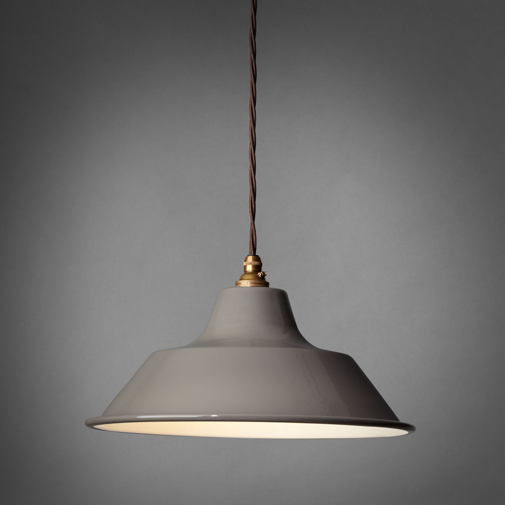
What are you most proud of? My shop and my website and our own Tommy enamel shades.
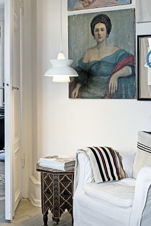
Do you have a favourite thing in the store right now? Doo-Wop by Louis Poulsen
What's hot for 2013? LEDs, LEDS and LEDs - we are slowly working on it!
Every Wednesday 'Indie of the week' celebrates the best independent stores around. These places sell interesting and varied collections of design-related things you don't see everywhere else. They may support young or local designers or be great at finding unique things from around the world. By thinking a little more creatively about what they stock they are fighting the bland homogenisation of so much of the high street. And since I'm down with the realities of modern life, online only stores count too, because a beautiful and easy to use website is just as delightful an encounter in cyberspace.
Do you you have a favourite store?  I'd love to hear from you.


Child Vision gets public vote

childvision1.jpg

If you still need convincing that 'design' is more than just window-dressing then take a look at this. The Child Vision glasses have just won the Visitor Vote - ie voted by members of the general public - at the Design Museum's Designs of the Year 2013.

These glasses have a fluid-filled lense that allows children (aged 12-18) to self-adjust their glasses as their sight changes over time. Targeted at children with limited access to opticians - and who would otherwise struggle to see blackboards in class clearly - it was designed by Professor John Silver from The Centre for Vision in the Developing World to not only improve vision, but look good too. 

It's a fantastically feel-good story and one that shows what happens when the general public engages with design - note that The Shard did not win. In fact, in second place was the [tear-jerk alert] 3D printed Exoskeleton "Magic Arms" device to help children with musculoskeletal disabilities and in third was a non-stick ketchup bottle. 

The overall winner of Designs of the Year (not voted by the pubic) was the GOV.UK website. Best product went to the briliant Cola Life initiative - as previously featured in this blog post. Yeah!


childvision2.jpg

Indie of the Week #28: Fate London

Fort Standard Trivet Feature Landscape.jpg
Fate London began as a collection of images on Pinterest before it was turned into an online shop earlier this year. The duo behind the brand - Louise Bliss and Saffron Hunt - had spent hours pulling together images of things they loved before having their lightbulb “let’s open a shop” moment. You can still see their boards on Pinterest and they have a very distinct and rather beautiful aesthetic which is inspired by “the muted, dreamlike feeling you get from stores in America”, says Louise. This raw, earthy feel is reflected in the range of products - think stone trivets, brass bottle openers and olive wood trays. While a lot of websites are promoting British or Scandinavian design, it’s interesting to find this range of hand-picked items from suppliers in Brooklyn, Portland and San Francisco. 
Who are you? Louise & Saffron of fatelondon.com
Where can we find you? Online at fatelondon.com (but we like to pop up now and again)
Describe your store in five words: Home Goods Store (Our Edit)
What makes you different? It's all about sharing our favourite things that we have seen and found, whether that be images on Pinterest or items through the store. There are no seasons, brand guidelines or trends, and products are sourced from around the world enabling us to bring new ideas and designs to the surface, as well as exclusivity in the UK on a few items. 
How you decide what makes the cut? We might choose something for it's design, materials or because we love the ethos and processes of the designers. Most importantly we have to love it and want to own it ourselves. 
What were you doing before you did this? Louise still works at a digital agency, Saffron is a creative director/stylist.
If you were starting again what advice would you give yourself? We could sit down for a few hours for this one. To choose one thing: stick by your first instincts. If something doesn't feel right, it probably isn't. 
What are you most proud of? We've had some help along the way, but pretty much everything has been developed and managed by just the two of us. From developing the concept, designing and building the website, buying each product, styling the shoots and artwork... There isn't an element that we haven't produced. 
Do you have a favourite thing in the store right now? Our persian rug inspired towels were one of the first things we found and have always been a favourite. They look so good on the beach. 
What's hot for 2013? We don't really follow trends but you can always follow what we are coveting right now on our Pinterest board here.
Every Wednesday 'Indie of the week' celebrates the best independent stores around. These places sell interesting and varied collections of design-related things you don't see everywhere else. They may support young or local designers or be great at finding unique things from around the world. By thinking a little more creatively about what they stock they are fighting the bland homogenisation of so much of the high street. And since I'm down with the realities of modern life, online only stores count too, because a beautiful and easy to use website is just as delightful an encounter in cyberspace.
Do you you have a favourite store?  I'd love to hear from you.