Indie of the Week #5: Solid ID

Every Wednesday 'Indie of the week' celebrates the best independent stores around. These places sell interesting and varied collections of design-related things you don't see everywhere else. They may support young or local designers or be great at finding unique things from around the world. By thinking a little more creatively about what they stock they are fighting the bland homogenisation of so much of the high street. And since I'm down with the realities of modern life, online only stores count too, because a beautiful and easy to use website is just as delightful an encounter in cyberspace.
Do you you have a favourite store?  I'd love to hear from you.
anchor in shop.JPG
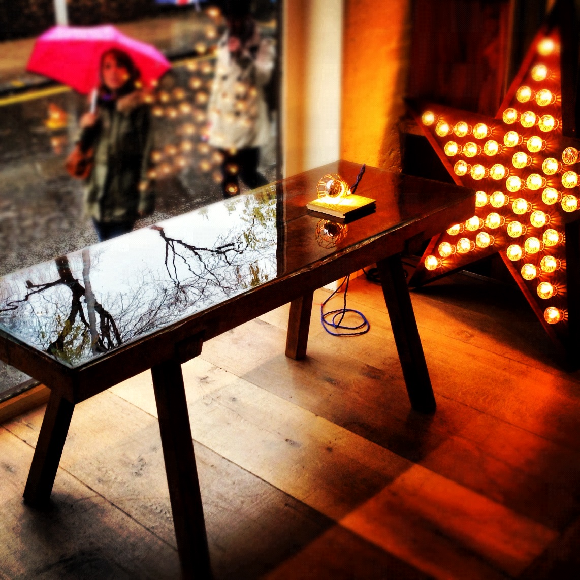
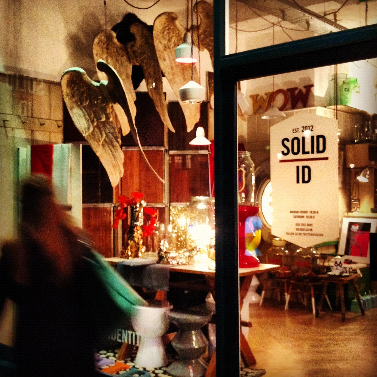
I stumbled across Solid ID at Design Junction last September when my eye was caught by the fabulous anchor light shown above. It just seemed a really fun and playful way to show what you can create through the re-use of materials and the re-imagining of what things could be. Perhaps I should have guessed there was a Dutchman behind it (I'm married to one) as they are known for their ebullient approach to design/life. Eelke Jan Bles is from The Netherlands, but now lives in Spitalfields, and Solid ID is his quirky shop on London's Fulham Road. 
Who are you? Eelke Jan Bles of Solid ID.
How can we find you? 273 Fulham Road, London, SW10 9PZ, online Solid ID, or on Pinterest.
Describe your store in five words: Off-beat goods for the home.
What makes you different? We source and curate our collection of individually designed items with care and a quirky eye.
How you decide what makes the cut? The main proposition is: we only sell what we like and or would have in our own homes. As long as items sit well together, being old or new does not matter, they just need to talk the same language.
What were you doing before you did this? I started my professional career as an interiors and food photographer. I own bespoke floor company Solid Floor and I also work as an interior designer and am very passionate about contemporary art.  Solid ID is a natural progression of what I have done previously.
If you were starting again what advice would you give yourself? To have more patience and to be bolder.
What are you most proud of? The bestselling items in the store have been those we have individually designed or re-worked ourselves: the flower cage lamp, the hand painted storage jars and the resin topped butcher tables. It’s really gratifying to see that these pieces have had such a resonance with our customers.
Do you have a favourite thing in the store right now? Vintage butcher tables with cool resin tops.
What's hot for 2013? Vintage re-invented with a bit of colour. Heritage pieces paint dipped and re-worked to suit a modern interior.

Monday blues-buster

Something very satisfying about these plates - not just the strong red, white and blue colour combo, or the cute, whimsical illustration - but the fact that they're from the original purveyors of twee chinaware: Royal Doulton. I love it when heritag…

Something very satisfying about these plates - not just the strong red, white and blue colour combo, or the cute, whimsical illustration - but the fact that they're from the original purveyors of twee chinaware: Royal Doulton. I love it when heritage brands shake off the old and embrace the new, in this case with illustrations by Karolin Schnoor.
This collection will be debuting at Home next week, along with lots of other lovely interiorsy things. Happy New Year!

Indie of the Week #4: Jane Newbery

Every Wednesday 'Indie of the week' celebrates the best independent stores around. These places sell interesting and varied collections of design-related things you don't see everywhere else. They may support young or local designers or be great at finding unique things from around the world. By thinking a little more creatively about what they stock they are fighting the bland homogenisation of so much of the high street. And since I'm down with the realities of modern life, online only stores count too, because a beautiful and easy to use website is just as delightful an encounter in cyberspace.
Do you you have a favourite store?  I'd love to hear from you.

DSC00269.JPG
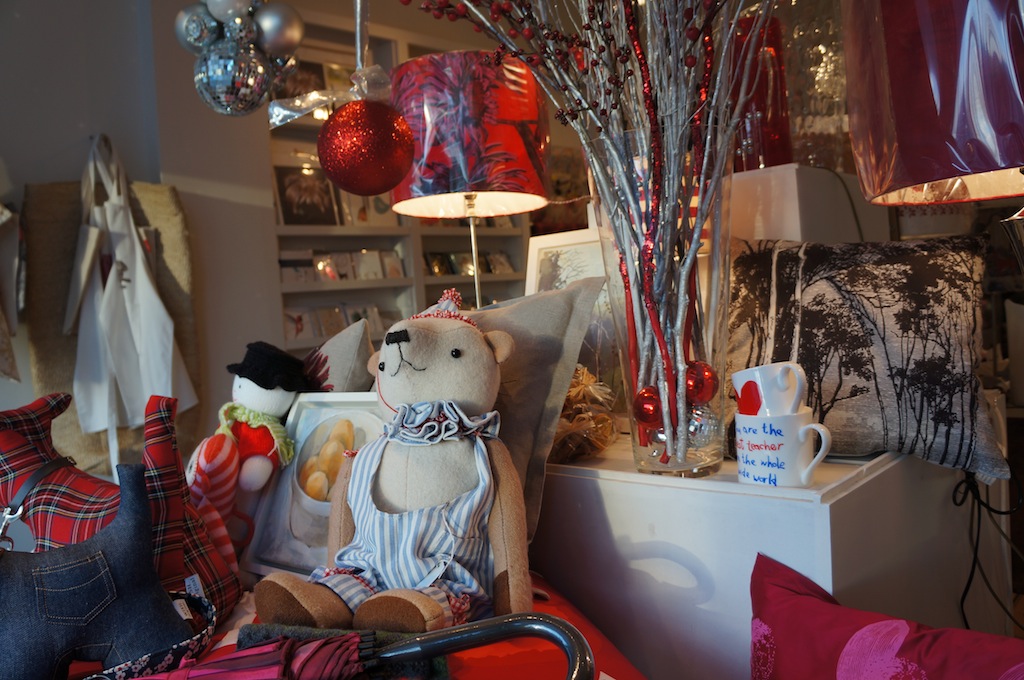
I was wandering around the leafy streets of Dulwich in South East London recently with friend who directed me to this little gem. Owner Jane Hole sells an interesting, and very tactile, collection of interiors items and accessories on the ground floor and art from the gallery downstairs. It's exactly what a local shop should be - curated with care and a joy to visit. 
Who are you? Jane Hole of Jane Newbery
Where can we find you? 33 Dulwich Village, London SE21 7BN. Online at Jane Newbery
Describe your store in five words: Clear, cohesive, colourful, thought-through design.
What makes you different? The eclectic mix: from Fatboys to Beatrix Potter - something for everybody.  
How you decide what makes the cut? I buy what I like and in general the item has to have beauty and function. 
What were you doing before you did this? I was an English teacher in my previous life.
If you were starting again what advice would you give yourself? I would have enjoyed my summer holidays and told myself not to panic during the quiet time in August.
What are you most proud of? Writing a convincing business plan and managing my cash-flow. 
Do you have a favourite thing in the store right now? The set of Beatrix Potter hanging ornaments. 
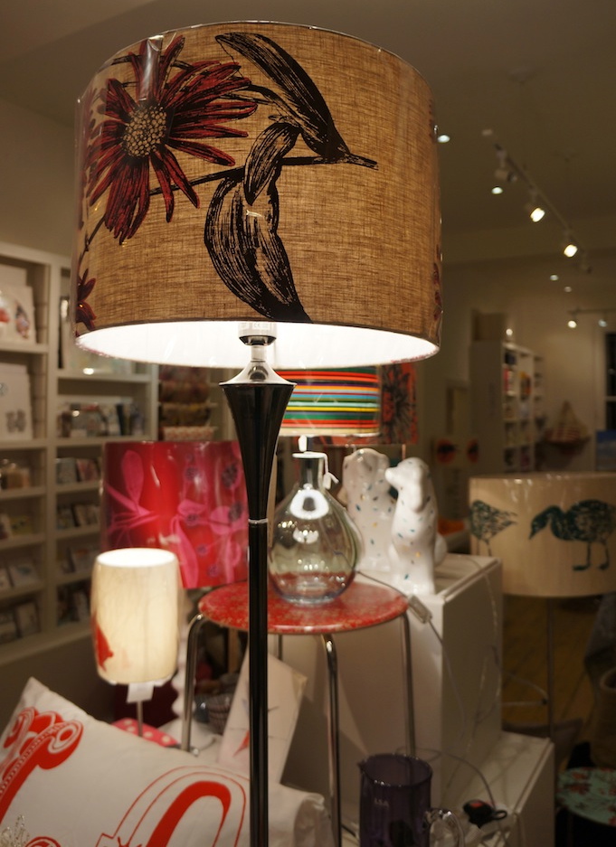
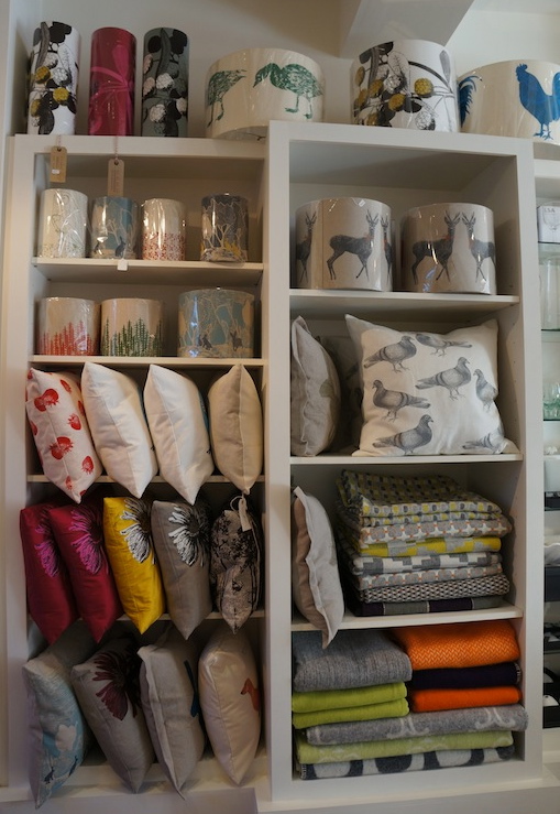
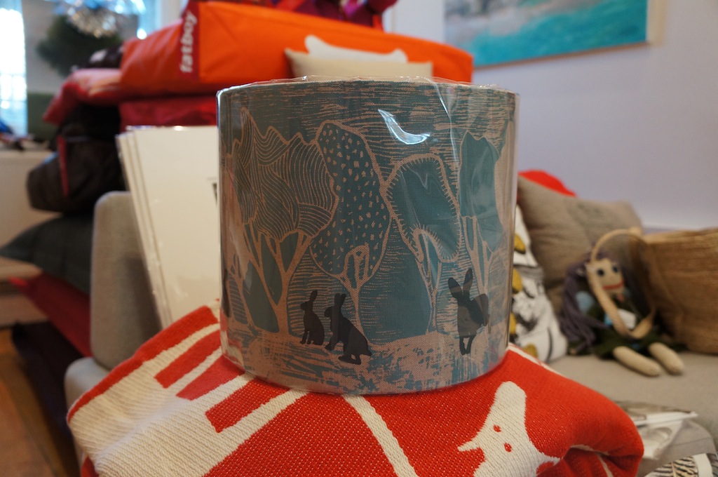
What's hot for 2013? Orwell & Goode lampshades - especially the hare design (pictured below, right). 

Indie of the Week #3: The Original Pop Up Shop

Every Wednesday 'Indie of the week' celebrates the best independent stores around. These places sell interesting and varied collections of design-related things you don't see everywhere else. They may support young or local designers or be great at finding unique things from around the world. By thinking a little more creatively about what they stock they are fighting the bland homogenisation of so much of the high street. And since I'm down with the realities of modern life, online only stores count too, because a beautiful and easy to use website is just as delightful an encounter in cyberspace.
Do you you have a favourite store?  I'd love to hear from you.
2011-07-14 10.17.58.jpg
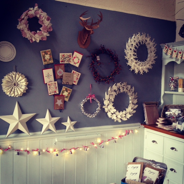
Ever wondered what ice-cream parlours are used for in winter? This enterprising trio have come up with the perfect seasonal solution.
Who are you? Louise, Carol & Meryl of The Original Pop Up Shop
Where can we find you? At our pop up Christmas shop, now until the 21st December, at the Riverside Parlour, Tolney Lane, Newark, Nottinghamshire, NG24 1DA. Online at The Original Pop Up Shop; on Facebook; and on Twitter
Describe your store in five words: Festive, inspiring, timeless, crafty and original of course!
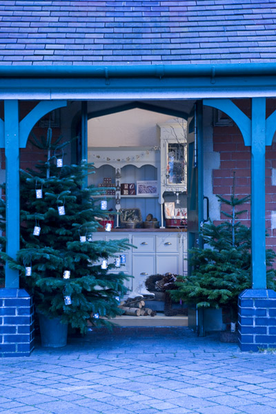
What makes you different? We started out life as a pop up shop three years ago transforming our family ice-cream parlour into a festive wonderland for the five weeks leading up to Christmas. Out go the freezers and in come the decorations, wreaths and locally grown Christmas trees, last year we launched online so we're a kind of online pop up shop too, that's quite different I think.
How you decide what makes the cut? Planning for each Christmas collection seems to start earlier every year and we always try to source unusual and beautiful products, often collaborating with little designer makers to come up with something a bit different. So we are often involved in the design process early on which means you've got to love it, or it's just no fun.
What were you doing before you did this? We are all still working full time in other jobs, so this is a project that we all fit around that. Carol runs the ice-cream parlour for the remainder of the year, Meryl is in finance and Louise is a freelance stylist in Sydney, Australia.
If you were starting again what advice would you give yourself? Trust your instincts a bit more and remember that it's all a massive learning curve so don't be too hard on yourself when things don't always go to plan.
What are you most proud of? The fact that we have managed to achieve what we have with one third of the team half way round the world, a really small budget and lots of determination.
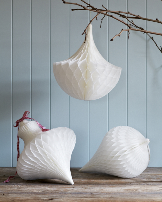
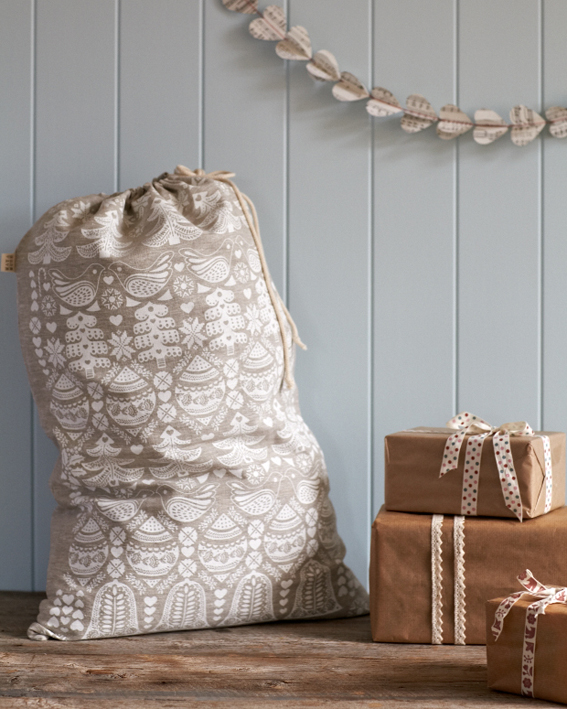
Do you have a favourite thing in the store right now? Probably our hand printed Santa sacks and the super cute 'decos' by Abbie Brown - love them!
What's hot for 2013? We are loving our multi coloured felt ball garlands and can see them being strung up not just for Christmas but all year.
Christmas Pop-Ups

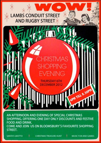
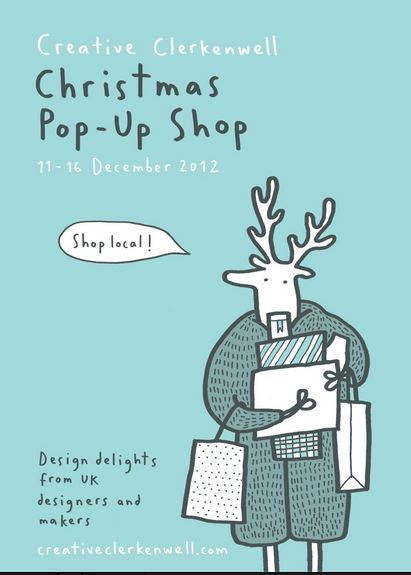
I've been enjoying the posters advertising late night Christmas shopping and pop-up shops. There is so much going on over the next few weeks, check out: retro finds and up-cycled goods at Brixton East Pop-Up Shop, hipster East London stores get together for the Shoreditch Christmas Triangle, seek out original design-led objets at FAO Pop-Up Shop, festive decorations at The Original Pop-Up Shop, British boutique brands in The Christmas Arcade at Somerset House. Enjoy.
Indie of the Week #2: Quill London

quill1.JPG
Christmas card season is upon us... so what better time to celebrate an independent store dedicated to stationery. Quill London is an online-only endeavour that has quickly gained a cult following (it only launched this year) among fans of pen and paper, of which it turns out there are many. 
Who are you? Lucy Edmonds. I run Quill London.
Where can we find you? www.quilllondon.com; @QuillLondon; Facebook.com/QuillLondon
Describe your store in five words: Super stylish stationery & paper goods. Is that cheating?!
What makes you different? I started Quill because I felt there was a big gap between high street stationers and super high-end brands. Quill offers something in between: style-led pieces mostly from small studios and independent brands, offering good quality without the Bond Street prices.
How you decide what makes the cut? I would be lying if I said I didn't choose things I personally love. That's a pretty important test. I try to source from designers that don't have much representation in the UK so that we offer something British customers may not have discovered before. 
What were you doing before you did this? I used to work at a small start-up business that produced swedish-designed homeware, and wholesaled to some great UK retailers. I learnt so much during my four years there, and particularly from the company's owners - two remarkable businesswomen - and it gave me the know-how to start something for myself.
If you were starting again what advice would you give yourself? Do it sooner. I spent a little too long procrastinating and suffering crises of confidence. It wasted so much time! 
What are you most proud of? I am proud of our logo. It was created by James Bowskill, a wonderful designer who is based in Tokyo. He created something I would never have come up with myself but that I absolutely love and will never get bored of. It always gets commented on when I give people my card.
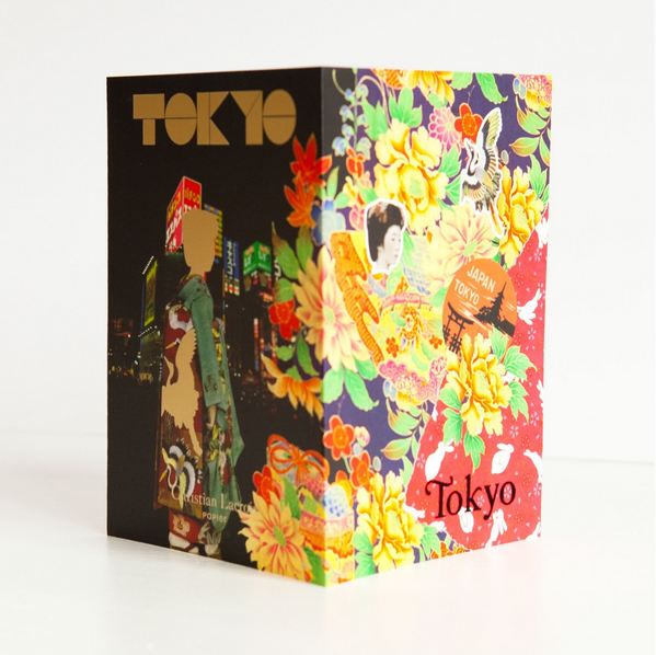
Do you have a favourite thing in the store right now? So many! Our calendar print called 'The Sun, It Shines' by Spring Once More is striking and so cleverly designed. I adore everything that Sarah and Juliette at Brown Paper create. I can't help but love the PS'Ikat notebook by Christian Lacroix Papier with a secret crazy skeleton hidden inside the pages. I also love the Maison Martin Margiela quill biros: the perfect gift for someone that has everything.
What's hot for 2013? I think as we come into the spring time, our handmade tissue paper pompoms will really come into their own. They're great for adding a bit of colour and frivolity to interiors, parties, weddings, picnics - anything, really!

V&A Furniture Gallery

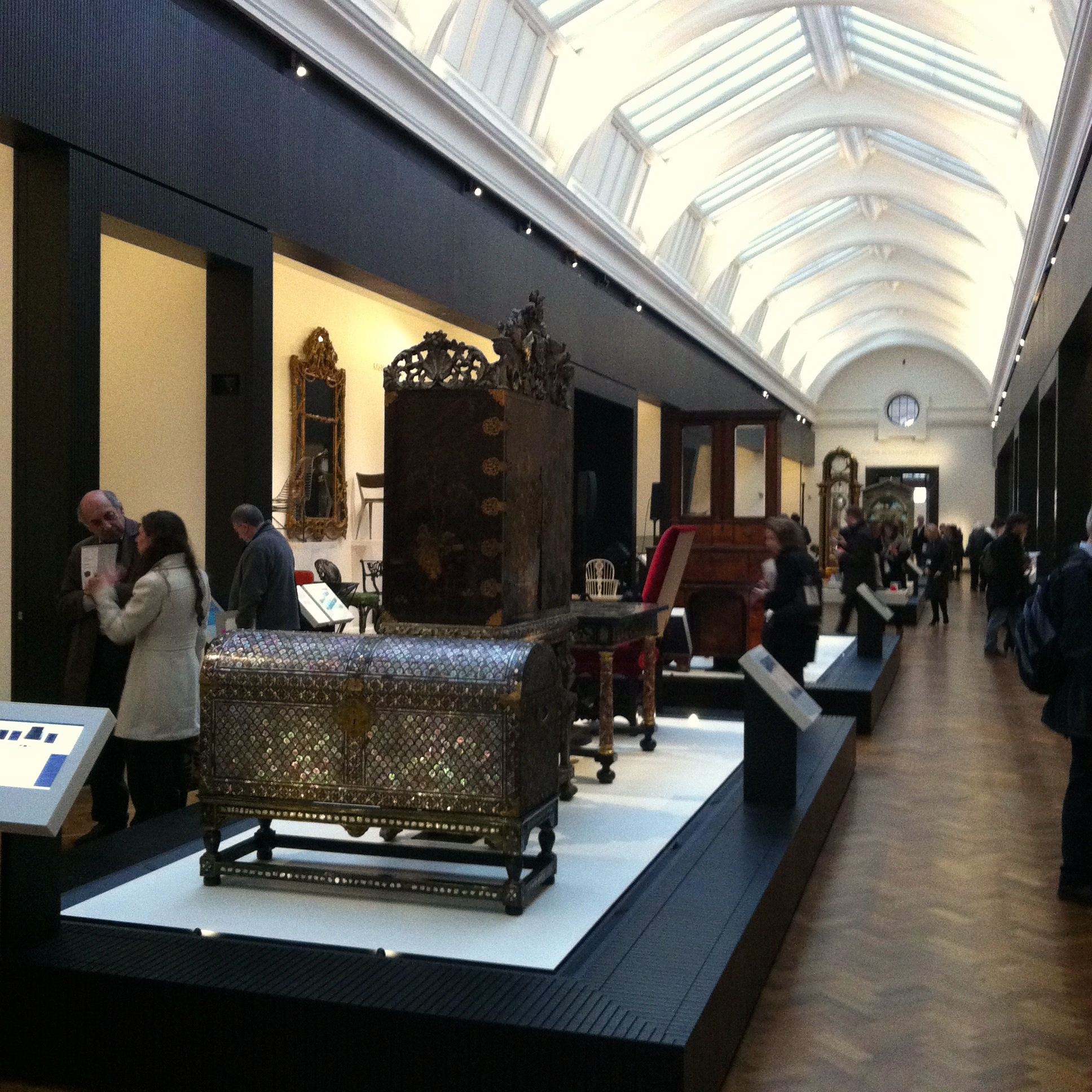
What's it all about then? It's the first time the V&A has ever had a gallery devoted to furniture, despite the fact they've been collecting it for 150 years. Almost everything came from their stores, around 90%, and many of the items have not actually been seen in living memory.
So why now? Their research shows that people are fascinated by the way things are made so the collection is built around techniques and decoration - rather than say, big name designers. It's essentially the way furniture has been made in the West from around 1400 to now.
What will I see? The displays devoted to 'making' show variety (joinery, lacquer, veneering, inlay, gilding, turning, injection moulding) but also continuity (chairs and wardrobes always popular). And lots of juxtaposition. Yep, there is an Ikea bookcase standing just a breath away from a medieval book chest. 
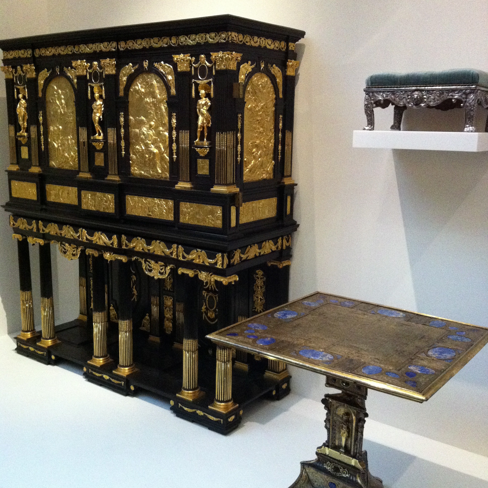
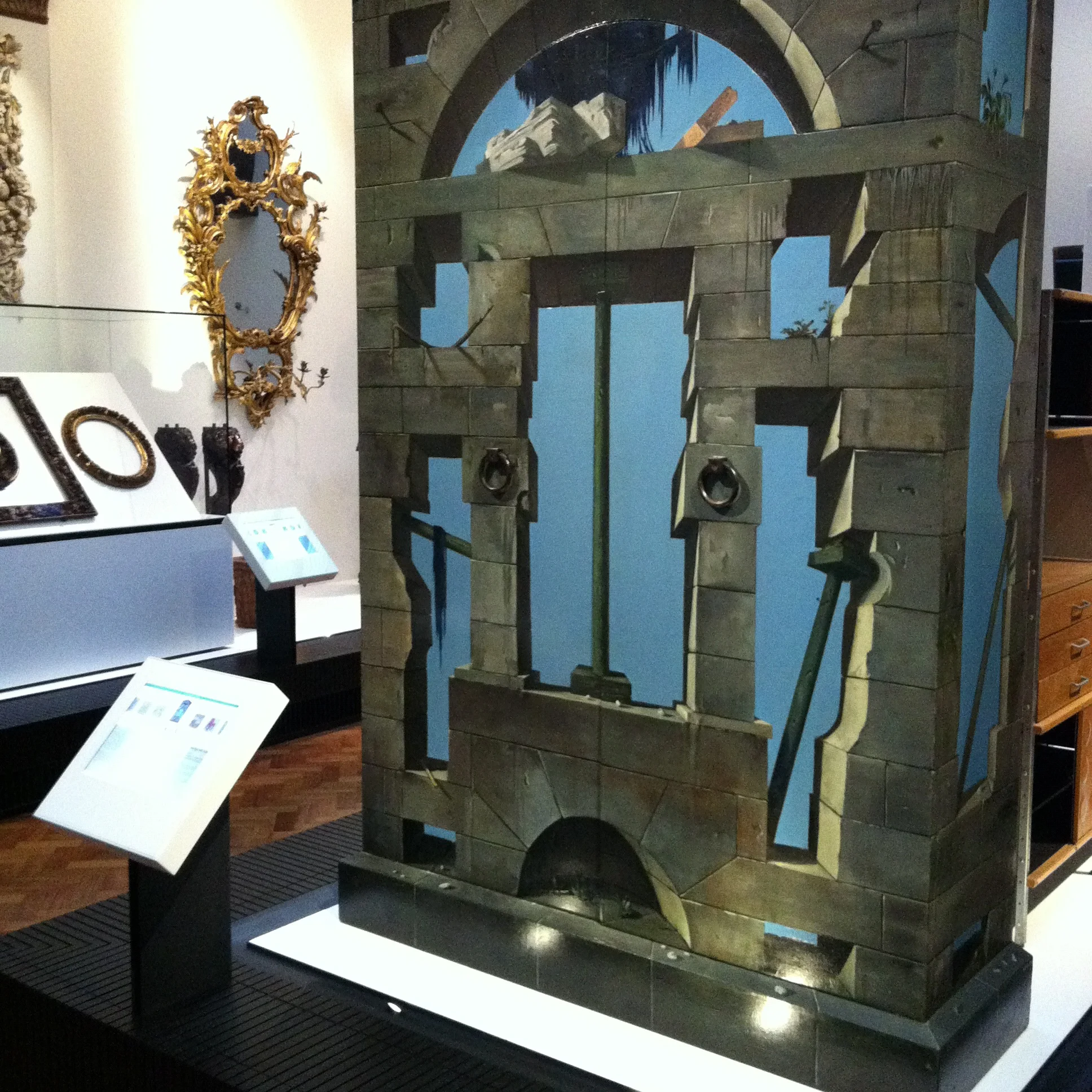
Do I need to know my Jacobsen from my Jacobean? It's not a gallery of famous names, there's not masses of Modernism, it's more about the human story behind the furniture. There are some extraordinary pieces such as the Surrealist wardrobe and the ornate 17th century Parisian 'Marie de Medici' cabinet (both pictured).
Who's it for? Designers, makers, collectors, students, anyone who is interested in furniture and the way it is made - and those adventurous enough to make it up to the sixth floor. It's next to the Ceramics Gallery which is amazing, if you've never been: wall-to-wall tableware.
Look but don't touch? Keep away from the furniture or you'll set the alarms off. But there are digital labels to swipe through and interactive tables where you can touch the materials and information about them flashes up on screen. Danger of learning something: quite high.
V&A Furniture Gallery, opens 1st December.

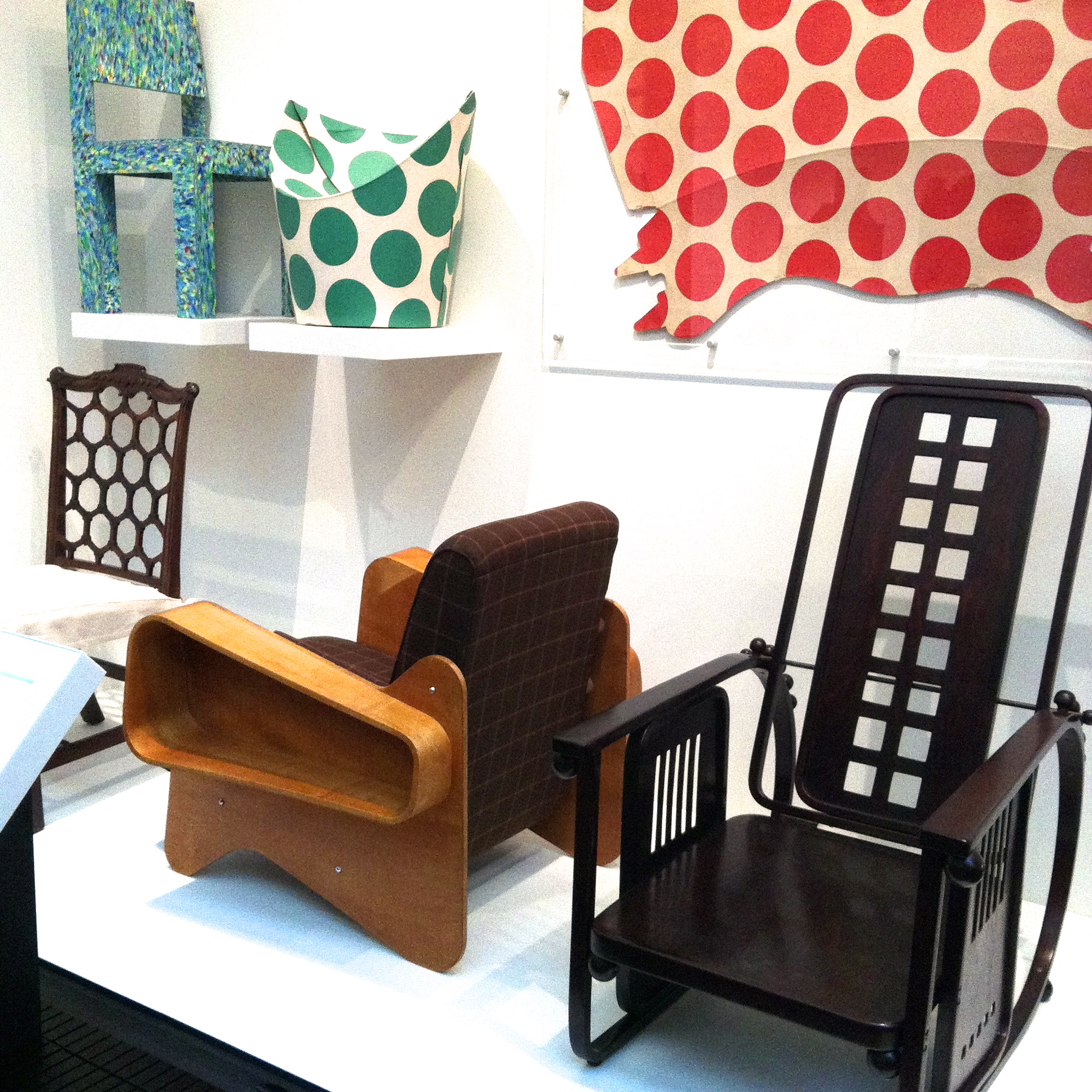
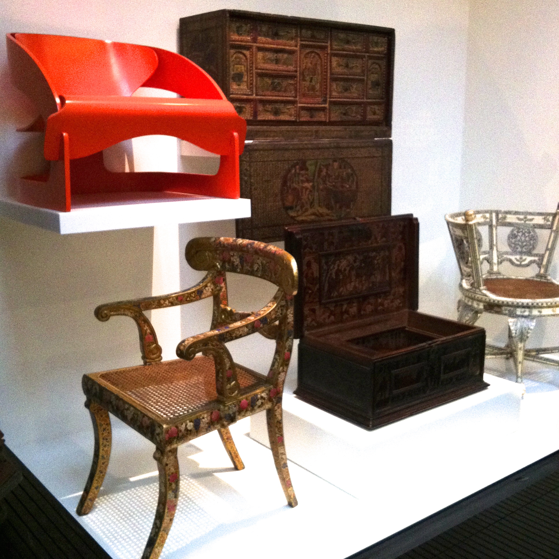
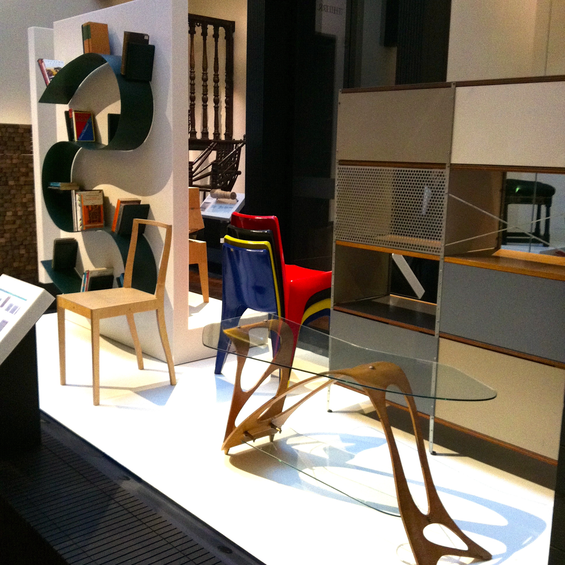
Picture captions, clockwise from top left: The V&A's Furniture Gallery was designed by NORD Architecture; Plywood armchairs by Marcel Breuer (left, 1936) and Josef Hoffmann (right, 1908) with spotted 'Child Chair' (1964) made from flat-packed cardboard; 17th Century Parisian 'Marie de Medici' cabinet with ebony veneer and gilded brass plaques depicting scenes from a romantic poem; 20th Century hits: Ron Arad's 'Bookworm', Jasper Morrison's 'Ply-Chair' and Carlo Mollino's 'Arabesque' table; Wardrobe painted in 1939 by Eugene Berman, a Russian painter, stage designer and Surrealist; Decorative 19th Century armchair from India sits beneath Joe Colombo's 1963 Armchair.

Indie of the Week #1: Lavender Room

I'm starting a new series called 'Indie of the week' celebrating the best independent stores around. These places sell interesting and varied collections of design-related things you don't see everywhere else. They may support young or local designers or be great at finding unique things from around the world. By thinking a little more creatively about what they stock they are fighting the bland homogenisation of so much of the high street. And since I'm down with the realities of modern life, online only stores count too, because a beautiful and easy to use website is just as delightful an encounter in cyberspace.
Do you you have a favourite store?  I'd love to hear from you.

2012-11-17 17.32.55.jpg
I was in Brighton recently and stumbled across Lavender Room, a little gem in the North Laine which sells a feminine, but not too girlie, collection of homes stuff, clothes and jewellery. It had a very personal feel, the kind of place where if you like one thing, chances are you'll like the rest - and it smelled lovely too.
Who are you? We are Jenny Atherton & Nicky Sanderson and we run Lavender Room.
How can we find you? Lavender Room, 16 Bond Street, Brighton BN1 1RD (01273 220380); facebook.com/LavenderRoomtwitter.com/lavenderroompinterest.com/lavenderroom
Describe your store in five words:  Boutique, fashion, home accessories, gifts.
What makes you different?  Our lifestyle concept of fashion and home accessories under one roof
How do you decide what makes the cut? If we love it, then it's in.
What were you doing before you did this? Jenny: I was a fashion buyer for high street retailers, Nicky sourced and sold products to the high street retailers.
If you were starting again, what advice would you give yourself? Always keep a tight reign on financial planning and cash flow.
What are you most proud of? Hearing customers say that we are their favourite shop. And reaching almost ten years in business.
Do you have a favourite thing in the store right now? Our Woop Studios artwork, especially "A Murmuration of Starlings", very Brighton.
What's hot for 2013? Our ten year anniversary in March, we'll be planning a party to celebrate.
 

Creativity at Work

It's here... the book behind the blog, and what a lush tome it is.

'Creativity at Work' is a collection interviews with a select group of designers, artists and all-round creative types by New Yorker Heather Clawson. Since 2007 Clawson has been documenting life at the sharp end of fashion and style, in both words and pictures, on her successful blog Habitually Chic.

The people included in her book work in the kind of spacious, colourful and effortlessly-chic furnished offices which may make you weep into your cornflakes; or hopefully, once you've cleaned up the mess, inspire you. As she says herself in the introduction: "it's never too late to make a change... Julia Child [life made into a film starring Meryl Streep] didn't start cooking until she was 36".

Creativity at Work, by Heather Clawson: a book to inspire you to get creative

Creativity at Work, by Heather Clawson: a book to inspire you to get creative

Miranda Brooks, landscape designer, at work

Miranda Brooks, landscape designer, at work

The sleek corner office of Jenna Lyons, Creative Director, J.Crew

The sleek corner office of Jenna Lyons, Creative Director, J.Crew

Stick your beliefs on the wall like Jonathan Adler, Potter and Designer

Stick your beliefs on the wall like Jonathan Adler, Potter and Designer

Hello! Bean Bags

Patricia Urquiola sits on the laid back Hosu chair she designed for Coalesse

Patricia Urquiola sits on the laid back Hosu chair she designed for Coalesse

“In the connected world work and life are merging” says the strap-line on a new range of furniture by San-Francisco based design company Coalesse.

To anyone who has found themselves responding to a work email on their phone at 6:30am this won't be a huge surprise. We take our work with us wherever we go; it stretches out across the whole day and is done wherever and whenever required. 

The challenge is to find the balance between this mind-expanding new freedom - where you're capable of snapping into work mode at any moment - and the inevitable encroachment on your personal life. The new buzz word for this is 'toggling', or taking a mental time-out, often by dipping into something else techy. 

With many people working in kitchens, on sofas, in coffee shops, and in more social and collaborative ways, it's bye bye formal meeting room - hello bean bags. 

The Hosu lounge chair was designed by Patricia Urquiola with comfort in mind. Settle back and scroll through your phone, tablet or laptop - note that it also converts to a chaise so you can put your feet up. 

The Hosu chair seat pad flips over to convert into a foot rest. And... relax.

The Hosu chair seat pad flips over to convert into a foot rest. And... relax.

Rethink: The Way You Live

You can grow your own in the city.

You can grow your own in the city.

I've put this new book down on my Christmas list as I reckon I'll need the incentive of a New Year's resolution if I'm going to take action. It's called 'Rethink: The Way You Live', by Aussie design writer (and Snoop blogger) Amanda Talbot. 

Far from being a traditional flick-through coffee table interiors book (don't get me wrong, still a big fan of those) this is one that's grounded in alternative ideas about how you can live differently in your home. 

You may already be recycling your own weight in Tetra-Paks every year, but are there more creative ways to incorporate sustainability into everyday life? Talbot has scoured the globe for trendsters who are pushing the boundaries and rethinking the way they live. 

Whether my own veg patch gets off the ground in 2013 remains to be seen. 

Rethink: The Way  You Live, book cover

The Savoy

I had the joy, pleasure and privilege of spending a night at The Savoy last weekend. The landmark Edwardian and Art Deco hotel has re-opened after a multi-million pound renovation, and I can report that it is looking truly splendid. As the favoured haunt of Hollywood legends such as Frank Sinatra, Marlene Dietrich, Marilyn Monroe and Katharine Hepburn, it oozes old fashioned glamour and style. Drop in for a drink in the moody, low-lit Beaufort Bar, or just gawp at the striking and artfully arranged interiors.
The Strand's most glamorous resident
Upper Thames Foyer
 Upper Thames Foyer
 Art Deco suite sitting room
 River restaurant
 Gondoliers (meeting rooms)
View of The Thames and London Eye 
Marlene Dietrich had her own suite at the hotel. 
She always had a dozen pink roses and a bottle of Dom Perignon waiting in her room. Like her style.

Another Country

There is something very soothing about this furniture designed by Another Country
It's made of rustic materials (unvarnished oak and ash) and has a country feel to it, but it is definitely very modern too. Perhaps unsurprisingly the designs are inspired by Scandinavian simplicity, English country kitchens, the Shaker movement and Japanese woodwork which when thrown together create something everyone could live with.
Calm, discreet, un-showy: they could be the perfect flatmate. 
anothercountry2.JPG
anothercountry3.JPG
anothercountry5.JPG
anothercountry6.JPG
anothercountry10.JPG
anothercountry9.JPG
anothercountry8.JPG

All pictures from Another Country