Pitfield London

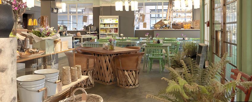
At Decorex last week I heard a talk by Shaun Clarkson and Paul Brewster, the slick duo behind lifestyle shop/cafe Pitfield in Shoreditch. It was fascinating to hear how quickly they have established their brand despite only opening last December.
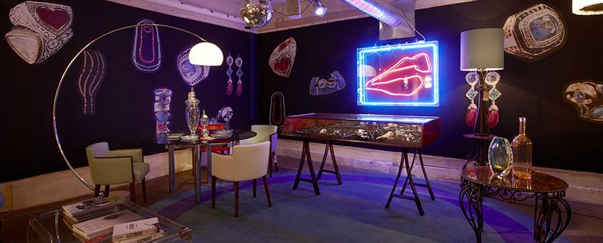
Pitfield sells a range of colourful and eclectic hipster-happy old things alongside new things with a cafe, deli and exhibition space to boot. You'll find sixties chairs in new fabrics, ceramics, candles, vintage lamp bases with new shades, displays of old brushes and feather dusters; in essence it's a very carefully considered (in order to look random) assortment of things you probably can't afford. And it could easily moonlight as a set on an episode of Portlandia.
To get something like this off the ground it certainly helps if you've spent twenty years in the trade. Clarkson is an established interior designer (with offices upstairs) and the man behind nineties style bars Pop and 10 Rooms, and gastro pub The Albion, who pretty much knows what we want before we want it, and Brewster is a textile designer. 
But despite the duo's obvious ease in collating a kick-ass collection of designer ephemera it hasn't all gone as expected. The big hit has been the cafe - a late addition to the master plan - which took over to the point where they had to get someone else in to run it. Croissants are now baked on site from 5am and they took the Pitfield brand on the road by doing a pop-up cafe at Tent London and served 8,000 coffees in four days. 
The future may lie in the cafe, but at least the iittala cups they use are on sale in the shop.
pitfield1.JPG
pitfield3.JPG
pitfield2.JPG
pitfield5.JPG

Tent London 2012

Met some interesting people and saw a lot of interesting things last Friday at Tent London located in the Old Truman Brewery on Hanbury Street, E1.
 Watched a demo of the cleverly expandable Seer table, see the short video. Tried and tested in a small London kitchen, I'm assured.  

Couldn't resist these giant knitted chairs by Claire Anne O'Brien

... or these playful up-scaled textiles at Melanie Porter

And these knitted fibre optics by Fay McCaul looked great under glass. Very cool.

Young design studio Jailmake turned their stand into their workspace for the duration of the event. Smart thinking. 

Box shelves from Belle and Bespoke suggested neat ways for displaying collections instead of hanging a picture. It's the modern mantelpiece.

Or how about a made to measure foam seat molded to the shape of your very own behind. Martijn Rigters' Foam Party drew crowds as willing participants sat still for for 15 minutes while the foam set.

Award for best sign went to Mashiko Pottery Japan

Downstairs at the Superbrands exhibition the vibe was a bit high end architectural; the chairs were a bit radical.

... and so were the lights.

Outside on Hanbury Street was some gritty urban scrawl.

Report: London Design Festival 2012

Uplifting blue skies and sunshine kicked off this year's London Design Festival, here's what I saw.
A novel use for old traffic cones: the striking entrance to the V&A turned out to be part of the Thomas Heatherwick exhibition
One of the ten benches in the V&A courtyard to mark ten years of the London Design Festival. This one (above) is called 'Bench of Plates', by architect Amanda Levete's studio AL_L, and was inspired by the V&A's ceramic collection.
Out of The Woods talk at the V&A
While at the V&A, I attended a talk which posed the timely question: does the world need another chair?  'Out of The Woods: Adventures of 12 Hardwood Chairs' is an interesting collaboration between RCA students (the designers), Benchmark Furniture (the manufacturers) and American Hardwood Export Council (who provided the wood).

The students spent a week down at the Benchmark factory where they produced 12 unique chairs, currently on display at the V&A, with sustainability as a core requirement. Each chair was made using a Life Cycle Assessment (LCA) study which measures the environmental impact of the hardwood from the moment it is chopped down through to the end of its life. So the answer to the question seemed to be: yes, to more chairs, if they are made this way.

I spoke to Sean Sutcliffe, co-founder with Sir Terence Conran of Benchmark, and he said this: "Life Cycle Assessment will be something that ten years from now everyone will talk about. We won't have VAT, we'll have Life Cycle Tax. You won't pay tax on what something costs in money, you'll pay tax on what something costs in real terms”.
Serious global-warming-what-does-the-future-hold-stuff aside... the students' designs were genuinely good.

'Tree Furniture', by RCA student Anton Alvarez is made from a single untreated Cherry wood log to look as if it was carved where it was felled (photo by Petr Krejci)

It was made with just three cuts (photo by Petr Krejci)
Alvarez intended his seat to be something people might chance upon while walking in the woods (photo by Mark O'Flaherty)
'Leftovers Chair', by fellow RCA student Lauren Davies, was inspired by food and cooking, and made from a variety of hardwoods. It has 'smoked' Hickory legs, the seat is 'pickled' in vinegar and Maple spindles 'flavoured' with fruit essences - for a  literal take on a classic Windsor kitchen chair.

Round the corner in the Brompton Design District there was a riot of colour set against black walls at quirky upholsterers Squint

Over at Designjunction held in a huge former sorting office on New Oxford Street, W1 there was some highly original re-use and recycling going on with this very fine anchor, the bulbs are made of glass door handles, by Solid ID
The three-floor warehouse space was the ideal backdrop for a design show. Fifty vintage Chair 69s by Alvar Aalto (rescued from a building in Finland) in use and for sale at the 2nd Cycle Cafe by Artek.
This one's for charity: Joy of Living Part 2 (as previously featured on this blog) is this year raising money for Maggie's Centres with customised furniture donated by designers.
Other interesting stands at Designjunction included: elegant furniture at Another Country and Bethan Gray both available at new shopping site FAO, interiors at Nordic Elements, old school cooking at Falcon Enamelware, posters at Outline Editions and random ephemera at Theo.

London Design Festival 2012


The London Design Festival is back for another year and it opens tomorrow.

But what does this mean for you and me? With over 200 events spread over nine days it is the largest event of its kind in Europe and many of the events are open to the public, for free.

If you like new things and you want to see what's going on in the world of design - ie the stuff that surrounds you - then go see something. There are several key venues, or hubs, across the capital and these are the ones I plan to check out next week.

Central: Designjunction
Designjunction takes place in an old sorting office on New Oxford Street over three floors in a 120,000 sq. ft space and will host international brands, pop-up shops, temporary restaurants, working flash factories, cutting-edge labels. It sounds like it will a buzzing hive of activity; I'll definitely be taking my camera.

With a sleek new entrance on Hanbury Street these two events are located on separate floors in the same building. The clue is in the name as to the differences between them: Super Brands does not undersell itself in the title, this is where you'll find the big international players on the design scene. Whereas Tent London offers temporary shelter to established independent brands and new international finds. There will be a LOT to look at.

Once again the V&A will be the official hub of the London Design Festival and is hosting several exhibitions including Heatherwick Studio: Designing the Extraordinary (as in Thomas 'Olympic cauldron' Heatherwick) and the sculptural and digital installation (pictured above) called Prism by Keiichi Matsuda, both of which I really want to see. Around the corner is the Brompton Design District - the collective name for shops located around Brompton Road - which will all be open and active during the festival.

For further reading on the festival I suggest these links: Barbara Chandler for Homes & Property, The Independent and The FT


Trend Translation

Predicting the future without a crystal ball

I received an interesting document recently; it was a trend report from this year's Milan Furniture Fair by the Research, Trends and Strategy team at design company Seymour Powell.

While I'm not one for horoscopes or palm readers, I do find myself strangely fascinated by the people whose job it is to predict future trends. The ones who take take the cultural temperature and exclaim: THIS is what you will be thinking and doing and wearing and buying in the months to come.

The two women behind the report are Mariel Brown and Karen Rosenkranz. I imagine this glamorous duo working in a sleek, large-windowed office with mind-blowing mood boards and spinning-around chairs, shouting buzz words at each other.

These zeitgeisty pearls are then used in marketing and branding campaigns for the company's consumer clients. Here's what they had to say about design right now


Now I guess we just wait a year to see if they were right...

Pulse 2012

I was at Pulse this week. The show is a platform for new products and ideas from established and up and coming designers who want to sell their wares to the world.

This time the mood was very much Made in Britain and I was struck by how many of the items - whether it be wooden postcards, knitted tea cosies, mugs with bums - are being designed and produced in the UK. They may only be operating on the scale of a cottage industry, from home or part time, but the internet makes small entirely possible. And if it brings work to British printers, knitters and ceramicists then it can only be a Good Thing.

Eye-catching illustration by Mengsel: screen-printed and sewn in the UK
English bone china mugs from We Love Kaoru: printed and hand painted in Stoke on Trent

Vintage Glasses from the Pop Out Card Company: designed and manufactured in the UK

Quite literally sticking it to...The Man by London-based independent printmaker James Brown 

Read all about it

Glossy pages but no expensive glossy paper: one advantage of online-only publishing

This week I've been enjoying flicking through the virtual pages of a new online homes/craft/style/vintage themed magazine called 91 Magazine. Already on to their third issue, and up to an impressive 82 pages, it is elegantly laid out with lush photography and enthusiastic writing. 
Edited and art directed by Caroline Taylor aka blogger Patchwork Harmony it has a retro, dreamy, make do and mend for the Pinterest generation vibe about it. Articles cover topics such as how to use wild flowers, vintage shopping destinations and a look inside a Parisian artist's home. 
It's a passion project and a meeting place for like-minded people. And it's free. In an earlier age printing costs would have limited the reach of a magazine like this, but online it could go anywhere. Ain't technology brilliant.


Worth the price of a stamp

Did you know that in Britain we spend around £1.4 billion a year on cards and send on average 30 each per year, which is more than any other country. It's a booming industry.
So I'm sure I am not alone in finding rubbish and unfunny cards a source of great disappointment (sorry Clintons). Fortunately when you do find a good one it can be really quite joyful; I found this lot at the delightful Southbank Centre Shop
This one's by Snorg for Cardelicious and it made me laugh.

Always good to find a cool newborn card. Thanks creepytree

Love prints. Love birds. Love Nadia Taylor


Best of British

I visited the excellent British Design: 1948-2012 exhibition at the V&A recently.

It's a timely look back at some of the remarkable things that have been created on this island in the past sixty years. With the London Olympics less than one hundred days away there seems no better time to give ourselves a hearty pat on the back and celebrate Britain's contribution to the worlds of fashion, art, graphic design, product design and popular culture. 
And while we may bemoan the lack of tickets and the squeeze on public transport for the coming Games, I can guarantee we'll all love it in fifty years time. I was feeling positively jingoistic by the time I left the show; my head spinning with images, see below. 

Original posters from the 1951 Festival of Britain

 Furniture by Max Clendinning produced for Liberty in 1965

Allen Jones's controversial Chair from 1969

Dress from Horn of Plenty collection by Alexander McQueen in 2009

Radical fashion by Malcom McLaren and Vivienne Westwood in 1976

Tulle dress by Hussein Chalayan in 2011

Magazine Sofa by Michael Young in 1994 and Jack Light by Tom Dixon in 1996


Makes me wanna shop

This week I headed to Earls Court to visit the new Home show.

It's a trade show where shop owners go to seek out delightful things to put in their shops, but I went along in nosy journalist capacity to get some inspiration.

And inspiration I did get. Here are some of my entirely personal and wholly subjective highlights. I'm starting with two of the standout stands.

There was a lot of lovely stuff there, I looked at as much as I could before shiny object fatigue set in.

Breakfast Express by Reiko Kaneko - I love a good visual gag

Jumpy Mug BMX by Reiko Kaneko - A mug worthy of the manchild in your life

Forest Friends (DIY paper animals) by Mibo - Too cute. Apparently their biggest fans are eight year old girls. And me.

Wise Guy by Mibo - Need I say more?


Modern Vintage: the book

Emily Chalmers' new book
This is one book I have been judging by its cover since I saw it a few months ago. I love it. And I can report that the houses featured inside the book are pretty stunning too.

I had the pleasure of talking to Emily last week and she told me all about how to get the Modern Vintage look. In a nutshell it's the fine art of mixing old with new and not ending up with a junk shop for a living room.

The interview is the cover story in the Interiors issue of The Independent's Saturday Magazine out this weekend.

Sunny South Bank

The bunting was out on the South Bank over the Easter weekend as celebrations got under way for the 60th anniversary of the Festival of Britain. There will be events going on all summer, but you don't need a ticket to enjoy the vibe. 
Summer in the city: the Royal Festival Hall
Fabulous beach huts: peek inside to see British holidays as they were sixty years ago
A really massive seagull
Blowing in the breeze: 'The Lion and Unicorn'
This installation of poems, both printed and spoken, caught my attention (above). It was created in a collaboration between artist Gitta Gschwendtner (who incidentally designed the wondrous oversized Plant Cup) and young people from refugee groups across London. It is an homage to the original 1951 Lion and Unicorn Pavilion which housed a flight of ceramic birds symbolising migration and freedom of speech. Very poignant.

Walls of fame: William Morris

Morris & Co wallpapers: considered quite radical in Victorian times
"William Morris prints were very big in the 1970s. Households up and down the country were gripped by the trend for co-ordinating wallpapers and fabrics. It wasn't enough to have a swirling floral print on the walls, to get the complete look you needed to cover your curtains, chairs and bedspreads in it, too. At its peak the Morris & Co fabric "Golden Lily" was selling 5,000 metres a month in tasteful shades of brown and orange..." 
I wrote a piece for today's The Independent about the legacy of William Morris's revolutionary company Morris & Co as it celebrates 150 years in business. Read the full article here

Joy of Living

If you've ever sat staring at a blank page waiting for inspiration to magically appear then you will feel some empathy with the designers involved in the Joy of Living project. 
Over 100 designers were invited by Max Fraser to create a work of art from a simple piece of A4 graph paper to raise a total of £50,000 for Maggie's Cancer Caring Centres
The challenge was put out to creative minds including Terence Conran, Tom Dixon, Ella Doran, Donna Wilson and Rob Ryan among others, and the wonderfully varied results will be available to see and purchase next week. 
Joy of Living exhibition for Maggie's Cancer Caring Centres from 15th - 21st March at Somerset House, London.

Switched on

Decanterlamp by Lee Broom
Here's an inventive use for wedding presents you don't know what to do with
Port and wine decanters were piled up to create this rather elegant lamp base. Made by award-winning designer Lee Broom it has been produced in an original crystal (clear) version and a more modern lacquered white. 
A limited edition will be on sale shortly at the always ahead of the curve The Shop at Bluebird. I've no idea on price, let's just assume quite a lot.
And one with a white lacquered finish

The fabulous fifties

Miro wallpaper from Sanderson
Today's post is an homage to the print and pattern of the fabulous 1950s - a decade which is proving to be an enduringly popular reference point in the interiors world.
Last year we had the Heal's Rediscovers range of chairs, cushions and china inspired by Lucienne Day archive prints. Now we have the Sanderson collection of 1950s-inspired wallpapers and fabrics (pictured) which will appeal if you are a fan of bold, graphic prints. 
Yep. Guilty. 
Mobiles fabric from Sanderson
This year also marks the 60th anniversary of the Festival of Britain, the 1951 exhibition of ideas and innovation on London's South Bank designed to lift the spirits of the nation in the post-war period. Highlights of the exhibition included buildings such as the futuristic Skylon, the Dome of Discovery and the Royal Festival Hall (the only structure still standing today) which feature on the very retro new Festival wallpaper by Mini Moderns.
Festival wallpaper by Mini Moderns


Domestic delight

Saving the world one sock at a time
I'm on a bit of an eco-trip this week as I've been road-testing a revolutionary (so they tell me) cleaning product. Method is the brainchild of San-Francisco-based Adam Lowry, a chemical engineer and environmental scientist, and Eric Ryan, a former graphic designer. 
Together they combined a passion for green living with some savvy design and marketing skills and created a range of non-toxic cleaning products that appeal to the fair-weather end of the eco-worrier market as well as to the truly committed. 
Rather like the Plumen low energy light bulb I mentioned earlier in the week, this is a way you can ease your green conscience without dramatically altering your life; which - as the smart companies have realised - is one of the more effective ways of getting people excited about environmental issues. 
And it works. 

The laundry detergent actually works, the bottle looks good, plus it ticks all the right eco-boxes.
It is 8x concentrated (so you use much less), it's made from 95% plant-based ingredients (which are biodegradable), it comes in a handy pump-dispensing recycled bottle (you squirt it straight into the machine). The packaging uses less plastic, energy and oil to produce. It was given a rave review on sustainability website Tree Hugger. It is so right on it practically has a halo. 
And, as if that wasn't enough, last year it received Cradle to Cradle (C2C) product certification which is like getting a big GOLD STAR in the green world. C2C is essentially a philosophy for doing business in a socially responsible way: from the ingredients, through to manufacturing and packaging, right down to the corporate structure. 
The innovative company is 10 years old this year and has a turnover of $100 million. This how to do green in the 21st Century.